Fonts
- Introduction
- Theory
- Document Structure
- Chapter Headings
- Chapter Numbering
- Table of Contents
- Outline
- Navigator
- Text Body
- Paragraph styles overview
- Reusing styles
- Default Page Formatting
- Title Page
- Papers without a Title Page
- Pages with and without numbering
- Roman Page Numbering
- Group Work
- Proofreading
- Numbered lists and bullets
- Line numbering
- Cross-references
- Footnotes
- Bibliography
- Quotes
- Tables
- Charts
- Pictures
- Snapshots
- Presentations & Graphics
- Cross tables (Statistics)
- Extra Long Web Adresses
- Fonts
- Emphasis
- Special Characters
- Non separable combinations
- Shortcut keys
- Mouse clicks
- PDFs
- Saving your files
- Several files open at once
- Search and replace
- Spell Check
- Synonyms
- Document Infos
- Labels and Form letters
- Help
- Installing Program
- Microsoft Word
- Practice I
- Practice II
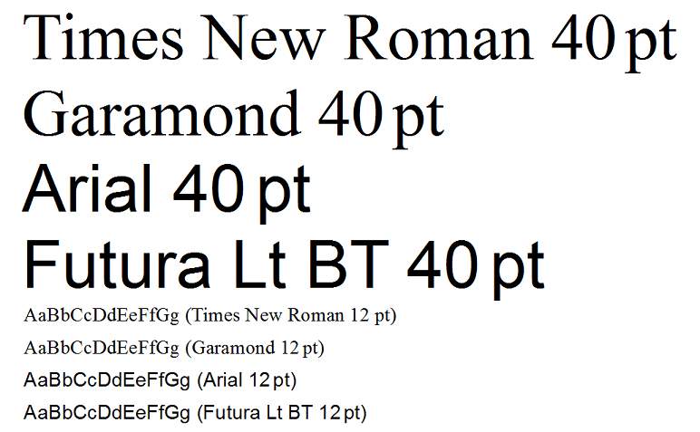
The right choice of fonts is important to increase overall legibility. There are thousands of fonts out there, but one main category are the fontswith serifs such as Times New Roman.
For your Text body you should use a font with serifs. Serifs are the horizontal stroke at the tips of the letters, mostly coinciding with the base line as in the letters “i” or “m”, a few lying above as in “w” and another set placed below the line as for letters “p” and “q”. A few characters such as “o” have no serifs. These serifs give the letters stability on the horizontal axis and also reduce the gaps between letters, so that words gain a more compact appearance. This in turn increases reading speed as you tend to seize complete words as units and not as loose collections of letters.
For main titles, posters, flyers etc., whose object it is precisely to attract more attention, fonts without serifs such as Arial are very suitable. Here the object is precisely to slow down the pace of reading so as to attract more attention.
There exists a great variety of fonts within each. Futura Lt BT for example is lighter than Arial and marries well with Garamond which in turn islighter than Times.
Philosophically speaking you could say that Garamond has been stripped of any unnecessary fat, being reduced to the ‘mathematical minimum’ necessary for rapid reading. It is also more rounded than Times giving it a less aggressive appearance. And in spite of its slightly reduced dimensions at same font size it remains very legible.Of course you need to have these fonts installed on your computer. Some of them are unfortunately quite expensive.
On the whole avoid using different fonts. Instead just vary font size and typeface.
If you’re using a page format of A4, you will probably want a font size of 12pt (or 11pt in case you do opt for Arial, which is by nature larger). If producing a pamphlet size A5 you can reduce the font size down to 11pt or even 10.5pt. The better the printer and the quality of paper, the more you can reduce the font size without the text becoming illegible.
