Charts
From Apache OpenOffice Wiki
- Introduction
- Theory
- Document Structure
- Chapter Headings
- Chapter Numbering
- Table of Contents
- Outline
- Navigator
- Text Body
- Paragraph styles overview
- Reusing styles
- Default Page Formatting
- Title Page
- Papers without a Title Page
- Pages with and without numbering
- Roman Page Numbering
- Group Work
- Proofreading
- Numbered lists and bullets
- Line numbering
- Cross-references
- Footnotes
- Bibliography
- Quotes
- Tables
- Charts
- Pictures
- Snapshots
- Presentations & Graphics
- Cross tables (Statistics)
- Extra Long Web Adresses
- Fonts
- Emphasis
- Special Characters
- Non separable combinations
- Shortcut keys
- Mouse clicks
- PDFs
- Saving your files
- Several files open at once
- Search and replace
- Spell Check
- Synonyms
- Document Infos
- Labels and Form letters
- Help
- Installing Program
- Microsoft Word
- Practice I
- Practice II
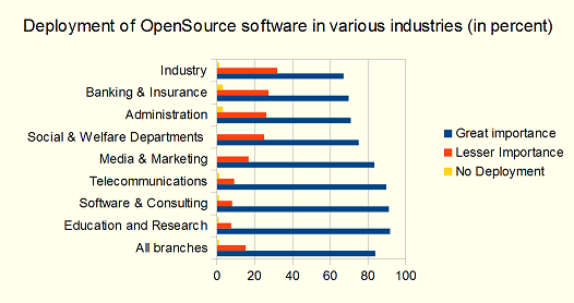
You can display the information contained in Table 4 in the shape of a chart as in illustration 28. Here is how to go about it:
- Mark the whole table (rows and columns) using left mouse button.
- Choose menu Insert › Object › Chart.
- In the pop-up window choose the kind of chart you want (e.g. bar instead of columns) and add a title.
- Confirm your choices pressing Finish
- Right click on your Chart to provide it with a meaningful Caption.
Note that as soon as you click on a graph, the symbols on your menu change, offering you a number of shortcuts. Double and triple clicks on the various areas of your chart offer you further options.
'Illustration 28: Source: See table 4
