Fonts
- Introduction
- Theory
- Document Structure
- Chapter Headings
- Chapter Numbering
- Table of Contents
- Outline
- Navigator
- Text Body
- Paragraph styles overview
- Reusing styles
- Default Page Formatting
- Title Page
- Papers without a Title Page
- Pages with and without numbering
- Roman Page Numbering
- Group Work
- Proofreading
- Numbered lists and bullets
- Line numbering
- Cross-references
- Footnotes
- Bibliography
- Quotes
- Tables
- Charts
- Pictures
- Snapshots
- Presentations & Graphics
- Cross tables (Statistics)
- Extra Long Web Adresses
- Fonts
- Emphasis
- Special Characters
- Non separable combinations
- Shortcut keys
- Mouse clicks
- PDFs
- Saving your files
- Several files open at once
- Search and replace
- Spell Check
- Synonyms
- Document Infos
- Labels and Form letters
- Help
- Installing Program
- Microsoft Word
- Practice I
- Practice II
Fonts play an important role in making the text more legible. There are millions of them around, but two main categories always come up as alternatives for Text Body. On the one hand there are the Serif Fonts, then you have the Sans Serif Fonts.
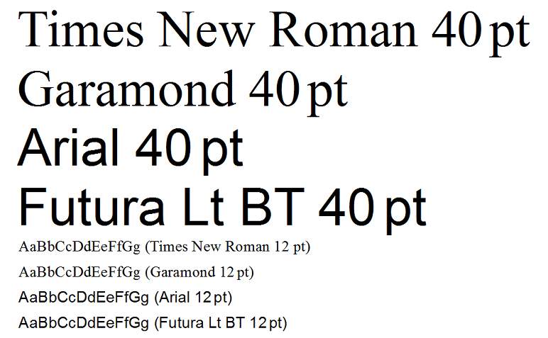
The Serif Fonts are characterized by semi-structural details at the tips of the strokes. You could name these “base lines” or pedestals, most of them coinciding with the base line of writing as in the case of the letter “i”, a few being higher up as in “w” and another set placed below the line as for letter “p”. These have the effect of giving the letter some optical stability on the horizontal axis and also reducing the gaps between letters, thus making them to a degree “fuse together” so words become more compact. The overall effect is to increase reading speed as you tend to seize the word as a complete unit, your eyes jumping from one word to the next, rather than from one letter to the next. So, for Text Body, do use a Serif font such as Times New Roman or Garamond.
For large titles, posters, flyers etc. on the other hand, fonts without serifs such as Arial or Futura (Futura comes in all sorts of varieties) are very elegant.
Taking a closer look at our two Serif Fonts, Times New Roman and Garamond, you will notice that the latter is somewhat finer and rounder in overall shape. This increases the legibility even more. A page full of Garamond text will appear lighter than one full of Times.
On the whole avoid using different fonts. In fact you can stick to just one font for the whole text and use Garamond even for Headings – just varying size and Typeface (Regular, Italic, Bold and Bold Italic). If you do mix Serifs with Sans Serifs, aim at choosing good combinations: Garamond harmonizes better with a Futura Light than with Arial being of similar proportions and similar weight.
If you are using a page format of A4, you will probably want a font size of 12pt (or 11pt in case you do opt for Arial, which is by nature larger). If producing a pamphlet size A5 you can reduce the font size down to 11pt or even 10.5pt. The better the printer and the quality of paper, the more you can reduce the font size without the text becoming illegible.
Some teachers – at least over here in Germany – insist on very detailed specifications so as to force students to produce only a certain amount of text. Instead of saying: “Please write 10,000 characters plus/minus five percent, they specify font size, font type, margins and number of pages. This is really an unfortunate misuse of formatting for control purposes.
