Difference between revisions of "Documentation/Writer for Students/Charts"
From Apache OpenOffice Wiki
m |
(Adjusted to revision May 2014) |
||
| Line 6: | Line 6: | ||
|NextPage=Documentation/Writer for Students/Snapshots | |NextPage=Documentation/Writer for Students/Snapshots | ||
}}__NOTOC__ | }}__NOTOC__ | ||
| − | You can | + | You can display the information contained in Table 3 in the shape of a chart as in illustration 28. Here is how to go about it: |
| − | + | # Mark the whole table (rows and columns) using left mouse button. | |
| − | + | # Choose menu '''Insert › Object › Chart'''. | |
| − | + | # In the pop-up window choose the kind of chart you want (e.g. bar instead of columns) and add a title. | |
| − | + | # Confirm your choices pressing '''Finish''' | |
| − | + | # Right click on your Chart to provide it with a meaningful '''Caption'''. | |
| − | + | ||
| − | Note that as soon as you click on a graph, the symbols on your menu change, offering you a number of shortcuts. | + | Note that as soon as you click on a graph, the symbols on your menu change, offering you a number of shortcuts. Double and triple clicks on the various areas of your chart offer you further options. |
| − | Be careful not to clutter your page with too many graphs and illustrations. | + | {{Documentation/Note|''Note'': Be careful not to clutter up your page with too many graphs and illustrations. Should one graph overlap with another, add one empty paragraph below the first graph and make your second graph '''Anchor''' to this new empty paragraph. Every graph or frame needs a separate anchor point – usually a paragraph, though you could also anchor it to the page or treat it as a single character. This shows that OpenOffice Writer is primarily a text programme and not a layout programme – for fancy layouts use the open source programme '''Scribus'''.}} |
| + | |||
| + | <div style="overflow: hidden"> | ||
| + | <!--makes text to start after the picture--> | ||
| + | [[File:wfs023-object1.png|none]] | ||
| + | </div> | ||
| + | '''Illustration 28: Source: See table 3''' | ||
| + | |||
| + | <div style="overflow: hidden"> | ||
| + | <!--makes text to start after the picture--> | ||
| + | [[File:wfs_may2014_029 source_http_www_poverty.png|none]] | ||
| + | </div> | ||
| + | '''Illustration 29: Source: See table 3''' | ||
<br /> | <br /> | ||
<br /> | <br /> | ||
Revision as of 12:08, 9 June 2014
- Introduction
- Theory
- Document Structure
- Chapter Headings
- Chapter Numbering
- Table of Contents
- Outline
- Navigator
- Text Body
- Paragraph styles overview
- Reusing styles
- Default Page Formatting
- Title Page
- Papers without a Title Page
- Pages with and without numbering
- Roman Page Numbering
- Group Work
- Proofreading
- Numbered lists and bullets
- Line numbering
- Cross-references
- Footnotes
- Bibliography
- Quotes
- Tables
- Charts
- Pictures
- Snapshots
- Presentations & Graphics
- Cross tables (Statistics)
- Extra Long Web Adresses
- Fonts
- Emphasis
- Special Characters
- Non separable combinations
- Shortcut keys
- Mouse clicks
- PDFs
- Saving your files
- Several files open at once
- Search and replace
- Spell Check
- Synonyms
- Document Infos
- Labels and Form letters
- Help
- Installing Program
- Microsoft Word
- Practice I
- Practice II
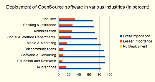
You can display the information contained in Table 3 in the shape of a chart as in illustration 28. Here is how to go about it:
- Mark the whole table (rows and columns) using left mouse button.
- Choose menu Insert › Object › Chart.
- In the pop-up window choose the kind of chart you want (e.g. bar instead of columns) and add a title.
- Confirm your choices pressing Finish
- Right click on your Chart to provide it with a meaningful Caption.
Note that as soon as you click on a graph, the symbols on your menu change, offering you a number of shortcuts. Double and triple clicks on the various areas of your chart offer you further options.
Illustration 28: Source: See table 3
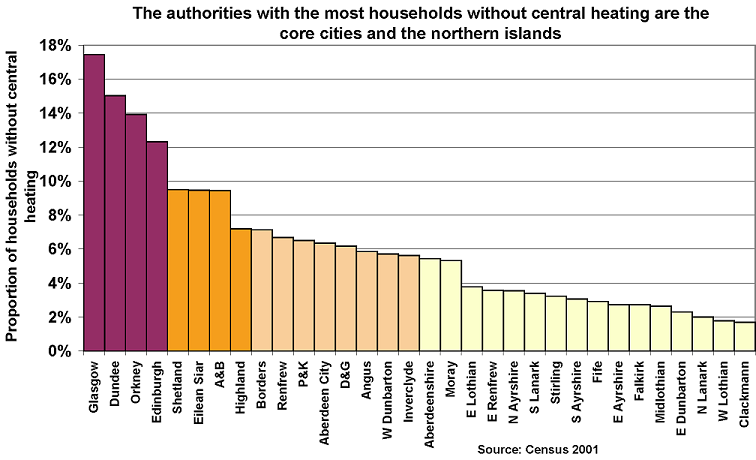
Illustration 29: Source: See table 3

