Difference between revisions of "Documentation/Writer for Students/Cross Tables"
m |
(Adjusted to revision May 2014) |
||
| Line 3: | Line 3: | ||
|ShowPrevNext=block | |ShowPrevNext=block | ||
|ShowPrevPage=block | |ShowPrevPage=block | ||
| − | |PrevPage=Documentation/Writer for Students/ | + | |PrevPage=Documentation/Writer for Students/Presentations |
|NextPage=Documentation/Writer for Students/Extra Long | |NextPage=Documentation/Writer for Students/Extra Long | ||
}}__NOTOC__ | }}__NOTOC__ | ||
| − | OpenOffice Calc is not in | + | Apache OpenOffice '''Calc''' is perhaps not in league with specialised statistics’ programmes like SPSS or its very recommendable cost free and open source alternative PSPP. Nevertheless you can use it for statistical purposes, one of the most popular being '''Cross Tables''' to illustrate the (presumed) dependency of one variable upon another. |
== Example of survey using two categories and percentages == | == Example of survey using two categories and percentages == | ||
| − | |||
| − | |||
| − | |||
| − | |||
| − | |||
| − | |||
| − | |||
| − | |||
| − | |||
| − | |||
| − | |||
| − | |||
| − | |||
| − | |||
| − | |||
| − | |||
| − | |||
| − | |||
| − | |||
| − | |||
| + | In a fictional survey we asked 12 people, men and women, to tell us on a scale from 1 to 10 how much they abhorred violent videos. The aim was to see if there is any significant variance between women and men. The raw results are listed in table 4 and the dependencies in cross table 5. | ||
{| class="wikitable" style="margin: 1em auto 1em auto;text-align: center;" border="1" | {| class="wikitable" style="margin: 1em auto 1em auto;text-align: center;" border="1" | ||
! Questionnaire || Sex || Level of rejection in % | ! Questionnaire || Sex || Level of rejection in % | ||
| Line 57: | Line 38: | ||
| 12 || F || 90 | | 12 || F || 90 | ||
|} | |} | ||
| − | <p style="text-align: center;">'''Table | + | <p style="text-align: center;">'''Table 4: Degree of aversion amongst men and women towards violent videos'''</p> |
| − | <div style="overflow: hidden"> | + | |
| − | <!--makes text to start after the picture--> | + | {| class="wikitable" style="margin: 1em auto 1em auto;text-align: center" border="1" |
| − | [[File:wfs025_pivot_table.png|none]] | + | ! Sex || Level of rejection in % |
| − | </div> | + | |- |
| − | '''Illustration | + | | F || 81 |
| + | |- | ||
| + | | M || 34 | ||
| + | |- | ||
| + | | Total || 62 | ||
| + | |} | ||
| + | <p style="text-align: center;">'''Table 5: Same data as above in form of cross table showing that women reject violent videos to a greater degree than men (or pretend to do so)'''</p> | ||
| + | |||
| + | To obtain the summary as displayed in table 5 do the following: | ||
| + | |||
| + | # Mark the two columns of interest, i.e. “sex” and “extent of rejection” in the raw data table 5, copy them into memory, go to the module Spreadsheet (menu '''File › New › Spreadsheet''') and there insert the contents of computer memory using shortcut '''Ctrl + v'''.<div style="overflow: hidden"><br><!--makes text to start after the picture--><br>[[File:wfs025_pivot_table.png|none]]<br> | ||
| + | </div><br>'''Illustration 30: After having dragged the two buttons “Sex” and “Level of …” into their appropriate fields, go to Options and choose Average'''<br> | ||
| + | |||
| + | # In your spreadsheet you again mark the two columns and go to menu '''Data › DataPilot › Start''' and confirm '''Current selection'''. | ||
| + | # Drag and drop the button “Sex” onto the white area '''Row Fields''' and drag and drop the button “Level of rejection …” onto the white area '''Data Fields'''. | ||
| + | # Press Options and choose '''Average'''. Confirm '''OK''' and again '''OK'''. | ||
| + | # Your new Cross Table makes it appearance on your spreadsheet. | ||
| + | # Mark it and go to menu '''Format › Cells''' and open tab '''Numbers'''; here choose '''Category Numbers''' with '''Decimal place''' of “'''1'''” and '''Leading zero''' also of “'''1'''”; confirm with '''OK''' (see illustration 26). | ||
| + | # Copy your new Cross Table into computer memory. | ||
| + | # After returning to your text file use menu '''Edit › Paste Special › Formatted text [RTF]''' (keyboard shortcut '''Shift + Ctrl + v''') (this will insert the raw numbers of your table instead of an image file of the same, thus allowing you a free hand for further formatting of table within your text file). | ||
| + | |||
<div style="overflow: hidden"> | <div style="overflow: hidden"> | ||
| Line 125: | Line 126: | ||
<br /> | <br /> | ||
---------- | ---------- | ||
| − | <p style="text-align:left;">[[Documentation/Writer for Students/ | + | <p style="text-align:left;">[[Documentation/Writer for Students/Presentations|< Previous Page]]</p> |
<p style="text-align:right;">[[Documentation/Writer for Students/Extra Long|Next Page >]]</p> | <p style="text-align:right;">[[Documentation/Writer for Students/Extra Long|Next Page >]]</p> | ||
[[Category:Documentation/Writer]] | [[Category:Documentation/Writer]] | ||
Revision as of 12:50, 9 June 2014
- Introduction
- Theory
- Document Structure
- Chapter Headings
- Chapter Numbering
- Table of Contents
- Outline
- Navigator
- Text Body
- Paragraph styles overview
- Reusing styles
- Default Page Formatting
- Title Page
- Papers without a Title Page
- Pages with and without numbering
- Roman Page Numbering
- Group Work
- Proofreading
- Numbered lists and bullets
- Line numbering
- Cross-references
- Footnotes
- Bibliography
- Quotes
- Tables
- Charts
- Pictures
- Snapshots
- Presentations & Graphics
- Cross tables (Statistics)
- Extra Long Web Adresses
- Fonts
- Emphasis
- Special Characters
- Non separable combinations
- Shortcut keys
- Mouse clicks
- PDFs
- Saving your files
- Several files open at once
- Search and replace
- Spell Check
- Synonyms
- Document Infos
- Labels and Form letters
- Help
- Installing Program
- Microsoft Word
- Practice I
- Practice II
Apache OpenOffice Calc is perhaps not in league with specialised statistics’ programmes like SPSS or its very recommendable cost free and open source alternative PSPP. Nevertheless you can use it for statistical purposes, one of the most popular being Cross Tables to illustrate the (presumed) dependency of one variable upon another.
Example of survey using two categories and percentages
In a fictional survey we asked 12 people, men and women, to tell us on a scale from 1 to 10 how much they abhorred violent videos. The aim was to see if there is any significant variance between women and men. The raw results are listed in table 4 and the dependencies in cross table 5.
| Questionnaire | Sex | Level of rejection in % |
|---|---|---|
| 1 | M | 20 |
| 2 | F | 80 |
| 3 | F | 70 |
| 4 | M | 30 |
| 5 | F | 90 |
| 6 | F | 80 |
| 7 | M | 80 |
| 8 | F | 100 |
| 9 | M | 0 |
| 10 | F | 60 |
| 11 | M | 40 |
| 12 | F | 90 |
Table 4: Degree of aversion amongst men and women towards violent videos
| Sex | Level of rejection in % |
|---|---|
| F | 81 |
| M | 34 |
| Total | 62 |
Table 5: Same data as above in form of cross table showing that women reject violent videos to a greater degree than men (or pretend to do so)
To obtain the summary as displayed in table 5 do the following:
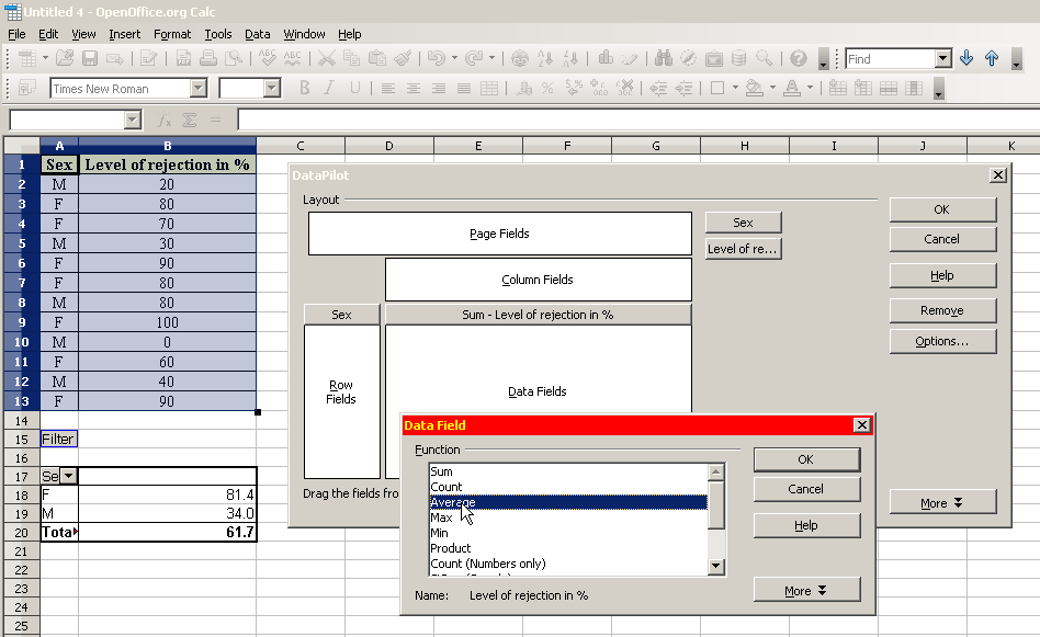
- Mark the two columns of interest, i.e. “sex” and “extent of rejection” in the raw data table 5, copy them into memory, go to the module Spreadsheet (menu File › New › Spreadsheet) and there insert the contents of computer memory using shortcut Ctrl + v.
Illustration 30: After having dragged the two buttons “Sex” and “Level of …” into their appropriate fields, go to Options and choose Average
- In your spreadsheet you again mark the two columns and go to menu Data › DataPilot › Start and confirm Current selection.
- Drag and drop the button “Sex” onto the white area Row Fields and drag and drop the button “Level of rejection …” onto the white area Data Fields.
- Press Options and choose Average. Confirm OK and again OK.
- Your new Cross Table makes it appearance on your spreadsheet.
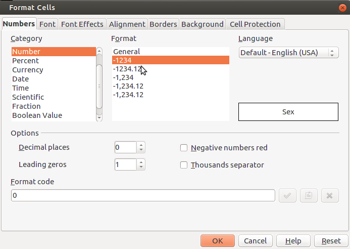
- Mark it and go to menu Format › Cells and open tab Numbers; here choose Category Numbers with Decimal place of “1” and Leading zero also of “1”; confirm with OK (see illustration 26).
- Copy your new Cross Table into computer memory.
- After returning to your text file use menu Edit › Paste Special › Formatted text [RTF] (keyboard shortcut Shift + Ctrl + v) (this will insert the raw numbers of your table instead of an image file of the same, thus allowing you a free hand for further formatting of table within your text file).
Illustration 26: The number of decimal places is reduced to 1
Example of survey involving yes/no answers
If it had been a Yes/No survey, for example to the question “are you mainly right or left handed?”, as in table 7, then you’d do the following:
- Copy the two right columns “sex” and “handedness” from the raw data in table 7 into memory and insert them into your spreadsheet.
- In your spreadsheet again mark these same two columns and go to the menu Data › DataPilot › Start and confirm Current Selection.
- Drag & Drop the button “Sex” onto the white area Row Fields.
- Drag & Drop the button “Handedness” onto the white area Column Fields and also onto the white area Data Fields.
- Under Options choose Count instead of Sum and press More and there choose as Type the option % of row.
- Copy the resulting Cross Table into computer memory.
- Back in your text file insert the contents of computer memory using the keyboard shortcut Shift + Ctrl + v and choose the option Formatted text [RTF] (so as to obtain a formatable table)
Sex Left handedness Right handedness Women 14% 86$ Men 60% 40% Total Result 33% 67% Table 6: Cross table comparison as to handedness dependent on sex
Questionnaire Sex Handedness 1 M R 2 F R 3 F L 4 M R 5 F R 6 F R 7 M L 8 F R 9 M L 10 F R 11 M L 12 F R Table 7: Right- and Left-Handedness and Sex (raw data)

