User Experience/Improved Styles
|
|
|---|
|
Quick Navigation Team Communication Activities |
Presentation
Improving the use of styles in Writer is a recurrent subject on the User Experience discussion list. We can identify three main questions:
- How to improve the user experience of the style-related dialogs and User Interface elements, in terms of usability, productivity and enjoyment?
- How can we incite the user to use styles rather than hard formating (for his own good)?
- How can we enhance the default styles to make Writer looks more appealing and provide a better User Experience?
Status of this activity
This activity is independent of other User Experience projects, such as the recent Renaissance. It could be broken in sub-activities or milestones if required.
Currently, the brainstorming season is on. Please add your ideas, your design proposals and future user interface mockups. In the next step, we will have to rate the requirements and the ideas and select an adequate design solution. Until we get close to development, a roadmap is not necessarily needed.
The problem
Styles usage is often misunderstood or found «too much complicated» by end users, who often prefer using the formatting toolbar instead of styles.
The fact is styles are one of the most powerful features a user could use to increase its productivity, but they don't think so, beeing afraid of the feature. One of the most common reply over style is «I know I should use them, I have to think about it, I don't know how its works and I don't have time to look further».
Some suggestions
Sebastien Just has made a list of suggestion in this mail. Feel free to add your own ;).
The Styles panel
User Experience and Overall Design
- The style panel should be always visible
- In Sebastien's opinion, hard formatting should not exist at all, but that's another discussion…)
- Display an example of text formatted with the style
- instead of the style name only (like the font selector.) As noticed by Philip Ganchev in this mail, there are many issues with sizes.
- Improve the Style filter
- It is quite difficult to understand while it's an handy tool. Placing it on top of the Frame panel should show people it's importance. At the bottom of the panel, they don't see it at all and don't even try to click on it. Maybe a folder like presentation (like layouts in Photoshop) may be a good replacement for it.
Best practices and conformity to guidelines
- Avoid using contextual menus
- for «Modify» and «New.» Contextual menus are always a bad thing when it's the only way to do something. People are not aware of the way to change the styles. Maybe a «Modify» icon next to the style example should be a good thing.
- The «New style» button should not be only an icon
- but icon + text.
- Style type selection
- People don't understand the difference between paragraph, character, pages, frame and numbering styles. The buttons are not self-explanatory. We should have buttons with icon+text in the toolbar to explain it, or even better: tabs. The style list presentation using examples should help explain the difference too.
Default Styles
- Reduce the number of default styles
- It would help the user to select the right one, reduce the cognitive burden and apparent complexity of styles.
- Provide much more visual differences between the default styles
- It would help the user to remember them.
- More eye-candy
- It may help in OpenOffice end user adoption to write documents that look really nice even if they don't play with styles or hard formatting. We can see how Apple's iWork productivity suite is fun to use as documents are rendering so «cool» even in the earliest stage of document creation.
The way we approach formatting
Page Style Confusion
Jaron Kuppers has said that “OpenOffice.org poorly distinguishes between page styles and selected individual pages. The Format-Page menu option is improperly named, as the user is in fact changing the page style. There really is no way to effectively format the current page without explicitly creating a new page style and then applying that style to the selected page which is extremely confusing to most users.„ The subject has also been longly discussed in the thread about page numbering.
See Also
Some proposal by Leonard Mada to enhance the selection of styles: User_Experience/UI_ideas#Styles_button. See also the palette idea in this post by Clément Pillias (in section ‘the complex solution’.)
Solutions and Mockups
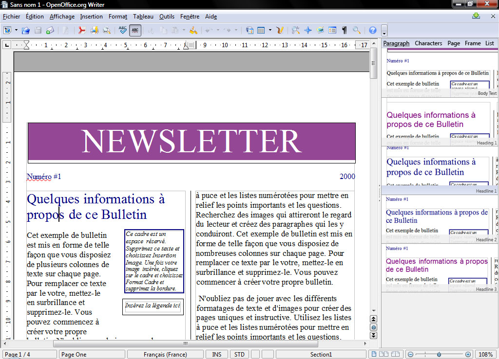
Solution : direct style preview
This solution is provided as an example. It shall not be implemented as-is. For discussion only.
The main problems :
- the user interface changes too much while the user works. Modal interfaces are counter intuitive for end users.
- too much styles leads to complicated selection
- visual difference between styles can lead to confusion even if the styles are named ( below the style preview )
The benefits are :
- no need for direct hard formatting, everything is style usage
- hard formating disappear, letting the user with styles _without telling users_ that the styles are used ( they are commonly afraid of styles )

