DataPilot example 1: Sales volume overview
A typical introductory example in courses and books for beginners with spreadsheets is a simple sales volume overview.
This example demonstrates the user interface and how to insert text and numbers into cells. Useful aids like AutoFill and drag and drop have been demonstrated in other chapters. The most important part is the connection between cells through formulas, for example addition with the plus operator or the SUM function.
This small exercise might be useful for a first contact with the program, but it shows only a very small fraction of the tasks in an office. To create such a sales overview, you also need the orginal data. That is, before you can use a spreadsheet for creating the sales overview, you need to add many single purchases from different lists and then enter the sums into the relevant fields C5 to F7.
Practical problems and questions
- For displaying additional values for May, June, July, and so on, you need to add extra columns. This means that you have to change the structure of the calculation sheet. This is not only somewhat inefficient from a workflow point of view, it also adds some practical questions: How do references react, if you add more columns or rows to the sum formulas?
- The layout, where the timeline is displayed horizontally, might be less convenient if you add more months. A vertical layout might be a more efficient use of space. How can the table then be transposed? Do you have to enter everything again?
- What if the management asks unexpected questions or adds an additional subdivision for the different sales regions or a constraint of the sales for a given employee? In such cases you again have to manually add all the sums and create different tables in many variations.
- Is it really acceptable and realistic to create such an overview by adding the different values manually? This is really a lot of work and extremely error-prone!
Solution
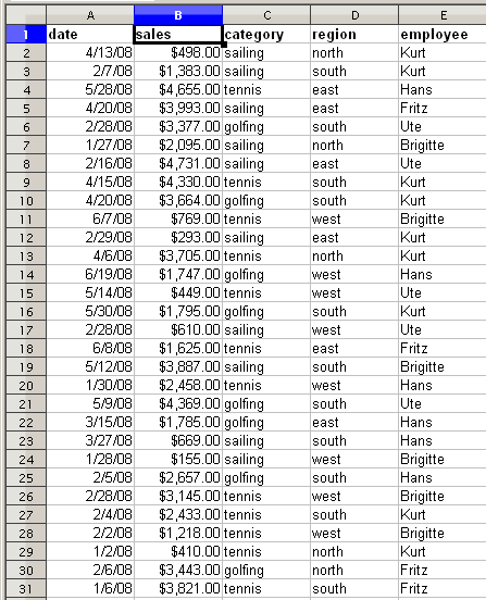
The most important part of your task in the example is the addition of the total sales per month cells. This had to be done manually. To do this automatically with the program, just get the data into Calc. You can enter the single numbers by hand or you can import a file from your bookkeeping software. In any case we assume a continuous table, that keeps track of all sales in a somewhat primitive form.
You can create the sales volume overview by following these instructions:
- Select the cell A1 (or any other single cell within the list).
- Select Data → DataPilot → Start. On the Select Source dialog, choose Current selection and click OK .
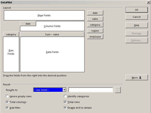
- The DataPilot dialog has four white layout areas and several fields that look like buttons. These small fields are the titles of the different columns of your list.
- Move the date field into the Column fields area.
- Move the sales field into the Data fields area.
- Move the category field into the Row fields area.
- Click More, to see more options in the lower part of the dialog.
- In the Results to field, select – new sheet – from the drop-down list.
- Click OK .
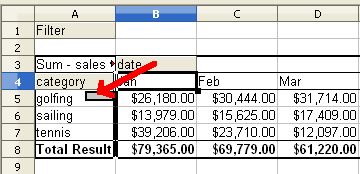
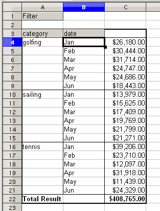
- The result appears on a new sheet. It has the desired structure, but the columns are not yet grouped into months.
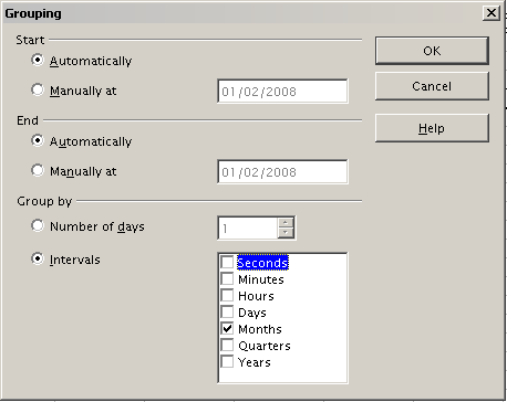
- To group the columns, select cell B4 or any other cell that contains a date. Then select Data → Group and Outline → Group. On the Grouping dialog, make sure Intervals and Months are selected in the Group by section, and click OK . The result is now grouped for months.
In this result, you will recognize the beginners’ example. It is very easy to produce, without any further knowledge about the spreadsheet. You do not have to enter any formulas.
Advantages
- No manual entering or adding of any values is necessary. There is less work and fewer errors.
- The layout is very flexible: months are listed horizontally and fields vertically or vice versa, in two mouse clicks.
- Additional differentiating factors are immediately available.
- Many types of evaluation are possible; for example, number or average instead of sum, accumulated values, comparisons and so on.
We will now demonstrate some of these advantages.
Starting with the result above, drag the Date field under the Category field, as shown below.
Now the summary is as shown below.
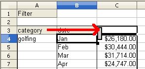
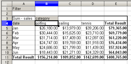
To transpose the table completely, just drag the Category field above the area of the displayed values, to cell C3. (See figure below.)
The result of this action is shown below.
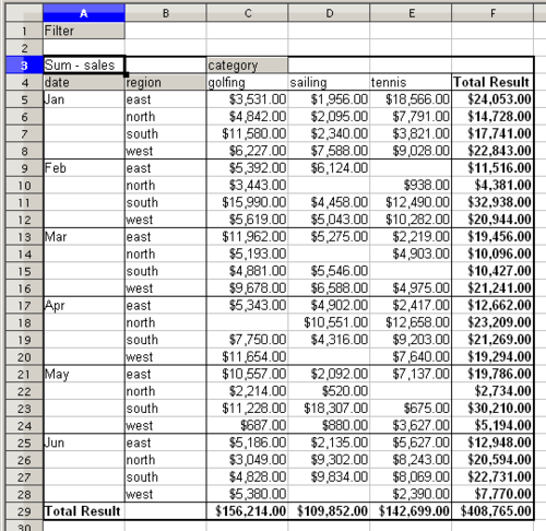
In contrast to the beginners’ example, it is now very simple to view or add different aspects of the underlying data. For example, to see the values for different regions, do the following:
- Select the cell A3 (or any other single cell that is part of the DataPilot result).
- Select Data → DataPilot → Start, to start the DataPilot again. Drag the Region field into the Row fields area . Depending on the order you choose for the row fields, the result is either regions with date subdivisions or vice versa.
- Click OK .
In another variation you may want to add the employees.
- Select the cell A3 (or any other single cell that is part of the DataPilot result).
- Select Data → DataPilot → Start, to start the DataPilot again.
- You do not need the Region field in this case. Drag it out of the layout area.
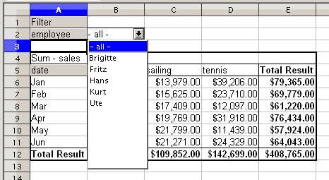
- Drag the Employee field into the Page fields area.
- Click OK .
Fields that you use as page fields are placed in the result above the summary with the name Filter. You then have a drop-down list that you can use to show only the sums of a given employee:
Up to now we have not seen the most powerful features of the DataPilot. The following examples will show you more.
| Content on this page is licensed under the Creative Common Attribution-Share Alike 3.0 license (CC-BY-SA). |

