Proposal by Michel Renon
|
|
|---|
|
Quick Navigation
Team |
| Please do not edit this page unless you are the original author. Your feedback and comments are welcome in the Comments section below or on the ui@ux.openoffice.org mailing list. |
Design Proposal "Tools on demand & simplified toolbars"
The following design proposal is part of the collection of design proposals for “Accessing Functionality”, which is part of Project Renaissance.
Summary and Status
| Important Information the wiki page is not up to date with the pdf file. I'm sorry, I don't have enough time to update.
The current version of the pdf file is Media:Proposal_impress_ui_renon3.pdf (37 pages !). Changes :
|
For a complete description, please download the pdf file : Media:Proposal_impress_ui_renon2.pdf.
In this file, you'll find precise informations about toolbars, their content, how to customize them, how they can be moved, attached, detached...
The fundamental idea is to focus on user's needs, specially the type of document and the associated tools.
Depending on the type of document I work, I need a subset of the tools available in OOo.
But OOo proposes only basic types of document : word processing, spreadsheet, slideshow, drawing...
OOo should propose more detailed type of documents, for example :
Writer
- 1 page simple letter
- business document
- scientific document
- Thesis
- mailing, labels, envelopes
- publishing
- web
- …
Calc
- financial document
- scientific document
- Canvas/ Grid – Editor (cf http://wiki.services.openoffice.org/wiki/)
Then OOo should propose associated tools in a very simple UI : the idea is to show only tools on demand through toolbars.
Each toolbar has few elements about a common subject. Tools shared by every documents would be macros, forms, media, drawing tools... For example, tools for Writer would be mailing, versions, indexes, headers & footers...
The element are actions, not properties.
There is a main toolbar for each document : she contains the basic tools for the document.
The user can add, remove, move, organize (horizontally, vertically, in tabs or beside) the toolbars (except the main).
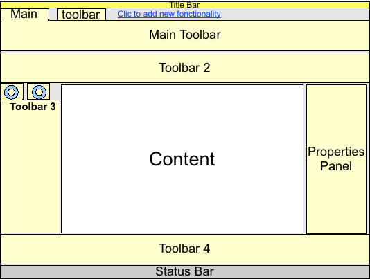
An example of main toolbar with buttons shared by all types of documents :
An example of UI with several toolbars reorganized :
Note the “Click to add new functionality” : it's the entry point to add toolbars
Note the properties panel : it's an inspector :
- it is context-sensitive : its content change according to the selected object
- his content allow the user to change the properties of the selected object
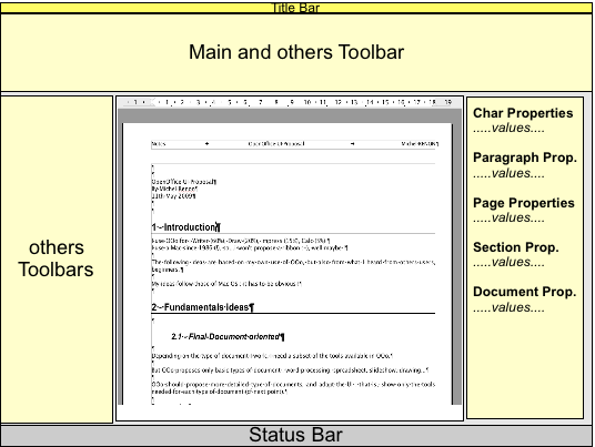
As there is a hierarchy of objects, the properties panel show every properties of every object in the hierarchy.
For example, in Writer, if we usually have the hierarchy : Document/Section/Page/Paragraph/character, the properties panel looks like :
It is very common in others software.
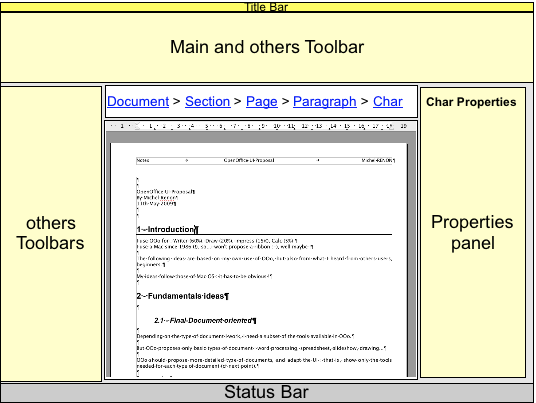
I propose a variation : the properties panel show properties of only one object. We provide the user a way to select every object of the hierarchy : a “breadcrumb”. For example :
It's just an idea : I don't know if it'll be very user-friendly...
Proposal for Impress
Needs
From my experience with Impress, and with what I heard from other users, I suppose that most needed features are :
- add slides
- change background
- add images /videos
- add some simple transitions between some slides
Remarks on actual Impress
Here is what I find difficult with Impress :
- some terms are difficult to understand and/or are incoherent :
- the most important example is “master slide” : in the task panel, it's called “master slide”, and in the “view” menu, it's in a group called “mask”...
- the other example is “slide layout” : beginners don't find that very obvious
- the “Insert” menu is very complicated and has too many sublevels :
- to insert a spreadsheet, you have to select “Insert” then “Object”, then “OLE” and then select “spreadsheet” from a panel !
- Some very disturbing behavior (should define a bug report ?) :
- when you modify a mask, if you clic on the tab “handout”, what really happens ?
- when you modify a mask, if you clic in one “master page” or “layout” in the “tasks” panel, what really happens ?
- for beginners, it's not obvious that you can change default text size with the “mask”
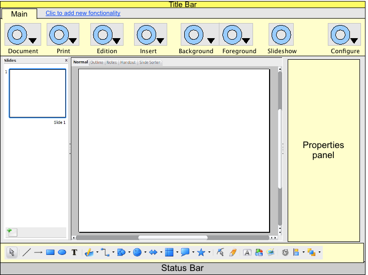
Main toolbar for Impress
The first idea is to use terms “Background” and “Foreground” instead of “master/mask” and “layout”.
Then one button would give access to the backgrounds, and another to the foregrounds :
Menubar and tab for documents
One of the hottest subject in last months of refexion has been “tabs for document” : that is, reuse the concept of tabs introduced by Google Chrome.
One consequence is another question : what about the menu bar ?
About “tabs for documents” I already proposed to keep that optional, for power-users. Some of my friends are beginners with computers and I can tell you that they don't even know that tabs exists...and if I tell them “open that web page in a new tab”, I understand they get frightened !... It's already difficult for them to manage several windows, don't oblige them to use tabs for documents.
About the menubar... As a Mac user, I would say “there must be one” (every Mac app must have one, even if there are only the “application”, “File” and “Edit” menu) But after the frst refexions about toolbars, i'm not sure...
Status: Request for Comments
Mockup
PLEASE NOTE THAT THESES MOCKUPS DON'T TAKE CARE OF TRANSITION BETWEEN SLIDES OR ANIMATION OF OBJECTS
I'll work on theses questions if I have time and if it's necessary :-)
Note 2 : I had no time to define precise mockups, with right scales and dimensions. It would be the next step...
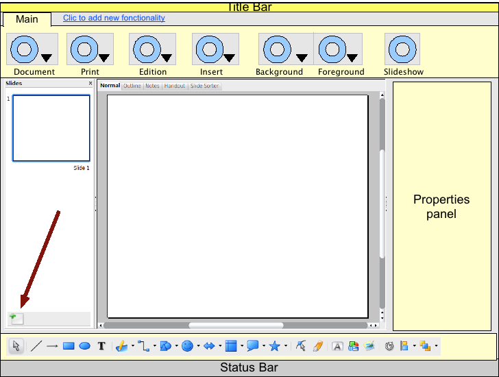
Default screen
Note that the Drawing toolbar at the bottom is just a copy of the actual drawing toolbar : the number of elements should be reduced.
Add a slide
Just click on the “Add slide” button in the local toolbar :
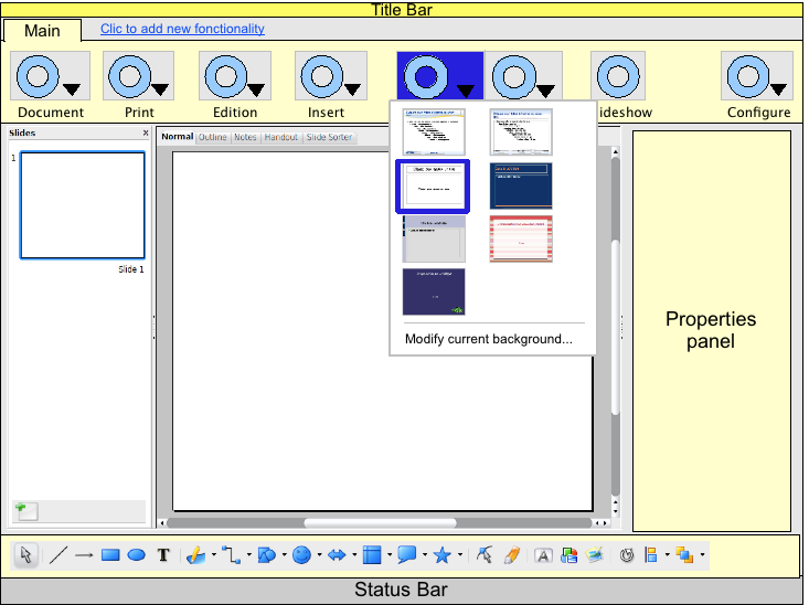
Modify background
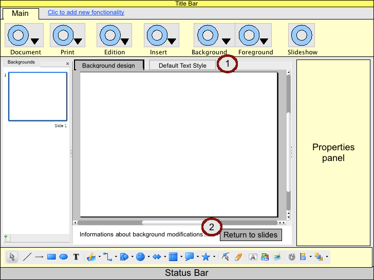
Select “Modify current background” from the “background” button : just like today, you enter the “background modification” mode :
But there are some differences :
- 1 : Note that there are only 2 tabs in the content view
- “Background design” : you can draw, insert image, insert date and time fields...
- “Default Text Style” : you just can change the default text style
- 2 : Note the special information :
- there is a text that explains what is a background and what you can change...(and maybe a “more” link ?)
- and there is a button that “returns to slides”, it is equivalent to the actual “stop mask mode”, but this one seems friendlier
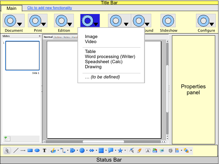
Insert image or video
Just select “Image” or “Video” from the “Insert” button : you'll be prompted the standard file dialog.
Detailed Description
For a complete description, please download the pdf file : Media:Proposal_impress_ui_renon2.pdf.
I started others ideas : a new style browser/editor, a UI to help resize table columns But i need time to polish them and that's what I miss...
Update --Michelr 08:23, 15 May 2009 (UTC)
You can find an example of the contents and layout of the properties panel here : http://www.mmiworks.net/eng/publications/systemslecture2005.pdf (pages 17 to 25). The difference in my proposal is that there is not the first line of icons (under the title bar) : i propose to replace that with the breadcrumb.
I find their work very very interesting, and i got inspired by them.
Additional Material and Mockups
Author or Team Working on This Proposal
| Author / Team Member | Contact (OpenOffice.org login name, used for email) |
| Michel Renon | MichelR |
Comments
| Community members, this is where your comments and questions concerning completeness and clarity should be written. Please add your OpenOffice.org login name to let us contact you via email. |
Your space :-)
How are users going to cope with migration from current OpenOffice to this. They have nothing in common with the past. http://en.wikipedia.org/wiki/Renaissance It would pay if people had read the meaning of this. Renaissance is looking to the past and improving on it. Not taking a leap of faith into a void throwing everything way to get there. Please think how users have any use for there old information to make the migration painless. --Oiaohm 23:34, 13 May 2009 (UTC)
| Answer --Michelr 08:21, 15 May 2009 (UTC)
I would say that what's important is the destination : if we propose a new UI that's much easier and obvious to use, users won't get disapointed. Sure, the first seconds, they'll say "oh no, they changed the ui..." and after few minutes "finally, it's better". I know, i'm the first user to react like that :-) And we can look back when the Mac was introduced : at that time, software was dos-based, had black screen and a lot of complicated keyboard-shorcuts, each different for every software. And then came the Mac : something COMPLETELY different, but that different thing was so easy to use that users had few problems to migrate, and most important, they didn't wanted to come back ! The condition is that the destination has to be very very easy and obvious... |
Hi Michel, thank you so much for your in-depth proposal and some nice (!) ideas (styles editor, breadcrumb) besides “Accessing Functionality”. Just a few questions with reference to your PDF document...
- Q1, page 1, summary and status: You write “OOo should propose associated tools”, does that mean, that the user gets a set of tools based on e.g. a certain document template?
- Q2, page 4, needs: You name “other users”, can you please shortly tell us what kind of users you refer to? Private people working on small texts, scientific researchers showing their results?
- Q3, page 5, default screen: There is both an insert button and the drawing toolbar which also certain some elements? How does that relate?
- Q4, page 13, adding toolbars: If the toolbars are added/modified/removed by the user, are these changes valid/persistent for the current document, the document type, in general? Or uses OOo the defaults with each new document?
Thank you very much in advance! --ChristophNoack 16:03, 22 May 2009 (UTC)
| Thanks for your comments !
Q1 : yes. I propose some example of tools in 4.2.1 (page 11) of the pdf doc Q2 : "others users" are friends who are teachers, and beginners with computers : they want software that "just work, and be VERY simple" :-) Q3 : I used the current drawing toolbar because I had no time to define mine... In page 9, you can see that the "insert" menu has an "Drawing" item : it is an OLE object of Draw. IIRC, MSWord 2003 propose that behavior by default : when you want to add a shape, it automatically create a drawing canvas, and I find that a good idea. Your question shows that this point still needs works... Q4 : I think that everything should be possible, depending on user's prefs... there must be a default behavior (to be defined by UI experts) but the user may be able to change it I hope my answers are ok for you. I would like to add informations to my proposal, I just need some time... I still have 3 days to work on it ! --Michelr 21:05, 22 May 2009 (UTC) |


