Proposal by Andreas Schuderer
|
|
|---|
|
Quick Navigation
Team |
| Please do not edit this page unless you are the original author. Your feedback and comments are welcome in the Comments section below or on the ui@ux.openoffice.org mailing list. |
Design Proposal "Habituating Interaction"
The following design proposal is part of the collection of design proposals for “Accessing Functionality”, which is part of Project Renaissance.
 "I made this letter longer than usual because I lack the time to make it shorter."
     -- Blaise Pascal, Provincial Letters XVI
Summary and Status
In this proposal, I suggest the following changes to the interface:
- Make Keyboard Command Invocation the primary method of invoking commands.
- Combine Direct Manipulation and the Context Menu into one paradigm for working with visible items.
- Put all item properties in a scrolling sidebar (only properties, not commands)
- Replace Wizards with Activity Guides
Status: Proposal Complete
Goals
This proposal tries to improve the following aspects (adapted from "A nearly one page summary of design rules by Jef Raskin"):
1. Make the interface more habituating.
- Commentary. If the interface can be operated habitually, then, after you have used it for a while, its use becomes automatic and you can release all your attention to the task you are trying to achieve.
2. Reduce modes, aiding habituation and reducing errors.
- Commentary. Modes exist where the same user action yields different results depending on system state at a time when your attention is not on system state. In the presence of modes, you will sometimes make mode errors, where you make a gesture intending to have one result but get a different and unexpected result, distracting you from your task.
3. Reduce the number of concepts used in the interface. Attempt monotony.
- Commentary. "Monotony" here is a technical term meaning that you do not have to choose among multiple gestures to achieve a particular sub-task. The idea is to make the system image as straightforward and simple as possible, to minimize UI consistency errors and wrong user images. Monotony is a tough goal because we try to change the interface while retaining the learned value of the user base. Both can't be achieved in full. That's why the result will have to be a compromise between adding some new concepts and getting rid of some old concepts.
4. Make the interface discoverable and clear while maximizing information efficiency, and preserving as much screen space for content as possible.
- Commentary. To paraphrase the above, you should always be able to find out what you can achieve and how to achieve something by yourself (discoverability). To that end, the interface should not be cluttered and functionality shouldn't be placed in unexpected places (clarity). You shouldn't have to click and push keys more than strictly needed for your task (information efficiency). You should be able to work at your content with a minimum of squinting or scrolling around (screen space for content). I really can't stress the last one too much. Everything around software appears to be focused on functionality, but the most important part of the whole office suite is your content! What good is one-click functionality when it comes at the cost of making it more difficult to write and read your content in the first place?
Classical design virtues like "efficiency", "consistency" and "learnability" are inherent to the above goals. They are a logical consequence if those goals are achieved.
Another subgoal, "getting rid of wizards", also follows from the above goals: Wizards are modal, require lots of interaction, work against learnability by duplicating functionality etc. Their shortcomings are too numerous to list here in full.
Another current problem that will be addressed here as well is the current lack of distinction between "item properties" (usually represented by nouns) and "commands" (usually represented by verbs). Of course there will always some kind of blur between those two categories, but the distinction can be resolved clearly for 95% of the cases. Currently you change some properties by invoking commands. And then there are many properties that you currently can only change through dialogs (We'll get rid of all those dialogs as well). When removing all property-manipulating commands one finds that real commands aren't invoked as frequently as one might have thought. Manipulation of properties is far more frequent, and can be dealt with more efficiently through direct manipulation and the Properties Sidebar. This way, you've got distinct ways to access commands and properties, and you'll always know where to find which.
Detailed Description
Keyboard Command Invocation
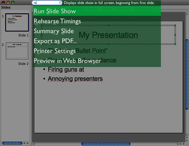
Keyboard Command Invocation, as the name implies, takes place with the keyboard. It will enable the user to invoke every available command in a consistent, quick and easy-to-learn way (most of the items that you currently see in OpenOffice.org's menus are commands). There will be a text entry field that provides a visual cue and may be clicked on. It can also be given focus by pressing the CAPS-LOCK key. It won't have a "go"-button to avoid training the user to inefficient mouse-keyboard-changes, but the user can use the Enter key to invoke the command.
Because this will be the most-used UI element by far, it's very important that everyone will be comfortable with invoking it. That's why we give up monotony for the sake of universal accessibility. The field can be invoked in three ways:
- Holding down CAPS-LOCK, typing/selecting a command, and releasing the CAPS-LOCK key.
- Pressing and releasing CAPS-LOCK, typing/selecting a command, and pushing the Enter key (disabled by default).
- Clicking it with the mouse, typing/selecting a command, and pushing the Enter key.
The first variant is quasimodal. It relieves the user of the burden to check visually whether their input goes into the text field -- they just know it because they FEEL it (holding down the CAPS-LOCK key). If the CAPS-LOCK key is held down while typing, it's a command, if it isn't, it isn't. This gets rid of mode errors and improves accessibility. You can cancel a command invocation by typing gibberish and releasing CAPS-LOCK -- it's quick to perform and no command will be found. You can also hit the Esc key.
While the user is typing into the command field, a list of suggestions is constantly updated below it. The topmost suggestion is selected by default, but the user can select another suggestion from the list by using the arrow keys. Typed letters will be matched non-consecutively. That means that when typing "rsl", the command "Run Slide Show" will appear in the suggestions list. The suggestions list will be ordered according to the following factors (with different weights applied to each of the factors):
- Matches at beginnings of words appear higher in the list.
- Consecutive matches appear higher than non-consecutive matches.
- Matches that cover more letters of the command name will appear higher.
- Suggestions that have previously been selected after typing the same letters appear higher.
The last point means that the system learns what command you mean by a particular letter combination.
Of course you need not invent abbreviations like "rs". If you're comfortable with typing more of the command name, go ahead and type "run".
The selected item will be invoked when the user releases CAPS-LOCK (variant 1) or presses Enter (variant 2 and 3). When no command has been found for the typed letters, there will be a non-modal message telling you so. This message will go away by itself when the user goes on using the system (uses the keyboard, moves the mouse more than a few pixels), and it doesn't swallow up the input event that dismisses it.
This principle is very similar to the formerly-commercial application Enso. You can also try out a interface demo of a similar interface.
| Mockup: As an example on how space could be saved, the Command Invocation Field has been integrated into the title bar. It is important to note that click-through should not work with the field (i.e. when the window is in the background and the text field is clicked, the field should not take input focus. Only the window should activate). |
About discoverability: It may appear as if this approach "hides" all commands from the users, making them hard to discover. And in fact when "hiding" means "not cluttering up the screen with them", it does! But in fact this kind of interface is easier to explore than a menu-driven one. Static mockups can't convey that, due to the instant feedback of the suggestions, you are able to find out what command to use very quickly by typing and erasing letters. If you want to get an overview about the capabilities of the application, you can also "list available commands".
Although we now got rid of any visual representation of commands, there is a case where I am in favor of toolbar-like command invocation: Sometimes, there are commands that (a) are frequently executed in a context when the user is working with the mouse intensely, and (b) do not fit into the context menu by being too "general", i.e. unrelated to any of the on-screen objects. I guess the "create circle" command fits into this category. For these cases, I would allow for a toolbar, with very carefully selected commands, that can be easily customized by the user if they find that they need a command often when working with the mouse. The used toolbar icons have to be clear and large, have a lot of contrast, unique silhouettes, and additional text labels. See the Apple Keynote toolbar for a good solution to the aspects of choice, icon design and user customization.
Rationale
Commands have names anyway. Those will now be used to invoke the commands. A similar idea has previously been discussed under the name "Command Search". Keyboard Command Invocation maximizes the screen space available for the content, while at the same time avoiding excessive interaction (navigating through menus and sub-menus). Also, typing a letter sequence habituates nicely.
Commands are atomic. They don't take arguments (not yet, at least). Their only "argument", if any, is the current locus of attention, e.g. the current selection, the current slide, etc. All that is said here about commands applies independently of whether they are invoked through the keyboard or through the mouse.
Examples for commands are "create oval" or "save file". The command "create oval" puts an oval with default properties onto the current slide. Those properties can be changed later, e.g. through direct manipulation or through the Scrolling Properties Sidebar. Not having to determine object properties at the point of creation is part of the "de-wizardization" goal of this proposal. De-coupling those steps gets rid of unnecessary double work and increases flexibility and the user's creative possibilities by an order of magnitude.
One word about the choice of CAPS-LOCK. This is a key which, by its original function, causes more harm than value. For the majority of users, they hit it accidentally far more often than they use it on purpose. By using it as the Command-Invocation key, we can put this big, nice key to good use.
Direct Manipulation and Mouse Gestures
Impress currently makes decent use of direct manipulation to modify content objects. That's a good thing, because the object on the screen blends with its physical properties. Its physical properties are not abstract, but tangible, right there on the object itself.
This proposal suggests that direct manipulation can be further improved and extended very far. As many physical properties as possible should be modifiable through direct manipulation. The Properties Sidebar (see below) will ideally only need to be used for fine-tuning (also, there won't be any dialogs/wizards for item properties any more). Here's the proposal:
alpha) Always keep the object's appearance up-to-date at all times during a user manipulation.
Having to deal with wireframes and delayed visualization of properties turns direct manipulation into a clumsy, inefficient and error-prone process. Therefore, the object is always kept up-to-date and rendered in full while its properties are being manipulated by the user (e.g. by dragging a direct manipulation handle or dragging a slider in the properties sidebar). I don't mean displaying semi-transparent previews, but really updating the object's rendering itself.
a) Changing single click behavior to always select the object
There should be no exceptions, such as is the case now for text objects. You will double click them to edit, same as with other objects. Then it's not so ludicrously difficult any more to select a text object (clicking once, pausing, and trying to click the border the second time). The thick selection border of text objects will then become unnecessary.
b) Changing "snap to grid" functionality
Currently, when performing some dragging operation (drag, resize, ...) on an object, it locks to an imaginary grid by default. Instead, do it like Apple Keynote: Get rid of this imaginary grid and snap to positions relative to the other objects (if closer than about 5-10 pixels). When snapping occurs, display guidelines to indicate what is being snapped to. Snap edges/center of object...
- ...to slide edges/center
- ...to edges/center of other on-slide objects
- (if text) ...to text edges/center of other text objects
c) Improving consistency of modifier keys
The operation should always react to pressing/releasing modifier keys during the operation. You could e.g. start resizing an object and then press the Shift key during resizing to preserve aspect ratio. This aids discoverability and reduces the need to stop, undo and start again. The modifier keys should always stay freely combinable, just as they are now. These are the current uses of modifier keys, with slight improvements:
- CMD/Ctrl overrides snapping (already implemented in Impress)
- Alt modifies action so that is uses the object center as pivot point (partly implemented in Impress -- should also react to pressing Alt during the operation)
- Shift forces the action to be more "orderly", e.g. resizing preserves aspect ratio, rotating snaps to 45 and 90 degree positions (only aspect-ratio implemented in Impress)
d) Adding more handles for direct manipulation
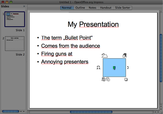
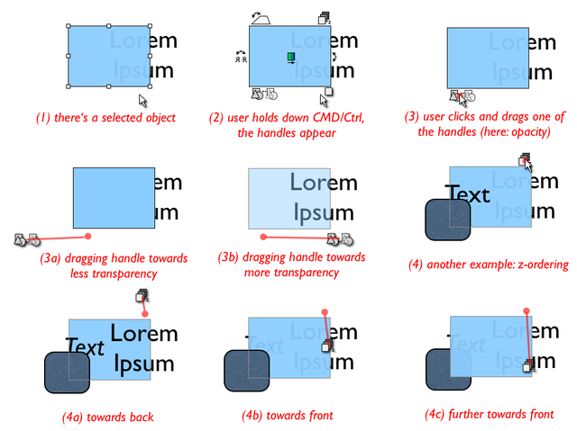
When holding down CMD/Ctrl before starting to drag, additional handles, in addition to the corner and edge handles, appear on and around the selected object. The user can drag these to perform their operation. When the user starts to drag, all handles disappear and the mouse cursor assumes the handle's shape. The dragging operations all react to the modifier keys mentioned above (where it makes sense). The only exception is that no snapping takes place in these operations. Therefore, no snapping-override (CMD/Ctrl) is necessary. The handles have distinct symbols that convey their physical effect through their shape, and they have a tooltip. They are for example:
- Handle for rotation (desperately needed)
- Handle for 3D tilt (backward/forward)
- Handle for moving object backwards/forwards in Z order (up is back and down is front)
- Handle to drag a drop shadow (determines angle and distance/blur of drop shadow)
- Handle to adjust opacity
- Handle to flip the object
- Handle to modify a color gradient
- ...and so on.
Those are a lot of handles, but they don't clutter up the interface because they only appear on demand (when CMD/Ctrl is held down). By adding those handles, we already made many dialogs and context menu entries redundant. Hooray!
| Mockup: Examples for additional direct manipulation handles which are shown while the user holds down CMD/Ctrl. |
| Mockup: How direct manipulation handles are dragged. Note that they can be used to change gradual properties (opacity, tilt) as well as discrete properties (z-ordering, flip). |
e) Adding a gestural context menu (replacing the current context menu)
There will probably still be often-needed properties that are will not fit this "drag a handle" metaphor. Also there are some often-needed context menu entries. That's why we'll still need some sort of context menu. But please take note that we will definitely not keep those context menu entries that simply provide shortcuts to properties dialogs. Those are kept in the Properties Sidebar (see below). We only want context menu entries that perform a particular action -- that is, that are commands.
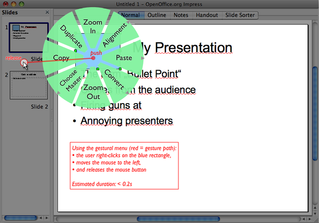
I suggest making the context menu fit the direct manipulation approach by not using the classical menu paradigm, but a gesture-based menu.
This is a blend between a pie menu and mouse gestures, combining the advantages of both. I lifted this approach from the easyGestures project (http://easygestures.mozdev.org/).
Similar to the Keyboard Command Invocation, invocation of the context menu will not be monotonous for discoverability's sake. There will also be a quasimodal and a modal way to use the context menu:
- Right-click-and-hold on object, choose menu item by moving mouse in its direction and releasing mouse button (quasimodal)
- Right-click-and-release on object, click left again on a menu item to choose it (modal)
In the preferred first (quasimodal) usage, you cancel by (1) releasing the button again without having moved the mouse more than 10 pixels, (2) moving the mouse far beyond the menu, or (3) hitting Esc.
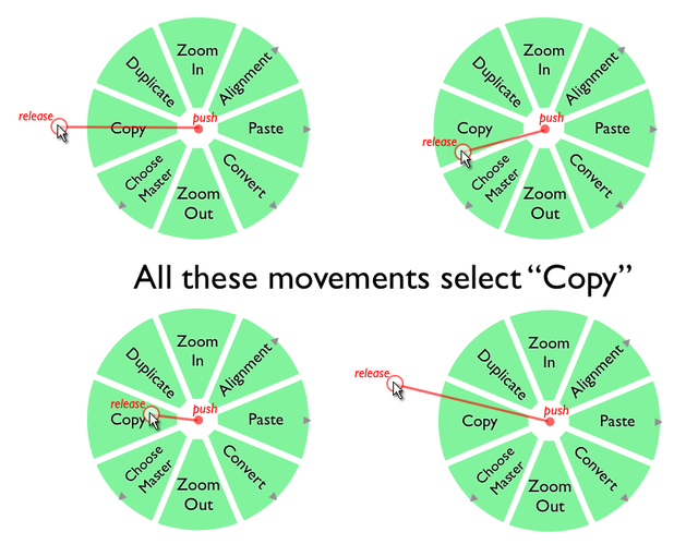
In a circular menu, you select an item by moving the mouse a certain angle. The distance you move it is not so important. Humans are far more precise in moving the mouse in a particular angle than in moving it a particular distance (you need to be dexterous in the latter for linear menus).
| Mockup. Example of using a gestural context menu. |
| Mockup. It's easy to hit a menu item. Great dexterity is not necessary. |
To copy an item, you would:
- Right-click object and hold button
- Move the mouse a bit to the left and release the right mouse button
The menu appears instantly on mouse-down. There's no timing involved whatsoever. The whole gesture takes less than 0.2 seconds.
The position of the menu items never changes (unavailable ones can be grayed out, however). You will habituate the selections you make after only a few uses, and invoking them will no longer be a conscious action, but one that will be performed by your hand, not by your brain.
A technical note: When the user pushes down the right mouse button, it's important that the system already tracks gestures instantly -- even before the menu has actually been drawn. The reason is that users will soon rely on invoking commands by a quick flick of the wrist and won't look at the menu any more anyway. This is the idea of habituation, which should be supported by all means available. We don't want the user to hesitate (he already has made the choice of what to do before invoking the menu).
| Mockup. Example of using a submenu. |
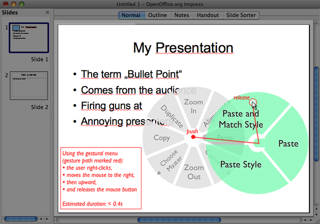
Submenus are invoked in a similar fashion. There's no need to release the button or click again while navigating submenus. They open by themselves when you move over them (immediately, no timeout). To select a sub-entry, you just "change the course" towards the subitem (and so on for deeper nested menus).
Here, it slowly becomes obvious why these are called "gestural menus". When you imagine the selection process without the visible menus, you've got classical mouse gestures. Copy is left. Paste and Match Style is right, then up/left. And so on. The main difference to ordinary mouse gestures is that you always have a visual cue available when you need them. You don't have to remember anything -- it's still a menu.
When trying to merge direct manipulation handles and gestural menus, the next step could be to provide direct manipulation handles whose use can be parametrized by combining them with associated gestural menus.
Put all item properties in a scrolling sidebar (only properties, no commands)
This will also replace all the property-editing dialogs and some wizards. The term "property" here also comprises "formats" (which are visual properties).
Much functionality that is invoked like a command today is in reality a property or set of properties. The complete list of editable properties is quite extensive. This seems to suggest that there would be a need to divide them up and portion them into subcategories like "basic" and "advanced". But in my opinion, this approach can't succeed, because it introduces the artificial concepts of "basicness"/"advancedness" and leads to users having to hunt for properties in different places.
Here, I'm trying to put *all* the document, slide, and item properties that exist into one single interface element. My goals are to have one place to look for properties, to make it easy to skim them, to improve their arrangement and visual presentation, and minimize the interaction necessary to "dig down" to a particular property.
This alone doesn't suffice, of course. Useless properties (such as permanently setting a "rotation pivot point" for an object) have to be weeded out.
For the goal of having one place to look for properties, I decided to go for a sidebar (or pane). It will include all the properties that exist.
For the goal of making it easy to skim properties, I decided to make (almost) all properties visible at the same time, and make the sidebar scrollable. There's no "digging down" necessary. In order to see the more obscure properties, you simply scroll down. An important implementation aspect here is that you can scroll the sidebar with the scroll wheel as soon as you move your mouse over it. You don't have to click inside the sidebar to give it "scroll focus".
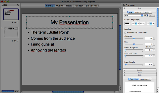
For the goal of improving the presentation of properties, I took a shortcut. I took the arrangement and controls from Apple Keynote's Inspector window and modified them but a little. The arrangement in the Inspector is damn good and a great example for how to present properties clearly and in a quick-to-use manner. Please note that because of using the Inspector as a source for the images, the properties shown here don't necessarily correspond to the properties that are actually available in Impress. It's only a mockup after all. The main shortcoming of the Inspector, i.e. having to switch between main property groups of text, graphics, etc., has been eliminated by putting them below each other in the scrollable sidebar.
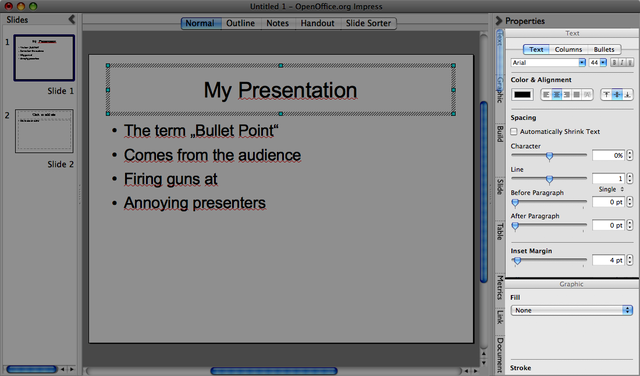
| Mockup. Scrollable Properties Sidebar. You see some collapsed and some visible sections. See the live mockup to play around with scrolling and collapsing, and get a feel for the joy of having all properties right there, without having to click through menus and tabs. |
Also try out the live mockup to get a feel for the sidebar (you can scroll around and collapse sections).
Side note: In the meantime, I've been experimenting with a blend of tabbed and scrolled sidebar. It adds section markers to the scroll bar. The section markers are clickable, so in effect, they work similarly to vertical tabs. I noticed that this is pretty similar on what has been tried out in the prototyping process. It's pure coincidence, I swear! :) See the Discussion Page for details and rationale, or try out a "tabbed" scrolling live mockup right here. I'm not sure yet whether blending tabbing and scrolling in an interface is actually going to work. The scroll bar seems too narrow to provide a good click target. Fitts' Law strikes again. :)
The property sections in the sidebar are sorted by how frequently they are needed. The sections that most users need most often are located at the top, and the most obscure properties are located furthest away at the bottom.
All property sections are extended by default to aid discoverability and "skimmability". One may minimize those that one uses rarely. The collapsing configuration and scroll position are remembered between application launches. One important difference to current behavior of panes is that extending one section does *not* automatically minimize the other sections. You can have all sections open at the same time. Or none (if you really want that).
As mentioned before, Impress-specific properties are not represented in my mockups. Please imagine that e.g. the selection of layouts and master slides are included in the sidebar in a space-saving manner.
Sidebars, toolbars and other interface elements do never have an "x-button" (close button) in my proposal. The reason is that the place where you get rid of something should be the same place where you make it (re-)appear. Otherwise, you accidentally close an interface element and have no idea how it's called and how to get it back.
The sidebars in my proposal can't be "removed" at all. They can just be minimized. They have a clearly visible button for minimizing and showing them. When the user clicks the button to show the sidebar, it will not claim space within the window (squeezing the content together), but extend the window dimensions to the outside (with some sensible heuristics when hitting the screen edge or running out of screen width). The content area should be just as large and easy to manipulate with shown sidebars as with hidden sidebars. This is particularly important for the properties sidebar, because property adjustments usually go hand in hand with intense interaction in the content area (fine-tuning positions, properties, dimensions, etc.).
Activity Guides instead of Wizards
Currently, there are quite a lot of wizards in OOo. Most wizards that exist out there (not only in Impress) are an attempt to compensate for a hard-to-use interface. The time invested in implementing wizards would be better spent in improving the use of templates and usability in general.
There are several problems with wizards. They are modal, clunky, require lots of interaction, and hamper learnability. To explain the latter: Wizards don't "show the users how to fish", but "give them a fish". This means that they solve a particular task for them, but they don't teach them how to modify the result later on, or achieve the similar tasks without using the (often time-consuming) wizard. You could of course put more information and help texts into wizards, but will users read and remember those? No, because reading those will not help solve the task that needs solving right now. The best way to learn an interface is by using it.
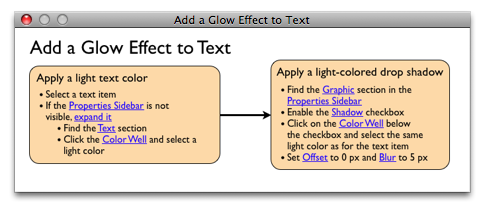
Enter Activity Guides. In essence, an Activity Guide looks like a very simple activity diagram with hyperlinks. It divides up its main tasks into subtasks, and each one of those into steps.
Activity Guides are shown in a floating (always-foreground) window that can be moved around freely.
When moving the mouse pointer over a blue "hyperlink" in the Activity Guide, the corresponding UI item is revealed and highlighted in yellow color as long as the mouse stays over the hyperlink. When the mouse moves away from the hyperlink, the user interface is restored to its previous state. This way, by moving the mouse pointer over the blue hyperlinks, users can "skim" over the steps and get an overview about the places where they will have to make adjustments.
When the user clicks on blue "hyperlink" text in an Activity Guide, the corresponding UI item is revealed permanently (and also highlighted in yellow color for 2 seconds). This means that clicking makes the UI item stay visible when moving the mouse away from the blue link.
The system reveals a UI item of the properties sidebar by expanding the sidebar, expanding the corresponding section, scrolling (animated) to the item's position and highlighting the UI item in yellow color. The system "reveals" Commands by showing their name in the command field and highlighting the field in yellow color.
Additional Material
- See http://www.mprove.de/script/02/raskin/designrules.html for a quick overview of Raskinian design rules
- See http://schuderer.net/experiments.shtml#ensoid ("Enso...") for a live mockup of an interface using Keyboard Command Invocation.
- See http://schuderer.net/experiments.shtml#piemenus ("Pie Menus on the Web") for more information on pie menus, the basis for gestural menus. You'll also find a somewhat dated live mockup there.
- See http://easygestures.mozdev.org for more information about the Firefox easyGestures project
This proposal has been named "Humane" originally because much of was inspired by the book The Humane Interface by Jef Raskin. But "habituating" is more in line with how it works. The Keyboard Command Invocation section is strongly influenced by Humanized's Enso and also by Quicksilver.
The Scrolling Sidebar is an idea I had when I saw a presentation on RedOffice during last year's OpenOffice.org conference. It appeared to me that many sidebar (or pane) proposals run out of space sooner or later, and I was looking for a way to solve this.
Author Working on this Proposal
| Author / Team Member | Contact (OpenOffice.org login name, used for email) |
| Andreas Schuderer | anjoschu |
Copyright Notice
![]() The text, images and other contents on this wiki page and the corresponding discussion page that have been created by Andreas Schuderer are licensed under a
Creative Commons Attribution 2.0 License.
If you'd like to reuse this content, you may do so under the condition that you include a readily visible attribution to the original author, including the name of Andreas Schuderer and the web address http://schuderer.net. See the full license for details.
The text, images and other contents on this wiki page and the corresponding discussion page that have been created by Andreas Schuderer are licensed under a
Creative Commons Attribution 2.0 License.
If you'd like to reuse this content, you may do so under the condition that you include a readily visible attribution to the original author, including the name of Andreas Schuderer and the web address http://schuderer.net. See the full license for details.
Comments
| Community members, this is where your comments and questions concerning completeness and clarity should be written. Please add your OpenOffice.org login name to let us contact you via email. |
Activity guides look interesting. And I agree that wizards should not be used to compensate for bad work flow path.
Other proposals are radical departure from current interface,
Question - How will users find activity guides for tasks they are about to perform? ----Ajay
Ajay, thank you for your comment! are radical departure from current interface
Hehe, I take that as a compliment. I suppose you can't be better without being different... *wink* ;)
How will users find activity guides for tasks they are about to perform?
Activity guides are invoked through commands, and can be found like any other commands. So, the when the user types something like "fax" into the command field, the command Activity Guide on Creating a Fax will appear in the suggestions list. There will also be a command to List Available Activity Guides (analogous to List Available Commands). Activity Guides may also be made available through help. After all, they're really not that different from help content anyway. --Anjoschu 18:29, 25 May 2009 (UTC)
Seems like an attempt to sensibly rethink interaction with office productivity tools. With little sign of going down the (doomed to failure) root of copying the largest player in the market. How do we vote for this to properly developed as an alternative UI for OpenOffice? And simultaneously ensure no fat top of page ribbon (he says, typing on a computer with the most common screen format i.e. wide...). ----Chris

