Proposal by Ajay Shyanbhog
|
|
|---|
|
Quick Navigation
Team |
| Please do not edit this page unless you are the original author. Your feedback and comments are welcome in the Comments section below or on the ui@ux.openoffice.org mailing list. |
| Late Submission! This proposal was submitted after the official deadline. Thus, it might not have been reviewed sufficiently by the community. |
Design Proposal "Hybrid UI"
The following design proposal is part of the collection of design proposals for “Accessing Functionality”, which is part of Project Renaissance.
Summary and Status
Hybrid UI, as the title suggests, is a iterative approach that brings in new UI elements, without dramatically upsetting established work-flows. It's goal is to seamlessly transition users by retaining major elements of existing UI, while introducing new work-flows that users can explore and adopt at their own pace.
Principles of the design are
- All functions should be accessible within three clicks. Two clicks is more desirable.
- Functions most likely to be used should be one-click away.
- Minimal mouse movement away from main work area i.e. the document itself
- Softwares like Openoffice.org will be used by nerds with big displays, and on-the-road executives with netbooks that can sit in their pockets. UI should be adaptable enough to feel natural in both environments.
Status: Proposal Complete
Mockup
|
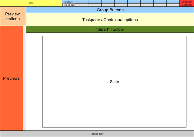
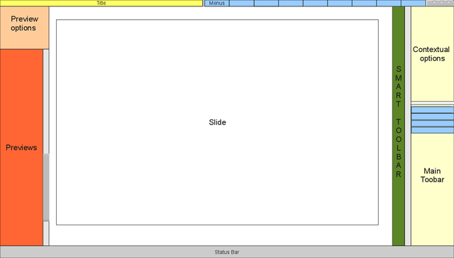
Fig 1.1: Layout of major elements for 4:3 ratio screen |
|
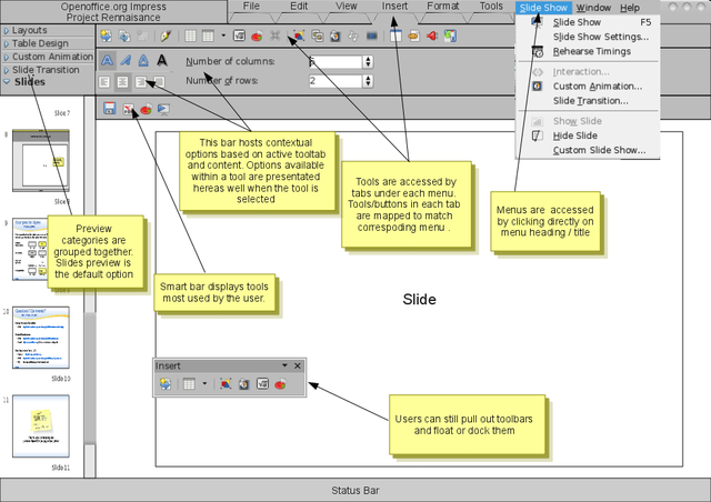
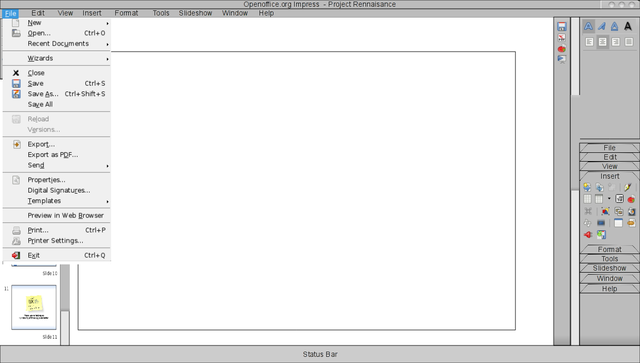
Fig 1.2: Sample screen-shot of proposed 4:3 ratio layout |
|
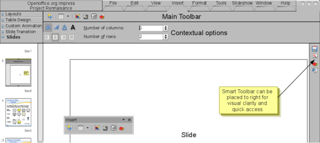
Fig 1.3: Smart bar can be moved to right for visual clarity and easy access |
|
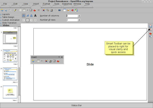
Fig 1.4: Layout is more acceptable with Title bar and Menu bar seperated |
|
Fig 2.1: Layout of major elements for 16:9 ratio screen / wide screen |
|
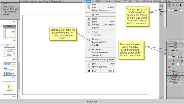
Fig 2.2: Sample screen-shot of proposed 16:9 ratio layout |
|
Fig 2.3: Good utilization of screen estate even with Title and Menu bar in separate rows |
Detailed Description
Menubar:The menubar stays on. Many users are comfortable using menus, and since they take up very little screen estate, it makes more sense to keep it. Users will also take time to adopt to the new interface and can use menus as fall-back option when they are in a hurry or get stuck.
Hybrid UI requires menus and tool tabs to be consistent with each other. Menus act as reference for users to get familiar with spread of tools in tabs. Thus, menus may need streamlining to match work-flow of icon based tool tabs. Option to switch off menu display completely should be provided
Tool Tabs: Tool tabs is one of the new players on field. Though not dramatically different from existing tool-bars, the new tool tabs win by being more orderly, predictable and comprehensive. All or most of the functionality available through menus should be replicated to be accessible through tool tabs.
Like menus, tool tabs also function as fall-back for users. Hence tool tabs should not allow any form of customization such as removing tools or modifying layout. But option to completely switch off Tool tabs display should be provided.
Tool-bar: Dock-able or floating tool-bars are still available, but are not displayed by default. Users can enable it through view tool tab / menu, or by simply dragging out a tool tab.
When user drags out a tool tab, copy of the original tool tab is created. But unlike tool tab, users can customize the tool-bar. Existing tool-bar customization interface is retained, along with the option to create new tool-bars.
Smart Bar: Smart bar somewhat borrows the functionality of “most used” section available in start menu of many operating systems, but is more dynamic.
Smart bar is designed to adopt to individual user behaviour over time, and provide quick access to the tools he or she is most likely to use. Multiple ranking parameters such as “most used”, “most recently used”, “most likely used with the selected content” etc are used by the software to determine contents of smart bar. Smart bar, like tool-bars, allow docking and floating. Users can also increase or decrease the size of bar, thus varying the number of tools displayed by smart bar.
Smart bar should ideally reduce the number of times users access menus, tool tabs and generic tool-bars. Smart bar also eliminates the need for a “always displayed” tools. For example, by defualt, smart bar can ship with tools such as Save, Print, Undo, File open etc. But over time the smart bar adopts to user behaviour, and dynamically adds or removes tools displayed on the bar. Couple of scenarios that smart bars may encounter
- Nerdy users or power users generally learn keyboard shortcuts, and hence don't access tools like Save, Undo etc through mouse. Such tools may disappear from their smart bar over time. Tools that they sometimes use, but are difficult to access thorugh keybaord, such as inserting formulas etc., may appear in their smart bar.
- An average user who clicks on save, undo or print option often will continue to have such tools dominate their smart bar.
We should take a iterative approach to adding more “intelligence” to smart bars. Initial version of smart bar can ship with rudimentary ranking functionality built-in, such as “most used” and “recently used” etc. More parameters can be added in next versions, and as the approach matures, we may even be able to make smart bars dynamically adopt to type of document the user is building (for example, image heavy, vs charts heavy, vs text heavy content etc.).
Contextual Bar: As name suggests, the bar holds contextual tools. Contextual tools in this context, are tools and settings that are accessible / applicable to a specific object type or content. Object types maybe images, tables, text etc. Well designed contextual tools can make a big difference in quality of user experience.
Additional Material and Mockups
Screen Layouts: Entry of small screen net-books is a problem and opportunity for Openoffice.org. The problem being OOo is not designed for small screens. While the opportunity for OOo is that its main competitor is worse off for small screens, and OOo is on the path for UI overhaul, while the competitor is well past it.
Smart tool-bar was conceived to make OOo usable on small screens. Further, OOo should include pre-set layouts for different screen ratios and allow user or provider (i.e hardware vendors who bundle software on their devices) to choose what suits them best. With this in mind, the following four pre-sets are proposed,
- 4:3 ratio layout: Sample of proposed pre-set is shown in Fig 1.2 and Fig 1.3. This layout is not very different from default OOo layout at present. Tool-bars are vertically placed to provide more horizontal screen-estate for slides. The sample screen-shot show menu-bar placed on the Title bar, as being done in some recently released browsers and graphics softwares. This can be looked at if OOo team is open to radical changes
- 16:9 ratio layout: Tool-bars and contextual-tools-space are placed vertically on a side as shown in Fig 2.2, utilizing the extended horizontal space provided by wide-screens. Users can already create such a layout by dragging tool-bars and manually placing them to the side. But while tool-bars can be wrapped to split tools into levels when in floating position, they assume a single, vertical or horizontal level when docked. (Maybe I should file a feature request to allow multiple tool levels in docked position)
- Small screen pre-set: The menu-bar can be moved to title bar, freeing some valuable space for main workspace. Buttons / icons sizes are reduced, to balance visibility and space.
- Large screen pre-set: When this option is selected, the icon sizes should be set to "large" and the icon names should be shown below. "Icon with text" setting in Firefox is a good example.
Net-books shipping with 4:3 ratio screen are gaining popularity, while Desktop screens are joining laptop screens by moving towards 16:9. Similarly, small screen net-books are gaining acceptability, while falling monitor prices is encouraging desktop users to opt for larger monitors. OOo should provide pre-sets to address the diverging trends, this can go a long way to increase user experience across multiple segments.
Openoffice Drawing files: The drawing files used to create the layouts can be downloaded below, feel free to download and play with it, if you want to tweak my layouts.
Author or Team Working on This Proposal
| Author / Team Member | Contact (OpenOffice.org login name, used for email) |
| Ajay | ashyanbhog |
Comments
| Community members, this is where your comments and questions concerning completeness and clarity should be written. Please add your OpenOffice.org login name to let us contact you via email. |
Your space :-)

