Presenter Screen
Contents
Introduction
The presenter screen for Impress is a feature that aids a presenter during a slide show. It provides information on a second screen, that typically is not visible to the audience. This includes
- a view to the currently displayed slide (for when the presenter faces the audience and can not see the primary screen)
- a preview of the next slide or next effect
- the notes of the current slide
- the current time and/or the elapsed time
- navigation buttons for going to the previous/next slide
- Here is what the presenter sees:
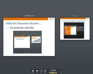
Initial view
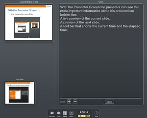
Notes view
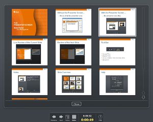
Slide overview
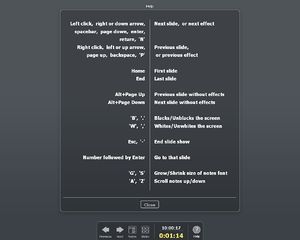
Help screen with key mapping
The presenter screen is an extension that is implemented in C++. The presenter screen was previously also known as presenter view or presenter console.
Status
The extension is publicly available and can be downloaded from the extension repository. Please note that you need at least OpenOffice.org 3.0 beta for this extension.
Attention: There have been some incompatible API changes (of unpublished API, unfortunate but not illegal). The result of which is that the extensions in the repository with versions 0.9 and 1.0 are incompatible with the Beta2 of OpenOffice.org. The new version 1.1 of the extension should be available soon.
The draft specification can be found here.
Specification
Implementation
The description of the implementation of the presenter screen has its own page: Presenter Screen/Implementation.
There is an outline of how to implement a new UI control for the Presenter Screen: Presenter Screen/How To Add a New UI Control.
Implementation took place in child work spaces presenterview and presenterscreen. Bug fixes were made in CWS presenterfixes.
Linked features
The presenter screen can be highly valorized by the use of remote control. One of those controlers is the Apple Remote, integrated into OpenOffice.org for the Mac OS X version. For Linux, LIRC is a nice solution too.
See : Apple Remote implementation
Team and Contact
Please use the dev@graphics.openoffice.org mailing list for questions, comments, problem reports or if you want help develop the Presenter Screen.
The following people are currently working on the presenter screen:
- Andre Fischer (Development and iTeam Lead, Sun Microsystems)
- Christian Jansen (User Experience, Sun Microsystems)
- Christoph Lukasiak, Wolfram Garten (Quality Assurance, Sun Microsystems)
- Uwe Fischer (Documentation, Sun Microsystems)
Presenter Screen
The Presenter Screen is a feature for Impress that gives the presenter information during a presentation that is not visible to the audience. This information appears on a second screen and thus requires that at least two screens are present, for example a laptop computer and a beamer. There are four different modes/screens that show different types of information:

|
The presenter screen starts with a screen that shows
|

|
The notes view additionally shows the notes of the current slide. The font size can be adapted. The other controls-the two previews and the toolbar-are also displayed. |

|
The slide overview shows, well, an overview of all the slides. Single click on a preview makes that slide the current slide. A
double click does the same but also closed the slide overview and goes back the previously active screen. |

|
The help screen shows the key mapping. |
Design principles
This section explains the reasoning behind some elements of the presenter screen.
One of the general design principles is that many presenters are quite nervous during a presentation. Too much information can be confusing instead of being helpful.
Slide overview
The slide overview is displayed in its own screen instead of beside the slide previews because we expect it to be used in a typical presentation in a Q&A session (questions and answers) at the end of the presentation. Besides, the previews of the current and the next slide are part of the slide overview anyway. In a Q&A session you may be asked by the audience to go back to some specific slide. The more slides that you can see on the screen, the better. The notes pane would just waste space and would not help in this phase and with a double click you are back in the standard or notes view, anyway.
Focus and Keyboard
With two screens showing the presentation at the same time the problem of focus handling arises. One solution is to avoid this problem by
- having no control on the Presenter Screen that accepts or even grabs the focus,
- let the Presenter Screen react to key presses in the same way the full screen presentation would.
Keyboard Shortcuts
Here is a list of all keyboard shortcuts that are supported by the Presenter Console:
Left click, right or down arrow, spacebar, page down, enter, return, 'N'
- Next slide, or next effect
Right click, left or up arrow, page up, backspace, 'P'
- Previous slide, or previous effect
Home
- First slide
End
- Last slide
Alt-Page Up
- Previous slide without effects
Alt-Page Down
- Next slide without effects
'B', '.'
- Blacks/Unblacks the screen
'W', ','
- Whites/Unwhites the screen
Esc, '-'
- End slide show
Number followed by Enter
- Go to that slide
'G', 'S'
- Grow/Shrink size of notes font
'A', 'Z'
- Scroll notes up/down
'H', 'L'
- Move caret in notes view backward/forward
Ctrl-'1'
- Shows the Presenter Console
Ctrl-'2'
- Shows the Presentation Notes
Ctrl-'3'
- Shows the Slides Overview
Miscellaneous
There is no button to end the slideshow because the danger of hitting it accidentally far outweighs its benefit.
Requested Features / ToDo
Here is a list of missing and requested features:
- Timer
- Add start, stop and reset buttons (or menu entries).
- Provide countdown timer with notifications when time runs out (eg color coded).
- Slide Sorter
- When advancing to the next slide (or any other) make the slide and the following visible.
- Allow modification of the preview size.
- Navigation
- Add button for (your favorite feature). Can and should we add buttons for features like blank screen for which there is already a key binding but not a button?
- Other
- A "lobby" mode: give access to other Impress documents than the current one and allow easy switching to slides of these.
Known problems
When the Presenter Screen is properly installed but still does not show up, it can have one of the following reasons:
- There is only one display. The Presenter Screen is not displayed because it could easily obscure the actual presentation and at least on the Mac you were not even able to bring the presentation to front.
- There are two displays but they are set to show the same content. On a Mac you can turn this off by going to System Preferences->Display->Arrangement and unchecking Mirror Displays.
List of open issues:
- Mouse wheel not supported for advancing notes (issue 88836) nor for advancing slides (http://www.openoffice.org/issues/show_bug.cgi?id=96129).
Submissions
I deliberately didn't look at the spec until after I did this because I didn't want my view to be coloured by it. This is a small version, I'm mindful of being on a dialup connection.

screen sized version is here
I will expose my bias here from the start, I come at this from an Educators point of view and as a consequence this submission is geared at a specific usage pattern. I use Impress all the time. My Data Projector is with me all the time as constantly as my Laptop.
I'll tackle the elements one by one.
The Notes pane on the left. Presenters should rarely have more than bullets and Key words in here. Column view is much better for that. In Notes view therefore while editing, the default should be two columns and slide. One Narrow Keywords column and a wider Detail column. Picture here. In Presenter Mode only the Keywords column is shown, both are printed when printing handouts.
I don't believe it is necessary to show a full view of the slide that is being displayed, it's up on the screen already, title and number yes and possibly a thumbnail in the top of the Keywords Column
Also it is unnecessary to have a Navigation buttons. Mouse buttons are the accepted method. One of the most frustrating things about Impress right now is the right click menu while in Slide Show mode.
The behaviour should be:
- Left click = forward one slide
- Right click = back one slide
The reason for this is that good presenters prefer to be away from the computer using remote control. Normally these have left and right click only. Impress forces you to be at the computer if there is a need for the ability to backtrack. This is extremely bad usability having to rush up to the computer just so you can go back one slide. There isn't even the ability to change this behaviour in the Customize Dialogs
The Slide Preview Box should be the largest element and the default function on "Run Slideshow"/F9 would be click on the box for "Next Slide". Default display on "Start" would the slide following the one that is presently on screen,
In my version the Preview Box is an active element and displays editing On The Run. Either as a preview before Submitting the edit to the display or displaying real time editing of the slide. It would work something like this:
- On Start: Preview Box takes the focus. Mouse clicks advance slides in the normal manner, displays Next slide as default.
- Click Live Edit: Preview box changes from "Next" to "Present" slide. Clicking a text box in the Slide displays the content of that box in the "Add Content" Box in which that content is editable and is instantly viewable on the display
- Click the "Add Content" Box also displays present slide.Clicking a text box in the Slide displays the content of that box in the "Add Content" Box in which that content is editable but is not displayed on the Screen in real time until:
- Click Submit assigns the edit to the Display and returns the Slide Display to Default Slide Show behavior
- Shift + Submit assigns the edit to the display but stays in OTR edit mode.
Alternatively, the Realtime edit mode could be actually done in the Display Slide Box and the Add Content box used for delayed submission edit or all edits done within the Preview Box and the "Add Content Box" becomes a Button to make the Preview Box editable
The two buttons on the pic should change
- "Live Edit" on click toggles to "Slide Show" or perhaps "Continue"
- "Submit" on click toggles to "Add Content" or similar
Each toggles the preview box between edit and Play.
The Vertical slider on the right
- Default behaviour on start Slide show(F9), is numbers with slide indicator at active slide.
- MouseOver reveals preview Thumbnail of slide numdber at cursor location
- Left click on a slide number moves slider to the slide that cursor is indicating and Displays that slide on screen
- Right click on slide number: Opens a menu with options:
- "This Slide next"
- "Move this slide up one"
- "Move this slide down one"
- "Hide/Reveal slide toggle"
- left click and hold to drag and drop slide elsewhere in the sequence
Yorick 12:08, 23 November 2007 (CET)
After some discussion with some of my colleagues some suggested changes. Consensus was that Draft one view was too complex and people wanted the Active Slide view so that they weren't forced to look at the screen. As you can see from my earlier comments, I was overruled! So we simplified it to this.
- Top left box Shows "Previous"
- Top right shows "Active Slide"
- Bottom Centre "Next"
Some discussion arose WRT the position of the Remaining Time counter. Opinion was divided as to whether the Clock should be swapped with the Edit buttons.

Full screen version with some notes added here
When the slide show is started the default behavior is the standard slideshow behavior
Additionally:
- Mouse clicking on the slide preview boxes whether "next" or "previous" moves the display to that slide
- Single mouse click on a slide number on the slider displays that slide in the "Next Slide" Preview so that on the next click or space that slide is displayed.
- Double click on a slide number causes Impress to display the slide in the "Active slide" view and on screen immediately (With transitions intact off course)
- Editing done in the Preview box activated by the "Live Edit" and "Non Live Edit" ( What's a better way to describe that behavior: "Running Edit" and "Resting Edit" perhaps? Not sure.. Suggestions?)
Other behavior as above
Yorick 06:19, 24 November 2007 (CET)
Extending on this design to include Andreasma's progress bar. Using the vertcal slide indicator on the right of screen (Position of that could be optional.No reason why it couldn't be top, bottom or left)
The red slider that is there at present moves during the presentation depending on the Active slide, a ghost of that slider could be time sensitive. The User could either preset a time on each slide or the default would be to divide the total time evenly across the slides. This would give a time indication relative to the slides and would allow the presenter to easily match slideshow progress to available time so if he needs to he can skip to important slides as necessary.
The colour could change as well, so that it could be position sensitive. That is in relation to the Active slide indicator. It could change from green to amber to red if the Time indicator got too far ahead of the Active Slide indicator, or optionally set to just go by total time. That could be a simple toggle switch in the Presentation Menu so that it's not necessarily set during creation. This then would put all of Andreasma's ideas on a single indicator as well as Mechonbarsa's traffic light function
Yorick 04:15, 30 November 2007 (CET)
I agree wholeheartedly with Yorick on the right mouse click, the vertical notes pane, and the second layout above. Don't like "Running Edit" and "Resting Edit" - I think Live and Non-live makes sense.
We need some of these features in the stock presentation mode.
Rygle 28 November 2007
Andreasma's Ideas
Some ideas for enhancements of the presenter screen:
- There should be an progressbar (Fortschrittsbalken in german) showing the progress
of slides.
- A second progressbar should give informations about the time (time
used and time available for the presentation). It would be a nice idea, if the progressbar could change her color when the presentator has not enough time to finish (maybe from green over yellow to reed).
- Another thought: if a presentator tests his presentation with presentation
with time measurement, then this values for every slide should be used for the progressbar(s) (asynchron minutes for every slide).
Mechonbarsa's Idea
I think Andreasma's idea of a second progressbar is great. But I could add something else. I recently attended a software engineering convention and saw that the staff signaled the keynote speaker his/her time remaining using a separate screen with "traffic lights": Green when the presentation is on-time, yellow at 10-15 minutes remaining, red at 5 minutes remaining, to signal the speaker that he has this little time for conclusions and closing remarks.
Wouldn't it be great that this "traffic lights" system could be added to the presenter screen? And its colors' time intervals customized?
MAW Idea's
The presenter screen as working currently is great, a real advance on anything else I have seen or used. It is important that the screen remains simple and uncluttered, I would prefer the background was the standard windows toolbar colour (usually a light grey) and also seeing the previous slide does not really offer any useful information to the presenter - current and next suffice.
Slide Numbers
The idea of a list of slide numbers down the side showing progress is great, also I like the idea of a 'ghost' pointer tracking against rehearsed timings. This list could have pop out previews of the slides to enable jumping to a particular slide.
Clock
The current time is often the required option and analogue is preferred for that. Time elapsed or remaining is sometimes a better option, however sometimes the important point is not the end of the presentation but the upcoming break time - could time elapsed/remaining have break points? For time elapsed/remaining digital is a better display - sometimes both the current and remaining time (analogue and digital) clocks would be useful.
Editing
I don't like the idea of editing on the fly - it is a very unprofessional look, however a toolbox with a few useful mark-up tools that could draw on the preview and display live on the full screen view would be better than awkward right click menu items. Tools would be something like Highlighter, Pen (with good thick lines), Text, Pointer, Rectangle, Oval, Cloud, and Arrows. Some method of setting the colour and the transparency should be available - although not necessarily during the presentation.
Focus
All the standard methods for changing slides should work even in the presenter mode (left click, arrow keys, slide number/enter, b, w, esc, etc.) except when the mouse was over a working button or control, then left/right click would be as per the control. Side note that I too would prefer right click to be able to be set to 'back' instead of context menu.
Further Enhancements
Again without wanting to clutter the interface it would be useful to have the controls for black screen and white screen. Also something I have seen and been impressed by was a break timer (Zoom It from http://sysinternals.com) which covers the screen with a semi-transparent wash-out and then displays a count-down timer to indicate when the break will end.
Maw 03:13, 5 December 2007 (CET)
Mark C's Ideas
Editing/Mark-up
Like MAW I don't see the need for live editing of slides, but live mark-up of slides would be very useful. Ideally a markup view would show a copy of the current slide that is almost full size, with a palette of tools along one or two edges. The content of the palette should focus on simple tools that are likely to be used during a presentation:
- Drawing Tools
- Highlighter - a freehand pen with thick lines and a default opacity of about 50% so that it can be used to colour over content on the slide to draw attention to it
- Pencil - A thin pen with full opacity for annotations
- Pen - A medium thickness pen with full opacity for annotations and freely-drawn lines and arrows
- Marker - A thick pen with full opacity for freely-drawn lines and boxes.
- Rectangle - A simple rectangle tool with 50% opacity
- Circle - A tool for circles/ovals with 50% opacity
- Text - A text input tool with full opacity
- Arrow - A simple tool for drawing an arrow with full opacity
- Eraser - Used to erase parts of the markup (individual lines or other primitives)
- Colour Swatches - A few strong colour swatches used to pick the drawing colour for the tools above
- Control Buttons
- Undo Button - Undoes the last drawing/erase step. Repeated use continues further through the drawing history
- Save Button - See below
- Clear Button - Clears the current markup from the display completely
- I'm not sure how you say that editing on the fly is unneeded but you want a extra tools to do the same sort of thing that I want the editing on the fly for. I'm obviously in need of an explanation of the difference between Editing and Mark-up. Because all the tools you describe above are just variations on ordinary Editing tools, but by the sounds of it we are wanting the same thing, just using different words to describe it. Mind you I can see how limiting the available tools would be useful, if only for saving realestate.
Some of the above could be done just using existing tools. For instance:
- Drawing Tools
- Highlighter - a freehand pen with thick lines and a default opacity of about 50% so that it can be used to colour over content on the slide to draw attention to it Format painting tool. Would require less accuracy
- Pencil - A thin pen with full opacity for annotations. Use callouts? easier and tidier and already there
- Pen - A medium thickness pen with full opacity for annotations and freely-drawn lines and arrowsfreehand tool, just needs the default line thickness changed. Could be done in stylist.
- Marker - A thick pen with full opacity for freely-drawn lines and boxes.freehand tool, again
- Rectangle - A simple rectangle tool with 50% opacity Set opacity defaults in stylist and use the standrad rectangle tool
Yorick 02:14, 11 December 2007 (CET)
Yes, markup mode is effectively a layer above the presentation. I'm coming at this primarily from the perspective of a tablet PC user for whom being able to write, draw and scribble "over the top" of the presentation is a very intuitive and powerful facility.
The idea of the markup mode is simply to enable the same sort of interactions that people commonly use when presented with information on a black- or whiteboad - that is the ability to scrawl and scribble; to highlight items by roughly circling them; to annotate relationships by drawing lines and arrows between them. But I'm not talking about the ability to use neat and tidy objects that are precisely positioned, I'm talking about the ability for John from the accounts department to pick up a pen or a stylus and immediately annotate the presentation without requiring any prior experience of using the software.
I've had to give two main types of presentations in my time - those where you are just presenting information (the stereotypical PowerPoint presentation), and those where you are using the presentation as the basis for a collaborative effort (e.g. a group of engineers discussing possible solutions to a problem). The latter inevitably ends up moving from the screen to a whiteboard, or even a scrap of paper to allow people to add their own ideas. The idea of a markup mode is to add the tools to enable the latter type of presentation and to try to make it as natural as switching to a whiteboard.
Mark c 17:23, 10 January 2008 (CET)
The Save button would insert a duplicate slide, complete with the markup, into the presentation just before the slide that is currently being shown. This would allow the markup to be preserved so that it can subsequently be saved to disk, edited, or printed out. Repeated use of the Save and Clear buttons would allow a single slide to be re-used as the base for several marked-up versions.
Markup tools like this would be particularly useful in conjunction with a graphics tablet, a tablet PC, or a digital whiteboard.
Remotely Synchronised Presentations
Moving well into the realms of fantasy, I would love to see the ability to synchronise two (or more) copies of a presentation via a network connection. There would be more than one computer, each with a copy of OOo and the presentation - one of them would be displaying the Presenter Screen, and the others would show the presentation itself, synchronised with the presenter's machine. Ideally any markup on the presenter's screen would appear on the slave machines as well. This feature would serve four purposes:
- A copy of a presentation could be sent to a remote colleague, or multiple colleagues, then the presentation can be driven by one person while being narrated over a phone call. This would allow for a lot of the benefits of teleconferencing without the expense.
- Ad-hoc presentations could be performed in environments where a projector is not available but multiple computers are.
- It would enable a greater separation of the Presenter Screen from the projector. Consider a presenter with a Tablet PC: they could present without being tethered to a desk, and annotate slides more comfortably, while their PC drives the slave machine via a wireless network. The slave machine would be hooked to a projector, but the presenter would be wire-free.
- If the ability to markup or annotate a slide could be given to other users (at the presenter's discretion) then it would offer a means to collaboratively work using one or more slides as a base.
The idea of networked-synchronised presentations may not be directly related to the development of a Presenter Screen, but it makes most sense if one of the people on the network sees the Presenter Screen while the others don't. In that respect it might be worth developing the Presenter Screen in a way that could easily allow for network use in future, even if that functionality isn't made avilable immediately.
Mark c 17:49, 5 December 2007 (CET)
- THIS would be a killer feature, I have absolutely no doubt.
Yorick 02:16, 11 December 2007 (CET)
+1 I also believe this would be the "killer app" feature.
But, it would be even better if we could have the option of storing presentation on the slave machine or the control machine. The logic behind this is that the machine connected to the presentation device (projector, TV, etc) will be tethered to it, and not everyone has two portable computers (eg. laptop and tablet). But, it is much more likely that a person would have a PDA device (such as a Pocket PC or Palm OS device). This is impractical for storing the presentation on a PDA device, but the PDA could be used to remote-control the presentation.
Just adding my thoughs to the pool, thanks.
Enigma 0Z 22:28, 26 January 2008 (CET)
Being able to drive the presentation from a PDA or other device is a good idea. In practice the presentation would be loaded onto the slave machine(s), and the master controls them via a simple series of commands over the network. So, for example, the most basic commands might be "move to next slide" and "move to previous slide". The actual user interface that is shown on the master machine would usually be a version of the presenter screen - hence the inclusion of this suggestion here - but doesn't have to be. It's not difficult to conceive of alternative UIs for the master machine, which would allow a PDA or phone to drive the presentation, so long as the commands that are sent remain the same.
I would suggest the use of XMPP (the protocol behind Jabber) as a transport layer for the commands themselves to avoid reinventing the wheel.
Mark c 16:30, 29 January 2008 (CET)