|
|
| (23 intermediate revisions by 2 users not shown) |
| Line 1: |
Line 1: |
| − | The sidebar (working title) is a new feature likely to be in the 4.0 release. It combines ideas and code from both the [[Symphony]] sidebar and the OpenOffice [[Impress]] task pane. | + | The sidebar is a UI feature that was introduced for all OpenOffice applications in version 4.0. It is based on the [[Symphony]] Properties Panel which in turn is based on the old [[Impress]] task pane. The sidebar looks like this: |
| | | | |
| − | The UX part of the work is described on another [[AOO_UX_Design_Exploration_-_Task_Pane_Content_-_Information_Design|page]]. This page focuses on the API design and implementation. | + | [[File:Sidebar-Writer.png|600px|center]] |
| | + | |
| | + | |
| | + | Information about the implementation of the sidebar and how to extend it with new panels can be found in the [[Sidebar for Developers]] page. |
| | + | |
| | + | A [[#Glossary|glossary]] is available below. |
| | + | |
| | + | |
| | + | ==Overview== |
| | + | |
| | + | The sidebar window is located on the right side of the edit views of Writer, Calc, Impress, Draw, Base. It contains one or more [[#Panels|panels]], based on the current document context. Panels are organized into [[#Decks|decks]]. A [[#Tab_Bar|tab bar]] on the right side of the sidebar allows to switch between different decks. |
| | + | |
| | + | The [[#Properties|Properties]] deck is context sensitive. When text is being edited then it contains panels for changing the font or text attributes, when a graphical object is selected then other panels give access to fill and line style as well as the object's position and size. |
| | + | |
| | + | <br>[[Image:Sidebar-Screenshot-Writer-Context-Text.png|300px]] [[Image:Sidebar-Screenshot-Writer-Context-Shape.png|300px]] [[Image:Sidebar-Screenshot-Writer-Context-Graphic.png|300px]]<br>''Different panels in Properties deck for different contexts (from left to right): text editing, logo pasted as outline, logo pasted as bitmap'' |
| | + | |
| | + | |
| | + | A panel is basically a mix of a toolbar and a non-modal dialog. That means that sidebar panels do not lock the document. The user can freely mix working in the edit view to eg enter text and use the [[#Text|Text]] panel to change text attributes. |
| | + | |
| | + | At the moment, toolbars and sidebar panels share many functions. For example, the buttons for making text bold or italic exist in both the text toolbar and the [[#Text|Text]] panel. This duplicity is the result of a design decision to allow users to gradually learn to use the sidebar. It is our plan to reduce functions provided in toolbars and provide them only in the sidebar. The speed and scope of this change depends on feedback from our users. |
| | + | |
| | + | The width of the sidebar is variable. The controls in its panels are adjusted accordingly. When the sidebar becomes too small to be usable it collapses to the tab bar. This transitional state is indicated by an arrow that is displayed in place of the deck. A click on one of the buttons on the tab bar restores the deck to its former width. |
| | + | |
| | + | [[File:Sidebar-Different-Widths.png|640px]] |
| | + | |
| | + | ==Panels== |
| | + | Eleven property panels have been migrated from IBM Lotus Symphony: Alignment, Area, Cell Appearance, Graphic, Line, Number Format, Page, Paragraph, Position and Size, Text and Wrap. |
| | + | Seven panels come from the old Impress tool panel: Available for Use, Custom Animation, Layouts, Recently Used, Slide Transition, Table Design, Used in This Presentation. |
| | + | Four are non-modal (ie non locking) dialogs: Functions, Gallery, Navigator, Styles and Formatting. |
| | + | One is new: Insert Shapes. |
| | + | |
| | + | [[File:Sidebar-Panels.png|500px]] |
| | + | |
| | + | Some of these are displayed in the context sensitive 'Properties' deck, others are displayed in a deck on their own. In that case the panel title bar is usually not displayed and the deck title is the same as the panel title. When the panel title bar is shown then a mouse click on it collapses the panel to just its title bar. Another click and the panel is expanded to its former size. |
| | + | |
| | + | [[File:Sidebar-Expand-Collapse.png|350px]] |
| | + | |
| | + | Some panels have a 'More Options' button in their title bar. A click on it opens a dialog with many more options than would fit into the panel. These dialogs, however, are modal, ie. the edit view is locked while the dialogs are open. |
| | + | |
| | + | [[File:Sidebar-more-options.png|500px]] |
| | + | |
| | + | ===Alignment (Calc only)=== |
| | + | Alignment of cell text (horizontal, vertical, rotation) |
| | + | |
| | + | [[File:Sidebar-Panel-Alignment.png|100px]] |
| | + | |
| | + | ===Area=== |
| | + | Fill style of shapes like color, gradient, bitmap, hatch, transparency. |
| | + | |
| | + | [[File:Sidebar-Panel-Area.png|100px]] |
| | + | |
| | + | ===Available for Use (Impress only)=== |
| | + | List of all available templates. |
| | + | |
| | + | [[File:Sidebar-Panel-AvailableForUse.png|100px]] |
| | | | |
| − | Help in every form is welcome. After reading the general introductory stuff:
| + | ===Cell Appearance (Calc only)=== |
| − | *if you are a developer then proceed to section [[#Implementation.2FMigration|Implementation and Migration]]
| + | Cell background color and border. |
| − | *if you are interested in QA then proceed to section [[#QA|QA]]
| |
| | | | |
| | + | [[File:Sidebar-Panel-CellAppearance.png|100px]] |
| | | | |
| − | ==Status== | + | ===Custom Animation (Impress only)=== |
| − | The main implementation work is finished. We are now fixing bugs and doing visual fine tuning.
| + | Add or modify animations of shapes. |
| | | | |
| − | Here is how it looks:
| + | [[File:Sidebar-Panel-CustomAnimation.png|100px]] |
| − | [[File:sidebar-2013-04-15.png|400px]] | |
| | | | |
| − | ==Resources== | + | ===Functions (Calc only)=== |
| | + | Insert functions (mathematical, string related, other) to a Calc cell. |
| | | | |
| − | * UX
| + | [[File:Sidebar-Panel-Functions.png|100px]] |
| − | **[[AOO_UX_Design_Exploration_-_Task_Pane_Content_-_Information_Design|UX design exploration]]
| |
| − | **[[AOO_UX_Design_Exploration_-_Docked_Task_Pane_Container_-_Pane_Header_User_Interface_Design|Pane Header UI Design]]
| |
| − | **[[AOO_UX_Design_Exploration_-_Task_Pane_Content_Panel_-_User_Interface_Design_Proposals|UX Design propoals]]
| |
| − | * Symphony
| |
| − | ** Assessment of the [[AOO_Symphony_UX_Migration/Merge_Analysis_-_Task_Pane|migrating the Symphony sidebar]].
| |
| − | ** Older proposal to use the [[Sidebar_Proposal_by_IBM|Symphony sidebar]].
| |
| − | * AOO
| |
| − | ** Overview of an existing but unfinished attempt of implementing [[Framework/Article/Tool_Panels_Internals|tool panels]].
| |
| − | ** Introduction to [[Framework/Article/Tool Panels|writing tool panels]].
| |
| − | ** Description of the [[Drawing framework|drawing framework]], that is used by the Impress tool panel.
| |
| | | | |
| − | ==Developer Builds== | + | ===Gallery=== |
| − | The sidebar branch has been integrated into trunk and is therefore available in all regular builds.
| + | Gallery dialog as sidebar panel. |
| | | | |
| − | Grab trunk builds off the build bots (Links?)
| + | [[File:Sidebar-Panel-Gallery.png|100px]] |
| | | | |
| − | If you find any bugs in the sidebar or caused by the sidebar then please write a BugZilla issue for each and
| + | ===Graphic=== |
| − | * Prefix the title with "sidebar:"
| + | Adjust bitmap attributes like brightness, contrast, colors, gamma. |
| − | * Mark them as blocker of [https://issues.apache.org/ooo/show_bug.cgi?id=121420 issue 121420].
| |
| − | * Assign it to me (awf dot aoo at googlemail dot com)
| |
| | | | |
| − | Known bugs:
| + | [[File:Sidebar-Panel-Graphic.png|100px]] |
| − | * Crashes caused by dispatching uno commands [https://issues.apache.org/ooo/show_bug.cgi?id=122028 122028] and [https://issues.apache.org/ooo/show_bug.cgi?id=122030 122030] (with patches)
| |
| − | * Disabling of uno commands does not work [https://issues.apache.org/ooo/show_bug.cgi?id=121960 121960]
| |
| − | * Uno commands not labeled and not well named [https://issues.apache.org/ooo/show_bug.cgi?id=122025 122025] and [https://issues.apache.org/ooo/show_bug.cgi?id=122026 122026]
| |
| | | | |
| − | Requested improvements/changes:
| + | ===Insert Shapes (Draw only)=== |
| − | * Make the visible controls in panels customizable similar to toolbars [https://issues.apache.org/ooo/show_bug.cgi?id=121940 121940]
| + | Buttons and drop down menus for inserting shapes into Draw documents. |
| − | * Change request for the association of contexts and panels: show area and line panel for OLE objects, show the area panel for images [https://issues.apache.org/ooo/show_bug.cgi?id=121936 121936] and [https://issues.apache.org/ooo/show_bug.cgi?id=121937 121937].
| |
| − | * Show legacy sidebar extensions in the old, not in the new sidebar [https://issues.apache.org/ooo/show_bug.cgi?id=122057 122057].
| |
| | | | |
| − | ==Glossary==
| + | [[File:Sidebar-Panel-InsertShapes.png|100px]] |
| − | Work in progress. Comments are welcome.
| |
| | | | |
| − | [[File:SidebarNames.png|thumb|200px|Schematic overview of sidebar components. Location of elements do not reflect UX design.]]
| + | ===Layouts (Impress only)=== |
| − | ;sidebar: Name of the feature and name of the control including all its components (icon bar, content panels).
| + | Assign a predefined layout to a slide. There are different sets of layouts for the different edit modes standard, handout and notes. |
| − | :Also known as task pane(l) or tool pane(l)
| |
| − | ;tab bar: Similar to a vertical tool bar. Clicking on buttons switches between sidebar decks.
| |
| − | ;deck: Contains one or more content panels. Only one deck is visible at any one time.
| |
| − | ;content panel: Displays information about the document and/or provides the means for document modification.
| |
| − | :Each content panel focuses on one topic like font, table or shape properties.
| |
| − | :There may be more than one content panel in a deck.
| |
| − | :Examples are the task panels of the Impress task pane or the property views of the Symphony sidebar.
| |
| − | ;title bar: Displays the title for the current sidebar deck.
| |
| − | :Can contain a closer button.
| |
| − | ;content panel title: Displays the title for one content panel. Optional when there is only one content panel.
| |
| − | ;configuration menu button: Opens a popup menu that allows switching between decks and also allows the activation and deactivation (tab is not shown) of decks.
| |
| | | | |
| − | ==Panels and Decks==
| + | [[File:Sidebar-Panel-Layout-Standard.png|100px|top]] [[File:Sidebar-Panel-Layout-Handout.png|100px|top]] [[File:Sidebar-Panel-Layout-Notes.png|100px|top]] |
| | | | |
| − | At any one time there is one and only one deck visible. It contains one or more panels. There are rare occasions where there is no panel for a given context, but in this case a replacement panel is displayed with a message to the effect "intentionally left blank".
| + | ===Line=== |
| | + | Adjust color, width and style of lines and outlines. |
| | | | |
| − | The set of decks available via the tab bar and panels inside a deck depend on the current context. Contexts are defined by different features or states. This can be the selection of shapes, text editing on/off, switching between views (in Impress).
| + | [[File:Sidebar-Panel-Line.png|100px]] |
| | | | |
| − | ===Decks=== | + | ===Navigator=== |
| − | ;Properties:This deck is visible by default. Context changes typically change the set of property panels inside this deck.
| + | The navigator dialog as sidebar panel. Small differences between the different applications. |
| − | ;Master Pages:This Impress only deck contains three panels for the currently used, recently used and available master pages.
| |
| − | ;Custon Animation:Displayed only for Impress, this deck contains only one panel for displaying and modifying shape animations.
| |
| − | ;Slide Transition:Another Impress only deck. It contains one panel for slide transitions.
| |
| | | | |
| − | ===Panels===
| + | [[File:Sidebar-Panel-Navigator-Writer.png|100px]] [[File:Sidebar-Panel-Navigator-Calc.png|100px]] [[File:Sidebar-Panel-Navigator-Impress.png|100px]] |
| − | ;Text: Text properties.
| |
| − | ;Page: Page properties.
| |
| − | ;Area: Fill style properties for shapes.
| |
| − | ;Line: Border style properties for shapes
| |
| − | ;Position and Size: Position and size for shapes.
| |
| − | ;Graphic: Properties for images.
| |
| − | ;Layouts: Impress layouts.
| |
| − | ;Used in This Presentation: Master pages that are in use by the current Impress document.
| |
| − | ;Recently Used: Master pages that where recently used by the current Impress document.
| |
| − | ;Available for Use: All available master pages. Independent of the current Impress document.
| |
| − | ;Custom Animation:Shape animations.
| |
| − | ;Slide Transition:Slide transitions.
| |
| − | ;Table Design:Table properties for Impress documents.
| |
| − | ;Alignment: TBD.
| |
| − | ;Cell Appearance: TBD.
| |
| − | ;Number Format: TBD.
| |
| − | ;Paragraph: TBD.
| |
| − | ;Wrap: TBD.
| |
| | | | |
| | + | ===Number Format (Calc only)=== |
| | + | Set the number format of selected cells. |
| | | | |
| − | ===Contexts===
| + | [[File:Sidebar-Panel-NumberFormat.png|100px]] |
| | | | |
| − | The following table shows the association between panels and dialogs for all supported contexts. It also lists whether panels are initially displayed expanded or collapsed and the uno command to use to open a more detailed dialog. Applications are abreviated:
| + | ===Page (Writer only)=== |
| − | * SC - Calc
| + | Set page properties like orientation, margin or size. |
| − | * SD - Draw and Impress
| |
| − | * SW - Writer
| |
| | | | |
| − | {| class="prettytable sortable"
| + | [[File:Sidebar-Panel-Page.png|100px]] |
| − | !Panel
| |
| − | !Application
| |
| − | !Context
| |
| − | !Initially visible
| |
| − | !Detail dialog command
| |
| − | |-
| |
| − | |Alignment ||SC|| Auditing ||yes|| .uno:Hyphenate
| |
| − | |-
| |
| − | |Alignment ||SC|| Cell ||yes|| .uno:Hyphenate
| |
| − | |-
| |
| − | |Alignment ||SC|| EditCell ||yes|| .uno:Hyphenate
| |
| − | |-
| |
| − | |Alignment ||SC|| Pivot ||yes|| .uno:Hyphenate
| |
| − | |-
| |
| − | |Area ||SC|| Draw ||yes|| .uno:FormatArea
| |
| − | |-
| |
| − | |Area ||SD|| 3DObject ||yes|| .uno:FormatArea
| |
| − | |-
| |
| − | |Area ||SD|| Draw ||yes|| .uno:FormatArea
| |
| − | |-
| |
| − | |Area ||SD|| TextObject ||no || .uno:FormatArea
| |
| − | |-
| |
| − | |Area ||SW|| Draw ||yes|| .uno:FormatArea
| |
| − | |-
| |
| − | |Cell Appearance ||SC|| Auditing ||yes|| .uno:FormatCellDialog
| |
| − | |-
| |
| − | |Cell Appearance ||SC|| Cell ||yes|| .uno:FormatCellDialog
| |
| − | |-
| |
| − | |Cell Appearance ||SC|| Pivot ||yes|| .uno:FormatCellDialog
| |
| − | |-
| |
| − | |Graphic ||SC|| Graphic ||yes|| -none-
| |
| − | |-
| |
| − | |Graphic ||SD|| Graphic ||yes|| -none-
| |
| − | |-
| |
| − | |Graphic ||SW|| Graphic ||yes|| -none-
| |
| − | |-
| |
| − | |Line ||SC|| Draw ||yes|| .uno:FormatLine
| |
| − | |-
| |
| − | |Line ||SC|| Graphic ||yes|| .uno:FormatLine
| |
| − | |-
| |
| − | |Line ||SD|| 3DObject ||yes|| .uno:FormatLine
| |
| − | |-
| |
| − | |Line ||SD|| Draw ||yes|| .uno:FormatLine
| |
| − | |-
| |
| − | |Line ||SD|| Graphic ||yes|| .uno:FormatLine
| |
| − | |-
| |
| − | |Line ||SD|| TextObject ||no || .uno:FormatLine
| |
| − | |-
| |
| − | |Line ||SW|| Draw ||yes|| .uno:FormatLine
| |
| − | |-
| |
| − | |Number Format ||SC|| Auditing ||no || .uno:FormatCellDialog
| |
| − | |-
| |
| − | |Number Format ||SC|| Cell ||no || .uno:FormatCellDialog
| |
| − | |-
| |
| − | |Number Format ||SC|| Pivot ||no || .uno:FormatCellDialog
| |
| − | |-
| |
| − | |Wrap ||SW|| Graphic ||yes|| .uno:ObjectWrapDialog
| |
| − | |-
| |
| − | |Wrap ||SW|| OLE ||yes|| .uno:ObjectWrapDialog
| |
| − | |-
| |
| − | |Wrap ||SW|| Frame ||yes|| .uno:ObjectWrapDialog
| |
| − | |-
| |
| − | |Layouts ||SD|| DrawPage ||yes|| -none-
| |
| − | |-
| |
| − | |Layouts ||SD|| HandoutPage ||yes|| -none-
| |
| − | |-
| |
| − | |Layouts ||SD|| NotesPage ||yes|| -none-
| |
| − | |-
| |
| − | |Layouts ||SD|| SlidesorterPage ||yes|| -none-
| |
| − | |-
| |
| − | |Page ||SW|| Table ||no || .uno:PageDialog
| |
| − | |-
| |
| − | |Page ||SW|| Text ||no || .uno:PageDialog
| |
| − | |-
| |
| − | |Paragraph ||SC|| DrawText ||yes|| .uno:ParagraphDialog
| |
| − | |-
| |
| − | |Paragraph ||SD|| 3DObject ||yes|| .uno:ParagraphDialog
| |
| − | |-
| |
| − | |Paragraph ||SD|| Draw ||no || .uno:ParagraphDialog
| |
| − | |-
| |
| − | |Paragraph ||SD|| DrawText ||yes|| .uno:ParagraphDialog
| |
| − | |-
| |
| − | |Paragraph ||SD|| Graphic ||no || .uno:ParagraphDialog
| |
| − | |-
| |
| − | |Paragraph ||SD|| Table ||yes|| .uno:ParagraphDialog
| |
| − | |-
| |
| − | |Paragraph ||SD|| TextObject ||yes|| .uno:ParagraphDialog
| |
| − | |-
| |
| − | |Paragraph ||SW|| Annotation ||yes|| .uno:ParagraphDialog
| |
| − | |-
| |
| − | |Paragraph ||SW|| DrawText ||yes|| .uno:ParagraphDialog
| |
| − | |-
| |
| − | |Paragraph ||SW|| Table ||yes|| .uno:ParagraphDialog
| |
| − | |-
| |
| − | |Paragraph ||SW|| Text ||yes|| .uno:ParagraphDialog
| |
| − | |-
| |
| − | |Position and Size ||SC|| Draw ||no || .uno:TransformDialog
| |
| − | |-
| |
| − | |Position and Size ||SC|| Form ||yes|| .uno:TransformDialog
| |
| − | |-
| |
| − | |Position and Size ||SC|| Graphic ||no || .uno:TransformDialog
| |
| − | |-
| |
| − | |Position and Size ||SC|| Media ||yes|| .uno:TransformDialog
| |
| − | |-
| |
| − | |Position and Size ||SC|| MultiObject ||yes|| .uno:TransformDialog
| |
| − | |-
| |
| − | |Position and Size ||SC|| OLE ||yes|| .uno:TransformDialog
| |
| − | |-
| |
| − | |Position and Size ||SD|| 3DObject ||yes|| .uno:TransformDialog
| |
| − | |-
| |
| − | |Position and Size ||SD|| Draw ||no || .uno:TransformDialog
| |
| − | |-
| |
| − | |Position and Size ||SD|| Form ||yes|| .uno:TransformDialog
| |
| − | |-
| |
| − | |Position and Size ||SD|| Graphic ||no || .uno:TransformDialog
| |
| − | |-
| |
| − | |Position and Size ||SD|| Media ||yes|| .uno:TransformDialog
| |
| − | |-
| |
| − | |Position and Size ||SD|| MultiObject ||yes|| .uno:TransformDialog
| |
| − | |-
| |
| − | |Position and Size ||SD|| OLE ||yes|| .uno:TransformDialog
| |
| − | |-
| |
| − | |Position and Size ||SD|| TextObject ||no || .uno:TransformDialog
| |
| − | |-
| |
| − | |Position and Size ||SW|| Draw ||no || .uno:TransformDialog
| |
| − | |-
| |
| − | |Position and Size ||SW|| Form ||yes|| .uno:TransformDialog
| |
| − | |-
| |
| − | |Position and Size ||SW|| Graphic ||yes|| .uno:GraphicDialog
| |
| − | |-
| |
| − | |Position and Size ||SW|| Media ||yes|| .uno:TransformDialog
| |
| − | |-
| |
| − | |Position and Size ||SW|| OLE ||yes|| .uno:FrameDialog
| |
| − | |-
| |
| − | |Table Design ||SD|| Table ||yes|| -none-
| |
| − | |-
| |
| − | |Text ||SC|| Auditing ||yes|| .uno:CellTextDlg
| |
| − | |-
| |
| − | |Text ||SC|| Cell ||yes|| .uno:CellTextDlg
| |
| − | |-
| |
| − | |Text ||SC|| DrawText ||yes|| .uno:FontDialog
| |
| − | |-
| |
| − | |Text ||SC|| EditCell ||yes|| .uno:FontDialog
| |
| − | |-
| |
| − | |Text ||SC|| Pivot ||yes|| .uno:CellTextDlg
| |
| − | |-
| |
| − | |Text ||SD|| 3DObject ||yes|| .uno:FontDialog
| |
| − | |-
| |
| − | |Text ||SD|| Draw ||no || .uno:FontDialog
| |
| − | |-
| |
| − | |Text ||SD|| DrawText ||yes|| .uno:FontDialog
| |
| − | |-
| |
| − | |Text ||SD|| Graphic ||no || .uno:FontDialog
| |
| − | |-
| |
| − | |Text ||SD|| OutlineTExt ||yes|| .uno:FontDialog
| |
| − | |-
| |
| − | |Text ||SD|| Table ||yes|| .uno:FontDialog
| |
| − | |-
| |
| − | |Text ||SD|| Textobj ||yes|| .uno:FontDialog
| |
| − | |-
| |
| − | |Text ||SW|| Annotation ||yes|| .uno:FontDialog
| |
| − | |-
| |
| − | |Text ||SW|| DrawText ||yes|| .uno:FontDialog
| |
| − | |-
| |
| − | |Text ||SW|| Table ||yes|| .uno:FontDialog
| |
| − | |-
| |
| − | |Text ||SW|| Text ||yes|| .uno:FontDialog
| |
| − | |-
| |
| − | |} | |
| | | | |
| − | ==Implemenation design== | + | ===Paragraph=== |
| | + | Adjust paragraph properties. |
| | | | |
| − | The UI of the sidebar consists of two major components:
| + | There are small differences for different contexts.<br>From left to right: Impress/Table, Writer/Annotation, Writer/DrawText, Writer/Table, Writer/Text. |
| | | | |
| − | *The buttons in the vertical tab bar on the right switch manually between sidebar decks.
| + | [[File:Sidebar-Panel-Paragraph-Impress-Table.png|100px|top|Impress/Table]] |
| − | *The content area contains a two-tier hierarchy of deck and content panels. There is one deck visible at any one time. It contains one or more content panels. A content panel can be displayed expanded or collapsed.
| + | [[File:Sidebar-Panel-Paragraph-Writer-Annotation.png|100px|top|Writer/Annotation]] |
| | + | [[File:Sidebar-Panel-Paragraph-Writer-DrawText.png|100px|top|Writer/DrawText]] |
| | + | [[File:Sidebar-Panel-Paragraph-Writer-Table.png|100px|top|Writer/Table]] |
| | + | [[File:Sidebar-Panel-Paragraph-Writer-Text.png|100px|top|Writer/Text]] |
| | | | |
| − | The visible deck and content panels depend on the current context. Each context change may result in replacing one set of visible panels with another or changing the whole deck. A context consists of two strings:
| + | ===Position and Size=== |
| − | *The id of the current application (like <code>com.sun.star.text.TextDocument</code> for Writer).
| + | Change position, size and rotation of shapes. Not all of these attributes can be modified in any context. Free positioning is not supported in Writer. Bitmaps can not be rotated in Writer. |
| − | *The name of the actual context (like <code>Text</code> for text editing, <code>Table</code> for editing table content, or <code>default</code> for the default context)
| |
| | | | |
| − | ===Context===
| + | This results in three different versions of the panel: with position, size and rotation (left) with size and rotation (center) only size (right) |
| − | What makes up a context depends on the application. For example <code>Text</code> is the default context for Writer but in Impress you have to select a text object to enter that context.
| |
| | | | |
| − | ====Context change notification====
| + | [[File:Sidebar-Panel-PositionAndSize-Impress.png|100px|top|Impress]] |
| − | Context changes are broadcast office wide via the <code>com::sun::star::ui::ContextChangeEventMultiplexer</code> singleton service and <code>com::sun::star::ui::XContextChangeEventMultiplexer</code> interface. In order to restrict the communication to one application window there exists the concept of the event focus. When you register as context change event listener or broadcast a change notification then you pass a event focus object. Only when listener and broadcaster use the same event focus object then the notification will pass from broadcaster to listener. Typically the event focus object is the controller of the application.
| + | [[File:Sidebar-Panel-PositionAndSize-Writer-Draw.png|100px|top|Writer/Draw]] |
| | + | [[File:Sidebar-Panel-PositionAndSize-Writer-Bitmap.png|100px|top|Writer/Graphic]] |
| | | | |
| − | To make life easier for developers there exists the <code>svx::sidebar::ContextChangeEventMultiplexer</code> frontend that
| + | ===Recently Used (Impress only)=== |
| − | - figures out the application name and event focus from either a given <code>frame::XController</code> or <code>SfxViewShell</code> object.
| + | List the recently used templates/master pages. |
| − | - accepts only enum values from <code>sfx2::sidebar::EnumContext::Context</code> to prevent typos in context names to not correctly deliver context change events.
| |
| | | | |
| − | On the receiving side of context change events there is the <code>sfx2::sidebar::SidebarPanelBase</code> base class for panel implementations. Let your panel implement the <code>sfx2::sidebar::IContextChangeReceiver</code> interface, use SidebarPanelBase (which probably needs a better name) as glue code between the sidebar framework and your panel and context change events will be delivered to you via the <code>IContextChangeReceiver::HandleContextChange()</code> method. Not all panels need to be informed about context changes. For many it is enough that they are activated for some contexts and deactivated for others.
| + | [[File:Sidebar-Panel-RecentlyUsed.png|100px|top]] |
| − |
| |
| − | ====Forced context changes====
| |
| − | By default the property deck is displayed. The user can switch between decks by clicking on buttons in the tab bar. This will result in the forced notification of a context change.
| |
| | | | |
| − | ===Defining the set of decks and panels=== | + | ===Slide Transition (Impress only)=== |
| − | Apart from the actual implementation the sidebar framework needs to know which decks and panels exists, which panels are to be displayed in each deck and for what configuration to display each deck and panel.
| + | Add or modify transition animations between slides. |
| | | | |
| − | The configuration files <code>Sidebar.xcs</code> (schema) and <code>Sidebar.xcu</code> (data) can be found in the <code>main/officecfg</code> module. They describe a list of decks and a list of panels.
| + | [[File:Sidebar-Panel-SlideTransition.png|100px|top]] |
| | | | |
| − | ====Decks==== | + | ===Styles and Formatting=== |
| − | Each deck has
| + | The styles and formatting dialog, aka Stylist, as sidebar panel. |
| − | *a unique id ("Id") which is referenced by panels that are to be displayed in the deck
| |
| − | *a localized title ("Title") for display in the deck title bar
| |
| − | *two URLs for the icon in the tab bar, one ("IconURL") is the default icon, the other ("HighContrastIconURL") is used when high contrast mode is active
| |
| − | *an integer number ("OrderIndex") that describes the order in which deck icons are displayed in the tab bar; higher values result in locations farther down.
| |
| − | *a string list of context descriptions ("ContextList") that specify for which contexts to display the deck; see more details about this in one of the next sections.
| |
| | | | |
| − | ====Panels====
| + | There are small differences between the applications: (from left to right) Writer, Calc, Impress |
| | | | |
| − | Each panel has
| + | [[File:Sidebar-Panel-StylesAndFormatting-Writer.png|100px|top]] |
| − | *a unique id ("DeckId") which references a deck by its "Id" field; the panel will only be displayed in the referenced deck
| + | [[File:Sidebar-Panel-StylesAndFormatting-Calc.png|100px|top]] |
| − | *a localized title ("Title") for display in the deck title bar
| + | [[File:Sidebar-Panel-StylesAndFormatting-Impress.png|100px|top]] |
| − | *a flag ("TitleBarIsOptional") that indicates whether the title bar can be omitted when the panel is the only one in the deck
| |
| − | *a command name ("DefaultMenuCommand") for opening a dialog with more detailed options (eg. ".uno:FormatArea"); when no command is given then no menu icon will be displayed in the panel title bar
| |
| − | *an integer number ("OrderIndex") that describes the order in which panels are placed in their deck; higher values result in locations farther down.
| |
| − | *a string list of context descriptions ("ContextList") that specify for which contexts to display the deck. See more details about this in the the next section.
| |
| − | *a URL for specifying the implementation ("ImplementationURL") like <code>private:resource/toolpanel/SvxPanelFactory/AreaPropertyPanel</code>.
| |
| − |
| |
| − | ====Context Specification====
| |
| − | The "ContextList" properties of both decks and panels have basically a table form that is evaluated after each context change. If one of its rows matches the new context then deck or panel is displayed.
| |
| | | | |
| − | Rows are really separated by semicolons (or whatever you specify in the opening <code>value</code> tag). Formatting them into rows just makes reading their content easier. Each row contains three or four values which are separated by commas. Leading and trailing spaces are ignored.
| + | ===Table Design (Impress only)=== |
| | + | Properties of tables in Impress. |
| | | | |
| − | Columns are:
| + | [[File:Sidebar-Panel-TableDesign.png|100px|top]] |
| − | ;Application name:
| |
| − | This can be the full application name as returned by <code>frame.ModuleManager</code> but to increase readability shorter names can also be used. There is a special name, <code>DrawImpress</code> for the common case that decks and panels are handled exactly the same in Draw and Impress. Similarily <code>WriterAndWeb</code> covers the applications Writer and Writer/Web.
| |
| − | Recognized values are:
| |
| − | com.sun.star.text.TextDocument
| |
| − | com.sun.star.text.WebDocument
| |
| − | com.sun.star.sheet.SpreadsheetDocument
| |
| − | com.sun.star.presentation.PresentationDocument
| |
| − | com.sun.star.drawing.DrawingDocument
| |
| − |
| |
| − | Writer
| |
| − | WriterWeb
| |
| − | Calc
| |
| − | Impress
| |
| − | Draw
| |
| − |
| |
| − | DrawImpress
| |
| − | WriterAndWeb
| |
| − | any
| |
| − | none
| |
| − | Most of these are self explanatory. <code>DrawImpress</code> and <code>WriterAndWeb</code> have been explained above. <code>any</code> matches any application while <code>none</code> matches no application. Use <code>none</code> to disable deck or panel temporarily during development.
| |
| − | ;Context name:
| |
| − | Recognized values are <code>3DObject</code>, <code>Annotation</code>, <code>Auditing</code>, <code>Cell</code>, <code>Chart</code>, <code>Draw</code>, <code>DrawPage</code>, <code>DrawText</code>, <code>EditCell</code>, <code>Form</code>, <code>Frame</code>, <code>Graphic</code>, <code>HandoutPage</code>, <code>MasterPage</code>, <code>Media</code>, <code>Multiobj</code>, <code>OLE</code>, <code>OutlineText</code>, <code>Pivot</code>, <code>SlidesorterPage</code>, <code>Table</code>, <code>Text</code>, <code>TextObject</code>.
| |
| − | It is, however, possible to invent your own context names.
| |
| − | The special value <code>any</code> matches any context name.
| |
| − | ;Initial state:
| |
| − | Can be either <code>visible</code> or <code>hidden</code>.
| |
| − | For decks this state decides whether the deck is initially enabled or disabled. You can change this state at runtime via the top button in the sidebar tab bar.
| |
| − | For panels this state controls whether the panel is initially expanded or collapsed. Click on the panel title bar to toggle this state.
| |
| − | ;Menu command override:
| |
| − | This optional value is only used for panels. It overrides the "DefaultMenuCommand" for the panel.
| |
| | | | |
| − | Here is an example for the "Area" property panel:
| + | ===Text=== |
| − | <prop oor:name="ContextList">
| + | Adjust text properties like font, size, bold, colors. |
| − | <value oor:separator=";">
| |
| − | Calc, Draw, visible ;
| |
| − | DrawImpress, 3DObject, visible ;
| |
| − | DrawImpress, Draw, visible ;
| |
| − | DrawImpress, TextObject, hidden ;
| |
| − | Writer, Draw, visible ;
| |
| − | </value>
| |
| − | </prop>
| |
| − | The panel will be displayed for the "Draw" context for all applications. For Draw and Impress it will also be shown for contexts "3DObject" and "TextObject". The panel will be initially expanded except for the "TextObject" context for Draw and Impress. For this context it will be initially collapsed.
| |
| | | | |
| − | ===Legacy addons===
| + | There are small differences in different applications and contexts. Not all controls/attributes are available everywhere. |
| − | Legacy addons are find in the application specific WindowState configuration files and instaniated via the existing ui::UIElementFactoryManager infrastructure is used.
| |
| − | 5.3 Sidebar
| |
| | | | |
| − | ==Implementation and Migration==
| + | [[File:Sidebar-Panel-Text-Calc.png|100px|top]] |
| | + | [[File:Sidebar-Panel-Text-Impress-Table.png|100px|top]] |
| | + | [[File:Sidebar-Panel-Text-Writer.png|100px|top]] |
| | + | [[File:Sidebar-Panel-Text-Writer-Annotation.png|100px|top]] |
| | | | |
| − | Bugzilla issue [https://issues.apache.org/ooo/show_bug.cgi?id=121420 121420] is the toplevel issue for the implementation of the sidebar.
| + | ===Used in This Presentation (Impress only)=== |
| | + | List of the templates/master pages that are currently used by the document. |
| | | | |
| − | The implementation is finished. We are now fixing bugs and fine tune the UI.
| + | [[File:Sidebar-Panel-UsedInThisPresentation.png|100px|top]] |
| | | | |
| − | ==How to help== | + | ===Wrap (Writer only)=== |
| | + | Select how to wrap text around a graphical object. |
| | | | |
| − | The migration of the Symphony panels to OpenOffice is a lot of work. Here is how you can help.
| + | [[File:Sidebar-Panel-Wrap.png|100px|top]] |
| | | | |
| − | ===QA=== | + | ==Decks== |
| − | The implementation and migration of a feature of this size provides a lot of opportunities for introducing new bugs or break existing functionality. Please help us find them.
| |
| | | | |
| − | Snapshot builds are available for testing. Please see [[Sidebar#Developer_Builds|above]] for details.
| + | A deck is a container for one or more panels. In some cases, where there is only one panel and the panel title and deck title are the same, the panel title bar is not painted. |
| | | | |
| − | There are some simple documents for Writer, Calc and Impress then show you how switch to all the contexts and which panels should be visible then:
| + | The deck title bar is not an active element, ie mouse clicks are ignored, but it can receive the keyboard focus. That is an accessibility feature. |
| − | *Writer: [[File:Contexts-Writer.odt]]
| |
| − | *Calc: [http://people.apache.org/~af/sidebar/qa/Contexts-Calc.ods Contexts-Calc.ods]
| |
| − | *Impress: [http://people.apache.org/~af/sidebar/qa/Contexts-Impress.odp Contexts-Impress.odp]
| |
| − | These documents are not intended as test documents but as initial help for writing such documents.
| |
| | | | |
| | + | ===Custom Animation (Impress only)=== |
| | + | Contains only the [[#Custom_Animation_.28Impress_only.29|Custom Animation]] panel. |
| | | | |
| | + | Icon is [[file:Sidebar-Icon-CustomAnimation.png]]. |
| | | | |
| − | Screenshots from the developer snapshots.
| + | ===Functions (Calc only)=== |
| − | In all three screenshots mouse is over the third button from the top in the sidebar, button above is selected.
| + | Contains only the [[#Functions_.28Calc_only.29|Functions]] panel. |
| − | Click to enlarge.
| |
| | | | |
| − | Linux: [http://people.apache.org/~af/sidebar/screenshots/screenshot-linux-sidebar.png http://people.apache.org/~af/sidebar/screenshots/screenshot-linux-sidebar-small.png] Mac: [http://people.apache.org/~af/sidebar/screenshots/screenshot-mac-sidebar.png http://people.apache.org/~af/sidebar/screenshots/screenshot-mac-sidebar-small.png] Windows: [http://people.apache.org/~af/sidebar/screenshots/screenshot-windows-sidebar.png http://people.apache.org/~af/sidebar/screenshots/screenshot-windows-sidebar-small.png]
| + | Icon is [[file:Sidebar-Icon-Functions.png]]. |
| | | | |
| − | Detail views of regular toolbar buttons. Right "abc" button is selected, mouse is over left "abc" button.
| + | ===Gallery=== |
| | + | Contains only the [[#Gallery|Gallery]] panel. |
| | | | |
| − | Linux: http://people.apache.org/~af/sidebar/screenshots/screenshot-linux-toolbar.png Mac: http://people.apache.org/~af/sidebar/screenshots/screenshot-mac-toolbar.png Windows: http://people.apache.org/~af/sidebar/screenshots/screenshot-windows-toolbar-detail.png
| + | Icon is [[file:Sidebar-Icon-Gallery.png]]. |
| | | | |
| − | Examples of toolbars in other applications:
| + | ===Master Pages (Impress only)=== |
| | + | Contains the [[#Used_in_This_Presentation_.28Impress_only.29|Used in This Presentation]], |
| | + | [[#Recently_Used_.28Impress_only.29|Recently Used]], |
| | + | [[#Available_for_Use_.28Impress_only.29|Available for Use]] panels. |
| | | | |
| − | Linux (file explorer): [http://people.apache.org/~af/sidebar/screenshots/screenshot-linux-explorer.png http://people.apache.org/~af/sidebar/screenshots/screenshot-linux-explorer-small.png]
| + | Icon is [[file:Sidebar-Icon-MasterPages.png]]. |
| − | Mac (Garageband): [http://people.apache.org/~af/sidebar/screenshots/screenshot-mac-GarageBand.png http://people.apache.org/~af/sidebar/screenshots/screenshot-mac-GarageBand-small.png] Windows (File Explorer): [http://people.apache.org/~af/sidebar/screenshots/screenshot-windows-Explorer.png http://people.apache.org/~af/sidebar/screenshots/screenshot-windows-Explorer-small.png]
| |
| | | | |
| | + | ===Navigator=== |
| | + | Contains only the [[#Navigator|Navigator]] panel. |
| | | | |
| − | For comparison here is a screenshot from Symphony (on Windows):
| + | Icon is [[file:Sidebar-Icon-Navigator.png]]. |
| | | | |
| − | http://people.apache.org/~af/sidebar/screenshots/screenshot-sidebar-symphony.png
| + | ===Properties=== |
| | + | Contains a selection of the panels [[#Alignment_.28Calc_only.29|Alignment]], [[#Area|Area]], [[#Cell_Appearance_.28Calc_only.29|Cell Appearance]], [[#Graphic|Graphic]], [[#Insert_Shapes_.28Draw_only.29|Insert Shapes]], [[#Line|Line]], [[#Number_Format_.28Calc_only.29|Number Format]], [[#Page_.28Writer_only.29|Page]], [[#Paragraph|Paragraph]], [[#Position_and_Size|Position and Size]], [[#Text|Text]] and [[#Wrap_.28Writer_only.29|Wrap]]. |
| | | | |
| | + | Icon is [[file:Sidebar-Icon-Properties.png]]. |
| | | | |
| − | ===In main/svtools/ and main/sfx2/===
| + | This is the only deck that is context sensitive by default. A list of which panels are belong to which contexts can be found [[Sidebar_for_Developers#Contexts|here]]. |
| | | | |
| − | The unfinished implementation of an office wide toolpane with Symphony like functionality can be found in svtools/source/toolpanel/ and sfx2/source/dialog/taskpane/. See [[Framework/Article/Tool Panels Internals]] for details.
| + | ===Slide Transition (Impress only)=== |
| | + | Contains only the [[#Slide_Transition_.28Impress_only.29|Slide Transition]] panel. |
| | | | |
| − | ===Existing API (main/offapi/)===
| + | Icon is [[file:Sidebar-Icon-SlideTransition.png]]. |
| | | | |
| − | XUIElement and XToolPanel from com::sun::star::ui provide an API abstraction of the toolpanel.
| + | ===Styles and Formatting=== |
| | + | Contains only the [[#Styles_and_Formatting|Styles and Formatting]] panel. |
| | | | |
| − | It is already possible to provide [[Framework/Article/Tool_Panels|new tool panels]] from an extension.
| + | Icon is [[file:Sidebar-Icon-StylesAndFormatting.png]]. |
| | | | |
| | + | ==Tab Bar== |
| | + | The tab bar is a column of icons on the right side of the sidebar. Its buttons switch between decks. The top button opens a menu that offers another way to switch decks. A sub menu allows individual decks to be hidden. |
| | | | |
| − | ===In the symphony branch=== | + | ==Glossary== |
| | + | [[File:SidebarNames.png|thumb|200px|Schematic overview of sidebar components. Location of elements do not reflect UX design.]] |
| | + | ;sidebar: Name of the feature and name of the control including all its components (icon bar, content panels). |
| | + | :Also known as task pane(l) or tool pane(l) |
| | + | ;tab bar: Similar to a vertical tool bar. Clicking on buttons switches between sidebar decks. |
| | + | ;deck: Contains one or more content panels. Only one deck is visible at any one time. |
| | + | ;content panel: Displays information about the document and/or provides the means for document modification. |
| | + | :Each content panel focuses on one topic like font, table or shape properties. |
| | + | :There may be more than one content panel in a deck. |
| | + | :Examples are the task panels of the Impress task pane or the property views of the Symphony sidebar. |
| | + | ;title bar: Displays the title for the current sidebar deck. |
| | + | :Can contain a closer button. |
| | + | ;content panel title: Displays the title for one content panel. Optional when there is only one content panel. |
| | + | ;configuration menu button: Opens a popup menu that allows switching between decks and also allows the activation and deactivation (tab is not shown) of decks. |
| | | | |
| − | The sidebar is implemented in sfx2/source/propertypanel.
| |
| − | Base functionality for sidebar and content panes can be found in svx/source/propertypanel.
| |
| | | | |
| − | Find application specific content panels in sw/source/ui/propertypanel, sc/source/ui/propertypanel, sd/source/ui/propertypanel.
| + | ==References== |
| − | In these directories the files propertydlg.cxx defines the set of panels that are to be displayed. These lists are hardcoded and can not be modified by extensions.
| + | The UX part of the work is described on another [[AOO_UX_Design_Exploration_-_Task_Pane_Content_-_Information_Design|page]]. This page focuses on the API design and implementation. |
| | | | |
| − | Painting of control backgrounds is also hardcoded. Look for instance at svx/source/propertypanel/paragraphpropertypage.cxx and search for calls to DrawGradient(). Colors for the background gradients are defined in every file that paints button backgrounds.
| + | [[Category:Development]] |
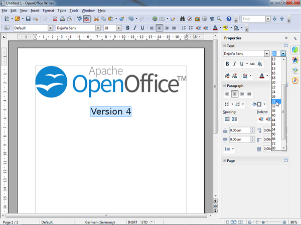
The sidebar is a UI feature that was introduced for all OpenOffice applications in version 4.0. It is based on the Symphony Properties Panel which in turn is based on the old Impress task pane. The sidebar looks like this:
Information about the implementation of the sidebar and how to extend it with new panels can be found in the Sidebar for Developers page.
A glossary is available below.
Overview
The sidebar window is located on the right side of the edit views of Writer, Calc, Impress, Draw, Base. It contains one or more panels, based on the current document context. Panels are organized into decks. A tab bar on the right side of the sidebar allows to switch between different decks.
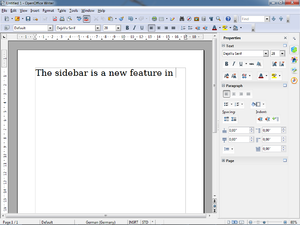
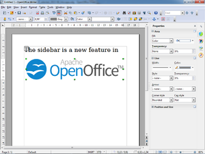
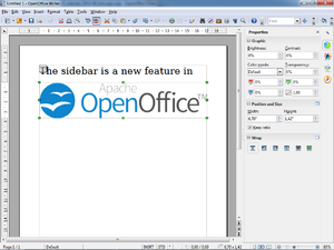
The Properties deck is context sensitive. When text is being edited then it contains panels for changing the font or text attributes, when a graphical object is selected then other panels give access to fill and line style as well as the object's position and size.


Different panels in Properties deck for different contexts (from left to right): text editing, logo pasted as outline, logo pasted as bitmap
A panel is basically a mix of a toolbar and a non-modal dialog. That means that sidebar panels do not lock the document. The user can freely mix working in the edit view to eg enter text and use the Text panel to change text attributes.
At the moment, toolbars and sidebar panels share many functions. For example, the buttons for making text bold or italic exist in both the text toolbar and the Text panel. This duplicity is the result of a design decision to allow users to gradually learn to use the sidebar. It is our plan to reduce functions provided in toolbars and provide them only in the sidebar. The speed and scope of this change depends on feedback from our users.
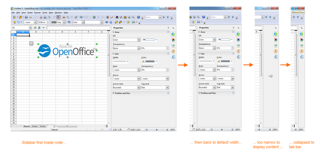
The width of the sidebar is variable. The controls in its panels are adjusted accordingly. When the sidebar becomes too small to be usable it collapses to the tab bar. This transitional state is indicated by an arrow that is displayed in place of the deck. A click on one of the buttons on the tab bar restores the deck to its former width.

Panels
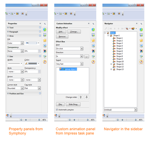
Eleven property panels have been migrated from IBM Lotus Symphony: Alignment, Area, Cell Appearance, Graphic, Line, Number Format, Page, Paragraph, Position and Size, Text and Wrap.
Seven panels come from the old Impress tool panel: Available for Use, Custom Animation, Layouts, Recently Used, Slide Transition, Table Design, Used in This Presentation.
Four are non-modal (ie non locking) dialogs: Functions, Gallery, Navigator, Styles and Formatting.
One is new: Insert Shapes.

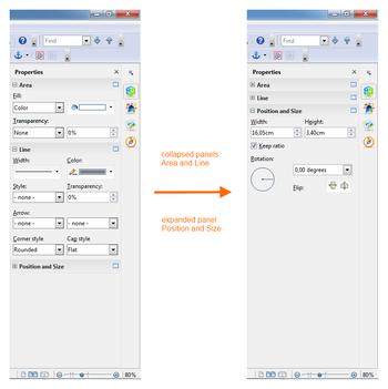
Some of these are displayed in the context sensitive 'Properties' deck, others are displayed in a deck on their own. In that case the panel title bar is usually not displayed and the deck title is the same as the panel title. When the panel title bar is shown then a mouse click on it collapses the panel to just its title bar. Another click and the panel is expanded to its former size.

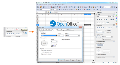
Some panels have a 'More Options' button in their title bar. A click on it opens a dialog with many more options than would fit into the panel. These dialogs, however, are modal, ie. the edit view is locked while the dialogs are open.

Alignment (Calc only)
Alignment of cell text (horizontal, vertical, rotation)

Area
Fill style of shapes like color, gradient, bitmap, hatch, transparency.

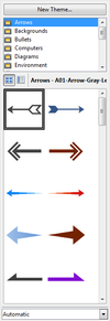
Available for Use (Impress only)
List of all available templates.

Cell Appearance (Calc only)
Cell background color and border.

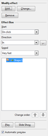
Custom Animation (Impress only)
Add or modify animations of shapes.

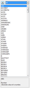
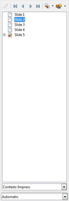
Functions (Calc only)
Insert functions (mathematical, string related, other) to a Calc cell.

Gallery
Gallery dialog as sidebar panel.

Graphic
Adjust bitmap attributes like brightness, contrast, colors, gamma.

Insert Shapes (Draw only)
Buttons and drop down menus for inserting shapes into Draw documents.

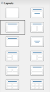
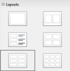
Layouts (Impress only)
Assign a predefined layout to a slide. There are different sets of layouts for the different edit modes standard, handout and notes.


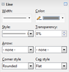
Line
Adjust color, width and style of lines and outlines.

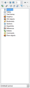
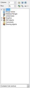
Navigator
The navigator dialog as sidebar panel. Small differences between the different applications.


Number Format (Calc only)
Set the number format of selected cells.

Page (Writer only)
Set page properties like orientation, margin or size.

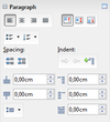
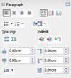
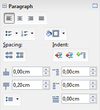
Paragraph
Adjust paragraph properties.
There are small differences for different contexts.
From left to right: Impress/Table, Writer/Annotation, Writer/DrawText, Writer/Table, Writer/Text.


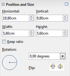
Position and Size
Change position, size and rotation of shapes. Not all of these attributes can be modified in any context. Free positioning is not supported in Writer. Bitmaps can not be rotated in Writer.
This results in three different versions of the panel: with position, size and rotation (left) with size and rotation (center) only size (right)


Recently Used (Impress only)
List the recently used templates/master pages.

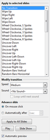
Slide Transition (Impress only)
Add or modify transition animations between slides.

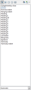
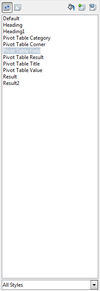
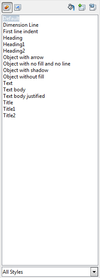
Styles and Formatting
The styles and formatting dialog, aka Stylist, as sidebar panel.
There are small differences between the applications: (from left to right) Writer, Calc, Impress


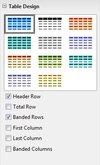
Table Design (Impress only)
Properties of tables in Impress.

Text
Adjust text properties like font, size, bold, colors.
There are small differences in different applications and contexts. Not all controls/attributes are available everywhere.


Used in This Presentation (Impress only)
List of the templates/master pages that are currently used by the document.

Wrap (Writer only)
Select how to wrap text around a graphical object.

Decks
A deck is a container for one or more panels. In some cases, where there is only one panel and the panel title and deck title are the same, the panel title bar is not painted.
The deck title bar is not an active element, ie mouse clicks are ignored, but it can receive the keyboard focus. That is an accessibility feature.
Custom Animation (Impress only)
Contains only the Custom Animation panel.
Icon is  .
.
Functions (Calc only)
Contains only the Functions panel.
Icon is  .
.
Gallery
Contains only the Gallery panel.
Icon is  .
.
Master Pages (Impress only)
Contains the Used in This Presentation,
Recently Used,
Available for Use panels.
Icon is  .
.
Navigator
Contains only the Navigator panel.
Icon is  .
.
Properties
Contains a selection of the panels Alignment, Area, Cell Appearance, Graphic, Insert Shapes, Line, Number Format, Page, Paragraph, Position and Size, Text and Wrap.
Icon is  .
.
This is the only deck that is context sensitive by default. A list of which panels are belong to which contexts can be found here.
Slide Transition (Impress only)
Contains only the Slide Transition panel.
Icon is  .
.
Styles and Formatting
Contains only the Styles and Formatting panel.
Icon is  .
.
Tab Bar
The tab bar is a column of icons on the right side of the sidebar. Its buttons switch between decks. The top button opens a menu that offers another way to switch decks. A sub menu allows individual decks to be hidden.
Glossary

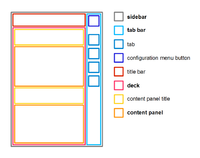
Schematic overview of sidebar components. Location of elements do not reflect UX design.
- sidebar
- Name of the feature and name of the control including all its components (icon bar, content panels).
- Also known as task pane(l) or tool pane(l)
- tab bar
- Similar to a vertical tool bar. Clicking on buttons switches between sidebar decks.
- deck
- Contains one or more content panels. Only one deck is visible at any one time.
- content panel
- Displays information about the document and/or provides the means for document modification.
- Each content panel focuses on one topic like font, table or shape properties.
- There may be more than one content panel in a deck.
- Examples are the task panels of the Impress task pane or the property views of the Symphony sidebar.
- title bar
- Displays the title for the current sidebar deck.
- Can contain a closer button.
- content panel title
- Displays the title for one content panel. Optional when there is only one content panel.
- configuration menu button
- Opens a popup menu that allows switching between decks and also allows the activation and deactivation (tab is not shown) of decks.
References
The UX part of the work is described on another page. This page focuses on the API design and implementation.
