Website/What's New/2008 Refresh
| Website Project |
|---|
|
Quick Navigation: Main Pages: |
Contents
Introduction
The 'Website Refresh' broadly encompasses numerous design changes to the OOo website that were progressively introduced between October 2008 and January 2009. This wiki page lists all of the changes.
Several teams and individuals took part during the redesign:
- Website Team, http://website.openoffice.org
- User Experience Team, http://ux.openoffice.org
- Visual Design (Graphics in Galaxy Style): Stella Schulze, Sun Microsystems GmbH, http://ui.openoffice.org/VisualDesign
- Native Language Consultant: Liz (Elizabeth) Matthis, Sun Microsystems GmbH
- Accessibility Consultant: Éric Savary, Sun Microsystems GmbH
New Header
Design Considerations
Following the launch of the OOo website redesign, concerns were raised about the contrast and accessibility of the header's functions:
It had initially been designed not to draw attention to itself, combining Search, a link to the NLC language selection page, and the Log In form in an HTML/CSS tab interface.
The new header design seeks to address the aforementioned concerns in the following ways:
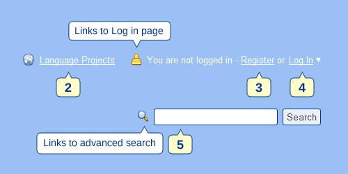
- Improved visibility: links to language projects, log in and search are all visible by default, making them easier to access
- Improved contrast: the new header has a greater contrast with the background compared with the tabbed header
- Improved accessibility: For example, login can be performed quickly by using access keys. In Firefox, press ALT + SHIFT + 4. This will open the log in box. If your username and password have been filled in automatically by the browser, the focus is automatically set on the Login button so all you need to do is press Enter. The other header functions have their own access keys (see below for a complete list of accesskeys).
Other changes
- Header gradient is slanted rather than being at 90 degrees
- The header is 15 pixels shorter
- Navigation tab states are more distinguishable
- More id tags assigned to header elements so they can be overwritten with JS if necessary
- Header logo image is now controlled via CSS (was an <img> tag) and has a <title> tag. The positioner style is also controlled via CSS (was wrapped with an <em> tag)
- Image optimizations: wave-bottom.png and wave-top.png merged into header.png. tab-left.png and tab-right.png are now tab.png. CSS is used to position the images correctly depending on the elements that use them.
Homepage Styles
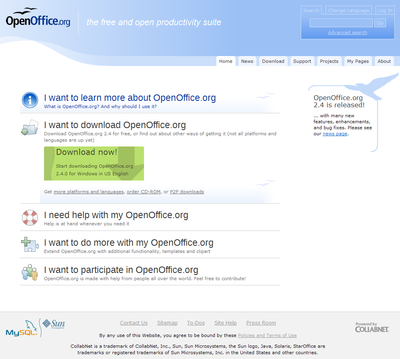
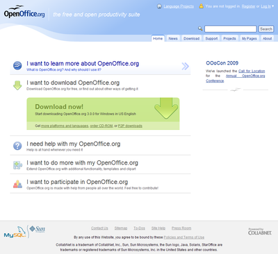
The screenshots below show the OpenOffice.org homepage before and after the refresh: in each screenshot, the download action statement has been opened, and the mouse is positioned over the first action statement.
- New Galaxy Icons - many thanks to Stella Schulze for making some custom icons specifically for the homepage
- Improved mouse-over behavior for action statements - arrow graphics indicate whether action statement is expandable or just a link
- New, nicer and bigger download button
- The download action statement can now be closed after it has been opened
- The news/announcements style is simpler, vertically flexible and proportional-width (24%). The gull in the rounded box is used on all other pages utilizing the campaign div.
General Styles
- a:hover and a:visited styles have been added
- Page background set to white to override custom browser defaults
- Minor margin/padding adjustments in CSS to lists, headings, paragraphs, etc
- All fonts default to sans-serif, letting the user choose the font they would like for the website (via the browser)
- Gradient background on NavColumn (left hand navigation) headers (e.g. Project Tools, Search, How do I...) and #navcol sections - fade down to white with a semi-transparent 2 gulls motif from the OOo logo at the bottom-right
- The clickable area has been expanded (links have 100% width within NavColumn)
- Mouseover effect for NavColumn links
- A 2px white margin from the left side of NavColumn has been removed
Download Page
- New graphics for download buttons - thanks to Stella for making these!
- New graphics for download / help us test OOo messages
Wiki
- The OOo wiki skin was updated to resemble the main OOo website styles more closely
Accessibility
- alt attribute added to search field in NavColumn
Access Keys
- 1 - OOo Homepage (or the page that the header logo links to)
- 2 - Language Projects
- 3 - Register if logged out, My Pages if logged in
- 4 - Log In if logged out, Log Out if logged in
- 5 - Search
- 6 - News
- 7 - Download
- 8 - Support
- 9 - Projects
- 0 - About
Other Stylesheet Changes
- Minor rearrangements in [style.css to group related styles more logically
- Print stylesheet was updated - text from the header is no longer visible
- Navigation styles separated into #navigation (for positioning) and .navigation (tab list styles). This allows NL projects to override the default navigation with absolute positioning (e.g. <div id="#navigation2" class="navigation">...) while reusing the default navigation styles.
- Homepage styles were moved from inline CSS (<style type="text/css">...) to a stylesheet file (/branding/css/home.css)
- The IE6 stylesheet has been removed as the new header is compatible with IE6
Changes in Website Template
- Removed project prefix for www project page titles
- Removed duplication of description and keyword meta tags
Localization
- Added basic support for localization via if... elseif statements (e.g. #if ($currentProject.getName() == "xyz")). The new header's strings are stored in variables within the file Locale.vm. They are overwritten for the German and French projects (currently). Support is currently very limited because the template files have to be encoded in ANSI, which has a very limited character set (please see Known Issues below).
Known Issues
- Caching - the OOo website appears to be displaying cached pages, even for authenticated users. This means that the header may display an incorrect login status - i.e. when you are logged in, it may incorrectly report that you are not logged in. Pressing CTRL + F5 (or forcing the browser to refresh the page) will get the header to display the current status, but this is an undesirable workaround to an issue that needs to be addressed. The problem seems to be minimized if you stay within a particular project/subdomain. See Issue 94328, which was filed before the refresh and remains unanswered.
- Konqueror Display Bug - the borders for the header's username/password text fields show through, even though the log in form is not visible (i.e., 'Log In' has not been clicked). This appears to be a Konqueror bug.
- Localization - The OOo templates are encoded in ANSI, which is extremely restrictive in the characters that can be used within them (only 256 characters are available).
What's Next?
One of the intentions behind the refresh was to keep the momentum going from the redesign and encourage continuous improvement to the website. Suggestions for future improvements are listed below, and feedback would be appreciated!
Possible directions:
- Improving breadcrumbs and clarifying OOo website structure
- Example: The term 'categories' is problematic if one is trying to understand the site structure. If we look at the Categories page (called ProjectList), it has one breadcrumb: 'Projects' - if we click this, we get taken to the Categories page, not Projects as we might expect. But on the Categories page, we see that Projects are one of numerous categories! If we go to Community council (a category), we can see the breadcrumb says Categories > council. So if we go into a project, shouldn't we see Categories > Projects > User Experience, for example? No - we see Projects (links to Categories) > Website. Native Languages are a category (but they are also a project according to the Projects page), so which breadcrumb should be used there? Confused yet? I am! :)
- Improving Native Language project selection page, a rough proposal is shown at Google Picasa
- Going tableless (getting rid of the #main table)
- Applying minimalist principles of the redesign to other major pages in OOo
- Get rid of the My Pages tab in the navigation and replace it with something more useful if/when the header caching issue is fixed in order to avoid duplication


