User Experience/ToDo/Product/Font Categories
Intro
Out of the many fonts typically installed on every system, most users will probably ever use only a couple of them. Most are just filling space. Selecting the appropriate font is however a nightmare.
This discussion will provide a more advanced alternative to the font drop-down list.
See also issue 15421.
Concept
The font drop-down list should be replaced by a special control (e.g. a stacked small window) that permits categorising fonts and selecting/filtering/displaying only a specific category of fonts.
Like a more complex filter-system, it should be possible to use more than one category to filter out / display only very specific fonts.
Font Categories
There are several types of (non-exclusive) categories.
The user should be able to filter the font-list based on at least 2 of these categories.
- Nota Bene
- Working with some of these categories will need a new type of control/checkbox that has 3 states:
- selected: display only fonts belonging to the category
- deselected: do NOT display fonts belonging to this category
- 3rd state: do NOT filter for this category, i.e. display both the fonts belonging and those not belonging to this category
- Instead of using separate controls for these options, it would be wise to have a control with 3 states (something like checked checkbox, non-checked checkbox, and semi-grayed out checkbox) as it conserves space.
Text-Font vs Symbol-Font
As the name suggests, fonts may contain text-chars or symbols. Users are usually interested either in one or the other, so it does make sense to filter the other category out when searching for the suitable font.
This works fine with an ordinary checkbox, but a 3-state control is also ok.
Serif vs Sans-Serif vs Handwriting
This are fairly straightforward categories. Sometimes, the user wants to select just a font belonging to one of these categories. Having 3 checkboxes for the 3 categories seems reasonable. Graying out the checkboxes seems reasonable when only the "Symbol-Font" is selected.
Proportional vs Monospace
A 3-state control is warranted.
New Concepts
This is where the really new concepts begin.
Font-Length
Sort fonts based on the text-length on a standard sentence at 12 pt:
- font-size and
- text of the sentence should be customisable by the user
The fonts should be sorted in ascending (or descending) order of the length of the sentence, e.g. a sentence might be:
- ~ 4 cm long with Times New Roman
- but ~4.5 cm in another font
- and ~5.0 cm with a 3rd font
Because it is possible to scale the width of the characters, this option is not that relevant. The next 2 paragraphs will discuss significantly more useful features.
Font-Height
Similar to the text-length, it should be possible to sort fonts based on the height of the text, e.g.:
- maximum height from the baseline of a specified sentence
- or maximum height, including also any descenders
Font-Weight
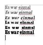
Similar to the previous 2 options, fonts should be sorted based on the weight. The font-weight should be computed as follows:
- draw (of course virtually) a specified sentence using a font
- compute how much black pixels are present
- compute the proportion of black-pixels to total area of the text-box
- sort fonts in ascending order of this computed weight, e.g.
This option makes sense to combine loosely with the Font-Length option, because more condensed fonts will appear to have a greater weight. To avoid this effect, fonts should be first grouped broadly into various length intervals. e.g.: compute the minimum length of the text and the maximum length of the same text (a user specified text) using all available fonts and split this interval into 10 sub-intervals. Group all fonts within a length-interval based on their weight.
Font Compactness: Tall vs Flat
Similarly, it makes sense to categorise fonts after their tall-vs-flat ratio, i.e. is the font slender and narrow (compact), or is it bulky (extended).
One way to do this is by computing the variance over the OY-axis and divide it by the variance over the OX-axis. This ratio would vary between 0 (a horizontal line - a perfectly flat font) and +Inf (a vertical line - a perfectly tall font).
The variance could be computed using the mean or median as parameters of central tendency, or more advanced settings, e.g. 2 values instead of just one:
- compute horizontal variance as the sum of squares of the shortest horizontal distance to the closest of 2 imaginary vertical lines drawn at 33% and 66% of the font width
- compute vertical variance as the sum of squares of the shortest vertical distance to the closest of 2 imaginary horizontal lines drawn at 33% and 66% of the font height
See Also
…
