Renaissance:UOS HCI Study Project 2009
Description
This wiki illustrates the efforts made by a group of students within the scope of a study project of the University of Osnabrück. Our design proposal focuses on the diagram function in Open Office Impress. We try to evaluate general ideas about task organization and navigation on the basis of a specific exercise: How to implement a diagram in OO Impress.
Our goal is to create a more practicable way of using the diagram function. Currently we are working on three different prototype designs because we have different expectations on how the diagram function should perform.
Subsequently, we are planning to run usability tests on our prototypes in the upcoming term regarding human information processing.
Team
Supervisor:
apl. Prof. Dr. Kai-Christoph Hamborg
OpenOffice.org User Experience
Andreas Bartel
Students:
Heike Angermann
Christian Frankenberg, B. Sc. (Cognitive Science), second-year master's student in Cognitive Science
Lutz Kolburg, fourth-year student in psychology
Anna Metzger, B. Sc. (Biology), second-year master's student in Cognitive Science
Jonas Nitschke
Andrea Struckmeier, B. Sc. (Applied Communication & Media Science), second-year master's student in Cognitive Science
Oliver Wedderhoff
Goals
The overall goal of this group is to become familiar with the techniques of usability engineering in the context of a study project. In line with the Renaissance Project of Sun Microsystems we are developing interface protoypes on our own which we will evaluate by means of a usability test during the next term.
Activities
Design Proposal 1: Toolbox
Basic idea:
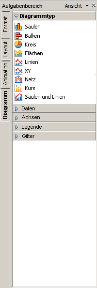
Our idea was to create a more intuitive way to interact with the diagram feature in OOI. The problems we encountered while we were working with the presented functionality did frustrate and confuse us to a point that it evoke the necessity to find a smoother, more “natural” way to access some of the tools/functionality we needed to twiddle with the diagram. The Toolbox approach seemed to match our needs, as it offers a more habitual way to access certain features. Our idea was that a toolbox in a software environment resembles a toolbox in real life. This means that you use an array of certain tools for coping with numerous different tasks. These Tools are stored in a collective location, you the user/craftsman know that you’ll find all appliances in this spot and therefore don’t have to search for a specific utensil all over the construction site. A toolbox is a common way of storing your tools and everyone is familiar with this concept and its practicality. This leads us to believe that this approach is an intuitive way of interacting with tools and therefore is also valid in the area of software usage. Organizing all functionality you could need to accomplish a tasks (i.e. working with a diagram) in one spot (the toolbar) seems practical and therefore desirable.
Context Sensibility:
This approach also offers the possibility that it can be organized context sensible. This implements the idea that you can only access tools that are usable in a specific operation and that the ones that you can’t use are not visible and therefore not clickable (which can be very confusing). Context sensibility offers the chance that the important (the ones you can use) tools become more salient and therefore increase the functionality of the program.
Navigator Feature:
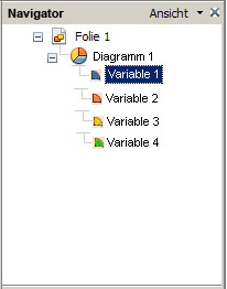
We also found the idea of an extended “navigator” function very appealing. We thought that it would be very useful to have an overview of all objects (with objects we mean everything you put on a slide, this can be a text body, a graphic a diagram etc) that are present on the current slide/ page. This can be helpful if you want to select a certain object, so you can work with it. This can be very hard, if none off the objects are listed and only visible on the slide. Sometimes it can be very unpractical to select a certain object, because it’s layered under another one. A navigator as we intend it allows you to see all objects at ones and this problem would disappear. Also it offers the possibility of a hierarchy which ranks all objects. The top one is the one most visible with the other below (lower in hierarchy) creating the background. The objects are changeable in its position, offering the functionality of adjusting the hierarchy to ones need. To extend this concept we thought it would be useful to even brake down specific objects. For example the diagram, a diagram is composed of different data which is represented i.e. in bars or pieces of cake. These elements would be accessible in our navigator through clicking on the diagram object. A list of all bars would be presented allowing to manipulate every single one of it (Our idea here was to animate only one bar or changing the colour of a selected one).
Location:
What we did is using the space on the right site of the main window (where the “tasks” menu is situated) to locate our toolbox. The features it posses are the navigator on the top and the main toolbox beneath it. The toolbox automatically switches to panel/tab which is adequate for fulfilling the task (i.e. when you insert a diagram, it switches to the diagram option panel). The only tab always accessible is the formatting panel. Formatting is a feature which is universally usable, similar to a level or a rule in real life construction work. Other functionality is hidden and therefore doesn’t abstract and confuses the user because it’s not usable. The user only gets what he can use and there only gets what he really wants. This would make work certainly more productive because it allows you to focus on your task.
Design Proposal 2: Pop-Up
Basic idea:
Our design idea is meant to improve the handling of the diagram function. Looking at
the current version we noticed that many of the functions are only available by
clicking on parts of the diagram “at random”. In our design, we tried to make all
functions accessible more intuitively by means of a toolbox.
To visualize our ideas, we implemented a prototype in OO-impress. After clicking on
the diagram icon in the main menu, the programme looks like that:
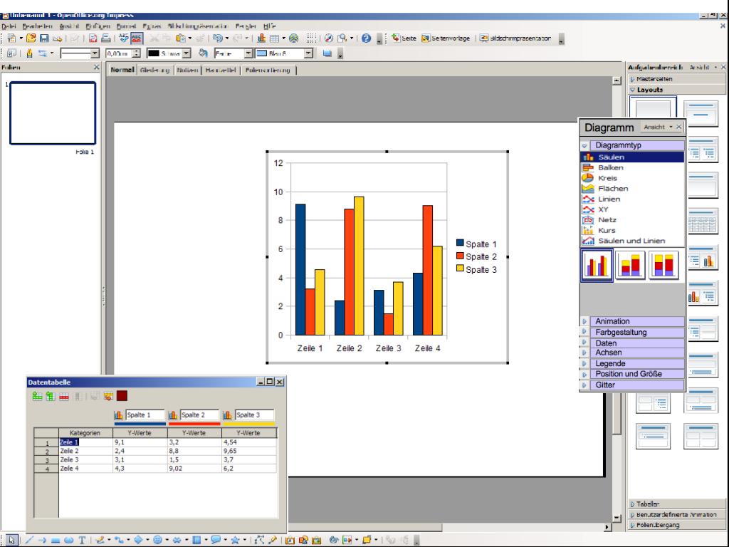
Fig.1: Standard view of diagram function
In opposition to the current version, there is no completely new window opening in which the user has to edit the diagram: As soon as the diagram icon is chosen, a default-diagram appears as well as a chart containing the default values. Moreover, a toolbox for editing the diagram is opening. The user can move these three elements with the mouse and position them where ever he likes. Meanwhile, the design of the “background” is not affected: The upper menu bar as well as the toolbox on the right side (containing slide layout etc.) remain the same. So the user doesn’t feel like being in a new programme when using the diagram function. Functions of the main menu that are not available while editing the diagram are greyed out (currently not yet included in the prototype). Below, the sinlge elements of our design and there special features will be described in more details.
The chart:
Fig. 2a: chart for histogram
Fig. 2b: chart for circle diagram
Chart Features:
- The colors in the chart correspond to the colors in the digram (also when the color of one bar is changed) - For the circle diagram, the default chart was adapted: cells which are not represented by the digram are greyed out; the color is adjusted to the rows (not the columns, as in the current version of the chart) (Fig. 2b) - as soon as one of the cells in the chart is marked, the corresponding part of the diagram is marked as well (see below, Fig. 5) - There is an icon for importing charts out of other programmes (e.g. “Calc”) - As soon as the chart is closed, the user leaves the diagram function and returns to the presentation (Toolbox disappears as well). - If the user wants the chart to be closed but still edit the diagram via toolbox, he can minimize the chart.
The Toolbox:
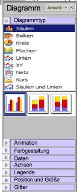
- Fig. 3a: Toolbox “Diagrammtyp”
Toolbox Features:
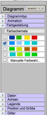
“Diagrammtyp” (already clickable, Fig. 3a): - part of the toobox that is opened when starting the diagram function - different styles of diagrams can be chosen here “Animation”: - contains different possibilities to animate different parts of the diagram. Before this function was very hard to find (at least in our opinion) “Farbgestaltung” (already clickable, Fig. 3b): - the different possibilities to change the colors in the diagram were also very hard find and qutite distributed. Therefore we summed them up under this point. Clicking on the corresponding field in the menu, the toolbox changes like that:
Fig. 3b: Toolbox “Farbgestaltung”
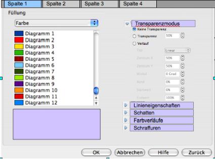
- there are already some different color schemes proposed - if the user wants to change the color of the diagram according to his own preferences, he can chose “Manuelle Farbgestaltung”; which makes the following window appear:
Fig. 4: Window for “Manuelle Farbwahl”, first column selected.
- In this window, the user can make changes to color, lines, transparence etc. for the different columns (or rows, in circle diagram) “Daten”, “Achsen”, “Legende”, “Gitter”: - the menu items in the toolbox make all functions available, which were originally be accessible via “Rechtskllick” (and still are) “Position und Größe”: - here the user can adjust size and position of the diagram If the user closes the toolbox, he leaves the diagram function (similar to closing the chart).
Changing values:
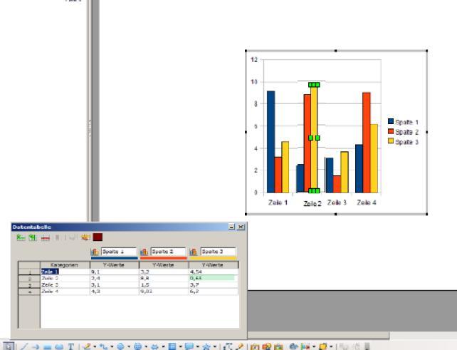
Moreover, we propose that the different parts of the diagram (like a single bar) can be manipulated directly by means of the mouse (e.g. increasing the value by drawing up the bar). Therefore the bar needs to marked (double click). The corresponding cell in the chart is then simultaneously marked, so that the value can also be changed by altering the value in the cell.
Fig. 5: Changing the value of one bar via change in the chart or direct manipulation via mouse; bar and corresponding cell marked.
Design Proposal 3: Expert User Interface
Conceptualize the Interface
Before we deal with the actual idea of our proposal we establish the following premises to base our approach on:
At first, we want to maintain a common frame structure when working with diagrams. When inserting a diagram in OOImpress the lateral frames drop away and the default toolbar is replaced by a context dependent toolbar with minimal functionality. The first impression imposed on the user is that a new program or a sub-program is executed. This comes with the uncertainty of not being able to turn back to the OOImpress default view, what has been reported to be the first intention of our group members when they first inserted a diagram.
When thinking of a desirable frame structure we decided to include a bottom frame which can be used for a time line like in the Proposal by Thibaut Dedreuil-monet or other features included in the new interface. Considering diagrams this frame will be used to display the specific values of a diagram by means of a table.
In addition, we want to retain a common toolbar for different types of objects in OOImpress. There is no reason to disable buttons e.g. for font size or color in general just to pop them somewhere else on the screen. If a user is used to alter the font size with two clicks on the toolbar we do not want to inhibit the usual way of manipulation.
The main idea of our approach is to extend the right frame by several tabs that allow easy access to the elements of a slide as well as quick and precise positioning and an efficient way of keeping track of your actions. The most important difference in this approach is an enhancement in the metaphor of a slide in OOImpress. A slide consists of several elements that are aligned in a certain sequence, can be grouped, dragged and so on. We want to make use of this representation in that every major object is treated as a separate layer, starting with the basic slide. A layer consists of multiple objects, e.g. a predefined text field. When a compound object (e.g. a diagram) is added into the slide view a new layer is created, consisting of all elements the new object is composed of. In the case of a diagram this would include bars, key, axes, ... We assume that the expert user is familiar with an organization into a layered structure since this is realized in many image editing softwares and applications that work on images as well.
compressed slide formating
Preexisting components that have been part of the right frame in OOImpress have been relocated in our approach. The general layout can be set in the upper section of the right panel. Once set the upper section can be used for protocol purposes. Nonetheless, layout tabs are still accessible.
a protocol tab
One of the major drawbacks of the current interface results from not being able to retrace the course of actions at first sight. A protocol has been established in many applications and fulfills several crucial requirements of a well designed interface:
1. provide feedback
2. name the action
3. offer error handling
4. easy undo implementation
5. well-arranged and intuitive
In particular points 3. & 4. extend the simple protocol. All in all, the combination of a hand full of basic requirements for well-designed interfaces in just a small box makes this feature indispensable for our approach.
section for object organisation
As has been stated above, the cardinal change in our approach is the representation of each element as an object. More complex units (like digrams, charts, ...) are organized in a separate layer, which consists of all objects of this complex unit. In Figure 2 the middle section of the tripartite frame on the right shows all elements of the active layer (Objekte). Layers can be switched via the layers tab (Ebenen). For easy use several objects can be grouped together to allow for example simultaneous animation or formatting.
positioning / animation
The bottom section of this frame contains information about the position in relation to a point of reference. We are of the opinion that the positioning of objects is fundamental for visual presentation. Object placement by mouse is sometimes imprecise or even impossible (e.g. due to ill-conceived alignment effects). The second tab includes the options to create visual effects on objects. This feature has not been reconsidered since it appears to work fine with our object based approach. In fact, the bottom section of the right frame is intended to make the most important properties of objects instantly available and allows for easy manipulation.
right click context menu
Every other function that is not listed in the tool bar (general properties like color, frame, fonts style) or situated in the bottom right frame (relative position, animation) is available via right-click on either the object on the slide or the object in the object list in the middle right frame.
The Diagramm Function
To insert a diagram on the current slide the most prominent option is to click on the icon in the toolbar that resembles a diagram. This will automatically create a default bar graph to work with. The type of the diagram can be altered when it is selected either by simply clicking on the downward arrow close to the diagram button which will open a pop-up menu at the bottom of the clickable button revealing a set of different diagram types. Of course the favoured type of diagram can also be directly selected in this pop-up menu right from the start, i.e. a click on one of the many types will create an instance of the selected type. Another alternative would be to switch to the layer view in the right panel and address the diagram options via right-click on the respective object, in this case the diagram, either on the slide or in the layer view. Now the diagram type can be changed and specified even more since the right-click menu contains all advanced options.
When a digram is added to the view it is of preset size and it will contain default values and default colours at first. All elements of this complex unit are listed in the object tab in the right panel, such as bar 1, bar 2, ..., x-axis, y-axis, ... and come along with a miniature view of the object to facilitate easy recognition of these objects.
The bottom frame is used to display the data table reflecting the values of the diagram. To alter a value in the data table simply click on the respective data field and change the value. In parallel, the visual object of the diagram in the slide view associated with this value (dependent on diagram type this is a bar, a point, a piece, ...) is selected as well as is the respective object in the object list. Another way to manipulate the value of a field is to select the object (via object list or left click in the slide view) and change the size of the object by transforming it, e.g. increase the height of a bar. This will result in a permanent modification of the respective value.
The advantages of an object-bases handling are at hand. All manipulable objects are accessible via the object list. In the current version of OOImpress our group experienced a huge amount of frustration when right-clicking rather randomly on objects, lines and frames trying to reveal the functionality given be the context menus popping up. In our approach, the user immediately knows what elements can be changed and more importantly how. In addition, there is no interference when selecting a particular element as has been experienced in the current version of OOImpress, e.g. when a larg object occludes a smaller one.

