Difference between revisions of "Proposal by Johannes Eva"
Johanneseva (Talk | contribs) (First tryout - A. Modern wide-screen resolutions) |
Johanneseva (Talk | contribs) (B. Competitors - Part 1) |
||
| Line 7: | Line 7: | ||
|} | |} | ||
| − | N.B. I'm working on this page right now! It is not finalized. | + | |
| + | '''N.B. I'm working on this page right now! It is not finalized.''' | ||
| + | |||
| + | This project is named "Martinů" in honor of the Bohemian (Czech) Composer [http://en.wikipedia.org/wiki/Bohuslav_Martin%C5%AF Bohuslav Martinů]. | ||
The following design proposal is part of the collection of design proposals for “Accessing Functionality”, which is part of Project Renaissance. | The following design proposal is part of the collection of design proposals for “Accessing Functionality”, which is part of Project Renaissance. | ||
| Line 38: | Line 41: | ||
* You may notice than some points are more detailed than others, regardless of their importance. One reason for it is that I am using material I had already written on some points - for example the "underline" part. Let's start! | * You may notice than some points are more detailed than others, regardless of their importance. One reason for it is that I am using material I had already written on some points - for example the "underline" part. Let's start! | ||
| − | == A. Modern wide-screen resolutions == | + | ==A. Modern wide-screen resolutions== |
| − | =1. Laptops= | + | ===1. Laptops=== |
* There is a clear tendency in screen resolutions in favour of wide resolutions. Laptops have almost all wide resolutions by now, the newest adopting even wider resolutions like 1366x768 (Dell Studio 15, Studio 16, Inspiron 15), which seems to be the new standard, instead of 1280x800, 1600x900 (Sony Vaio FW Series) instead of 1440x900, or 1920x1080 (Dell Studio 16, Sony Vaio AW-Serie) instead of 1980x1200. | * There is a clear tendency in screen resolutions in favour of wide resolutions. Laptops have almost all wide resolutions by now, the newest adopting even wider resolutions like 1366x768 (Dell Studio 15, Studio 16, Inspiron 15), which seems to be the new standard, instead of 1280x800, 1600x900 (Sony Vaio FW Series) instead of 1440x900, or 1920x1080 (Dell Studio 16, Sony Vaio AW-Serie) instead of 1980x1200. | ||
| Line 53: | Line 56: | ||
| − | =2. Desktop Monitors= | + | ===2. Desktop Monitors=== |
* TFT monitors are following the same tendency as laptop screens. 1920 x 1080 is the new standard for big monitors, instead of 1920x1200 for the "old" wide-screen format, and 1900x1600 for the "old" non-wide resolution. | * TFT monitors are following the same tendency as laptop screens. 1920 x 1080 is the new standard for big monitors, instead of 1920x1200 for the "old" wide-screen format, and 1900x1600 for the "old" non-wide resolution. | ||
| Line 62: | Line 65: | ||
| − | =3. Conclusion= | + | ===3. Conclusion=== |
* Why all this text about wide-screen resolutions? Well, because in all the UI discussions and drafts I have seen by now, it has not been taken into account. While people are working mostly on vertical sheets of paper (I'm speaking mostly of Writer) screens get wider and wider and the UI doesn't adapt and takes vertical space away, leaving big chunks of the screen unused, left and right of the virtual sheet of paper. (And this empty space is filled with the depressive "Battleship Grey" application background color!) | * Why all this text about wide-screen resolutions? Well, because in all the UI discussions and drafts I have seen by now, it has not been taken into account. While people are working mostly on vertical sheets of paper (I'm speaking mostly of Writer) screens get wider and wider and the UI doesn't adapt and takes vertical space away, leaving big chunks of the screen unused, left and right of the virtual sheet of paper. (And this empty space is filled with the depressive "Battleship Grey" application background color!) | ||
| Line 71: | Line 74: | ||
* This template, if viewed in a maximized window with a 1280x800 resolution (my case), is hard to read. The lines are too long! | * This template, if viewed in a maximized window with a 1280x800 resolution (my case), is hard to read. The lines are too long! | ||
| + | |||
| + | |||
| + | ==B. Competitors== | ||
| + | |||
| + | ===1. Microsoft Office=== | ||
| + | |||
| + | * If you are not familiar with Microsoft's new "Microsoft Fluent User Interface" aka "Ribbon", here are some very interesting links where you can find more information: | ||
| + | |||
| + | * Microsoft Office 2007 UI presentation: | ||
| + | [http://office.microsoft.com/en-us/products/HA101679411033.aspx The Microsoft Office Fluent user interface overview] | ||
| + | |||
| + | * How does the Ribbon scale down? | ||
| + | [http://blogs.msdn.com/jensenh/archive/2005/10/18/482233.aspx Scaling up, scaling down ] | ||
| + | |||
| + | * A great video about the creation of Office 2007 new UI: | ||
| + | [http://blogs.msdn.com/jensenh/archive/2008/03/12/the-story-of-the-ribbon.aspx The story of the Ribbon] | ||
| + | |||
| + | This last link is a video about the design of the ribbon interface. It shows many interesting UI prototypes, as well as useful data. | ||
| + | |||
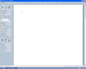
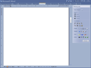
| + | * I was specially interested by the vertical "ribbon" UI drafts. | ||
| + | |||
| + | (I think the examples are small and a case of fair use, thus no being copyright infringement. If you think I'm wrong, please remove them or contact me.) | ||
| + | |||
| + | [[Image:Martinu_Microsoft_Office_2007_UI_Draft_1.png|300px|thumb|left|Microsoft Office 2007 Draft 1]] | ||
| + | |||
| + | [[Image:Martinu_Microsoft_Office_2007_UI_Draft_2.png|300px|thumb|left|Microsoft Office 2007 Draft 2]] | ||
| + | |||
| + | [[Image:Martinu_Microsoft_Office_2007_UI_Draft_3.png|300px|thumb|left|Microsoft Office 2007 Draft 3]] | ||
| + | |||
| + | |||
| + | |||
| + | |||
| + | |||
| + | |||
| + | |||
| + | |||
| + | |||
| + | |||
| + | |||
| + | |||
| + | |||
| + | |||
| + | |||
| + | |||
| + | |||
| + | |||
| + | |||
| + | |||
| + | |||
| + | |||
| + | |||
| + | |||
| + | |||
| + | |||
| + | |||
| + | |||
| + | |||
| + | |||
| + | |||
| + | |||
| + | |||
| + | |||
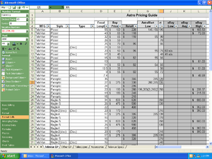
| + | The video “The story of the Ribbon” includes useful data about user interaction surveys. Basically, the data describes the most used commands in Word, Excel, Powerpoint, and if the interaction was done with the mouse or the keyboard. | ||
| + | I hope that the "OpenOffice Improvement program" will soon provide data of comparable quality. | ||
| + | |||
| + | |||
| + | [[Image:Microsoft Office 2007 Data 1.png|300px|thumb|left|Microsoft Office 2007 Data 1]] | ||
| + | |||
| + | [[Image:Microsoft Office 2007 Data 2.png|300px|thumb|left|Microsoft Office 2007 Data 2]] | ||
| + | |||
| + | |||
| + | |||
| + | |||
| + | |||
| + | |||
| + | |||
| + | |||
| + | |||
| + | |||
| + | |||
| + | |||
| + | |||
| + | |||
| + | |||
| + | |||
| + | |||
| + | I would like to highlight one detail about the “The story of the Ribbon” video. At one point (Minute 48), the narrator tries to explain why they didn't end up with a vertical design in Office 2007. | ||
| + | |||
| + | The arguments given by the narrator couldn't really convince me, and my paranoid nature ended up believing that they already had in mind that some day, it would be possible to use the vertical space for displaying... ads! And that may have been one good reason for making the UI horizontal, leaving a lot of space for vertical advertising. We will see what happens with Microsoft Office "Web" 2010. | ||
| + | |||
| + | |||
| + | ====Q & A==== | ||
| + | |||
| + | '''Q.''' Why design a vertical UI in times where the market leader has a successful horizontal UI? Don't you think that the guys at Microsoft had good reasons for it? | ||
| + | |||
| + | '''A.''' Remember than at the time Microsoft was designing Office 2007, back in 2003 – 2004, the 16:10 and 16:9 screen ratio tendency was not actual. The 16:10 tendency had started maybe, but nobody was thinking that 16:9 would ever be adopted on computers. When thinking about laptop and small screen sizes, the common thinking was that the resolution would go from 1024x768 to 1280x800, and then 1440x900, even on 13 inch laptops. Office 2007 UI is not a real pleasure to use with a 768 pixels height, but it is ok with 900. | ||
| + | Note that all the [http://www.istartedsomething.com/20080308/office-2007-interface-prototypes/ prototypes they were making] were in 1280x1024! | ||
| + | |||
| + | |||
| + | |||
Revision as of 12:42, 11 May 2009
Design Proposal [Martinů]
|
|
|---|
|
Quick Navigation
Team |
| Please do not edit this page unless you are the original author. Your feedback and comments are welcome in the Comments section below or on the ui@ux.openoffice.org mailing list. |
N.B. I'm working on this page right now! It is not finalized.
This project is named "Martinů" in honor of the Bohemian (Czech) Composer Bohuslav Martinů.
The following design proposal is part of the collection of design proposals for “Accessing Functionality”, which is part of Project Renaissance.
Summary and Status
How to use this template: Please write a short summary here to introduce the ideas in your proposal. For example, write a few sentences covering the highlights and the name of the proposed design. (Please delete this and all of the other gray explanatory text before you submit your proposal.)
Status: Request for Comments
After you consider the comments and questions in the comments section, revise your proposal for completeness and understandability. When you feel your proposal is ready for evaluation, please change the status above to “Proposal Complete”.
Mockup
Please add your main “wireframe” mockup. For example: A mockup which shows the functionality for adding a slide in Impress.
Detailed Description
This space is reserved for the detailed description of your design. Add anything you might find important for us to know. If you don't have any clue what this might be, then you will find some topics below.
- Describe dynamic behavior: The mockup above is something static. To better illustrate what will happen on the screen, describe what actions would be taken by the user and what would appear on screen.
- Explain the rationale and assumptions: If you decided to go for a certain concept, then please explain why you chose this.
- Highlight particular design ideas and alternatives: A concept usually incorporates many individual ideas. If you think certain ideas are really unique, then please highlight them. And if you think that there were other really good ideas which could not be implemented at the same time, tell us about them.
- List issues and open questions: Please list any issues you are aware of and open questions. Do not worry if your proposal or concept isn't perfect. If you have discovered any stumbling blocks or worries, then please provide this information right from the start. Maybe the team can help find answers/solutions.
- This proposal takes its roots in some basic ideas. I will detail some of them here.
- You may notice than some points are more detailed than others, regardless of their importance. One reason for it is that I am using material I had already written on some points - for example the "underline" part. Let's start!
A. Modern wide-screen resolutions
1. Laptops
- There is a clear tendency in screen resolutions in favour of wide resolutions. Laptops have almost all wide resolutions by now, the newest adopting even wider resolutions like 1366x768 (Dell Studio 15, Studio 16, Inspiron 15), which seems to be the new standard, instead of 1280x800, 1600x900 (Sony Vaio FW Series) instead of 1440x900, or 1920x1080 (Dell Studio 16, Sony Vaio AW-Serie) instead of 1980x1200.
- I just goggled around, just to find an article showing that the 4:3 to 16:10 to 16:9 is not my own fantasy:
- Laptop have topped Desktop computer sales since Q4 2008. So they can't be ignored.
Notebooks Top Desktop Sales Ahead of Schedule
2. Desktop Monitors
- TFT monitors are following the same tendency as laptop screens. 1920 x 1080 is the new standard for big monitors, instead of 1920x1200 for the "old" wide-screen format, and 1900x1600 for the "old" non-wide resolution.
- This wider screen tendency has been around for some month, and shows no sign that it shouldn't be taken seriously.
- Don't blame me for screens getting wider, personally I don't like it! But these are facts, we can't ignore them. By the time Renaissance will be implemented, 16:9 will be more probably a standard than 16:10. 4:3 monitors will probably be hard to find.
3. Conclusion
- Why all this text about wide-screen resolutions? Well, because in all the UI discussions and drafts I have seen by now, it has not been taken into account. While people are working mostly on vertical sheets of paper (I'm speaking mostly of Writer) screens get wider and wider and the UI doesn't adapt and takes vertical space away, leaving big chunks of the screen unused, left and right of the virtual sheet of paper. (And this empty space is filled with the depressive "Battleship Grey" application background color!)
- Personally, I also regret that the target or the proposal is Impress: Impress is an exception in OOo because the “paper” will be mostly horizontal. But as most people using OOo will use Writer, and a fewer proportion Impress, I really think that the design should be adapted to wider screens, if we want to archive a UI uniformity between the OOo applications. Most thoughts about my design proposal were targeted to Writer – I was surprised that the design seems to works really well in Impress, too.
- I wonder why the resolution for these drafts is 1024x768: try to by any consumer laptop or TFT with this resolution nowadays - it's almost impossible! 1280x768 or even the new 1366x768 would make much more sense.
- This template, if viewed in a maximized window with a 1280x800 resolution (my case), is hard to read. The lines are too long!
B. Competitors
1. Microsoft Office
- If you are not familiar with Microsoft's new "Microsoft Fluent User Interface" aka "Ribbon", here are some very interesting links where you can find more information:
- Microsoft Office 2007 UI presentation:
The Microsoft Office Fluent user interface overview
- How does the Ribbon scale down?
- A great video about the creation of Office 2007 new UI:
This last link is a video about the design of the ribbon interface. It shows many interesting UI prototypes, as well as useful data.
- I was specially interested by the vertical "ribbon" UI drafts.
(I think the examples are small and a case of fair use, thus no being copyright infringement. If you think I'm wrong, please remove them or contact me.)
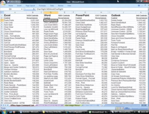
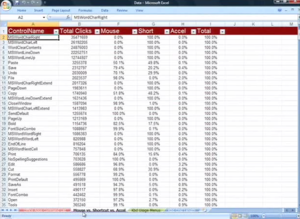
The video “The story of the Ribbon” includes useful data about user interaction surveys. Basically, the data describes the most used commands in Word, Excel, Powerpoint, and if the interaction was done with the mouse or the keyboard.
I hope that the "OpenOffice Improvement program" will soon provide data of comparable quality.
I would like to highlight one detail about the “The story of the Ribbon” video. At one point (Minute 48), the narrator tries to explain why they didn't end up with a vertical design in Office 2007.
The arguments given by the narrator couldn't really convince me, and my paranoid nature ended up believing that they already had in mind that some day, it would be possible to use the vertical space for displaying... ads! And that may have been one good reason for making the UI horizontal, leaving a lot of space for vertical advertising. We will see what happens with Microsoft Office "Web" 2010.
Q & A
Q. Why design a vertical UI in times where the market leader has a successful horizontal UI? Don't you think that the guys at Microsoft had good reasons for it?
A. Remember than at the time Microsoft was designing Office 2007, back in 2003 – 2004, the 16:10 and 16:9 screen ratio tendency was not actual. The 16:10 tendency had started maybe, but nobody was thinking that 16:9 would ever be adopted on computers. When thinking about laptop and small screen sizes, the common thinking was that the resolution would go from 1024x768 to 1280x800, and then 1440x900, even on 13 inch laptops. Office 2007 UI is not a real pleasure to use with a 768 pixels height, but it is ok with 900. Note that all the prototypes they were making were in 1280x1024!
Additional Material and Mockups
Please share everything you might think is important to better understand your proposal. Perhaps you also have other ideas which are not directly related to “Accessing Functionality”? You might add further documents, Internet links, or additional mockups - e.g. showing a workflow or different states of the software.
Author or Team Working on This Proposal
| Author / Team Member | Contact (OpenOffice.org login name, used for email) |
| Johannes Eva | OpenOffice.org Login Name |
| Real Name | OpenOffice.org Login Name |
Comments
| Community members, this is where your comments and questions concerning completeness and clarity should be written. Please add your OpenOffice.org login name to let us contact you via email. |
Your space :-)

