Difference between revisions of "MimeType Icons"
(→Color Language of Mime Type Iconse) |
(→Overview) |
||
| Line 23: | Line 23: | ||
<br> | <br> | ||
| − | + | === Overview === | |
| − | + | OpenOffice.org 3.0 | |
| + | Overview of all [http://ui.openoffice.org/nonav/VisualDesign/OOo30MimeType.html OpenOffice.org 3.0 MimeType Icons] | ||
=== OpenOffice.org 2.0 === | === OpenOffice.org 2.0 === | ||
Revision as of 10:10, 15 June 2010
Contents
OpenOffice.org 3.0
The new MimeType Icons also fit to Galaxy style.
Color Language of Mime Type Icons
The language of colors are one of the most important identifier to differ between all of OpenOffice.org applications. The colors apply the application, document and template icons. The color language of OpenOffice.org looks similary to the colors of our main competitor -> high recogniton value.
See the application identifier colors and how they was improved:
File:OOo30galaxy color-language.png
Symbolism Language of MimeType Icons
The other way to differ between the OpenOffice.org applications (the application, document and template icons) is the symbolic language. Clear and simlpe shapes make it easy to understand - in small size icons, too. Above all, the symbolism could help color-blind people to identify the mime types.
Overview
OpenOffice.org 3.0
Overview of all OpenOffice.org 3.0 MimeType Icons
OpenOffice.org 2.0
Overview of all OpenOffice.org 2.0 MimeType Icons
History
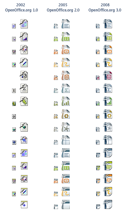
The History of OpenOffice.org MimeType Icons
The evolution of document icons:
