Difference between revisions of "Branding Initiative/branding guidelines draft"
From Apache OpenOffice Wiki
| Line 57: | Line 57: | ||
'''2.'''[[Image:Logo OOo space.png]] <br> | '''2.'''[[Image:Logo OOo space.png]] <br> | ||
| + | |||
| + | |||
| + | |||
| + | === Logo Inverse === | ||
| + | |||
| + | '''1. Blue: ''' | ||
| + | |||
| + | [[Image:Logo_OOo_invers_blue.png]] | ||
| + | |||
| + | '''2. Black:''' | ||
| + | |||
| + | [[Image:Logo_OOo_invers_black.png]] | ||
== Logo DON'Ts == | == Logo DON'Ts == | ||
Revision as of 16:01, 6 April 2010
Contents
Branding Guidelines Draft
This is a draft for the OpenOffice.org Branding Guidelines. Elements for discussion can be posted here. The content of this site is not yet official.
Brand Colors
| Please do not use the color picker to extract the colors. The colors shown on your screen may have been already altered by your computer's color management system. |
Picture
<br>
Table
| Blue | Black | |
| HEX | 0E85CD | 000000 |
| RGB | 14 133 205 | 0 0 0 |
| CMYK | tbd | tbd |
| Pantone | tbd | tbd |
Logo: DO's
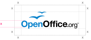
White Space Logo
Here are two proposals for the white space rule for the logo:
1. File:Logo OOo space more.png
Logo Inverse
1. Blue:
2. Black:
Logo DON'Ts
Don't change colors
Never change the color of the logo.
File:New logo dont change color.png
Don't stretch the logo
Never stretch the logo from it's original form but respect its aspect ratio.
Use an appropriated background color
Don't use background colors that negatively affects readability of the logo.
Do not move the elements
Do not place the gulls on a different place.


