Difference between revisions of "Art/Gallery/Logo Gulls"
From Apache OpenOffice Wiki
(New page: {{Art}} ==Slightly modified gulls in the OpenOffice.org logo== The OpenOffice.org logo contains a pair of gulls above the written text that fit good at this position. But if they are us...) |
m (internal link fixed) |
||
| (One intermediate revision by one other user not shown) | |||
| Line 13: | Line 13: | ||
[[image:logo_with_modified_gulls.png]] | [[image:logo_with_modified_gulls.png]] | ||
| − | Source: [[ | + | Source: [[Media:Logo_with_modified_gulls.svg|source as SVG file]] |
| + | [[Category:Art]] | ||
Latest revision as of 11:56, 30 November 2009
| |||||||||||
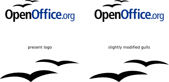
Slightly modified gulls in the OpenOffice.org logo
The OpenOffice.org logo contains a pair of gulls above the written text that fit good at this position.
But if they are used as separate graphical elements, they look not really symmetric when they are enlarged.
I modified these gulls a bit to have a more harmonic visual impression when they are used without the wording "OpenOffice.org".
Source: source as SVG file
