Visual Concept Proposals
| |||||||||||
These logos are not official, for a list of official logos visit here.
The artwork here is not (yet) meant for public representation. Even if it is licensed under an open source license, the name "OpenOffice.org" is trademarked.
Main Directive
The Art Project wants to provide a new basis for OpenOffice.org's visual branding. Therefore we start working on a new logo as well as on branding elements that can be used for OOo representation with and without the name "OpenOffice.org".
At the moment we want to create a set of logo proposals that can be presented to the community at the OpenOffice.org Conference in Orvieto. Because of the short time frame collection of logo proposals is limited until the 24th of October.
UPDATE
The presentation of these ideas at Orvieto (a display stand in the main hall and a discussion session on Friday Nov. 6th) has got a lot of positive replies.
There have been concerns about abrupt changes in visual identity, some people disliked one or another proposal as too technical, others as not serious enough for professional work.
But the main reaction was:
"It is very good to have an eye on the visual impression of OpenOffice.org throughout program, website, marketing material and others (like official documentation)."
The idea of initiating a new project covering design, artwork and branding of OpenOffice.org got merely positive reactions.
Follow these guidelines when submitting artwork please:
If you want to add any artwork to this page, please tell us at our mailing list what you've done. As the official collection time is over, your contribution would probably not been noticed otherwise.
- License: Open source license, recommended: LGPL to be able to include it in the main program one day.
- Font: Open source font, recommended: liberation font familiy
- Color language: recommended: present icon colors and the "OOoBlue" from the present logo (RGB: 6,52,140)
- Graphical elements: recommended: Basic ideas kept from present branding bugs: Gull/gulls, "S"-curve from the icons.
- Additional information: Please comment your design giving a short reasoning of your idea and it's implementation.
Please keep your images in a medium sized box so that we don't have massive images stretching the page.
The image description box should contain
- a logo name we can refer to when we talk about it on the mailing list
- your name
- the license
You may copy an existing entry and replace the parts with your data.
Logo proposals
Jens Habermann
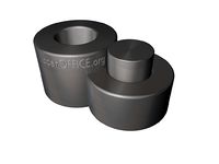
Letters of OOo presented in a different way
big O´s symbolized through Tubes and small o through cylinder
OpenOffice.org text is just a placeholder, because this Logo should be used along an OpenOffice.org text
Works 3D/2D and can modified various ways
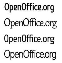
OpenOffice.org with new free fonts
Lavoisier (OFL)
Gentium Basic (OFL)
Share Regular (Free?)
District Thin (License?)
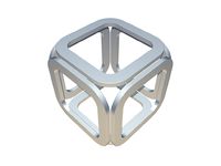
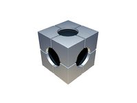
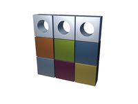
OOo worked into cubes
1. cube: build from char O, but similarity to old SGi Logo can cause legal problems.
2. cube: O´s symbolized through holes, cubed parts stand for different software tools in OOo
3. cube: cubed into 3x3, colors for software tools, OOo like second cube symbolized through holes, can be very easy transformed into 2D
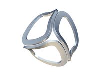
OOo warped
OOo chars warped into a circle like abstract
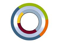
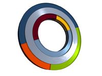
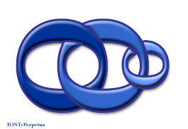
OOo Rings
OOo symbolized as rings. Outer rings with app colors and inner ring in metal finish.
Colors can easily added for new parts of OOo.
This time as 2D and 3D version for better visualization.
Graham Lauder
I like the reversed "S" bug that's used in the icons. Going for simple, with text and the application colours in the reversed S type shape. Modern design is going toward finer text so I've gone away from bold text. Font is Liberation Sans at 130% height
Direct link to Inkscape SVG source
This is one that I created back around the 3.0 launch, but this time I've done it in the 6:52:140 colour. Doesn't lend itself to Favicons/iconifying though, so I dumped it. That's what I thought at the time anyway but I've figured it out since. The text is probably too heavy for a modern logo. DejaVu Sans bold.
Direct link to Inkscape SVG source
Yorick 05:04, 10 October 2009 (UTC)
This one was designed to be a little bit out there, but I stuck with the colours! :) The intertwined Os represent how OpenOffice.org is an inseparable combination of the software, Open Standards and OpenSource and the Community
Yorick 11:59, 10 October 2009 (UTC)
This one was inspired by Niks cool freehand concentric circles design. Nothing else, I just wanted one that looked cool. Liberation Mono italic with a small adjustment to the kerning and the dot... square dots annoy me! :)
Yorick 12:34, 13 October 2009 (UTC)
Ivan Miskovic
Concept: Designed to maintain reasonable continuity with the current OOo Logo. The bird emerging out of the left-most 'O' symbolises freedom with OOo being one window through which freedom (in the sense of software) can be attained. It's just a basic concept at this stage; the bird's wings would need some work and the font itself has some oddities that would need to be sorted out (e.g. the character 'O' appears bulgy)
Font: Sacco-Vanzetti Web (OFL )
Bernhard Dippold
Just a first concept idea - no final design at all:
- Opening the "O" by addition of the gulls - visual expression of the "open" theme already used by the community in several places.
- Appearance of perspective by the different sizes and positions of the parts - a way towards future, our goals...
- Different sizes / positions: "Open" is the most obvious part - most important at first sight. "Office" tells about the content - what people get with the product. ".org" is smaller, further on the way to our goals: it stands for the community behind the product - striving towards our FOSS goals.
- Changing the mainly text based present logo concept (horizontal orientation) to a more square form - giving more opportunity to be used in other surroundings (round buttons, icons...)
- Adding "OOo" as acronym to the "official" set, so it might be used wherever is not enough place for the logo (favicons, web buttons) or where we just want to use a more specific branding bug than the gulls.
- Keeping the general impression (branding bugs and colors) near to the present logo, so people recognize it as consistent.
Some points not yet worked on:
- ".org" part is too small in smaller scales - didn't find a sans font with a larger cap height, that would allow me to keep the dot above the "i" while enlargening the ".org" without interference between "g" and "e".
- Still looks quite "oldfashioned" - blue might get a gradient (even if we must take in account how it looks in greyscale).
- Not quite sure, if the "o" in ".org" should be overlayed with the gull - might become too small to recognize.
BeDipp 09:50, 12 October 2009 (UTC)
Nikash SINGH
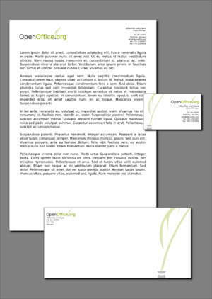
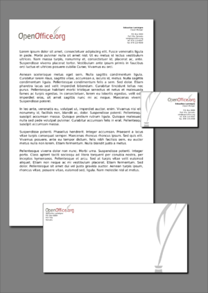
Just added about 4 Designs below, they all use Liberation Sans (I can't remember if this was discussed before, but LibSans seemed the most professional Free font, but I can *begrudgingly* replace it if need be. Each proposal below is also accompanied by a picture of how the logo might look on OOo stationery, this is not an accurate indication, it's just meant to give you an idea of how it sits on a page.
Rationale for "Free-O": These off-axis, asymmetrical and imperfect circles within one another were drawn freehand. I couldn't help but reflect how creating artwork freehand resembled the open, uncontrolled/ungoverned, free-flowing and unrestricted nature of OpenSource. The three "O"s are meant to reflect the OOo acronym and hint towards a "light at the end of the tunnel" metaphor (mainly the top one). Though they may look simple, the design has the potential to become easily identifiable and easy to deconstruct into branding bugs. I've also created a cleaner version using proper circles in case anyone wasn't too keen on the imperfect ones (they too are staggered, in order to create movement and visual-tension/interest).
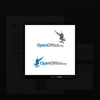
Rationale for "ElectricGull": This Design tests the waters. It's very techy and perhaps lacks a human-touch. It's a side-profile of a laptop, which is flying in place of the existing gulls in the logo. The freedom and open-air computing a laptop provides probably best reflects the ideas of openness and freedom we would want accompanying the OOo image. It's a modern spin on the existing logo and an attempt to attract the attention of the next generation of users.
Rationale for "Gotta fly": Hopefully the idea of a chair flying off to a meeting will bring a small smile to some faces. I tried to come up with a quirky and imaginative way of communicating what a truly open office would be like, and it don't get much more open than flying chairs. Despite the comic relief, so far this has been one of those images that makes people laugh a little and OpenSource software should suggest "fun" as well as "freedom". And due to it's unique shape, it's quite identifiable even when very small.
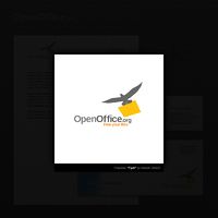
Rationale for "Flyer": Imagine an office SO open and in-tune with nature that the birds dropped the files off at your desk! While I sit and wait for that day to come, I'll leave you folk with my final proposal of our resident mascot dropping off a manilla folder to whoever else is out there waiting for a "Flyer" to come.
All of my proposals aim at communicating "Openness" and "freedom" while keeping some focus on the fact that we make Office software. I think it's really important that our logo says what we do, hopefully in a humorous way =)
Hope you like them. ;]
-Nik
--Overkill 18:00, 12 October 2009 (UTC)
Paul @ Dead End Cafe
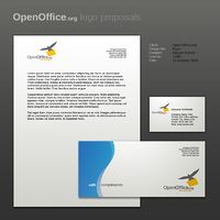
This design was simply another attempt to 'refresh' the OO.o logo design by re-interpreting the existing logo with various new features. A less stiff and cold font was used, the flat, impersonal shade of blue was replaced with a clean, fresh gradient and the stylized birds were replaced with a single gull silhouette.
The fonts used were all downloaded for free from www.dafont.com, though I'm not clear on whether simply being free is enough to be able to be used with OpenOffice. The gull was traced from a google-images photograph so again, someone will have to let me know the legality/appropriateness of this.
Thanks for looking!
Clemens Hamann
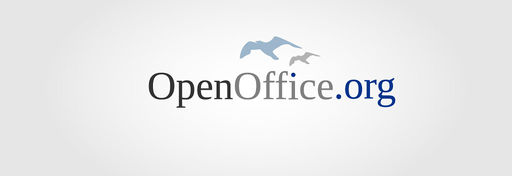
Theese are my first proposals for a new OOo Logo. I focused the current OOo Logo and created a new version by following new design guidelines: „Keep it clean and simple“. I used the Liberation Serif font to lighten the weight of the hole appearance. Playing with different grey tones underlines this effect. The OOo blue of the „i-dot“ and „.org“ gives it recognition value and makes the logo work well. Last but not least I gave the gull a new more interesting shape wich harmonizes with the typo-design.
Hope you like it ;-)
Christine Louise Beems
Christine sent me this one in a mail, so I put it up until she sorts a login and can edit herself
Yorick 21:09, 15 October 2009 (UTC)
Sébastien Lanteigne
