Art/Gallery/Logo Gulls
From Apache OpenOffice Wiki
The printable version is no longer supported and may have rendering errors. Please update your browser bookmarks and please use the default browser print function instead.
| |||||||||||
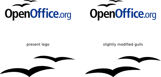
Slightly modified gulls in the OpenOffice.org logo
The OpenOffice.org logo contains a pair of gulls above the written text that fit good at this position.
But if they are used as separate graphical elements, they look not really symmetric when they are enlarged.
I modified these gulls a bit to have a more harmonic visual impression when they are used without the wording "OpenOffice.org".
Source: source as SVG file
