Proposal by Johannes Eva
|
|
|---|
|
Quick Navigation
Team |
| Please do not edit this page unless you are the original author. Your feedback and comments are welcome in the Comments section below or on the ui@ux.openoffice.org mailing list. |
Design Proposal "Martinů"
The following design proposal is part of the collection of design proposals for “Accessing Functionality”, which is part of Project Renaissance.
Summary and Status
| This project is named "Martinů" in honor of the Bohemian (Czech) Composer Bohuslav Martinů. |
| Warning: I am not a graphic designer! All UI mockups are here just to clarify an idea, and are not supposed to be taken seriously in terms of graphical artwork. |
Status: Complete
Mockups
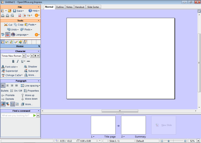
1024x768 with full sidebar
- The size of the picture is 1024x729 pixels. I have taken 39 pixels away in height: it is the size of the taskbar in Windows 7, which will probably be the standard when Renaissance becomes reality. The two standard panels in GNOME would take even more vertical space: 50 pixels height.
- This layout leaves more space for the document than in OOo 3.1.
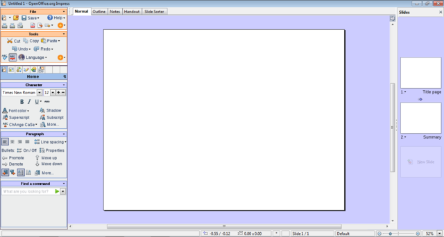
1366x768 with full sidebar
- The size of the picture is 1366x729 pixels. As in the precedent mockup, have taken 39 pixels away in height for the OS taskbar(s).
- Why 1366x768? It appears to be the tendency for laptop panels, replacing 1280x800, and it is an example of a 16:9 ratio screen resolution. More explanation in the detailed description.
- I should have made the "Slide Pane" larger. There is plenty of horizontal space for it. (It would take a lot of time to correct, so please imagine it!)
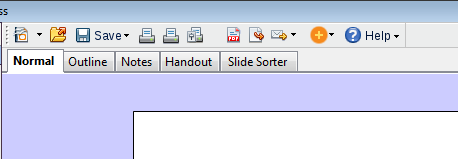
- It looks really ugly, but I tried to "toolbarize" the view tabs. (Normal, Outline, Notes, Slide Sorter) As a toolbar it can be moved around - vertical, for example, it would eat less space. But my main point is that now, toolbars can also be added on the same "line", therefore not loosing space:
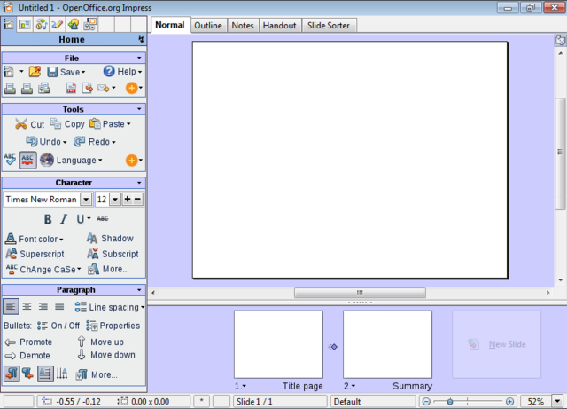
800x600 with full sidebar
- If the vertical size of the Impress window goes under 700 pixels, the "Find a Command" group disappears.
- The size of the picture is 800x576 pixels. I have taken 24 pixels away in height for a taskbar.
- I should have reduced the height of the slide pane at the botton, it is the same size as in 1024x768. Please imagine it a litte bit smaller!
- This mockup has 600 pixels in height, and hence shows how the design adapts to notebooks screen resolutions.
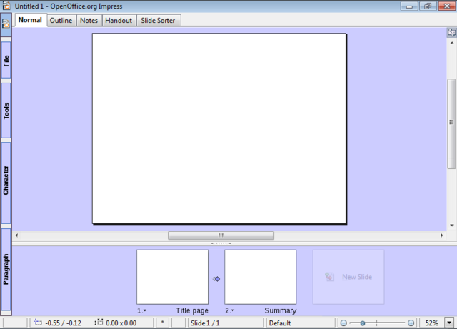
800x600 with collapsed sidebar
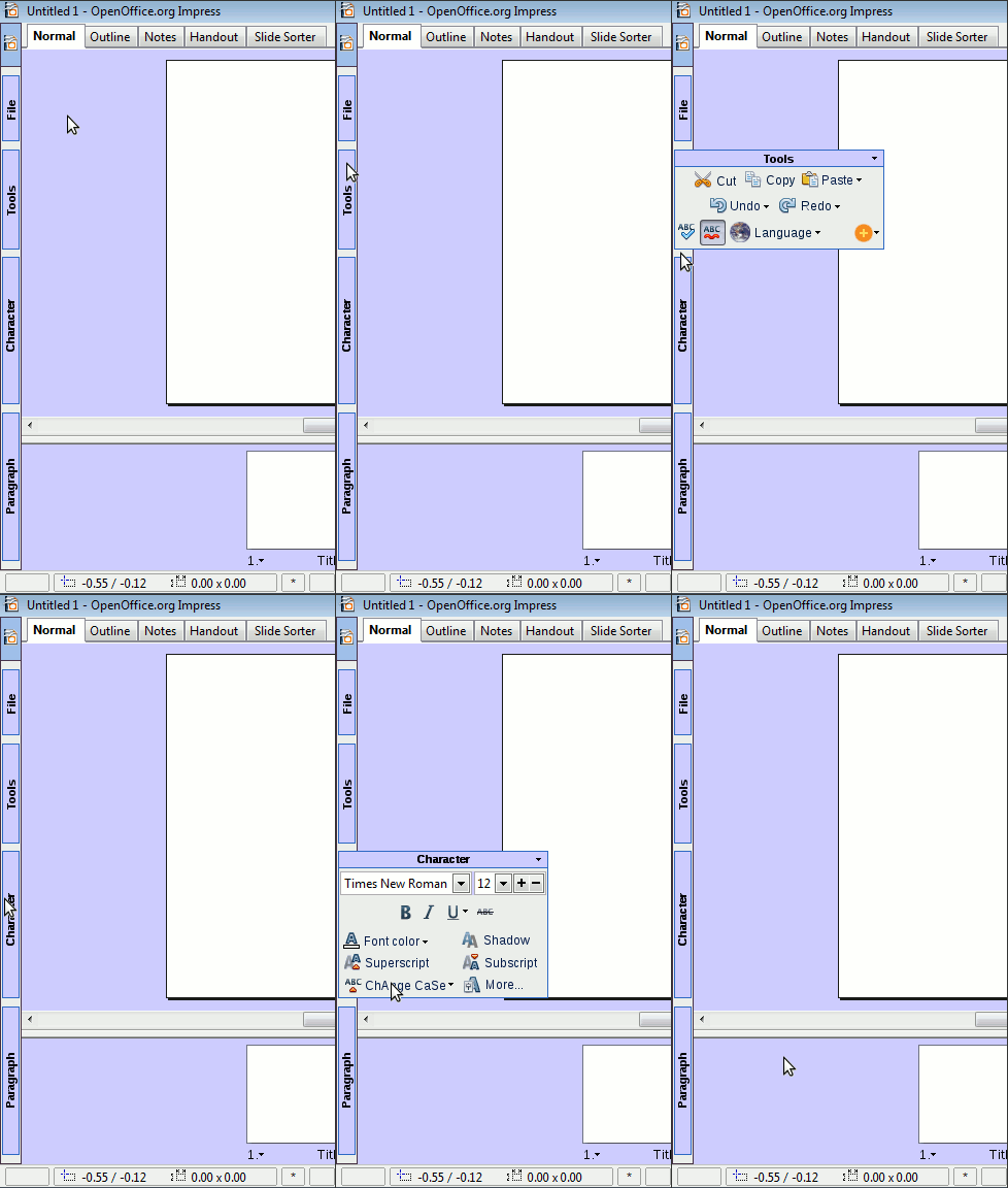
- In any resolution, the sidebar is able to collapse.
- Here is a proposal about how the collapsed sidebar could work:
(Sorry about the poor quality, it's the first animated picture in my life...)
- The collapsed sidebar would allow to go under 600 pixels height.
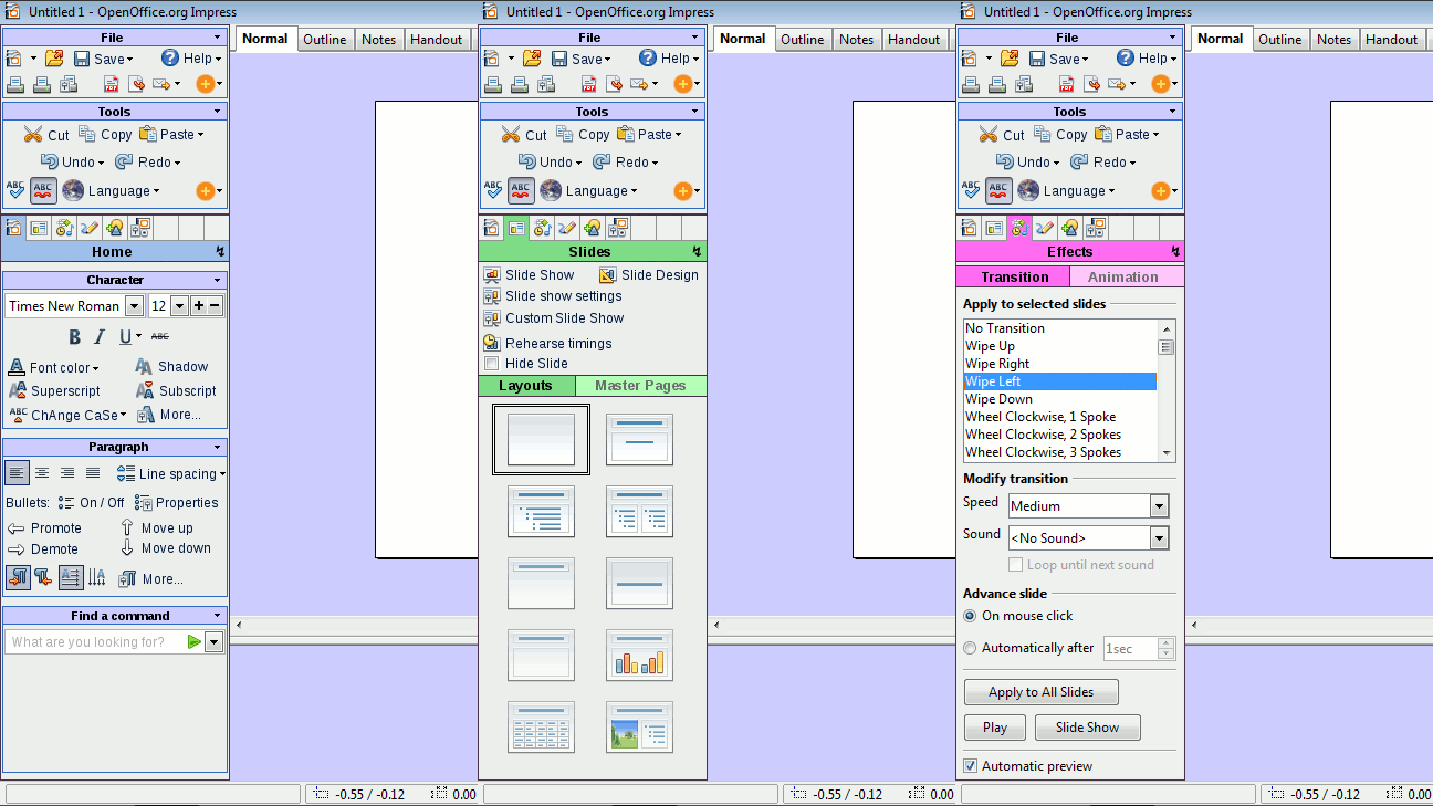
How the Sidebar Selector works...
- This is a variation on the sidebar theme, where the "File" and "Tools" groups stay on top of the sidebar. It was also influenced by comments from Brian Fleeger and Corsbu.
(Animated gif, 3 frames)
More Mockups... Writer!
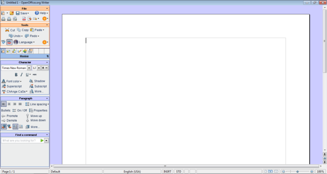
The focus of the call proposal is Impress. Nevertheless, Writer is interesting too, because it suffers more than Impress of the wide-screen trend. The page is mostly vertical (portrait), and there is no Slide Pane element. Two major differences!
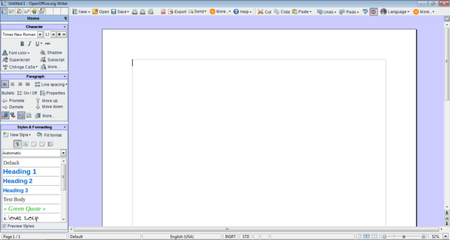
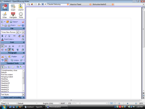
The current Writer aspect eats up a lot of vertical space, and leaves huge chunks of unused space on the sides. Here is how Writer 3.1 looks like on a 10:9 wide-screen monitor (1366x768):
A vertical UI would allow to display more of the most important element: the page!
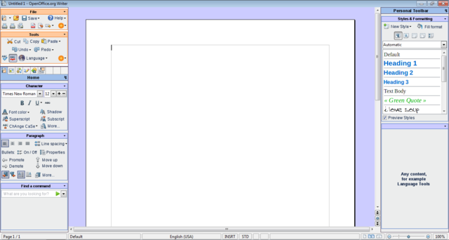
If we have 2 sidebars, we end up with the same zoom as in the first Writer mockup (100%), but with a 23% displayed page height increase:
Here comes the last general mockup. Unless other mockups, this one has almost everything:
- Toolbars, wich expand with text labels, as wide as possible,
- Ruler button, to show/hide the rulers easily,
- Zoom control, possible to type in zoom, or use left-click,
- Styles with preview,
- Sidebar, of course :-)
Detailed Description
- This proposal takes its roots in some basic ideas. I will detail some of them here.
- You may notice than some points are more detailed than others, regardless of their importance. One reason for it is that on some subjects, I am using material I had already written - for example the "line spacing" part. Let's start!
A. Modern wide-screen resolutions
1. Laptops
- There is a clear tendency in screen resolutions in favour of wide resolutions. Laptops have almost all wide resolutions by now, the newest adopting even wider resolutions like 1366x768 (Dell Studio 15, Studio 16, Inspiron 15), which seems to be the new standard, instead of 1280x800, 1600x900 (Sony Vaio FW Series) instead of 1440x900, or 1920x1080 (Dell Studio 16, Sony Vaio AW-Serie) instead of 1980x1200.
- I just goggled around, just to find an article showing that the 4:3 to 16:10 to 16:9 is not my own fantasy:
- Laptop have topped Desktop computer sales since Q4 2008. So they can't be ignored.
Notebooks Top Desktop Sales Ahead of Schedule
2. Desktop Monitors
- TFT monitors are following the same tendency as laptop screens. 1920 x 1080 is the new standard for big monitors, instead of 1920x1200 for the "old" wide-screen format, and 1900x1600 for the "old" non-wide resolution.
- This wider screen tendency has been around for some month, and shows no sign that it shouldn't be taken seriously.
- Don't blame me for screens getting wider, personally I don't like it! But these are facts, we can't ignore them. By the time Renaissance will be implemented, 16:9 will be more probably a standard than 16:10. 4:3 monitors will probably be hard to find.
3. Conclusion
- Why all this text about wide-screen resolutions? Well, because in all the UI discussions and drafts I have seen by now, it has not been taken into account. While people are working mostly on vertical sheets of paper (I'm speaking mostly of Writer) screens get wider and wider and the UI doesn't adapt and takes vertical space away, leaving big chunks of the screen unused, left and right of the virtual sheet of paper. (And this empty space is filled with the depressive "Battleship Grey" application background color!)
- Personally, I also regret that the target or the proposal is Impress: Impress is an exception in OOo because the “paper” will be mostly horizontal. But as most people using OOo will use Writer, and a fewer proportion Impress, I really think that the design should be adapted to wider screens, if we want to archive a UI uniformity between the OOo applications. Most thoughts about my design proposal were targeted to Writer – I was surprised that the design seems to works really well in Impress, too.
- I wonder why the resolution for these drafts is 1024x768: try to by any consumer laptop or TFT with this resolution nowadays - it's almost impossible! 1280x768 or even the new 1366x768 would make much more sense.
- If someone would be able to send a screenshot of a default OOo Writer or Impress window (maximized) at a 1366x768 resolution, I would be happy to link it here.
- This Wiki template, if viewed in a maximized window with a 1280x800 resolution (my case), is hard to read. The lines are too long!
B. Competitors
1. Microsoft Office
- If you are not familiar with Microsoft's new "Microsoft Fluent User Interface" aka "Ribbon", here are some very interesting links where you can find more information:
- Microsoft Office 2007 UI presentation:
The Microsoft Office Fluent user interface overview
- How does the Ribbon scale down?
- A great video about the creation of Office 2007 new UI:
This last link is a video about the design of the ribbon interface. It shows many interesting UI prototypes, as well as useful data.
- I was specially interested by the vertical "ribbon" UI drafts.
(I think the examples are small and a case of fair use, thus no being copyright infringement. If you think I'm wrong, please remove them or contact me.)
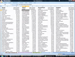
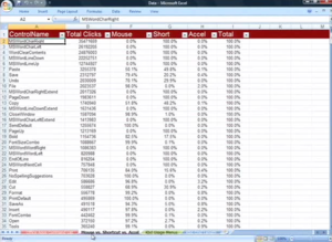
The video “The story of the Ribbon” includes useful data about user interaction surveys. Basically, the data describes the most used commands in Word, Excel, Powerpoint, and if the interaction was done with the mouse or the keyboard.
I hope that the "OpenOffice Improvement program" will soon provide data of comparable quality.
I would like to highlight one detail about the “The story of the Ribbon” video. At one point (Minute 48), the narrator tries to explain why they didn't end up with a vertical design in Office 2007.
The arguments given by the narrator couldn't really convince me, and my paranoid nature ended up believing that they already had in mind that some day, it would be possible to use the vertical space for displaying... ads! And that may have been one good reason for making the UI horizontal, leaving a lot of space for vertical advertising. We will see what happens with Microsoft Office "Web" 2010.
One more reason: at the time Office 2007 was developed, something else that would have taken space on the sides of the screen was going on: the Windows Vista Sidebar. Having the Windows Sidebar was already limiting horizontal space, so that it was clear that the Office 2007 UI could not be vertical.
| Q. Why design a vertical UI in times where the market leader has a successful horizontal UI? Don't you think that the guys at Microsoft had good reasons for it? |
| A. Remember than at the time Microsoft was designing Office 2007, back in 2003 – 2004, the 16:10 and 16:9 screen ratio tendency was not actual. The 16:10 tendency had started maybe, but nobody was thinking that 16:9 would ever be adopted on computers. When thinking about laptop and small screen sizes, the common thinking was that the resolution would go from 1024x768 to 1280x800, and then 1440x900, even on 13 inch laptops. Office 2007 UI is not a real pleasure to use with a 768 pixels height, but it is ok with 900. Note that all the prototypes they were making were in 1280x1024! |
What I personally like a lot in Office 2007 is that there is a lot of text. I don't remember icons very well, and as I could observe while watching to ordinary people using computers, neither they remember the signification of a lot of icons – except the classical B, I, U, font, paragraph alignment, save and print.
To be honest, in Writer, despite using it quite a lot, I never know which one is Font Color, Highlighting, and Background Color. An icon with text, or even text only would really be much more useful to me than an icon only. Even Office 2007 has too much icons and not enough text for me. Look at Windows 7, for example. It has much less icons and more text than previous Windows versions. To me it is much better.
2. RedFlag RedOffice 4.5
Have a look here for a swf presentation of the RedOffice 4.5 UI.
Or here for my older review of 4.0 beta.
I don't understand Mandarin, but Google translator helped me a little. New features of version 4.5 seem to be mainly support of Office 2007 file formats, new color management, and smaller UI changes. But please don't take me as a reliable source of information about RedOffice !
Though I couldn't use it a lot due to evident linguistic limitations, I like the RedOffice UI very much. It is obvious that the RedFlag team made a great job.
However, due to the compactness of the Chinese writing , it seems difficult to adapt the UI without major changes.
3. IBM Lotus Symphony 1.2
I am not really convinced by the sidebar in Lotus Symphony. First reason is the rather poor screen space management. For example, if there is an UI element everybody knows, it is the Font dropdown menu. There is no need to write "Font:" on it... Same thing for other really obvious UI elements. (It is the same, but not that worse, for Microsoft Office Mac 2008)
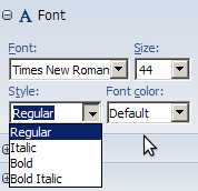
The other reason I'm not convinced it that in many cases the sidebar simply duplicates the normal toolbar elements. In some cases, it is even worse: the Font Styles dropdown menu, for example is absurd. It is just more complicated and less intuitive than the traditional [B] [I] [U], without any other advantage - it even doesn't take less space.
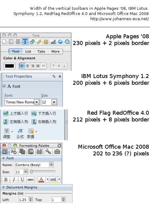
4. Sidebar width in different Office Suites
Here is an image I pasted together last February, as I was working on my first design.
C. My proposal: "Martinů"
As you probably guessed it by now, my proposal will feature a vertical toolbar / pane / sidebar / menu structure. Personally, I prefer to use the "Sidebar" term, as I don't really like the word "Pane".
| Q. Won't it be too difficult for users to adapt to a vertical menu structure? |
| A. In fact, many users are already used to vertical menu structures. They are present in a lot of software, for example designed for Apple. Here it can be useful to remember that Macs especially have the reputation to be easy to use. Good examples for existing vertical menu structures would be Apple iWorks or Microsoft Office Mac. Of course vertical menus are not only present on Macs. The GIMP, for example, as well as most image manipulation programs, have vertical UI elements.
The OpenOffice.org based Chinese office suite RedOffice has already made the jump to a vertical menu structure, so that it would be useful to ask them for user feedback. |
| Q Hi Johannes! I guess you might elaborate a bit more on your assumption that Macs and specifically iWork rely on vertical menus solely. As a Mac and iWork owner I very much disagree that the vertical menus are the things that make the e.g. Keynote UI simple. Apple is extemely good at applying the 80/20 rule "80% of the users constantly use only 20% of the functionality". That makes basic and frequently used tasks very simple since they are eassly available through large "buttons" in the UI. However, if you need to dive into some more advanced tasks that require functionality that is less frenquently used, then you need the inspector. The inspector itself could be compared to a "side pane" and is a consequence that iWork actually ran out of horizontal space and needs another location to put functionality in. |
1. The sidebar selector
The main problem that came out designing a vertical IU is: how to select the content of the sidebar? In the "Story of the ribbon", for example, there are some funny design proposals:
- leaving the tabs horizontal on the whole screen width
- grouping a text menu at the bottom of the sidebars
Both of them are imperfect, and at first I didn't want to have icons only, because it takes a long time to the users to learn what they mean, and text is more intuitive.
My first "sidebar selector", a mixture between the one in RedOffice and the Preferences dialog in Firefox looked like this:
The problems of this sidebar selector were: to keep its vertical size (height) acceptable, I had to limit the elements to 6, which is not enough. With 9 Elements, it was too tall. For the curious, the whole old design + sidebar (for OOo Writer) was like this:
The main flaw of this old design is that the group labels are under the group. Very unintuitive! The main Idea did not change in the current proposal, though.
Finally I had to accept leaving out the text, and adopting an approach which was more like The GIMP, Apple Pages or Microsoft Office Mac, with small icons. I still think that text is important, and unlike in the software I just named, the name of the current sidebar should be clearly displayed.
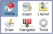
When the mouse goes over an icon in the sidebar selector, the text should change (maybe a very fast, smooth blend effect) and be displayed transparently (as in the the "add new slide" feature), until the user clicks "definitely".
Maybe color themes would help the user to identify each sidebar with its title and icon.
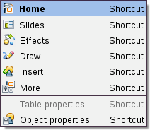
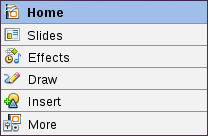
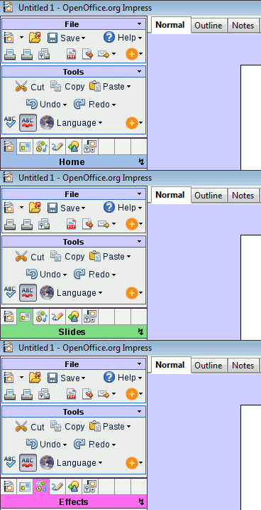
A single click (left / standard click) on the text ("Home", "Slides", "Draw", ... all the colored area) should pop down a menu with a list of all the possible tabs, with their keyboard shortcuts:
The lightening ↯ icon (or whatever, ▼ / ▾ are more standard) is a button with general sidebar options - equivalent to the right click. It should display a menu with these kind of options:
┌────────────────
│ Undock Sidebar
│ Duplicate Sidebar
│ Close Sidebar (only if there are more than one)
│ ────────
│ Sidebar preferences
└────────────────
1.1. The sidebar selector - alternatives
The sidebar selector is THE major design problem in this project. Here are some alternatives.
- Alternative 1
You already know it, it's my first choice.
Pros:
- Small vertical space
- Consequence of this: it can be used in more than one sidebars, on bigger screens. Each sidebar its sidebar selector.
- Design already used, for example in The GIMP, Microsoft Office Mac and Apple iWorks - though text label works differently). (Remember that Apple software has the reputation to be easy to use!)
Cons:
- Small icons, mouse click must be precise. (good keyboard could shortcuts help for this)
- Alternative 2
Here is an alternative, which I don't like that much because it takes a lot of vertical space:
When a table/picture is edited, a line is added.
- Alternative 3
In the comments Brian Fleeger proposed a design which is like FLUX UI, "accordion" menus. « Except that instead of the accordion being horizontal, you could make it be vertical. That way would allow you to use full horizontal text labels for each of your sidebar selector sections. » (Basically, the same as the Tasks pane in current versions of OOo Impress, or Microsoft Outlook.)
I'm not convinced because that implies that the selector/label, has no fixed position. Sometimes it's at the top, sometimes at the bottom. (In FLUX UI, sometimes right, sometimes left.) This will confuse your Aunt Dorothy, as it will confuse many basic users. Really!
I am convinced that the selector/labels should stay at the same place and not wander around.
- Alternative 4
Another Sidebar Selector alternative would be this one:
It needs one empty block for table/picture edition. One or two other blocks maybe for navigator / find&replace / gallery.
This alternative design would be my second choice, after the "Alternative 1".
- Alternative 5
The fourth alternative is the one used by Constantin Bürgi in his "Complete Sidebar Design". Proposal_by_Constantin_Bürgi.
Basically, the Sidebar Selector consists of vertical tabs.
In fact, I have mixed feelings about this idea.
Pros:
- Good real estate management, it is vertical :-)
- The surface is big & easy to click.
- Possible to use full text, or maybe icons + text.
Cons:
- I'm not sure that it is intuitive and won't confuse basic users.
- Conflicts with the collapsed sidebar design!
- The tabs will be in front of groups of icons, which they will be automatically assimilated to. For example, the "Insert" or "Options / More" Sidebar Selector tab could end up in front of the "Paragraph" group. This would be really confusing.
This last point would also imply "managing collisions" of groups and tabs in all sidebars, for not ending up with confusing situations.
I'm not really sure that this Sidebar Selector design is really better than Alternative 1 or Alternative 4.
2. The sidebars
The proposed organization I have for Sidebars is the following:
A. Home
B. Slides
Layouts | Master Pages
C. Effects
Transition | Animation
D. Draw
E. Insert
All | Table (| Chart)
F. More
Options | Notes (| Navigator)
(G. Navigator)
(H. Search)
(I. Gallery)
The order of the groups inside each sidebars should be configurable.
The user should also be able to change/modify/add elements inside each group, as well as make his own groups, and his own sidebars!
2.1 Sidebar A: Home – The "File" Group
My option for now is to have a two or three lines menu group, featuring the most used actions:
The "Round Orange +" button would give a dropdown menu of all less used options, in this example:
┌────────────────
│ Recent Documents
│ Wizards
│ ────────
│ Reload
│ Versions
│ ────────
│ Properties
│ Digital Signatures
│ Templates
│ ────────
│ Preview in web browser
└────────────────
How to know which elements to put directly accessible in the menu group, and which one in the "Round Orange +" menu? Well, as no one has a perfect answer to this, the best thing would be to wait for the results of the "OpenOffice Improvement program".
Therefore, the "Martinů" proposal as it is now is not at all intended to be anything reliable, it's only a vague idea, which should be improved by real user data as base.
The round "Help" button should show the content of the "Help" menu in current OOo versions.
The two printer icons shouldn't be looking the same. One is the "Print File Directly", the other the standard "Print…" dialog.
Update: The "File" and Standard Tools group should always be visible. Therefore there are two solutions:
- The groups should be above the "Sidebar Selector":
- Or we could use toolbars for these 2 goups. Probably only on the same line by defaut. Here an example with the "File" group:
In the comments, RiotingPacifist proposed a combination of both, so that the « sidebar groups would allow users to simply move the groups to the top and use them as toolbars ». This "fusion" of the two solutions is probably the best thing to do.
2.2 Sidebar A. Home – The "Standard Tools" Group
The ugly "planet" icon should open a dropdown menu with the options in "Tools → Languages". (Thesaurus, Hyphenation, More dictionaries.)
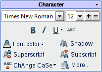
2.3 Sidebar A. Home – The "Character" Group
NB. I did borrow the [+][-] font size idea from Miroslav Mazel. (I don't know if it was his creation, though.)
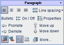
2.4 Sidebar A. Home – The "Paragraph" Group
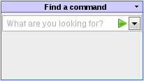
2.5 Sidebar A. Home – The "Find a Command" Group
If a user doesn't find a command, he can search it here. This Group should have a minimal size of two or three results should be able to expand if there is enough vertical space.
I have no time right now to imagine how the result list could look like. Not so easy problem which maybe goes beyond the scope of this proposal ;-)
Update: This has apparently been discussed at the ux mailing list, and already has a Wiki: User Experience/Command search
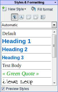
2.6 Sidebar A. Home – The "Styles & Formatting" Group
This group is for Writer, not for Impress. I would like to include it in my proposal because I think that it would be really important to have a new version of the "Styles & Formatting" dialog.
In this mockup, I only added the Styles preview, but actually, the current concept, with icons AND a dropdown menu to selects the styles in the list, is un-understandable by any normal user.
Anyway, styles preview would make this dialog definitely more friendly, and please, colors!
3. Details about a small subject: line spacing icons
I would like to take line spacing as a usability example. The line spacing icon shows a very different implementation and behavior depending on the platforms and office suites.
Basically there are two methods for displaying the line spacing icon(s). On one side, Office 2007, Pages '08, and Lotus Symphony, which display only one icon with a dropdown menu. On the other side, Office Mac 2008 and OOo, showing 3 icons and only 3 choices.
- Microsoft Office Mac 2008:
- OpenOffice.org 3.0:
- Microsoft Office 2007:
- Apple Pages '08:
Apple pages offers the most complete range of choice for line spacing in its "inspector" menu:
- IBM Lotus Symphony 1.2:
Though Lotus Symphony has a dropdown menu, it offers only 3 choices. A line space of 1.15 or 1.25 is not possible via this icon/dropdown menu.
Conclusion: My favourite implementation of the Line spacing "problem" is the one chosen by Office 2007. It does take only a small amout of space in the UI, whilst offering a clear and wide range of options.
Three icons as in OOo and Office Mac 2008 definitely take too much UI space, without offering enough options and being clearer. And why only these exact 3 choices? Is 1.5 really more useful than 1.15 or 1.25? Intermediate values are really useful.
At least in Office Mac 2008 there is a text description saying "Line spacing", which is missing in OOo.
PS. I just checked RedOffice, here is how it looks like:
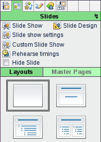
4. Sidebar B: Slides
This is an example of how a sidebar can be subdivided. Whether the user selects "Layouts" or "Master Pages", the bottom part of the sidebar changes. It basically acts like a tab. In this case, the color code makes it really intuitive.
The layouts could be really simplified and we wouldn't need that much different thumbnails if we would adopt the very smart behavior of Microsoft PowerPoint (and maybe others). In the layout thumbnails, only make the difference between an object and a text field. Then when the layout is applied on a slide, have a list of objects to insert as buttons, directly on the slide:
[Icon] Table
[Icon] Chart
[Icon] Pictures
Once the user creates one type of object, the list vanishes.
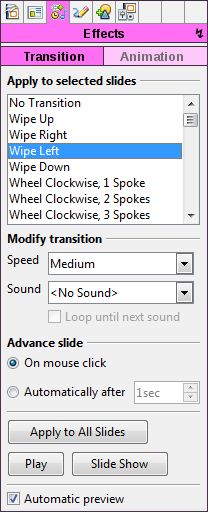
5. Sidebar C: Effects
This sidebar has to subdivisions: Transitions and Animations.
For now I just copied and pasted the content of Impress 3.1 inside of the panel. Improve it would be a whole project per se, and is not in the scope of this page.
(Yeah, the pink is just... too pink. Keeps one awake!)
6. Sidebar D: Draw
This sidebar should have to subdivisions:
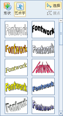
Drawing and Fontworks.
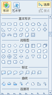
Again, I don't have time to make a mockup. But basically, it should work these screenshots of Redoffice:
I like this big list of drawing elements: it is much more easy to find a good shape in a big list than in all the small menus of Impress.
7. Sidebar E: Insert
Chart, Table, Pictures from file, Scan, Clipart, Header & Footer, ... no time to make a mockup, but it could be a really nice and sidebar!
7.1 What happens when an object is inserted/selected
Update: until now, I had no time to give more details on what happens when an object is inserted. Comments by Thibaut convinced me that I should give more details...
When an object has been selected / inserted / drawn, the current sidebar should change to an "Object Properties" sidebar.
An icon should appear in the last box of the Sidebar Selector, so that the user can leave and return as many times as he wishes:
![]() (Yes, the yellow is probably too yellow...)
(Yes, the yellow is probably too yellow...)
The items in these contextual sidebars depend very much on what kind of object is selected. For example, (and to answer to Thibaut's comments) that's the place for these icons: ![]() .
.
These were Alignment, Arrange, (de)group. If a picture is selected, all the picture filters, crop, shadow, etc. should also be in this sidebar.
As much as possible of these functions should have icon + text. It could be a really nice & useful sidebar!
Tables: The same could be done for tables. The table contextual sidebar could have two subdivisions. One subdivision being the "Table design" Task Pane in current OOo versions. The other subdivision would rather reflect the content of the actual "Table" toolbar. With text labels!
(Same thing for Charts?)
NB. As a picture can be nested in a table, maybe the two last boxes of the Sidebar Selector should be empty by default, to accommodate both a object property sidebar and a table sidebar?
8. Sidebar F: More
Options that don't fit anywhere else, Page setup, View (Grid, Rulers, Guides, Black & White/Grey/Color), ...
Maybe other sidebars for
G. Navigator and Gallery (two subdivisions of the same sidebar?)
H. Search & replace
9. Generalities about the Sidebar
The Sidebar should be configurable! In my imagination, there should be a way to move the Groups inside (or outside) the sidebars - similar to the "Customize Toolbar" in Firefox. It should also be possible to choose which elements should be displayed or not displayed inside each groups - OOo does that already in traditional toolbars.
As in Apple iWorks, there should be a possibility to have more than one sidebar, as well as to undock sidebars. This would it make possible to have one sidebar with the "Home" view, plus a second with, for example, drawing elements. (one beside or above/below the other, or floating / undocked.)
It should be possible to dock the sidebar left or right.
10. The "Slides" panel
In the default configuration of my project, the "Slide Pane" would be horizontal at the bottom of the screen, instead of vertical on the left as in previous Impress versions. It always seemed logical to me, as it gives a "temporal" vision, as in video editing software. Of course, it should be able to be moved vertically, to accommodate wider screen resolutions. (Sony P-Serie anyone?)
Note the "New Slide" feature, which is a little bit like the "New Tab" icon of some modern web browsers.
The transition symbol between the slides miniatures should be clickable, and should open the transition sidebar.
Miroslav Mazel (Iced Coffee) seems to have interesting ideas about the visualization of the slides transitions.
As many people don't use the right-click, the slide number should open a menu with the right-click options.
11. About the status bar
Personally, I love to use directly the status bar for selecting the language. I use it a lot. It is fast, and the actual language is always displayed, which is really useful. The page count is also very useful, not to speak about the indispensable zoom slider. By the way, I am not really enthusiastic about the Gear Stick zoom slider, which seems to be really complicated.
Nevertheless, the zoom slider should be enhanced by an precisely editable zoom, as in the GIMP.
The right bottom corner will be the geographic place of the zoom, so there is no necessity to put other zoom elements in the UI. (No zoom option in a View sidebar, for example. It would just be duplication of existing options.)
Please keep (and enhance) the status bar!
12. About the rulers
In Impress, the rulers are already hidden by default, which is a good thing. Nevertheless, the addition of a ruler button could be useful.
In my opinion, the rulers should also be hidden by default in OOo Writer. I wrote a detailed article about it, here it is!
The rulers could be animated when they slide away to the side, as the GNOME panels - so that people know "where they go". Here is a screen capture of a GNOME panel, mapped with an OOo ruler screenshot:
GNOME Panel mapped with OOo ruler bitmap (I can't upload ogv / Theora files, so it's an external link.)
- One rule of the game was not to add new features, and I already cheated enough. So I don't have any mockup for tabbed documents. I have to mention that I like Miroslav Mazel's ideas about the tabs very much.
- About the menu bar / File menu on MacOS: by default, the most minimalistic will be fine. What about only "Exit"?
For UI backward compatibility reasons, it should be possible to enable the old menu bar on MacOS. (Not "toolbarized" as on other platforms - See Section 15.)
14. On the way to Renaissance
While being really interested in the Renaissance project, sometimes I wonder if a new IU would really be the most needed and urgent improvement for OpenOffice.org. Some days ago, I stumbled about this page: DirectManipulationSnippets and thought that this would be a incredibly useful feature for OOo. As well as a new color selection tool, anchor selection for notes, "live preview" or a better Office 2007 file format support. In fact I am missing these features much more than a new UI.
Anyway, I'm wondering how, with the relatively small manpower of the OOo, Renaissance could be implemented. Wouldn't it be interesting to have a smooth transition to the new UI? Many things could be implemented in transition versions of OOo, Renaissance could be an evolution instead of a brutal change. In fact, a good UI project could be like a final target, and would give to OOo a global direction.
Here is the things I am dreaming of in OOo, on the way to Renaissance:
- DirectManipulationSnippets
- New Color selection tool / color management
- Anchor Selection for [Notes].
- Better OOXML / Microsoft format support
- "Live preview"
- New "Find & Replace" dialog, as a sidebar. Or at least not on top of the text being searched!
- Save George's time by implementing the two things discussed in point 16. (see below)
- Change gradually the toolbar contents to reflect the data from "OpenOffice Improvement program".
- Change the toolbars to have text beside icons when the screen is larger - use the whole width of the OOo window when possible.
14.1 More about toolbars
Some details on the last two points.
They could be implemented on the way to Renaissance, in the 3.x branches!
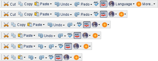
The toolbars should have labels beside the icons. Each toolbar should expand to the maximum possible within the OOo window.
The labels should be displayed depending on the size of the toolbar:
| Q. How to give priority to some labels over others?
A. Well, once more, the reference should be the ongoing "OpenOffice Improvement program". The results of this program hopefully will give us reliable data, so we know which labels should appear/disappear first when the toolbar size changes. |
Not all icons should have labels beside them, even if there is enough space. [B], [I], [U] are the best example. In the above example, I thought that the "Spelling and Grammar" and "Autospellcheck" icons were clear enough. (Though that could be disputed.)
Please note: Unfortunately, I will have no time to actualize all the mockups on this page, which should reflect this paragraph.
15. Backward compatibility & personalized toolbars
Backward compatibility is not a term that is often used for UIs. I think that a new UI for OOo could and should be backward compatible.
For example, the "Martinů" proposal could be backward compatible. How? Just by keeping the possibility to use the old toolbars and menus. For people needing it, it would be possible to keep the standard menu and toolbars! They just would fit perfectly in the "Martinů" design, at the same place than they always have been.
Why not? I am pretty confident that the users would get smoothly used to the sidebars. It would be a good thing for the development, because the sidebar could even be only an extension first. (No idea these kind of extensions / plugins are possible.) It would not break anything old. Renaissance could be a smooth transition, for the users and the people making it.
Upadate: A picture is worth a thousand words...
Here is the "toolbarized" File menu:
The File menu should not be shown by default! It should, of course, be advertised in the help pages, and also in general advertising concerning Renaissance not breaking "UI compatibility".
Here we have the same with a "File Group" toolbar:
In OOo releases prior to Renaissance, the toolbars should follow a gradual evolution, depending on the statistical results of the "OpenOffice Improvement program". The first version of OOo with a Renaissance UI should not disturb the user by radically different menus.
- I also think that it is important to keep the possibility to make personalized toolbars:
(This mockup is a tribute to the UI proposal by Philipp Lohmann.)
And here comes the last addition, or "full compatibility mode": :-)
NB. Unfortunately, I am not skilled at all in the accessibility field. But keeping the an optional file menu as well as backward compatibility in general is probably a good thing for accessibility.
16. The most important part - Georges tryes to open a .odp file
Have you ever observed a normal user opening a .odp file? I will tell you about things I have observed many, many times.
Well, first, a lot of people who open a .odp don't want to edit it. I would even say, most of the users. They probably don't know what a presentation is. (I'm not joking!) They don't know that you can either play it (Slide Show) or edit it.
The standard user - let's call him Georges - is opening this damn file because a friend of him sent a funny picture slideshow by email. Georges has no clue what software to use to open it, and no idea that OOo Impress is not exactly the same than OOo Writer.
If he is lucky, the file will open correctly in Impress. And now? What? Georges is perplex.
If Georges has time / patience / really wants to see the pictures, he will click every thumbnail, one after another, to see all the pictures. There are very few chances that he hits the F5 key, or clicks the Slideshow button.
If he does (or someone tells him to ;-) click the Slideshow button, unfortunately, he will land in the fullscreen mode. Surprise! There are no hints about what to do, and even no hints about how to exit! Many users don't know about the [Escape] key. I have seen users who wanted to exit go through a whole presentation because they didn't know any other way to exit!
Conclusion. This part is maybe the most important of my proposal! There are 2 solutions to the problems in the Georges scenario:
- 1. In full screen mode, there should be a menu by default. Something like in GThumb, for example, that automatically hides after a few seconds, but only in a corner. It should at least have a clearly labeled "Exit" and "Next Slide".
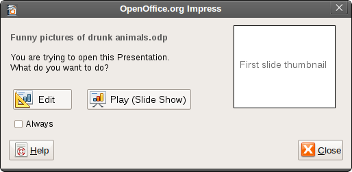
- 2. It is very important that a simple dialog shows up the first time a user opens an .odp file. So that the majority of the users who just play .odps are able to play them! I could be like the following dialog:
Advanced users, who always want to edit their .odps, would only have to check the "Always" checkbox.
17. OpenOffice.org online?
Sometimes I wonder if there are any plans to "export" OpenOffice.org online. I mean, having a Zoho / Thinkfree Office Live / Google Docs / Buzzword equivalent. And also, maybe even more important, a "Microsoft Office Live Workspace" equivalent. I'm dreaming, I know... but in my dreams, the design of Renaissance should take in account that hopefully some day, we will have an online version of OOo...
PS. By the way, Zoho Writer has a VERY interesting new UI - try it out!
Author or Team Working on This Proposal
| Author / Team Member | Contact (OpenOffice.org login name, used for email) |
| Johannes Eva | OpenOffice.org Login Name |
Comments
| Community members, this is where your comments and questions concerning completeness and clarity should be written. Please add your OpenOffice.org login name to let us contact you via email. |
| Hi Johannes, your proposal is nice!
One idea that strikes me on all the sidebar proposals here: Why not make the sidebar itself a scrollable area? The most frequently used panes can be positioned at the top, so they are always visible, while the less frequently used ones can be positioned lower (in descending order of importance) and can thus still be accessed in a consistent manner, simply by giving the scroll wheel a flick. This way, there will be no need to divide up functionality into "basic" and "advanced" and introduce another conceptual barrier that way. Everything will be just in one place. And if you look for something that you rarely use: Just scroll down. Regarding behavior: Of course you should not have to click the sidebar to give it "scroll focus" (like Windows XP does). Rather it should work like scrolling in Mac OS X, where scrolling always affects the area under your mouse pointer. I acknowledge that you'll get the problem of scrollable areas within the scrollbar. One approach to solve this would be to just extend those to their full length and get rid of their own scrollbar altogether. One other approach would be to apply a different mechanism to them that wouldn't interfere with vertical scrolling (for example horizontal scrolling, or horizontal tabbing/paging). I'd be glad if you'd give this aspect a thought. I'm afraid it's not comprehensive enough to warrant it's own proposal, which would then compete with your proposal (instead of support it). --Anjoschu 07:03, 21 May 2009 (UTC) |
Thanks. I'm glad you like my ideas. For the most part, I think your proposal is great, but I have a few comments (please don't hate me for being too critical -- I'm dissatisfied/unsure with half the things in my proposal, and I'm very nitpicky):
- I think that, if we want to be cross-platform and we want browseability, we need to have menus. And I also think that not all features should be packed into the sidebar. The sidebar, in my opinion, should present only the features you need often, but features like "Options," which the user uses rarely, don't really need a quick access icon. Menus would really help in uncluttering the sidebar and leaving what's important.
- I am, again, voicing my opinion about the "Show rulers" button. It doesn't make sense in the scroll bar, just like sheets don't make sense there. A scroll bar is for browsing, period. A "View" menu (or, in your case, panel) is meant for hiding/showing elements. Let's not throw away meaning and logic to follow Microsoft's example or to make a feature more visible.
- You mention a feature of Firefox being "to move the Groups inside (or outside) the sidebars." What exactly are you referring to?
- If you give the average user (who's used to the old way of doing things) the option of toolbars and menus, he usually won't slowly move away from them. He'll stick to the menus and toolbars, just because he's used to them. On top of that, developers will have extra work, as they will have to adjust panels, menus, AND toolbars as new features come up. I think if the interface was truly intuitive and logical, the user should be able to adjust to it easily, and we wouldn't have to worry about keeping things the old way.
- I'm really glad that someone agrees with me on the status bar issue. And I agree that Direct Manipulation Snippets (I still like "pockets" better) are great.
- I think "Language" should go under "Text," since only text can have language, and different sections can be in different languages.
- Thanks for the "Competitors" section.
- As for the line spacing, I think we should make it like the font chooser (although the "Add/remove space before/after paragraph" should be there too), with a slider on the left side and common choices on the right (I still need to put that into my proposal; oh well).
- Anyway, I really, really like this proposal (but I still prefer mine :D, but maybe that's because I made it up, and therefore understand it a whole lot more) and I'm looking forward to more ideas as you add them.--Mirek2 01:04, 12 May 2009 (UTC)
| Answer :
Hi Miroslav! Sorry for the time it took me to answer. Point by point:
I'm not sure about that. There will be a "File" menu bar in MacOS, ok. In my opinion, it could stay almost empty by defaut. The point of the design IS to put everything in the sidebar. If the sidebar is well designed, it shouldn't feel cluttered.
Come on - if you would read yourself you would wonder about how conservative this sounds ;-) Do you know the panels in GNOME? If you go in "Panel Properties", you can show the "Hide buttons". This allows to show / hide the panel - there is a nice animation, so people know where the panel goes. I just mapped the panel with a screenshot of a ruler on my GNOME desktop, here is a video: GNOME Panel mapped with OOo ruler bitmap (I can't upload ogv / Theora files, so it's an external link) I propose exactly the same for the rulers in OOo. They are not going really into the scroll bar, they are going, as the panels in GNOME, on the side. It is ABOVE the scroll bar. And very intuitive. A nice & smooth animation would even make it really cool ;-) (You insist that it is a Microsoft feature... it has been around for years in GNOME...)
Oh yes, sorry, this was really badly explained... I was only meaning the "Customize Toolbar" mode in Firefox, where you can move things around. I corrected it in the proposal - thanks!
Well, here, I don't agree with you! I really think that the transition should be done as smoothly as possible. In my opinion, keeping the old menus in some releases, and then maybe as an extension, would be a good thing.
Well, I'm also very happy that we agree on some points ;-)
I don't understand what you mean! Could you precise?
I'm afraid here neither... Could you precise? Thanks a lot for the comments, I still have a lot of work, but I'll try to comment your proposal, too. Iced Coffee is great, so I will probably only tell you that it should be vertical... and without rulers ;-) --Johanneseva 15:33, 14 May 2009 (UTC) |
- Thanks for the answer. I'm glad you like Iced Coffee (but the rulers are staying :) ). I think your proposal is great too, but I'm really sad to see the menus go -- they were probably more important to me than the status bar. Why? Well, they're a good way to look through commands and find features (and text is much easier to look through than icons, since it provides a clearer meaning), and, if you're a Mac user, it's a waste of precious space if you don't put all the features in the menu bar (you can't get rid of it) and it feels awkward not to have menus, since most other OS X applications center around menus, using toolbars only for quick access stuff. And why not have menus? The categorization could simply be derived from your sidebar panels... As for the placement of the ruler button, I didn't mean to sound conservative. I'm just saying that if we throw around commands "just because," we'll end up with a very illogical, confusing UI. The difference between the GNOME and MS Office utilization is simple -- while GNOME treats it as a real UI element, allowing deep customization, MS builds it just for a single button (a special UI element for a single button? Come on. And that's why your proposal seems like it was really based off of MS Office, since otherwise it doesn't really make too much sense logically). But I guess this was nitpicky on my part -- I guess it's all right if we do what you suggest. It just seems inconsistent with all the other UI elements, though -- there is no "Show status bar" button in the scrollbar. As for the panels, I agree with drag-and-dropping to customize. As for the "smooth transition," there is really no such thing -- it will always be a shock for the regular menu user when he sees the menus gone in a new version, even though there has been an alternative for a long while. I think it's better to just do everything in one version (although I still want my menus) -- make the things to remove into extensions, tell the user about those, and let the user get used to the new UI. Imagine if Microsoft didn't remove the menus in Office 2007 (but kept the ribbon) and suddenly pulled the menus in the next version -- that would seem very random and unnecessary, as it would be clear that the ribbon could accomodate menus easily. About "Language" going under "Text," I meant language-related commands (such as "Choose language," "Check spelling," etc.) being contextual, as they apply to text only. I agree that the line spacing comment was unclear -- I might have a mockup on Iced Coffee to show what I mean. Anyway, I'll be looking forward to the Iced Coffee comment (I also added a section on vertical UIs and how they are incorporated into the proposal, so be sure to read that before you comment) and maybe even a response here. Thanks.
Probably I didn't insist enough on this in my proposal: it is really important to me that most elements in the sidebar do have a label, and not only an icon. (Except for the most well know icons.) The sidebar should not, in any case, be a list of icons without labels.
It is not that much a waste of space! The vertical menus compensate largely the space lost by the menu bar: Macbook & McBook Air resolutions since 2006: 1280 x 800 McBook Pro resolutions since 2006: 1440 x 900, 1680 x 1050, 1920 x 1200 Imacsresolutions since 2007: 1680 x 1050, 1920 x 1200 Fortunately for their owners, they are not 16:9 for now, but they are ALL wide-screen!
Many reasons! Computer monitors are way bigger than when the menus were invented! Back then, what we needed in a 640x480 resolution was something with a lot of functionality within the smallest space possible: menu bars. Nowadays we have a lot of free, unused space on the sides, (I'll publish a mockup/screenshot of writer later, to show how ridiculus it ends up to bee), while vertical space is still expensive. Why not use this free space? Did you watch "The story of the Ribbon" video? They give their own arguments for abandoning the menu bar, and well, to me at least, some of them sounds convincing. Note that I'm not agains menus per se. But the actual menu structure is too full, cluttered and has grown over the actual possibility of menu bars, in terms of clarity. The tree structure that is hidden behind the sidebars is in my opinion much more adapted - and permits to render the complexity of the underlying structure under the friendliness of apparent simplicity... (I love this last sentence ;-)
I understand! You are not wrong. But actually, I wanted the "Language" element to reflect the Tool → Language menu entry. And the latter is a kind of general menu, because it has elements that apply to selection, paragraph or all text. Well, I'm not sure about this at all - but no doubt some OOo / UI expert will know better :-) As you see, I still had no time to comment Ice Coffee. I hope that I will have time on Wednesday, 20 or Thursday, 21. Once more thank you for commenting! --Johanneseva 16:56, 17 May 2009 (UTC) |
|
Sorry for dragging on the discussion, but I can't help myself.
|
- Very well thought out, I'm not sure I'd want to lose so much width in writer (not all displays are widescreen yet), but it defiantly works well for impress. It should be easy to hide the sidebar for when you just want to view documents (this dosn't really apply to impress),
- I defiantly agree about backwards compatibility. No matter how intuitive a UI some people are going to prefer the old way. Could The way that your sidebar uses groups would allow users to simply move the groups to the top and use them as toolbars (this has the advantage that keeping the old way doesn't require extra maintenance)
- While i think that there should be an obvious "play slideshow" option, im worried that using a dialog would slow down people that open and edit many presentations.--RiotingPacifist 01:27, 12 May 2009 (UTC)
Well, I have REALLY no idea about the plans (I'm not a Sun employee or whatever), but I can't realistically imagine a "Renaissance release of OOo" before 2 to 5 years. Will you still have the same monitor / laptop then? If you have a new one, I'm afraid that you won't have other choices than wide-screen. If I wanted to use pretentious sentences: it's about the future!
I have added a proposal about a collapsed sidebar. It's in the "Mockups" section, at the top.
Yes, that's exactly what I had in mind :-) I added a mockup.
That's why there is a little "Always" checkbox. Maybe the label is not explicit enough... For people mainly making (editing) presentations, they just have to check "Always" and presentations will always be edited by defaut. Thanks for your comments :-) --Johanneseva 22:26, 15 May 2009 (UTC) |
This is one of the best over-all UI implementations I have seen in any number of programs, proprietary or open source, since wide-screen monitors have become the rage. I recommend two changes, one little and one bigger. The little problem is that I think some of the functions you relegate to the "home" section should be available no matter what sidebar menu is available. These includes truly basic functionality, like save, back, forward, etc. FLUX UI does a good job of mixing different UI elements for "whatever works" in that regard. Maybe you could have some basic functions that are near the sidebar, but outside the realm that changes with each menu selection, so that they are always there.
The bigger problem I can see is that the menu section icons along the top of your side-bar might not be intuitive. They are relatively small targets and do not have text labels, making them hard to identify, and even harder to hit, even if you do know what they do. Constantin Bürgi used text for the section labels in a similar mock-up to yours (albeit with different widgit groupings), but he put major menu labels to the side. While his "sidebar" was to the right of the screen, if you were to take his sideways tab idea and apply it to your left-oriented version, your design would take advantage of Fitts' Law when changing menu tabs on fullscreen windows. A user just jerks his/her mouse the the left, and they are at the menus. If you decide it is too much a UX inconvenience to read text sideways, you could use larger icon-based tabs in their place.
Alternatively, you could take a page from the "FLUX UI" design team and incorporate something like their "accordion" menus. Except that instead of the accordion being horizontal, you could make it be vertical. That way would allow you to use full horizontal text labels for each of your sidebar selector sections, and would also (potentially) introduce some cool animation when switching between menu types. Imagine jumping between "home" "insert" "layout" "draw" "navigator" or "tools," where each time you switched there would be this cool swiping animation between each level. I don't know what programming language would work best to support the animations, since OO.o is multi-platform, but it would definitely enhance the UX. I suggest you work together with Constantin Bürgi to come out with one clean finished proposal, since you two effectively share the same design visions. Talk with the FLUX team too, because they seem really fixed on attaining a clean layout, which is itself an important part of UX--Brian Fleeger 12 May 2009 (UTC)
| Thanks a lot for these very interesting comments. I revised the proposal in consequence - a lot of changes in depth, even too much to mention them all here!
The only point where I don't really agree is the "Sidebar Selector". I don't think that tabs on the side or "accordeon" menus would be a good idea. I have added lots of explanations about why I don't like these solutions in the section: "1.1. The sidebar selector - alternatives". Thank you again, if you have suggestions for the revised version, please go on! --Johanneseva 22:26, 15 May 2009 (UTC) |
Your design is very close to mine with the sidebar containing most of the functions in groups. But there are two things, that have to be considered. The point with some static menu part already stated above, isn't easy to achieve (this is the reason I don't have it in my design either), but still very important, especially the undo and redo keys. Maybe a solution could be my update or to keep the bottom/top part of the sidebar static. Also I think, that copying from already present designs (MS, Mac,...) should be minimized to give OpenOffice its unique UI. Maybe for switching between the different menus, we could use my tab design and merge our ideas, as already suggested by several comments;). --Corsbu 13 May 2009 (UTC)
| Hi Constantin,
I have adapted my proposal to the first point you are speaking about, and I don't really agree on the second ;-) I don't think that it's about copying or not copying existing designs, but just doing something that works! In fact, the design that inspired me the most is RedOffice... which is originally based on OpenOffice.org. (Well, with huge UI changes!) But indeed there are some hints in existing software. I don't believe that the vertical tabs would work well as "Sidebar Selector" for the reasons explained in section 1.1. And in this case, a hint / justification would be: which software use vertical tabs? I don't know any, maybe it has reasons for it? On the contrary, the Sidebar Selector "Alternative 0" is very near from mainstream software. I cited Office Mac and iWorks, but the GIMP is even the best example: Our proposal have 2 big things in common: they use mainly a vertical sidebar and a horizontal Slide Pane. But apart of this, I don't see that much similarities! The organization within the tabs is definitely different, and some of the underlying concepts too... In any case, thanks a lot for commenting, next week I hope that I will have time to comment other projects, and also yours :-) Sincerely, --Johanneseva 22:26, 15 May 2009 (UTC) |
Not trying to be mean here. Migration how is a user going to cope coming from Openoffice 3.1, Ms Office 2003, Koffice or other things to this design. Like the idea of the side bar when you put the text under the icons. Problem here user does not know what is contained in the Icons. There is such things as changing too much at once. MS Office 2007 made that mistake so training costs to convert to it are massive.
We have to be realistic there is a limit on how much should be changed in 1 hit. Getting rid of memu bar also reduced compatibility of user knowledge to new interface. Take a step back and create a half way between current design and yours and it will be something great. It is very tempting to go too far too soon. --Oiaohm 23:18, 13 May 2009 (UTC)
I call it the "Sidebar Selector", but the name is not important. I have updated the proposal, with a lot of explanations for this element, and alternatives. See section '1.1. The sidebar selector - alternatives'.
Well, I don't think that everything should be changes in 1 hit, on the contrary. More details in the actualized section 14. On the way to Renaissance
In my proposal, the menu bar is not displayed by default, but is still available for "UI backward compatibility" and accessibility reasons. It wasn't there when you wrote your comment, but I actualized it. See section 15. Backward compatibility Thank you Oiaohm for your comments! --Johanneseva 13:33, 17 May 2009 (UTC) |
I'm really impressed with your work this is one of the most complet proposal. But i think your design miss one major point. There is a key point when you are doing a presentation with animation which is groups and order. You have to group selection in order to arrange them. I hope you will see my point because doing a presentation without any quick accessibilty to those options will be bad. --User:Thibaut Dedreuil-Monet
| Salut Thibaut!
I don't really understand the "groups and order" thing. Do you mean this dialog? If that is what you mean, it should be available, though I didn't have time to do a mockup. See section 5. Sidebar C: Effects. For advanced users, all Sidebars could be available very fast with a keyboard shortcut. If that was not what you were meaning, there is also the possibility of doing personalized toolbars. See new mockups in section 15. In any case, I didn't mean to cut out any functionality - it is a rule of the game anyway... Merci pour le compliment et le commentaire ! Meilleures salutations, --Johanneseva 13:58, 17 May 2009 (UTC) |
No I'm talking about those actual options in Impress ![]() . I'm really surprised that they are not even in one of your screenshot because they are essential to create a high quality slide in few clicks. Hope you will see my point. Again thanks for your time and your work
. I'm really surprised that they are not even in one of your screenshot because they are essential to create a high quality slide in few clicks. Hope you will see my point. Again thanks for your time and your work
Thibaut
| Now I understand... These elements are contextual, therefore should be only displayed when an object is selected. I have added more details on this in the section 7.1.
(These options should still be available on right-click, as in current OOo versions.) Thank you for the precisions! --Johanneseva 14:19, 18 May 2009 (UTC) |
Hi Johannes,
I like a lot of your new changes to Martinu, especially your use of text to accompany many infrequently used icons. I have a couple of recommendations after seeing your revisions. Some of the changes are big enough that I considered making my own submission, but I will probably not have time so close to the end of school. Instead, I will just give you lots of links to pictures and other sources, and let you decide what you think is best.
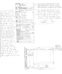
Below I discuss the following: the File and Tools menus; better sidebar tab labels; use of color in tab labels; contextual tools; a dockable sidebar; the use of animations; a search bar, and; a word count display in the status bar. Please see the image of a hand-drawn mockup I scanned to see how some of my ideas might appear (edit: thumbnail see below). Although it initially appears radically different from yours, the differences are superficial and the content is largely the same as your initial design.
How to make "File" and "Tools" always visible, while reducing the footprint of the "Slide View" tabs: Currently, your design uses tabs to select the "slide views," which takes up an entire horizontal line (approx 30 pixels tall) from the top of the screen (i.e. Normal, Outline, Notes, Handout, and Slide Sorter). In the FLUX UI, the designers chose to turn those tabs into a drop-down selector. (See: http://wiki.services.openoffice.org/wiki/Proposal_by_Knoxy) If you used a drop-down design, you could use the space your tabs previously occupied to lay out the "File" and "Tools" menu groups horizontally along the top. You could make all the functions fit into one row if you didn't include text labels for some really obvious functions, like "back" "forward" "save" "cut" "copy" and "paste". You would also gain space on the Sidebar. Because "File" and "Tool" commands are so core to the application, you might use larger icons, or different sized icons (like Office 2007 uses large icons for core functions) and use special color backgrounds to distinguish the two menu types.
Sidebar Tabs Along the Side: I did not present a coherent solution in my earlier suggestion about moving your sidebar tabs to the side, and the two options I mentioned each had serious issues. But I still feel your current menu tabs look very small and do not reflect their importance in the UI, so are sub-optimal. Looking at some of the mockups you made for low resolution 800x600 screens (the lowest common denominator), I think you would have plenty of room to use larger tab labels along the left side, kind of like this "twitter" client does: http://www.youtube.com/watch?v=yOee3Mwwn-4 If you move all the "file" and "tool" sections to a horizontal location, you will have even more room to space things out in the sidebar, and might not have to make it any wider than your current 210 pixel width, even with the bigger side labels. Even 220 to 230 pixels would be fine in the 800x600 layout. Your menu selection tabs could be much larger (say, 30-40 pixels), and use a grey or dark background to indicate their importance in the UI hierarchy.
Color in Sidebar Tab Labels: If you were to use larger icons along the side of the Sidebar for menu selection, I recommend making the active tab icon color, while making the others black and white. This is more a taste issue than anything, but I just think it looks better and makes it more clear which is the active tab. Also, instead of making the text label for the Sidebar section change color, you could just make the outline of the movable stub have different color glows for each position.
Contextual Sidebar Tabs and "Mini Toolbars": Instead of having contextual toolbars or toolbar spaces as suggested in other proposals, you could have whole sidebar tabs that appear just in the context of what you are currently doing. These are particularly useful for editing pictures and tables. Mini-toolbars are also very useful for quick access to commands. A mini-toolbar when you highlight a word or table, and a floating toolbar appears nearby your mouse with a small selection of commands relevant to the highlighted object. I first observed the use of mini-toolbars in Adobe Acrobat, but Microsoft later used it in Office 2007. I do not know if either party has intellectual property claims to the concept, but I find it highly useful.
Dockable/Movable Sidebar: The sidebar could be dockable on either side of the window, or that it should be draggable to become a floating child-window, like a floating toolbar in Office 2008 for MAC. In the task-list bar, the child-window sidebar should not show up as a separate window. Anecdotal evidence from conversations with left-handed friends suggests that not all users find left or right mouse movements equally easy. This makes sense, as I have read about studies suggesting downward mouse flicks are not as fast as upward mouse flicks. As for the rationale behind wanting a floating sidebar option, it just feels easier to focus my attention on the document sometimes when there are separate window frames for the document text and the menu. Giving the document full ownership of the windowed space may have cognitive advantages, but that is just conjecture.
Subtle Sidebar Animations on the X and Y Axis: OpenOffice could use subtle animations where appropriate to improve users' cognitive understanding of the UI and make the program more fun to use. Even Google Chrome uses animations when adding or removing tabs, and the use of animations in UI is increasing.
Going back to the "Tweetie" video, http://www.youtube.com/watch?v=yOee3Mwwn-4, it would be useful to show animations when switching menu sections and subsections. This would be particularly effective if you did indeed use a vertical tab icon layout, where main tab switching ("Home," "Slides," "Effects," and "Drawing") could use a vertical swiping animation (Y Axis), and submenu switching (like "Transition" and "Animation" in the "Effects" tab) could use a horizontal swiping animation (X Axis). Unlike the earlier suggestion I made about a FLUX style "accordion" layout, where the menu labels themselves would move up and down, in this idea the Sidebar tabs would always be static; animation would be limited to the sidebar content. Cognitively, the menu labels being constant while the menu contents move around would remind users of their higher/lower order relationship in the menu hierarchy. This holds true even with sub-menus (e.g. Transitions vs. Animations), as the rest of the menu would be static as they move left and right to select, suggesting their place as sub-menus. To see how a sideswipe motion might look, refer to the 0:33 sec mark in the "Tweetie" youtube video.
Search Bar: You might give the option of searching for words within the text, or searching for program commands. The search bar could be always present at the bottom of the sidebar, but not have its own sidebar tab to begin with. Then, when a user does search for something, a new contextual sidebar tab appears with all the statistics for search results and options/controls for finding/replacing/highlighting etc (next/previous) that you would expect to find in the traditional search popup window. In your layout, I see you have a "find command" bar. Instead of having a dedicated search bar to find commands, any relevant commands could be shown as part of the search results in a search contextual tab.
Word Count in the Bottom Left Corner (Status Bar): Having the word count always visible is one of the best (and most overlooked) little conveniences MS introduced in Office 2007. It would be great if your proposal included that too.
Best of luck to you in your proposal. -- Brian Fleeger May 19, 2009
Sorry for posting two comments in a row, but I just saw this new video for the Moblin 2.0 UI, and want to post it for its use of tabs. http://www.youtube.com/watch?v=vsCpIeLLoT8&eurl=http://www.liliputing.com/2009/05/moblin-20-beta-linux-distro-for-netbooks-released-video.html&feature=player_embedded
-- Brian Fleeger May 19, 2009
| Hello Brian,
thank you a lot for your proposal. I really would like to adapt Martinů to some of them. Unfortunately I won't have time before May 25th, but I'll try to do it next week-end, if the Wiki is still editable. Sincerely, --Johanneseva 15:39, 24 May 2009 (UTC) |
Hi Johannes, your proposal is really a joy to read:
- It does not rely heavily on context sensitive usage of screen space (as in the MS Office ribbon), which I think is a Good Thing(tm). The hard part about context sensitive toolbars is not the UI layout, but to define the context and to find the algorithms to find the controls needed in that context (and then: how are controls added/removed to/from the UI when the context changes and how does one fin controls that the algorithm think to be irrelevant in the current context and a lot of other navigation issues).
- You have done very deep analysis of the topics you describe in your proposal.
- It not only presents a proposal, but also argues the pro and cons of possible solutions. Thats great.
A few nitpicks (presentation):
- You cover a lot of topics in your proposal. Could you add a Table of Contents to the top of the Wiki page?
- Maybe it is possible to separate the proposal in a few sections so it is easier to comment on the relevant parts?
A few nitpicks (content):
- A few commenters argued, that some rarely used stuff does not need to be in the sidebar, but could be kept in the menu (that will still be there anyway, for example on OSX). I think it might be a good idea to have a clean separation of controls that are document-related (those are on the sidebar) and those that are application-related (those are on the menu). Then the menu itself could be spawnable from the sidebar by exactly one button to be also accessible on other platforms.
- Im a bit confused by having the labels to the right of the controls, I would expect them to the left (or below if space allows). Also here you have labels left and right of controls (bullets). Maybe thats just me.
- In general, since the controls are not layouted in a grid, i find it harder to see which label belong to which icon - especially, when there are different numbers of controls in each row, like here.
- Maybe a popup menu like the one here should be available on right-click, showing all controls in a nice tabular layout (just like your "Round Orange +", but including all options).
- Finally, I would love to have the sidebar and its buttons scalable - inexperienced users on big screens would be able to adjust the sidebar to have fewer, bigger buttons with more labels, simplifying the UI and experienced users can have smaller buttons and fewer labels, with more options available. (This would most likely require icons as scalable vector graphics).
--B michaelsen 15:50, 21 May 2009 (UTC)
| Hello B. Michaelsen!
Another load of really great comments, that I would like to integrate to Martinů. I'll improve the structure and insert a table of content next week-end, as I don't have a lot of time these days. Thank you, and sorry for the delay, --Johanneseva 15:39, 24 May 2009 (UTC) |
Just a side note: Thanks to all the commenters for the questions and hints. In combination with the explanations by Johannes it can be understood quite well :-) --ChristophNoack 13:01, 25 May 2009 (UTC)

