Difference between revisions of "Proposal by Johannes Eva"
Johanneseva (talk | contribs) m (Almost no change) |
Johanneseva (talk | contribs) (Added general mockup, quit grey text & added line spacing stuff) |
||
| Line 20: | Line 20: | ||
== Summary and Status == | == Summary and Status == | ||
| − | |||
Status: Request for Comments | Status: Request for Comments | ||
| Line 27: | Line 26: | ||
== Mockup == | == Mockup == | ||
| − | |||
{| class="prettytable" | {| class="prettytable" | ||
| − | | [[Image: | + | | [[Image:Martinu_-_General_Mockup_1_-_Home_sidebar.png|640px|thumb]] |
|} | |} | ||
| + | |||
| + | * The size of the picture is 1024x729 pixels. I have taken 39 pixels away in height: it is the size of the task bar in Windows 7, which will probably be the standard when Renaissance becomes reality. The two standard panels in GNOME would take even more vertical space: 50 pixels height. | ||
| + | |||
| + | * This layout leaves more space for the document than in OOo 3.1. | ||
== Detailed Description == | == Detailed Description == | ||
| − | |||
| − | |||
| − | |||
| − | |||
| − | |||
| − | |||
* This proposal takes its roots in some basic ideas. I will detail some of them here. | * This proposal takes its roots in some basic ideas. I will detail some of them here. | ||
| − | * You may notice than some points are more detailed than others, regardless of their importance. One reason for it is that I am using material I had already written | + | * You may notice than some points are more detailed than others, regardless of their importance. One reason for it is that on some subjects, I am using material I had already written - for example the "line spacing" part. Let's start! |
==A. Modern wide-screen resolutions== | ==A. Modern wide-screen resolutions== | ||
| Line 296: | Line 292: | ||
The ugly "planet" icon should open a dropdown menu with the options in "Tools → Languages". (Thesaurus, Hyphenation, More dictionaries.) | The ugly "planet" icon should open a dropdown menu with the options in "Tools → Languages". (Thesaurus, Hyphenation, More dictionaries.) | ||
| − | |||
| − | |||
| − | |||
| Line 326: | Line 319: | ||
I have no time right now to imagine how the result list could look like. Not so easy problem which maybe goes beyond the scope of this proposal ;-) | I have no time right now to imagine how the result list could look like. Not so easy problem which maybe goes beyond the scope of this proposal ;-) | ||
| − | ===2. | + | ===2.6 Details about a small subject: line spacing icons=== |
| + | |||
| + | I would like to take line spacing as a usability example. The line spacing icon shows a very different implementation and behavior depending on the platforms and office suites. | ||
| + | |||
| + | Basically there are two methods for displaying the line spacing icon(s). On one side, Office 2007, Pages '08, and Lotus Symphony, which display only one icon with a dropdown menu. On the other side, Office Mac 2008 and OOo, showing 3 icons and only 3 choices. | ||
| + | |||
| + | |||
| + | Microsoft Office Mac 2008: | ||
| + | |||
| + | [[Image:Martinu_Line_spacing_icons_-_Microsoft_Office_Mac_2008.png]] | ||
| + | |||
| + | OpenOffice.org 3.0: | ||
| + | |||
| + | [[Image:Martinu_Line_spacing_icons_-_OOo_3.png]] | ||
| + | |||
| + | Microsoft Office 2007: | ||
| + | |||
| + | [[Image:Martinu_Line_spacing_icons_-_Microsoft_Office_2007_small.png]] | ||
| + | |||
| + | [[Image:Martinu_Line_spacing_icons_-_Microsoft_Office_2007_expanded.png]] | ||
| + | |||
| + | Apple Pages '08: | ||
| + | |||
| + | [[Image:Martinu_Line_spacing_icons_-_Apple_Pages_08.png]] | ||
| + | |||
| + | [[Image:Martinu_Line_spacing_icons_-_Apple_Pages_08_-_Inspector.png]] | ||
| + | |||
| + | Apple pages offers the most complete range of choice for line spacing in its "inspector" menu. | ||
| + | |||
| + | IMB Lotus Symphony 1.2: | ||
| + | |||
| + | [[Image:Martinu_Line_spacing_icons_-_IBM_Lotus_Symphony_small.png]] | ||
| + | |||
| + | [[Image:Martinu_Line_spacing_icons_-_IBM_Lotus_Symphony_expanded.png]] | ||
| + | |||
| + | Though Lotus Symphony has a dropdown menu, it offers only 3 choices. A line space of 1.15 or 1.15 is not possible via this icon/dropdown menu. | ||
| + | |||
| + | My favourite implementation of the Line spacing "problem" is the one chosen by Office 2007. It does take only a small amout of space in the UI, whilst offering a clear and wide range of options. | ||
| + | Three icons as in OOo and Office Mac 2008 definitely take too much UI space, without offering enough options and being clearer. And why only these exact 3 choices? Is 1.5 really more useful than 1.15 or 1.15? Intermediate values are really useful. | ||
| + | At least in Office Mac 2008 there is a text description saying "Line spacing", which is missing in OOo. | ||
Revision as of 22:42, 11 May 2009
Design Proposal [Martinů]
|
|
|---|
|
Quick Navigation
Team |
| Please do not edit this page unless you are the original author. Your feedback and comments are welcome in the Comments section below or on the ui@ux.openoffice.org mailing list. |
| * N.B. I'm working on this page right now! It is not finalized. |
| * This project is named "Martinů" in honor of the Bohemian (Czech) Composer Bohuslav Martinů. |
| * Warning: I am not a graphic designer. All UI mockups are here just to clarify an idea, and are not supposed to be taken seriously in terms of graphical artwork. |
Summary and Status
Status: Request for Comments
After you consider the comments and questions in the comments section, revise your proposal for completeness and understandability. When you feel your proposal is ready for evaluation, please change the status above to “Proposal Complete”.
Mockup
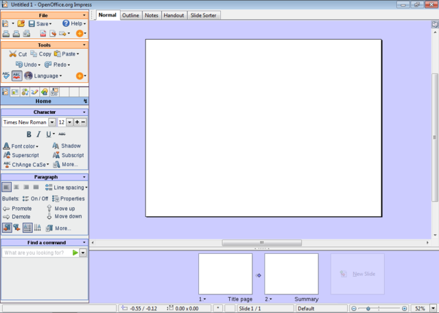
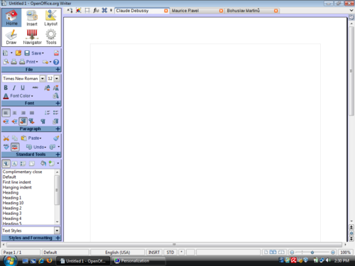
- The size of the picture is 1024x729 pixels. I have taken 39 pixels away in height: it is the size of the task bar in Windows 7, which will probably be the standard when Renaissance becomes reality. The two standard panels in GNOME would take even more vertical space: 50 pixels height.
- This layout leaves more space for the document than in OOo 3.1.
Detailed Description
- This proposal takes its roots in some basic ideas. I will detail some of them here.
- You may notice than some points are more detailed than others, regardless of their importance. One reason for it is that on some subjects, I am using material I had already written - for example the "line spacing" part. Let's start!
A. Modern wide-screen resolutions
1. Laptops
- There is a clear tendency in screen resolutions in favour of wide resolutions. Laptops have almost all wide resolutions by now, the newest adopting even wider resolutions like 1366x768 (Dell Studio 15, Studio 16, Inspiron 15), which seems to be the new standard, instead of 1280x800, 1600x900 (Sony Vaio FW Series) instead of 1440x900, or 1920x1080 (Dell Studio 16, Sony Vaio AW-Serie) instead of 1980x1200.
- I just goggled around, just to find an article showing that the 4:3 to 16:10 to 16:9 is not my own fantasy:
- Laptop have topped Desktop computer sales since Q4 2008. So they can't be ignored.
Notebooks Top Desktop Sales Ahead of Schedule
2. Desktop Monitors
- TFT monitors are following the same tendency as laptop screens. 1920 x 1080 is the new standard for big monitors, instead of 1920x1200 for the "old" wide-screen format, and 1900x1600 for the "old" non-wide resolution.
- This wider screen tendency has been around for some month, and shows no sign that it shouldn't be taken seriously.
- Don't blame me for screens getting wider, personally I don't like it! But these are facts, we can't ignore them. By the time Renaissance will be implemented, 16:9 will be more probably a standard than 16:10. 4:3 monitors will probably be hard to find.
3. Conclusion
- Why all this text about wide-screen resolutions? Well, because in all the UI discussions and drafts I have seen by now, it has not been taken into account. While people are working mostly on vertical sheets of paper (I'm speaking mostly of Writer) screens get wider and wider and the UI doesn't adapt and takes vertical space away, leaving big chunks of the screen unused, left and right of the virtual sheet of paper. (And this empty space is filled with the depressive "Battleship Grey" application background color!)
- Personally, I also regret that the target or the proposal is Impress: Impress is an exception in OOo because the “paper” will be mostly horizontal. But as most people using OOo will use Writer, and a fewer proportion Impress, I really think that the design should be adapted to wider screens, if we want to archive a UI uniformity between the OOo applications. Most thoughts about my design proposal were targeted to Writer – I was surprised that the design seems to works really well in Impress, too.
- I wonder why the resolution for these drafts is 1024x768: try to by any consumer laptop or TFT with this resolution nowadays - it's almost impossible! 1280x768 or even the new 1366x768 would make much more sense.
- If someone would be able to send a screenshot of a default OOo Writer or Impress window (maximized) at a 1366x768 resolution, I would be happy to link it here.
- This Wiki template, if viewed in a maximized window with a 1280x800 resolution (my case), is hard to read. The lines are too long!
B. Competitors
1. Microsoft Office
- If you are not familiar with Microsoft's new "Microsoft Fluent User Interface" aka "Ribbon", here are some very interesting links where you can find more information:
- Microsoft Office 2007 UI presentation:
The Microsoft Office Fluent user interface overview
- How does the Ribbon scale down?
- A great video about the creation of Office 2007 new UI:
This last link is a video about the design of the ribbon interface. It shows many interesting UI prototypes, as well as useful data.
- I was specially interested by the vertical "ribbon" UI drafts.
(I think the examples are small and a case of fair use, thus no being copyright infringement. If you think I'm wrong, please remove them or contact me.)
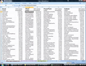
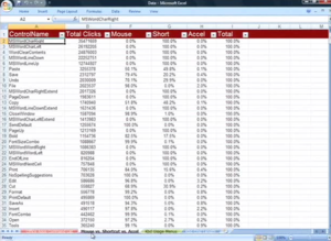
The video “The story of the Ribbon” includes useful data about user interaction surveys. Basically, the data describes the most used commands in Word, Excel, Powerpoint, and if the interaction was done with the mouse or the keyboard.
I hope that the "OpenOffice Improvement program" will soon provide data of comparable quality.
I would like to highlight one detail about the “The story of the Ribbon” video. At one point (Minute 48), the narrator tries to explain why they didn't end up with a vertical design in Office 2007.
The arguments given by the narrator couldn't really convince me, and my paranoid nature ended up believing that they already had in mind that some day, it would be possible to use the vertical space for displaying... ads! And that may have been one good reason for making the UI horizontal, leaving a lot of space for vertical advertising. We will see what happens with Microsoft Office "Web" 2010.
| Q. Why design a vertical UI in times where the market leader has a successful horizontal UI? Don't you think that the guys at Microsoft had good reasons for it? |
| A. Remember than at the time Microsoft was designing Office 2007, back in 2003 – 2004, the 16:10 and 16:9 screen ratio tendency was not actual. The 16:10 tendency had started maybe, but nobody was thinking that 16:9 would ever be adopted on computers. When thinking about laptop and small screen sizes, the common thinking was that the resolution would go from 1024x768 to 1280x800, and then 1440x900, even on 13 inch laptops. Office 2007 UI is not a real pleasure to use with a 768 pixels height, but it is ok with 900. Note that all the prototypes they were making were in 1280x1024! |
What I personally like a lot in Office 2007 is that there is a lot of text. I don't remember icons very well, and as I could observe while watching to ordinary people using computers, neither they remember the signification of a lot of icons – except the classical B, I, U, font, paragraph alignment, save and print.
To be honest, in Writer, despite using it quite a lot, I never know which one is Font Color, Highlighting, and Background Color. An icon with text, or even text only would really be much more useful to me than an icon only. Even Office 2007 has too much icons and not enough text for me. Look at Windows 7, for example. It has much less icons and more text than previous Windows versions. To me it is much better.
2. RedFlag RedOffice 4.5
Have a look here for a swf presentation of the RedOffice 4.5 UI.
Or here for my older review of 4.0 beta.
I don't understand Mandarin, but Google translator helped me a little. New features of version 4.5 seem to be mainly support of Office 2007 file formats, new color management, and smaller UI changes. But please don't take me as a reliable source of information about RedOffice !
Though I couldn't use it a lot due to evident linguistic limitations, I like the RedOffice UI very much. It is obvious that the RedFlag team made a great job.
However, due to the compactness of the Chinese writing , it seems difficult to adapt the UI without major changes.
3. IBM Lotus Symphony 1.2
I am not really convinced by the sidebar in Lotus Symphony. First reason is the rather poor screen space management. For example, if there is an UI element everybody knows, it is the Font dropdown menu. There is no need to write "Font:" on it... Same thing for other really obvious UI elements. (It is the same, but not that worse, for Microsoft Office Mac 2008)
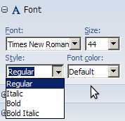
The other reason I'm not convinced it that in many cases the sidebar simply duplicates the normal toolbar elements. In some cases, it is even worse: the Font Styles dropdown menu, for example is absurd. It is just more complicated and less intuitive than the traditional [B] [I] [U], without any other advantage - it even doesn't take less space.
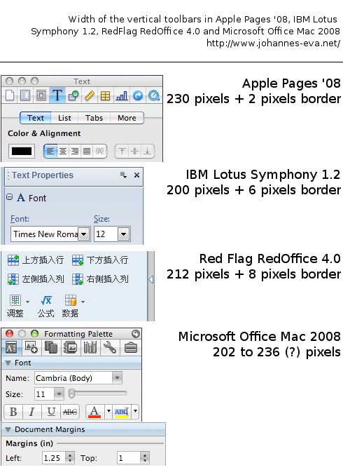
4. Sidebar width in differen Office Suites
Here is an image I pasted together last February, as I was working on my first design.
C. My proposal: "Martinů"
As you probably guessed it by now, my proposal will feature a vertical toolbar / pane / sidebar / menu structure. Personally, I prefer to use the "Sidebar" term, as I don't really like the word "Pane".
| Q. Won't it be too difficult for users to adapt to a vertical menu structure? |
| A. In fact, many users are already used to vertical menu structures. They are present in a lot of software, for example designed for Apple. Here it can be useful to remember that Macs especially have the reputation to be easy to use. Good examples for existing vertical menu structures would be Apple iWorks or Microsoft Office Mac. Of course vertical menus are not only present on Macs. The GIMP, for example, as well as most image manipulation programs, have vertical UI elements.
The OpenOffice.org based Chinese office suite RedOffice has already made the jump to a vertical menu structure, so that it would be useful to ask them for user feedback. |
1. The sidebar selector
The main problem that came out designing a vertical IU is: how to select the content of the sidebar? In the "Story of the ribbon", for example, there are some funny design proposals:
- leaving the tabs horizontal on the whole screen width
- grouping a text menu at the bottom of the sidebars
Both of them are imperfect, and at first I didn't want to have icons only, because it takes a long time to the users to learn what they mean, and text is more intuitive.
My first "sidebar selector", a mixture between the one in RedOffice and the Preferences dialog in Firefox looked like this:
The problems of this sidebar selector were: to keep its vertical size (height) acceptable, I had to limit the elements to 6, which is not enough. With 9 Elements, it was too tall. For the curious, the whole old design + sidebar (for OOo Writer) was like this:
The main flaw of this old design is that the group labels are under the group. Very unintuitive! The main Idea did not change in the current proposal, though.
Finally I had to accept leaving out the text, and adopting an approach which was more like The GIMP, Apple Pages or Microsoft Office Mac, with small icons. I still think that text is important, and unlike in the software I just named, the name of the current sidebar should be clearly displayed.
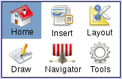
When the mouse goes over an icon in the sidebar selector, the text should change (maybe a very fast, smooth blend effect) and be displayed transparently (as in the the "add new slide" feature), until the user clicks "definitely". Maybe color themes could be used to help identify each sidebar with its title and icon.
A single left click on the text ("Home", "Slides", "Draw", ... all the blue area) should pop down a menu with a list of all the possible tabs.
The lightening ↯ icon (or whatever, ▼ / ▾ are more standard) is a button with general sidebar options - equivalent to the right click. It should display a menu with these kind of options:
┌────────────────
│ Undock Sidebar
│ Duplicate Sidebar
│ Close Sidebar (only if there are more than one)
│ ────────
│ Sidebar preferences
└────────────────
2. The sidebars
The proposed organization I have for Sidebars is the following:
A. Home
B. Slides
Layouts | Master Pages
C. Effects
Transition | Animation
D. Draw
E. Insert
All | Table (| Chart)
F. More
Options | Notes (| Navigator)
(G. Navigator)
(H. Search)
(I. Gallery)
2.1 Sidebar A: Home – The "File" Group
NB. I'm still wondering if the "File" and "Standard Tools" groups should be placed above the Sidebar Selector, thus be always visible. Or if there should be a kind of "quick shortcut toolbar".
My option for now is to have a two or three lines menu group, featuring the most used actions:
The "Round Orange +" button would give a dropdown menu of all less used options, in this example:
┌────────────────
│ Recent Documents
│ Wizards
│ ────────
│ Reload
│ Versions
│ ────────
│ Properties
│ Digital Signatures
│ Templates
│ ────────
│ Preview in web browser
└────────────────
How to know which elements to put directly accessible in the menu group, and which one in the "Round Orange +" menu? Well, as no one has a perfect answer to this, the best thing would be to wait for the results of the "OpenOffice Improvement program".
Therefore, the "Martinů" proposal as it is now is not at all intended to be anything reliable, it's only a vague idea, which should be improved by real user data as base.
The round "Help" button should show the content of the "Help" menu in current OOo versions.
The two printer icons shouldn't be looking the same. One is the "Print File Directly", the other the standard "Print…" dialog.
2.2 Sidebar A. Home – The "Standard Tools" Group
The ugly "planet" icon should open a dropdown menu with the options in "Tools → Languages". (Thesaurus, Hyphenation, More dictionaries.)
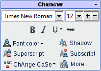
2.3 Sidebar A. Home – The "Character" Group
NB. I did borrow the [+][-] font size idea from Miroslav Mazel. (I don't know if it was his creation, though.)
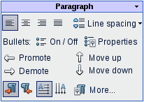
2.4 Sidebar A. Home – The "Paragraph" Group
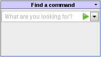
2.5 Sidebar A. Home – The "Find a Command" Group
If a user doesn't find a command, he can search it here. This Group should have a minimal size of two or three results should be able to expand if there is enough vertical space.
I have no time right now to imagine how the result list could look like. Not so easy problem which maybe goes beyond the scope of this proposal ;-)
2.6 Details about a small subject: line spacing icons
I would like to take line spacing as a usability example. The line spacing icon shows a very different implementation and behavior depending on the platforms and office suites.
Basically there are two methods for displaying the line spacing icon(s). On one side, Office 2007, Pages '08, and Lotus Symphony, which display only one icon with a dropdown menu. On the other side, Office Mac 2008 and OOo, showing 3 icons and only 3 choices.
Microsoft Office Mac 2008:
OpenOffice.org 3.0:
Microsoft Office 2007:
Apple Pages '08:
Apple pages offers the most complete range of choice for line spacing in its "inspector" menu.
IMB Lotus Symphony 1.2:
Though Lotus Symphony has a dropdown menu, it offers only 3 choices. A line space of 1.15 or 1.15 is not possible via this icon/dropdown menu.
My favourite implementation of the Line spacing "problem" is the one chosen by Office 2007. It does take only a small amout of space in the UI, whilst offering a clear and wide range of options.
Three icons as in OOo and Office Mac 2008 definitely take too much UI space, without offering enough options and being clearer. And why only these exact 3 choices? Is 1.5 really more useful than 1.15 or 1.15? Intermediate values are really useful.
At least in Office Mac 2008 there is a text description saying "Line spacing", which is missing in OOo.
Generalities about the Sidebar
The Sidebar should be configurable! In my imagination, there should be a way like in Firefox to move the Groups inside (or outside) the sidebars. It should also be possible to choose which elements should be displayed or not displayed inside each groups.
As in Apple iWorks, there should be a possibility to have more than one sidebar, as well as to undock sidebars. This would it make possible to have one sidebar with the "Home" view, plus a second with, for example, drawing elements. (one beside or above/below the other, or floating / undocked.)
It should be possible to dock the sidebar left or right.
The "Slides" panel
In the default configuration of my project, the "Slide Pane" would be horizontal at the bottom of the screen, instead of vertical on the left as in previous Impress versions. It always seemed logical to me, as it gives a "temporal" vision, as in video editing software. Of course, it should be able to be moved vertically, to accommodate wider screen resolutions. (Sony P-Serie anyone?)
Note the "New Slide" feature, which is a little bit like the "New Tab" icon of some modern web browsers.
The transition symbol between the slides miniatures should be clickable, and should open the transition sidebar.
As many people don't use the right-click, the slide number should open a menu with the right-click options.
About the status bar
Personally, I love to use directly the status bar for selecting the language. I use it a lot. It is fast, and the actual language is always displayed, which is really useful. The page count is also very useful, not to speak about the indispensable zoom slider. By the way, I am not really enthusiastic about the Gear Stick zoom slider, which seems to be really complicated.
Nevertheless, the zoom slider should be enhanced by an precisely editable zoom, as in the GIMP.
The right bottom corner will be the geographic place of the zoom, so there is no necessity to put other zoom elements in the UI. (No zoom option in a View sidebar, for example. It would just be duplication of existing options.)
Please keep (and enhance) the status bar!
About the rulers
In Impress, the rulers are already hidden by default, which is a good thing. Nevertheless, the addition of a ruler button could be useful.
In my opinion, the rulers should also be hidden by default in OOo Writer. I wrote a detailed article about it, here it is!
About tabbed documents
One rule of the game was not to add new features, and I already cheated enough. So I don't have any mockup for tabbed documents. I have to mention that I like Miroslav Mazel's ideas about the tabs very much.
Some random thoughts: "Reconception"
While being really interested in the Renaissance project, sometimes I wonder if a new IU would really be the most needed improvement in OpenOffice.org. Some days ago, I stumbled about this page: DirectManipulationSnippets and thought that this would be a incredibly useful feature for OOo. As well as a new color selection tool, anchor selection for notes, "live preview" or a better Office 2007 file format support. In fact I am missing these features much more than a new UI.
Anyway, I'm wondering how, with the relatively small manpower of the OOo, Renaissance could be implemented. Wouldn't it be interesting to have a smooth transition to the new UI? Many things could be implemented in transition versions of OOo, Renaissance could be an evolution instead of a brutal change. In fact, a good UI project could be like a final target, and would give to OOo a global direction.
Some days ago I was thinking about the term "re-conception". To go back to the French origin of the term, a "naissance" (birth) isn't possible before a "conception" (fertilization!), would a "renaissance" be possible before a "reconception"? Would reconception be a good name for a period of transition?
Backward compatibility
Backward compatibility is not a term that is often used for UIs. I think that a new UI for OOo could and should be backward compatible.
For example, the "Martinů" proposal could be backward compatible. How? Just by keeping the possibility to use the old toolbars and menus. For people needing it, it would be possible to keep the standard menu and toolbars! They just would fit perfectly in the "Martinů" design, at the same place than they always have been.
Why not? I am pretty confident that the users would get smoothly used to the sidebars. It would be a good thing for the development, because the sidebar could even be only an extension first. (No idea these kind of extensions / plugins are possible.) It would not break anything old. Renaissance could be a smooth transition, for the users and the people making it.
Additional Material and Mockups
Please share everything you might think is important to better understand your proposal. Perhaps you also have other ideas which are not directly related to “Accessing Functionality”? You might add further documents, Internet links, or additional mockups - e.g. showing a workflow or different states of the software.
Author or Team Working on This Proposal
| Author / Team Member | Contact (OpenOffice.org login name, used for email) |
| Johannes Eva | OpenOffice.org Login Name |
| Real Name | OpenOffice.org Login Name |
Comments
| Community members, this is where your comments and questions concerning completeness and clarity should be written. Please add your OpenOffice.org login name to let us contact you via email. |
Your space :-)

