Difference between revisions of "Proposal by Andreas Bartel"
(Some questions →Comments) |
|||
| Line 85: | Line 85: | ||
* File “Tabbed-Navigation”: No questions :-) | * File “Tabbed-Navigation”: No questions :-) | ||
Thanks a lot! --[[User:ChristophNoack|ChristophNoack]] 16:03, 22 May 2009 (UTC) | Thanks a lot! --[[User:ChristophNoack|ChristophNoack]] 16:03, 22 May 2009 (UTC) | ||
| + | |} | ||
| + | |||
| + | {| style="border: thin dashed #ff9900; padding:5px; background:#ffff99" | ||
| + | |- | ||
| + | |Hi Christoph. Here are my answers. | ||
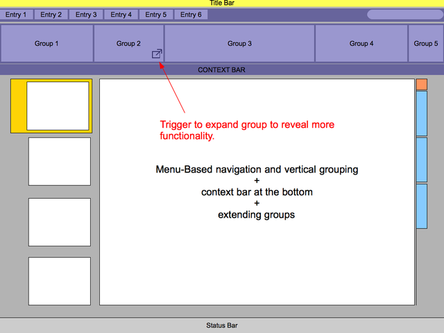
| + | * Q1: Vertical grouping simply means that you separate groups by a vertical e.g. line or any other visually salient separator. | ||
| + | * Q2: Since it is a menu-based approach, the menu entries behave as current menus in OOo. However, the size and the organization of content in the drop-down menus may be diffent. That is something to figure out. Groups should provide access to 20% of functionality that is used most frequently (80/20 rule). | ||
| + | * Q3: I don't know if you are familiar with the current ribbon implementation but one thing that is not that well solved there is that some ribbons have a small icon in the bottom right corner which triggers old-school dialogs with more functionality. We could solve that problem by extending a group over the available space while exchanging the content with other features. So, no repositioning but exchanging of content. --[[User:Andba|Andba]] 13:30, 125 May 2009 (UTC) | ||
|} | |} | ||
Revision as of 11:19, 25 May 2009
|
|
|---|
|
Quick Navigation
Team |
| Please do not edit this page unless you are the original author. Your feedback and comments are welcome in the Comments section below or on the ui@ux.openoffice.org mailing list. |
The following design proposal is part of the collection of design proposals for “Accessing Functionality”, which is part of Project Renaissance.
Summary and Status
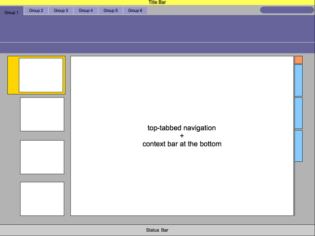
This slides contain general considerations of how to solve the navigation problem regarding global, local and contextual navigation. Two basic approaches are considered. Tabbed-navigation and a menu-based approach with contextual navigation. The main problem we are currently faced with is the organization of functionality. Menu and toolbars still have their strength. Menus, for instance, are still a pretty efficient way of presenting all available functionality to a user. However, this requires a proper organization of the menus and menus are per se not efficient for frequent usage. Toolbars were designed to offer access to 20% of the most important functionality (80/20 rule). This requires focus and knowledge of the 20%. Overall, the are always trade-offs. Tabbed-navigation seems to offer a more promising solution. Let's see how far we can push the concepts.
Status: Request for Comments
After you consider the comments and questions in the comments section, revise your proposal for completeness and understandability. When you feel your proposal is ready for evaluation, please change the status above to “Proposal Complete”.
Mockup
Please add your main “wireframe” mockup. For example: A mockup which shows the functionality for adding a slide in Impress.
Detailed Description
This space is reserved for the detailed description of your design. Add anything you might find important for us to know. If you don't have any clue what this might be, then you will find some topics below.
- Describe dynamic behavior: The mockup above is something static. To better illustrate what will happen on the screen, describe what actions would be taken by the user and what would appear on screen.
- Explain the rationale and assumptions: If you decided to go for a certain concept, then please explain why you chose this.
- Highlight particular design ideas and alternatives: A concept usually incorporates many individual ideas. If you think certain ideas are really unique, then please highlight them. And if you think that there were other really good ideas which could not be implemented at the same time, tell us about them.
- List issues and open questions: Please list any issues you are aware of and open questions. Do not worry if your proposal or concept isn't perfect. If you have discovered any stumbling blocks or worries, then please provide this information right from the start. Maybe the team can help find answers/solutions.
Additional Material and Mockups
Author or Team Working on This Proposal
| Author / Team Member | Contact (OpenOffice.org login name, used for email) |
| Andreas Bartel | Andba |
Comments
| I like the idea to move away from the standard "File - Edit - Format - ..." menu list. My understanding is, that you want to substitute this with the list of "Entry x"? Is it a series like "Slideshow" - "Slide" - "Object" etc? Please elaborate further. --Hillerd 19:33, 12 May 2009 (UTC) |
| It is actually not about WHAT is inside but more about HOW one can organize any content to enable efficient access. So the focus of the mock-ups presented here is to explore some possibilities that we have at hand to structure the content and make it "accessible" for the user. The principles behind very much rely on users' abilities to reactivate knowledge they have acquired in other contexts and to apply that kwowledge to the situation at hand. The question of WHAT goes WHERE is a whole other story. Unfortunately we did not begin to think about the required content in the first place. The task of defining an appropriate information architecture that reflects essential functionality that we should focus on to serve particular user goals has to be accomplished yet. Hence, the actual structuring, organizing and labeling of information that helps our users find and use required functionality would be the next step. So, to come back to your question, the content could be anything as long as the headers appriately reflect the group's intent/content/functionality. --Andba 18:30, 13 May 2009 (UTC) |
| Migration of users seams to be a key thing everyone is overlooking. It is important to ask yourself if you only know OpenOffice 3.1 and you landed in this new interface how would you cope. http://en.wikipedia.org/wiki/Renaissance Renaissance is such a key word most of you are failing to understand it. Renaissance is old with new. Not just new. Name of project was kinda chosen to remind designers about the importance of migration. Basically where is the old to make user migration as painless as able.--Oiaohm 23:54, 13 May 2009 (UTC) |
| Sorry Oiaohm, I really don't get your point here. Did you read my comment before? What do you mean specifically that is being overlooked? I am certainly aware of what the termn Renaissance means and why we have chosen it for this project. I guess you should get a bit more explicit about what you think we don't understand. Thanks. --Andba 23:30, 14 May 2009 (UTC) |
Hi Andreas, some questions regarding the brainstorming ideas...
Thanks a lot! --ChristophNoack 16:03, 22 May 2009 (UTC) |
Hi Christoph. Here are my answers.
|


