Difference between revisions of "Chart2/ChartTypes"
From Apache OpenOffice Wiki
< Chart2
(→Trace function: Interval Plot) |
m (→Box Plots) |
||
| (11 intermediate revisions by 6 users not shown) | |||
| Line 1: | Line 1: | ||
* This list is based primarily on the [http://graphics.openoffice.org/files/documents/12/3278/List_of_whished_enhancements_for_Charts.odt ''List of wished enhancements for Charts'']. | * This list is based primarily on the [http://graphics.openoffice.org/files/documents/12/3278/List_of_whished_enhancements_for_Charts.odt ''List of wished enhancements for Charts'']. | ||
* However, I will also present a number of new features not covered in the original list. | * However, I will also present a number of new features not covered in the original list. | ||
| − | * Some other issues are detailed on the [ | + | * Some other issues are detailed on the [[Calc/To-Dos/Statistical_Data_Analysis_Tool|statistics wiki page]], too. |
= Higher Priority = | = Higher Priority = | ||
| Line 33: | Line 33: | ||
* Violin Plot: http://addictedtor.free.fr/graphiques/RGraphGallery.php?graph=43 | * Violin Plot: http://addictedtor.free.fr/graphiques/RGraphGallery.php?graph=43 | ||
* Complex Charts: box-plot + whiskers + smooth polygon, http://addictedtor.free.fr/graphiques/RGraphGallery.php?graph=140 | * Complex Charts: box-plot + whiskers + smooth polygon, http://addictedtor.free.fr/graphiques/RGraphGallery.php?graph=140 | ||
| + | |||
| + | See also [http://qa.openoffice.org/issues/show_bug.cgi?id=13184 Issue 13184]. | ||
== Venn Diagrams (Overlapping Data) == | == Venn Diagrams (Overlapping Data) == | ||
| Line 70: | Line 72: | ||
== Pie chart with a second bar chart == | == Pie chart with a second bar chart == | ||
| − | [[Image: | + | [[Image:Chart2_PieChart2.jpg]] |
* In order to detail the most important sector. | * In order to detail the most important sector. | ||
| Line 77: | Line 79: | ||
== Pie chart with a second pie chart == | == Pie chart with a second pie chart == | ||
| − | [[Image: | + | [[Image:Chart2_PieChart1.jpg]] |
* In order to detail the most important sector. | * In order to detail the most important sector. | ||
| Line 87: | Line 89: | ||
* It's impossible to fix which series will be in bar and which other in line. It only depends on their order. | * It's impossible to fix which series will be in bar and which other in line. It only depends on their order. | ||
* covered in http://www.openoffice.org/issues/show_bug.cgi?id=27363 | * covered in http://www.openoffice.org/issues/show_bug.cgi?id=27363 | ||
| − | |||
| − | |||
| − | |||
| − | |||
== Ballon Plot == | == Ballon Plot == | ||
| Line 98: | Line 96: | ||
* http://addictedtor.free.fr/graphiques/RGraphGallery.php?graph=60 | * http://addictedtor.free.fr/graphiques/RGraphGallery.php?graph=60 | ||
| − | == | + | == Surface Chart == |
| + | * [[Image:Chart2_Surface.jpg]] | ||
| + | * covered in : http://qa.openoffice.org/issues/show_bug.cgi?id=29012 | ||
| − | [[Image: | + | == 3D Pie Chart with different heights for different pieces == |
| + | * [[Image:Chart2_3DPieChartDifferentHeights.jpg]] | ||
| + | * covered in : http://qa.openoffice.org/issues/show_bug.cgi?id=72638 | ||
| − | + | :;Please Don't Do It | |
| + | :Pie charts with different heights have been deemed among the worst graphics representations. The extra-dimension does NOT bring any '''additional information''' and annihilates the '''main concept''' behind the pie chart. | ||
| − | + | : see http://www.siggraph.org/publications/newsletter/v33n3/contributions/davis.html | |
| − | + | '''11. Features that appear meaningful should have meaning.''' | |
| − | + | [...] | |
| − | + | Consider the three variations on a pie chart in Figure 2, all of which attempt | |
| − | + | to display the same data. The towering slices in the multi-height design (Figure 2A) | |
| + | are the chart's dominant features, but in many published examples have no meaning. | ||
| + | The less exotic 3D pie chart (Figure 2B) has problems of its own. | ||
| + | : --[[User:Discoleo|Discoleo]] 23:40, 25 April 2008 (CEST) | ||
== Contour Plots == | == Contour Plots == | ||
| Line 218: | Line 224: | ||
== Receiver Operating Characteristics == | == Receiver Operating Characteristics == | ||
| − | * ROC curves: see | + | [http://en.wikipedia.org/wiki/Image%3ARoc.png ROC curves] |
| + | * ROC curves: see [http://en.wikipedia.org/wiki/Receiver_operating_characteristic wikipedia] and the [[Calc/To-Dos/Statistical_Data_Analysis_Tool|statistics wiki page]] | ||
| + | [[Category:Chart2]] | ||
Latest revision as of 14:33, 13 December 2009
- This list is based primarily on the List of wished enhancements for Charts.
- However, I will also present a number of new features not covered in the original list.
- Some other issues are detailed on the statistics wiki page, too.
Contents
- 1 Higher Priority
- 1.1 Histograms
- 1.2 Box Plots
- 1.3 Venn Diagrams (Overlapping Data)
- 1.4 Gantt Charts
- 1.5 Negative value in a percent chart
- 1.6 Smooth or not each curves independently
- 1.7 Smooth area chart
- 1.8 Pie chart with a second bar chart
- 1.9 Pie chart with a second pie chart
- 1.10 Combined charts
- 1.11 Ballon Plot
- 1.12 Surface Chart
- 1.13 3D Pie Chart with different heights for different pieces
- 1.14 Contour Plots
- 1.15 Geographical Maps and Map Data
- 1.16 Filling between 2 curves
- 2 Less priority - Other Chart Types
- 2.1 Trace function
- 2.2 Interval Plot
- 2.3 Cluster Plot
- 2.4 Dendrograms
- 2.5 Regressions
- 2.6 Bollinger Bands
- 2.7 Various Scatterplots
- 2.8 Climate Diagrams
- 2.9 Mosaic Plot
- 2.10 Funnel Plot
- 2.11 2D Arrow Plot
- 2.12 Star Plot
- 2.13 Several pie charts in one chart
- 2.14 Others
- 2.15 Complex Conditions
- 2.16 Time Series
- 2.17 Receiver Operating Characteristics
Higher Priority
Histograms

This is further discussed on the stat wiki page;
- covered by issue http://www.openoffice.org/issues/show_bug.cgi?id=49971
- see also http://addictedtor.free.fr/graphiques/RGraphGallery.php?graph=55
- bivariate histograms: http://addictedtor.free.fr/graphiques/RGraphGallery.php?graph=38
complex:
- scatterplot + histogram: http://addictedtor.free.fr/graphiques/RGraphGallery.php?graph=78
- back-to-back: http://addictedtor.free.fr/graphiques/RGraphGallery.php?graph=136
- equal counts: http://addictedtor.free.fr/graphiques/RGraphGallery.php?graph=89
- frequency polygon: http://addictedtor.free.fr/graphiques/RGraphGallery.php?graph=101
Box Plots

Box-plots (complementing stem-leaf plots and histograms) are some of the most useful and most used graphical methods in statistical data analysis. Every professional package should be able to draw box-plots.
- Simple Boxplots: http://addictedtor.free.fr/graphiques/RGraphGallery.php?graph=45
- actually, boxplots are usually drawn in BW
Various Boxplot Derivations (although these are lesser priority):
- Boxplot-derivatives: http://addictedtor.free.fr/graphiques/RGraphGallery.php?graph=102
- Violin Plot: http://addictedtor.free.fr/graphiques/RGraphGallery.php?graph=43
- Complex Charts: box-plot + whiskers + smooth polygon, http://addictedtor.free.fr/graphiques/RGraphGallery.php?graph=140
See also Issue 13184.
Venn Diagrams (Overlapping Data)

- While there is a workaround for many current issues, there is NO method to display overlapping data in OOo;
- see stat wiki page and wikipedia (http://en.wikipedia.org/wiki/Venn_diagrams)
- see also http://www.openoffice.org/issues/show_bug.cgi?id=62197
Gantt Charts

- see also http://en.wikipedia.org/wiki/Gantt (including the External links - Software section)
- R-packages: plotrix; Gantt Project: http://ganttproject.sourceforge.net/
- covered in http://www.openoffice.org/issues/show_bug.cgi?id=10704
Negative value in a percent chart

- Currently in a percent chart, negative values are represented as positive values. So negative value are not correctly represented
- covered in http://www.openoffice.org/issues/show_bug.cgi?id=64691
Smooth or not each curves independently

Smooth area chart

Pie chart with a second bar chart

- In order to detail the most important sector.
- covered in http://www.openoffice.org/issues/show_bug.cgi?id=64694
Pie chart with a second pie chart

- In order to detail the most important sector.
- covered in http://www.openoffice.org/issues/show_bug.cgi?id=64695
Combined charts

- It's impossible to fix which series will be in bar and which other in line. It only depends on their order.
- covered in http://www.openoffice.org/issues/show_bug.cgi?id=27363
Ballon Plot

Surface Chart

3D Pie Chart with different heights for different pieces

- Please Don't Do It
- Pie charts with different heights have been deemed among the worst graphics representations. The extra-dimension does NOT bring any additional information and annihilates the main concept behind the pie chart.
   11. Features that appear meaningful should have meaning.
   [...]
   Consider the three variations on a pie chart in Figure 2, all of which attempt
   to display the same data. The towering slices in the multi-height design (Figure 2A)
   are the chart's dominant features, but in many published examples have no meaning.
   The less exotic 3D pie chart (Figure 2B) has problems of its own.
- --Discoleo 23:40, 25 April 2008 (CEST)
Contour Plots

- Heat-Colours: http://addictedtor.free.fr/graphiques/RGraphGallery.php?graph=22 and http://addictedtor.free.fr/graphiques/RGraphGallery.php?graph=20
- Gray-scales: http://addictedtor.free.fr/graphiques/RGraphGallery.php?graph=21
- http://addictedtor.free.fr/graphiques/RGraphGallery.php?graph=1
- Topographic map: http://addictedtor.free.fr/graphiques/RGraphGallery.php?graph=11
- Topo+persp: http://addictedtor.free.fr/graphiques/RGraphGallery.php?graph=24
- http://addictedtor.free.fr/graphiques/RGraphGallery.php?graph=90
- Normal density distribution: http://addictedtor.free.fr/graphiques/RGraphGallery.php?graph=42
- Perspective: http://addictedtor.free.fr/graphiques/RGraphGallery.php?graph=23
- 3D Wireframe:
- Simple: http://addictedtor.free.fr/graphiques/RGraphGallery.php?graph=40
- Perspective: http://addictedtor.free.fr/graphiques/RGraphGallery.php?graph=25
- Coloured: http://addictedtor.free.fr/graphiques/RGraphGallery.php?graph=27
Geographical Maps and Map Data
-
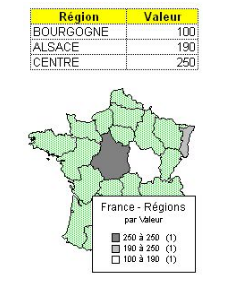
- covered in : http://qa.openoffice.org/issues/show_bug.cgi?id=37369
- useful programs GRASS and R (including packages GRASS and gstat)
- Geographic cluster analysis: http://addictedtor.free.fr/graphiques/RGraphGallery.php?graph=68
- elections Map: http://addictedtor.free.fr/graphiques/RGraphGallery.php?graph=113

Filling between 2 curves
-
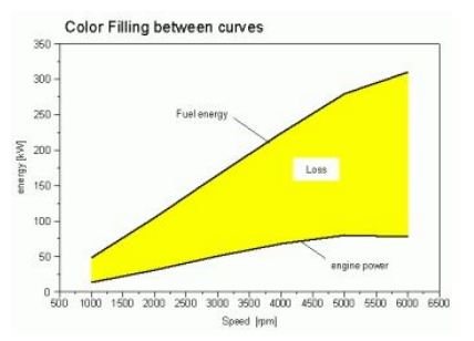
- see also http://addictedtor.free.fr/graphiques/RGraphGallery.php?graph=7
- Gradients: Seasonal Precipitations: http://addictedtor.free.fr/graphiques/RGraphGallery.php?graph=141

Less priority - Other Chart Types
Trace function

Interval Plot
- see http://junkcharts.typepad.com/junk_charts/2006/03/bar_in_a_bar.html (second graphic, NOT the 'Bar-in-bar' plot)
Cluster Plot
- Cluster Analysis: see also stat wiki page
- Cluster Plot: http://addictedtor.free.fr/graphiques/RGraphGallery.php?graph=67
Dendrograms
- coloured: http://addictedtor.free.fr/graphiques/RGraphGallery.php?graph=79
- http://addictedtor.free.fr/graphiques/RGraphGallery.php?graph=98
- Heat Map + Dendrogram: http://addictedtor.free.fr/graphiques/RGraphGallery.php?graph=66
Regressions
- Effect Plot for Generalized Linear Models: http://addictedtor.free.fr/graphiques/RGraphGallery.php?graph=124
- Quantile Regression: http://addictedtor.free.fr/graphiques/RGraphGallery.php?graph=109
Bollinger Bands
- especially in finance research, http://addictedtor.free.fr/graphiques/RGraphGallery.php?graph=65
Various Scatterplots
- with Tufte axes: http://addictedtor.free.fr/graphiques/RGraphGallery.php?graph=81
- smoothened: http://addictedtor.free.fr/graphiques/RGraphGallery.php?graph=139
- 2D boxplot: http://addictedtor.free.fr/graphiques/RGraphGallery.php?graph=112
- SPLOM - scatterplot matrices:
- 3D Scatter Plot: http://addictedtor.free.fr/graphiques/RGraphGallery.php?graph=44
Climate Diagrams
- climate diagrams are brief summaries of average climatic variables and their time course
- see http://www.zoolex.org/walter.html and http://addictedtor.free.fr/graphiques/RGraphGallery.php?graph=122
- other cyclic events: http://addictedtor.free.fr/graphiques/RGraphGallery.php?graph=75
- other dendrograms/trees:
Mosaic Plot
Funnel Plot
- for publication bias, http://addictedtor.free.fr/graphiques/RGraphGallery.php?graph=115
2D Arrow Plot
Star Plot
- http://addictedtor.free.fr/graphiques/RGraphGallery.php?graph=132
- for multivariate data set: http://addictedtor.free.fr/graphiques/RGraphGallery.php?graph=63
Several pie charts in one chart
- Possibility to display a rectangular data source as rings but also to put several pie chart in a grid.
Others
- http://addictedtor.free.fr/graphiques/RGraphGallery.php?graph=131
- http://addictedtor.free.fr/graphiques/RGraphGallery.php?graph=96
- http://addictedtor.free.fr/graphiques/RGraphGallery.php?graph=90
- http://addictedtor.free.fr/graphiques/RGraphGallery.php?graph=106
- http://addictedtor.free.fr/graphiques/allgraph.php
Complex Conditions
- Conditioning: split original data into various groups and plot them independently
- Draw Quartiles, other Indexes (e.g. of Central Tendency): http://addictedtor.free.fr/graphiques/RGraphGallery.php?graph=127
Time Series
- Kaplan-Meier curves: see http://en.wikipedia.org/wiki/Kaplan-Meier_estimator
Receiver Operating Characteristics
- ROC curves: see wikipedia and the statistics wiki page