Chart2/Features3.3
Contents
Additional Shapes
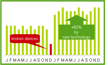
Arbitrary text shapes and drawing objects now can easily be inserted into Charts. As within the other applications the drawing toolbar allows to insert simple shapes such as lines, rectangles and text objects or more complex shapes such as symbols or block arrows. The drawing objects and texts can be manipulated via several dialogs available from the context menu. Use these additional shapes to add explanatory notes to your chart for example.
- Issue: 12587
- Specification: ChartDrawingObjects.odt
New Diagram Placement
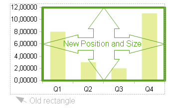
With the additional shapes it becomes more important that the placement of the diagram is stable. Until OOo 3.2.1 axis labels and axis titles were included into the positioning rectangle of the diagram. The space consumed by those labels depends on many factors like automatic scaling, chosen font, or font size, etc.. To prevent the resulting coordinate region from changing its size and position every now and then, those labels are excluded from the diagram size now. So you can set the position and size of the inner plot area directly.
- Issue: 100778
Hierarchical Axis Labels
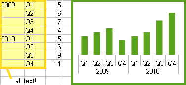
Multiple columns of categories now will be displayed in a hierarchical manner at the axis as shown. To get that automatically while creating a chart make sure that all the first columns (or rows) do contain text and not only numbers. You can also choose to set the ranges for categories to multiple columns on the 'Data Series' tab page in the Wizard or the 'Data Ranges' dialog. When having a chart with its own data, there is a new button in the 'Data Table' dialog which allows you to insert additional text columns.
- Issue: 82971
- Specification: new button for ChartDataDialog
New Defaults
Several defaults were changed to allow a faster creation of a pleasant looking and readable chart. So the diagram size is now larger with 9x16cm wide screen. That allows also for larger fonts at the axes, data labels and legend entries. We have 10pt here now. The somewhat outdated comic style with black borders around all the data points and symbols was left behind in favor of a modern clean look without borders.
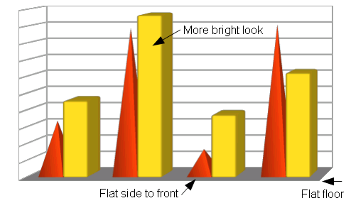
The 3D charts have received some tuning in the geometry creation and the default lights to brighten things up. They have been too dark and grey so far. Pyramids have got a new geometry also and are rotated with the flat side to front now. The floor in 3D charts has been flattened. And 3D charts are now created with “realistic look” by default, that means (no borders and smooth shading).


