Difference between revisions of "Writer/WYSIWYG"
B michaelsen (Talk | contribs) m |
|||
| Line 1: | Line 1: | ||
{{Writer Project|Category=Writer/CoreDoc}} | {{Writer Project|Category=Writer/CoreDoc}} | ||
| − | {{ | + | {{DraftPage|EN}} |
__TOC__ | __TOC__ | ||
Latest revision as of 10:13, 30 June 2018
|
Please view the guidelines
|
|---|
|
Popular Subcategories: Extension:DynamicPageList (DPL), version 2.3.0 : Warning: No results. Internal Documentation: Extension:DynamicPageList (DPL), version 2.3.0 : Warning: No results. API Documentation: Ongoing Efforts: Extension:DynamicPageList (DPL), version 2.3.0 : Warning: No results. Projects on this Wiki: (edit list)
|
| Sw.OpenOffice.org |
Contents
Introduction
The Writer is a printer device orientated text processor, i.e. the page layout, the line breaks, the distance between the baselines and the position of the characters inside the line is given by the printer driver. Ok, ok, I'm talking about the "normal" layout mode, the online layout mode is another theme, of course.
The reason is to get an optimal printing output for the doctoral thesis, the newspaper article, the book, the letter etc. During the creating of the document the user has the feedback of the printing result, this protects him from a bad surprise.
In future the electronical document exchange and displaying becomes more important and the significance of the printing output may decline.
What's the problem?
If we display the characters on the screen exact at the position they get on the printing output, the spacing looks ugly from time to time, depending on the resolution and the choosen font. The reason is a different font metric between printer and screen output device. The font metric is the height above and under the baseline (ascent, descent) and the width of the characters. The font metrics differs especially for small fonts because the screen resolution is very small in comparison with the printer resolution.
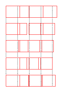
A sample: Four characters with same width for the printer layout but with different sizes for the screen display:
The printer sizes:
The screen sizes:
And here some experiments to find a good screen position near to the printer layout,
the printer position are the dotted lines.
- Ignore the printer layout, use perfect screen positions => the last character leaves the range.
- Use the (left) printer position of every character direct => Overlapping 1. and 2. character, space between 2. and 3.
- Center the screen character to the middle of the printer cells => Relative good result (for this example)
- Adjust the right border of every screen character to the right border of the printer cell => Overlapping 2./3, and 3./4. character
- The actual writer algorithm, the right border of the screen char is a compromise between the right border of the printer cell and the (screen) optimal right border.
- To ignore the printer position is not a good idea, the spacing between the screen characters is perfect, but what about tabulators, object like flyframes and the right border of the line? The screen output could hurt these limits, if it ignore the given printer positions.
- 100% printer position for screen output may be ugly, cause the spacing between characters jumps from overlapping to extra space from character to character as shown in example.
- Centering may be a possibility, the fluctuation in character spacing is better than in 2.
- Same problems like 2.
- A working compromise, not perfect at all.
What's the actual implementation?
The writer calculates a compromise position: 75% the perfect screen position immediately behind the last (screen) character and 25% of the position to adjust the screen character to the right border of the printer cell (see 4. above) with exceptions to the rule: If a character follows a blank character or it is the blank itself, the screen position is identical to the printer position. Another exception is the pair kerning, if pair kerning is activated, the influence of the printer position grows to 50%.
Even the influence of the printer seems to be insignificant, it's visible and it's annoying. For small fonts a deviation from a pixel to the optimal screen position looks very ugly sometimes.
There's another point: the calculation is based on logical coordinates in twips, the output is founded on pixel coordinates.
The chosen screen font and the printer font
If the font for displaying on the screen is smaller than the printer font, the problems are smaller, too. If the screen font has wider characters, they often come to contact eachother. So the writer tries to select the better screen font by testing two fonts. The first font is the font with the properties of the user, the second font is the font, which is used by the printer. These fonts may differ, e.g. the user font is unknown by the printer driver, so the printer uses an alternative font.
If aUserFont is the user font, pPrinter the printer output device and pScreen the window output device, this looks like follows:
pPrinter->SetFont( aUserFont );
pScreen->SetFont( aUserFont ) => test first font
pScreen->SetFont( pPrinter->GetFontMetric() ) =>test second font.
To choose the better font, the writer compares the width of a static standard test string, measured at the printer and at the screen with both alternatives. The screen font which is closer to the printer font is selected, but if the screen width is wider, the divergence is multiplied with 2 to prefer smaller fonts.
Another problem
The distance between the baselines is the font height of the printer device. If we have a bigger font for the screen display, the lines could overlap, especially the underscore or underlined characters causes problems. So the writer compares the height of the screen and the printer font and reduces the screen font size until it fits.

