Difference between revisions of "Website/Proposals"
(→Visual design proposals) |
|||
| (28 intermediate revisions by 5 users not shown) | |||
| Line 5: | Line 5: | ||
While work continues on finalizing the Website requirements, artists are encouraged to add their mock-ups of Website designs on this page so that we can keep track of all the proposals and the progress being made on each. By sharing our ideas we can also improve our designs overall towards the final product. | While work continues on finalizing the Website requirements, artists are encouraged to add their mock-ups of Website designs on this page so that we can keep track of all the proposals and the progress being made on each. By sharing our ideas we can also improve our designs overall towards the final product. | ||
| − | + | Looking for earlier proposals? [[Website/2007/Proposals]] | |
| − | + | ||
| − | + | ||
| − | + | === Design base === | |
| − | + | Minimalist OOo and murb_proposal1 were the designs that won the vote, please try to design from these designs. | |
| − | + | ||
| − | ; [http:// | + | ; [http://www.patentpending.co.nz/images/openoffice/siteconcept2.png Minimalist OOo] |
| − | + | : [[Image:thumb7.png]] | |
| − | :[[Image: | + | :;Author: Ivan |
| + | :;Description: A minimalist approach to graphics with more emphasis on text. This design would be fast loading (graphics < 10KB) and very flexible in terms of content placement (numbers of columns, rows, etc). | ||
| + | : [http://www.patentpending.co.nz/images/openoffice/minimalist.zip Download Source File] | ||
| − | ; [ | + | ;murb_proposal1 (modified Ivan_minimal) |
| − | : | + | :[[Image:Murb_homepageproposal1_homepage_normal.png|left|thumb|Normal homepage]][[Image:Murb_homepageproposal1_homepage_download.png|left|thumb|Homepage after the download action statement is clicked and OS is Windows XP]][[Image:Murb_homepageproposal1_homepage_download_mac.png|left|thumb|Homepage after the download action statement is clicked and OS is Mac]][[Image:Murb_homepageproposal1_homepage_normal_lang.png|left|thumb|Normal homepage when browserlanguage is not English, but Dutch]] |
| − | + | <br clear="all" /> | |
| + | :;Author: Murb (based on Ivan's minimal) | ||
| + | :;Date submitted: 14 December 2007 (CET) | ||
| − | + | === New variations === | |
| − | + | ||
| − | + | ||
| − | + | ||
| − | + | ||
| − | ; | + | ;Overkill 04 |
| − | : | + | :[[Image:siteprop04.png|left|thumb|Overkill turns minimalist]] |
| − | : | + | <br clear="all" /> |
| + | :;Author: Nik | ||
| + | :;Date submitted: 15.01.08 | ||
| + | :;Description: A modification of Ivan and Maarten's Minimalist design. And about dang time too! =) | ||
| − | + | :[[Image:Randy_Minimalist_Why_Thumb.jpg]] - - [[Image:Solo_Gull_230x120.png]] | |
| − | : | + | :;Author: Randy |
| − | + | :;Date submitted: 12 January 2008 | |
| + | :;Description: This is a Why page mockup in the new home page style. Content was pasted from the current Why page, changed here and there to make the text blocks look more even 8^) My little buddy the seagull is back, along with icon-curve-based tab images, a much lighter footer (again taken from the current footer). I also brightened up the blue in the orb icons a bit, along with using "OOo Blue" for links, etc. to help keep the logo from looking isolated. Verdana is the Head/Subhead font, Georgia for body text. | ||
| + | ;;[http://fission1.free-web-hosting.biz/OOo_Web/why/Randy_Minimalist_Why.html Click Here for Full Size] | ||
| + | ;;[http://fission1.free-web-hosting.biz/OOo_Web/why/Randy_Minimalist_Why.psd Download PSD] | ||
| − | :: | + | ::And a seagull. |
| − | + | ;[http://fission1.free-web-hosting.biz/OOo_Web/minimalist/Minimalist_Randy_Mod-1.html Minimalist_Randy_Mod-1] | |
| − | + | :[[Image:Minimalist_Randy_Mod-1_thumb.gif]] | |
| − | + | :;Author: Randy | |
| − | + | :;Date submitted: 1 January 2008 | |
| − | + | :;Description: This is my take on the minimalist design. I managed to sneek the gull in 8^). I'm kind of attached to the seagull as an element of freedom, plus the idea of the 'hatchling' from the old home page, now fully grown and soaring. The gull image by itself is only about 7K. I also added a footer based on overkill2mod by Nik | |
| − | :: | + | |
| − | + | ||
| − | :: | + | |
| − | :: | + | |
| − | + | ||
| − | + | ||
== Architectual proposals == | == Architectual proposals == | ||
| Line 55: | Line 52: | ||
* Several diagrams about now and future: http://ux.openoffice.org/reports/2007/website/sitestructure.odp | * Several diagrams about now and future: http://ux.openoffice.org/reports/2007/website/sitestructure.odp | ||
* Another sitestructure proposal by [[User:Murb|Murb]]: http://www.openoffice.org/nonav/issues/showattachment.cgi/49988/sitestructure.odp (based on a previous one, explanation included) | * Another sitestructure proposal by [[User:Murb|Murb]]: http://www.openoffice.org/nonav/issues/showattachment.cgi/49988/sitestructure.odp (based on a previous one, explanation included) | ||
| + | * Sitemap proposal by Graham: http://ooogear.co.nz/sitemap.html | ||
=== URL === | === URL === | ||
| Line 73: | Line 71: | ||
# What to do about the "Native Language" button????? | # What to do about the "Native Language" button????? | ||
#* [[User:Murb|maarten]]: We could do language detection, and have an box appear when the default language is other than English. Furthermore I think we should maybe stop presenting it as a Native Language confederation, but just OpenOffice.org in your own language. OpenOffice.org is a community, you can be part of in your own language as well. | #* [[User:Murb|maarten]]: We could do language detection, and have an box appear when the default language is other than English. Furthermore I think we should maybe stop presenting it as a Native Language confederation, but just OpenOffice.org in your own language. OpenOffice.org is a community, you can be part of in your own language as well. | ||
| − | |||
| − | |||
# Get rid of the right side News list. IF we think some of these are important as permanent links, add them to the upper toolbar. | # Get rid of the right side News list. IF we think some of these are important as permanent links, add them to the upper toolbar. | ||
#* [[User:Murb|maarten]]: I assume you are referring here to the "Always" links. Completely agree. Furthermore it is not a good idea to link directly off-site. It is better to only refer to 'press announcements' published by OOo (press announcements may be a bit too formal, we could also think of posts from a blog controlled by some of the major project/community leads (e.g. Louis) and or some dedicated writers willing to keep end-users up to date about recent developments. If we have some kind of serverside technique it is easy to have an RSS feed to be included automatically... (otherwise, it can be done using javascript and in case of no JS, link to the blog itself. | #* [[User:Murb|maarten]]: I assume you are referring here to the "Always" links. Completely agree. Furthermore it is not a good idea to link directly off-site. It is better to only refer to 'press announcements' published by OOo (press announcements may be a bit too formal, we could also think of posts from a blog controlled by some of the major project/community leads (e.g. Louis) and or some dedicated writers willing to keep end-users up to date about recent developments. If we have some kind of serverside technique it is easy to have an RSS feed to be included automatically... (otherwise, it can be done using javascript and in case of no JS, link to the blog itself. | ||
#* (Kays original moved) Yes, we still need to *always* include some catchy news items toward the bottom. These should give visitors a warm and fuzzy feeling like they've discovered an important project that they're not part of. | #* (Kays original moved) Yes, we still need to *always* include some catchy news items toward the bottom. These should give visitors a warm and fuzzy feeling like they've discovered an important project that they're not part of. | ||
# Mostly we need to make visitors feel welcome and not confused. Actually the "Contributing" page is very nice in terms of friendliness. | # Mostly we need to make visitors feel welcome and not confused. Actually the "Contributing" page is very nice in terms of friendliness. | ||
| − | |||
| − | |||
| − | |||
| − | |||
| − | |||
| − | |||
| − | |||
'''New HELP/Support Area''' | '''New HELP/Support Area''' | ||
| + | See the proposed content at: [[Website/Content/help]] (covers all what is below now) | ||
| + | |||
| + | [covered by the latest proposal on the wiki] | ||
* WOW! The Support tab, which is very complete, again, seems a bit overpowering to me. Might we just ditch the "user" mailing list and get general users into the new Forum area instead. This would help everyone I would think. Is there some way to easily port users subscription info from the mailing list INTO the Forum area and then jsut notify everyone. | * WOW! The Support tab, which is very complete, again, seems a bit overpowering to me. Might we just ditch the "user" mailing list and get general users into the new Forum area instead. This would help everyone I would think. Is there some way to easily port users subscription info from the mailing list INTO the Forum area and then jsut notify everyone. | ||
* If FAQ is really dead, why don't we just eliminate or archive the latest in some fashion. | * If FAQ is really dead, why don't we just eliminate or archive the latest in some fashion. | ||
| + | ** The FAQ isn't dead, the User-FAQ project is. Remove ot and point people [[Documentation/FAQ|here]] | ||
* I would reorganize some of the Support page's links into somethink like "Other Resources" if they aren't specifically coming from the OO.o site. | * I would reorganize some of the Support page's links into somethink like "Other Resources" if they aren't specifically coming from the OO.o site. | ||
* Definitely emphasize more "live" type support (i.e the Forum mechanism first) | * Definitely emphasize more "live" type support (i.e the Forum mechanism first) | ||
| − | The "Help Area" should point to | + | * The "Help Area" should point to |
| − | * [[User:fpe]]: the (soon to go live) forum | + | ** [[User:fpe]]: the (soon to go live) forum |
| − | * [[User:fpe]]: the Documentation project wiki page | + | ** [[User:fpe]]: the Documentation project wiki page |
| − | * [[User:fpe]]: the support page, which needs a clean-up. Get rid of 1.1x resources and put then in the archive | + | ** [[User:fpe]]: the support page, which needs a clean-up. Get rid of 1.1x resources and put then in the archive |
| − | + | * Add a HELP to the upper toolbar right next to HOME that would basically link to a New User/FAQ page *as well as* whatever we want to include from the current SUPPORT tab. Eliminate SO MUCH text. If we can't make the site more or less icon-intuiative, we're in big trouble. People are impatient! I would augment whatever is done to the new HELP area in some way so that folks running on specific OSes know exactly where to go for help. | |
| − | + | ** [[User:Murb|maarten]]: We should either have a help or support option in the menubar, not both. But yes, further cleaning is definitely required. It is too much oriented about types of help, whereas most users are probably focussed on getting help to a specific problem (without being worried about from which source it comes). | |
| − | + | * A new HELP page should encourage visitors to use a "knowledgebase" of some kind...then if all else fails, send an e-mail. (=Forum / FAQ / Mailinglist) | |
| + | ** [[User:Murb|maarten]]: I think we could try working from the support page. Maybe it is a better idea though to remove the 'Need help' link from every page, since it only deals with problems with the Collab net framework (this should be integrated with a more comprehensive help system. | ||
| + | * New User Area Needs to be much,much briefer. Maybe a quit over of what OO.o is with links to a newly revised HELP area. Currently too wordy in my estimation. | ||
| + | ** [[User:Murb|maarten]]: Maybe if help/support is improved, there is not even a need for this special page. [newly proposed content, solves it...] | ||
| + | [/covered] | ||
[[Category:Website|Proposals]] | [[Category:Website|Proposals]] | ||
Latest revision as of 22:29, 18 January 2008
This page covers both proposals from an architectural perspective and more of a visual perspective. I (Murb) would urge you to have a look at the more architectural aspects as well.
Contents
Visual design proposals
While work continues on finalizing the Website requirements, artists are encouraged to add their mock-ups of Website designs on this page so that we can keep track of all the proposals and the progress being made on each. By sharing our ideas we can also improve our designs overall towards the final product.
Looking for earlier proposals? Website/2007/Proposals
Design base
Minimalist OOo and murb_proposal1 were the designs that won the vote, please try to design from these designs.
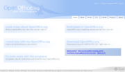
- Minimalist OOo
-
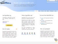
- Author
- Ivan
- Description
- A minimalist approach to graphics with more emphasis on text. This design would be fast loading (graphics < 10KB) and very flexible in terms of content placement (numbers of columns, rows, etc).
- Download Source File

- murb_proposal1 (modified Ivan_minimal)
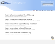 Normal homepage
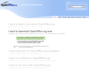 Homepage after the download action statement is clicked and OS is Windows XP
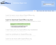 Homepage after the download action statement is clicked and OS is Mac
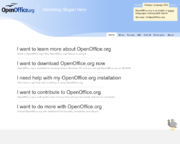 Normal homepage when browserlanguage is not English, but Dutch


- Author
- Murb (based on Ivan's minimal)
- Date submitted
- 14 December 2007 (CET)
New variations
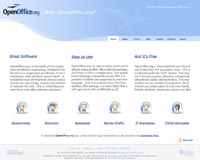
- Overkill 04
 Overkill turns minimalist

- Author
- Nik
- Date submitted
- 15.01.08
- Description
- A modification of Ivan and Maarten's Minimalist design. And about dang time too! =)
 - -
- - 
- Author
- Randy
- Date submitted
- 12 January 2008
- Description
- This is a Why page mockup in the new home page style. Content was pasted from the current Why page, changed here and there to make the text blocks look more even 8^) My little buddy the seagull is back, along with icon-curve-based tab images, a much lighter footer (again taken from the current footer). I also brightened up the blue in the orb icons a bit, along with using "OOo Blue" for links, etc. to help keep the logo from looking isolated. Verdana is the Head/Subhead font, Georgia for body text.
- Click Here for Full Size
- Download PSD


- And a seagull.
- Minimalist_Randy_Mod-1

- Author
- Randy
- Date submitted
- 1 January 2008
- Description
- This is my take on the minimalist design. I managed to sneek the gull in 8^). I'm kind of attached to the seagull as an element of freedom, plus the idea of the 'hatchling' from the old home page, now fully grown and soaring. The gull image by itself is only about 7K. I also added a footer based on overkill2mod by Nik

Architectual proposals
Proposals
A collection of design proposals, outlines, in a form that doesn't fit here on the wiki...
- Screenshots for current site and proposed new designs: http://ux.openoffice.org/reports/2007/website/sitedesign.odp
- Several diagrams about now and future: http://ux.openoffice.org/reports/2007/website/sitestructure.odp
- Another sitestructure proposal by Murb: http://www.openoffice.org/nonav/issues/showattachment.cgi/49988/sitestructure.odp (based on a previous one, explanation included)
- Sitemap proposal by Graham: http://ooogear.co.nz/sitemap.html
URL
I see a main homepage and 3 or 4 sub-homepages. Although all are linked, I would define a sub-homepage as a web page using a URL that is clear and simple for user to type or store in their Favorites or Bookmark file. E.g.:
- www.openoffice.org/part (participant page)
- www.openoffice.org/devel (developer page)
- www.openoffice.org/upgrade (upgrade page)
- www.openoffice.org/issue (issue tracker page)
If experienced users could by-pass the sales/marketing talk and first-time-downloading and go directly to their area of interest, this scheme might avoid some of the competition about what should be on the front page,. If people are interested, we could begin to diagram out the interrelationship of these various homepages and the info pages that belong with each. It shouldn't be hard to define the various target audiences and what their respective needs are.BillCase 23:28, 24 November 2007 (CET)
[from kschenk]
Home Page
- Home page needs a "friendly" facelift. Maybe put the gull mascot in the middle with downloads button to the LEFT and text explanation of what OO.o is to the LEFT.
- What to do about the "Native Language" button?????
- maarten: We could do language detection, and have an box appear when the default language is other than English. Furthermore I think we should maybe stop presenting it as a Native Language confederation, but just OpenOffice.org in your own language. OpenOffice.org is a community, you can be part of in your own language as well.
- Get rid of the right side News list. IF we think some of these are important as permanent links, add them to the upper toolbar.
- maarten: I assume you are referring here to the "Always" links. Completely agree. Furthermore it is not a good idea to link directly off-site. It is better to only refer to 'press announcements' published by OOo (press announcements may be a bit too formal, we could also think of posts from a blog controlled by some of the major project/community leads (e.g. Louis) and or some dedicated writers willing to keep end-users up to date about recent developments. If we have some kind of serverside technique it is easy to have an RSS feed to be included automatically... (otherwise, it can be done using javascript and in case of no JS, link to the blog itself.
- (Kays original moved) Yes, we still need to *always* include some catchy news items toward the bottom. These should give visitors a warm and fuzzy feeling like they've discovered an important project that they're not part of.
- Mostly we need to make visitors feel welcome and not confused. Actually the "Contributing" page is very nice in terms of friendliness.
New HELP/Support Area See the proposed content at: Website/Content/help (covers all what is below now)
[covered by the latest proposal on the wiki]
- WOW! The Support tab, which is very complete, again, seems a bit overpowering to me. Might we just ditch the "user" mailing list and get general users into the new Forum area instead. This would help everyone I would think. Is there some way to easily port users subscription info from the mailing list INTO the Forum area and then jsut notify everyone.
- If FAQ is really dead, why don't we just eliminate or archive the latest in some fashion.
- The FAQ isn't dead, the User-FAQ project is. Remove ot and point people here
- I would reorganize some of the Support page's links into somethink like "Other Resources" if they aren't specifically coming from the OO.o site.
- Definitely emphasize more "live" type support (i.e the Forum mechanism first)
- The "Help Area" should point to
- Add a HELP to the upper toolbar right next to HOME that would basically link to a New User/FAQ page *as well as* whatever we want to include from the current SUPPORT tab. Eliminate SO MUCH text. If we can't make the site more or less icon-intuiative, we're in big trouble. People are impatient! I would augment whatever is done to the new HELP area in some way so that folks running on specific OSes know exactly where to go for help.
- maarten: We should either have a help or support option in the menubar, not both. But yes, further cleaning is definitely required. It is too much oriented about types of help, whereas most users are probably focussed on getting help to a specific problem (without being worried about from which source it comes).
- A new HELP page should encourage visitors to use a "knowledgebase" of some kind...then if all else fails, send an e-mail. (=Forum / FAQ / Mailinglist)
- maarten: I think we could try working from the support page. Maybe it is a better idea though to remove the 'Need help' link from every page, since it only deals with problems with the Collab net framework (this should be integrated with a more comprehensive help system.
- New User Area Needs to be much,much briefer. Maybe a quit over of what OO.o is with links to a newly revised HELP area. Currently too wordy in my estimation.
- maarten: Maybe if help/support is improved, there is not even a need for this special page. [newly proposed content, solves it...]
[/covered]