Difference between revisions of "Website/2010 Redesign/Ideas"
m |
m (→Homepage Layout) |
||
| (One intermediate revision by one other user not shown) | |||
| Line 63: | Line 63: | ||
## Project leads | ## Project leads | ||
## Language communities | ## Language communities | ||
| + | |||
| + | |||
| + | Results of previous effort to structure OpenOffice.org site content can be found in [[Information_Sharing]] wiki page. | ||
| + | |||
| + | [[File:Ooo_ia_murb_2007.png]] | ||
| + | |||
| + | OpenOffice.org website information architecture proposal from [http://ux.openoffice.org/reports/2007/website/sitestructure.odp OOo Website Structure] presentation. | ||
| + | |||
| + | Persona profiles are available in [http://ux.openoffice.org/reports/2007/website/usergroups.odp OOo Website User Groups] presentation. [[User_Pages_Requirements]] page has some additional use cases specified. | ||
== Footer == | == Footer == | ||
| Line 71: | Line 80: | ||
== Homepage Layout == | == Homepage Layout == | ||
| + | |||
| + | === Ideas from Other Websites === | ||
| + | |||
| + | * [http://www.opera.com/ Opera] - clean header navigation, eye catching design, good grid layout. | ||
== Cleaning Up == | == Cleaning Up == | ||
Latest revision as of 00:30, 12 July 2010
Contents
CSS
- We should endeavour to use a common CSS framework across all sites (which also implies a common HTML framework - in terms of layout). Right now, each site uses its own CSS adapted from the main website with different classes, etc. Creating a robust and reusable CSS framework would be one of the top priorities; it would serve as the base, and other websites could then build on it.
Header
We could have a two-level menu (CSS-only): the top level, consisting of main items, and a sub-menu for some of the items (triggered by rollover). The top level menu links would be clickable (therefore it would remain accessible) but the submenu could provide one-click access to specific areas of the website (e.g., 1 click access to the issue tracker from the developer menu item). The most commonly accessed sub-link would be directly under its parent link.
Alternatively we can avoid using popup menus as they can be hard to navigate and use two horizontal bars for the navigation with second bar display on click. This can allow us to have consistent navigation as sub menu pages can always display second bar by default. UX project should have a strong say in, we should consider all the possible options with regard to navigation.
- Home (Do we need it? Could the logo serve this purpose like on mozilla.org?)
- News
- Press Releases
- Planet
- Download(s)
- Latest Version
- Extensions
- Templates
- Clipart
- Developer Previews
- Projects (or Community)
- How to Join (or Join Us)
- A few links to major projects
- More projects >>
- Support
- Forums
- Tutorials
- Books
- Commercial Support
- Wiki
- Development
- Getting Started
- Source Code
- Issue Tracker
- About
In a discussion on the mailing list, Goran suggested another site navigation structure that is trying to better reflect "OpenOffice.org is both a product and an open source project (community)". It does not require any new content to be written.
- News
- Press releases
- Blog planets
- Newsletter
- Office suite
- Download!
- Awards and reviews
- Extensions
- Templates
- Clipart
- Projects
- Contribute
- Ideas how to help
- Issue tracker
- Development
- Support
- Wiki
- About community
- Open source
- Community vision
- Organization and governance
- Project leads
- Language communities
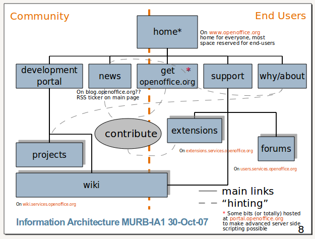
Results of previous effort to structure OpenOffice.org site content can be found in Information_Sharing wiki page.
OpenOffice.org website information architecture proposal from OOo Website Structure presentation.
Persona profiles are available in OOo Website User Groups presentation. User_Pages_Requirements page has some additional use cases specified.
- A bigger footer with links, like Mozilla
Metadata
Homepage Layout
Ideas from Other Websites
- Opera - clean header navigation, eye catching design, good grid layout.
Cleaning Up
- Removing/archiving old pages
- Simplifying content...
