Difference between revisions of "User:ChristophNoack/Planet Refresh 2010"
(→Design Proposals and Idea Collection) |
(Updated design and added Ivan'ss Proposal→Design Proposals and Idea Collection) |
||
| Line 61: | Line 61: | ||
== Design Proposals and Idea Collection == | == Design Proposals and Idea Collection == | ||
| − | + | === Connor === | |
| − | + | {| class="prettytable" | |
| + | |- | ||
| + | | | ||
| + | [[Image:OOo Planet.jpg|thumb|center|300px]] | ||
| − | Feedback, concerns, criticism? | + | | |
| − | [[ | + | This is a my first proposal for this redesign/development. I am still not certain how we can better improve the functionality of the planet... my original task is to increase it's visual aesthetic appeal with the general layout, then move from there. |
| + | |||
| + | I purposefully left out the header & footer, because if the Branding team has a new concept for those, this will utilize those concepts to stay uniform. Otherwise, we are sticking to the new branding guidelines, and even use a small planet logo Ivan made as icons for all of our planets! :) | ||
| + | |||
| + | Feedback, concerns, criticism? | ||
| + | |||
| + | |} | ||
| + | |||
| + | === Ivan === | ||
| + | |||
| + | {| class="prettytable" | ||
| + | |- | ||
| + | | | ||
| + | [[Image:OOoPlanetDraft.png|thumb|center|300px]] | ||
| + | |||
| + | | Looking at the current Planet, most of the posts are text-only, so it might be better to add a little "flashy"ness. The current planet doesn't motivate me to read the posts - I'd rather click on the post title and go to the original blog in the hope that the layout is better there. Having photos would definitely help the layout: faces on a white background would be ideal, but in other cases we could enclose them in a circle (to fit with the gull orb symbol). Whatever we can do to enhance readability (be it better font properties, more generous line spacing, etc). would help IMO. | ||
| + | I've put up a quick mockup based on the one by Connor. | ||
| + | |||
| + | We could also get rid of redundant info - either have the post date/time at the bottom of each post or have it as a heading for each day's posts. The sidebar is looking good - nice and simple. I guess clicking 'Add your blog' would take people to a form (or email address) where they can submit a link to their blog's OOo-related topics feed?<br> | ||
| + | |||
| + | |} | ||
== Final Design == | == Final Design == | ||
Revision as of 21:41, 13 May 2010
|
|
|---|
|
Quick Navigation Team Communication Activities |
Contents
Introduction
Summary
- Refresh of the OpenOffice.org Planet planet.services.openoffice.org
- Current discussion at ux-discuss.
- ... more to come (hopefully)
The team working on the feature:
| Role | Name | E-Mail Address |
| ... | Connor Montgomery | connor@connormontgomery.com |
Details
tbd
Requirements
Scope of the Work
tbd
Target Groups
tbd
Current OpenOffice.org Planets
tbd
Competitive Analysis
- A great overview can be found at User:DrewJensen/planets
tbd
Requirements List
tbd
Technical Constraints
- Infrastructure information at Infrastructure Overview
- Infrastructure prolems at Infrastructure Problems
tbd
Definition of Terms
Design Proposals and Idea Collection
Connor
|
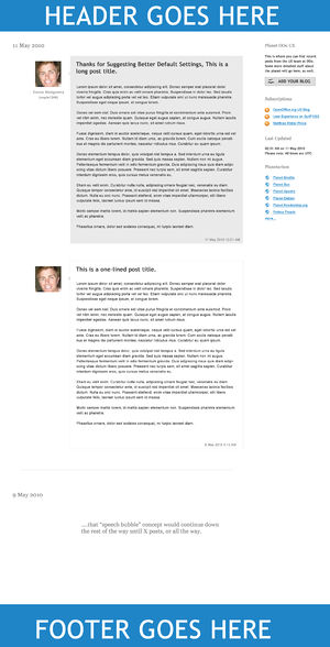
This is a my first proposal for this redesign/development. I am still not certain how we can better improve the functionality of the planet... my original task is to increase it's visual aesthetic appeal with the general layout, then move from there. I purposefully left out the header & footer, because if the Branding team has a new concept for those, this will utilize those concepts to stay uniform. Otherwise, we are sticking to the new branding guidelines, and even use a small planet logo Ivan made as icons for all of our planets! :) Feedback, concerns, criticism? |
Ivan
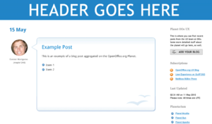
| Looking at the current Planet, most of the posts are text-only, so it might be better to add a little "flashy"ness. The current planet doesn't motivate me to read the posts - I'd rather click on the post title and go to the original blog in the hope that the layout is better there. Having photos would definitely help the layout: faces on a white background would be ideal, but in other cases we could enclose them in a circle (to fit with the gull orb symbol). Whatever we can do to enhance readability (be it better font properties, more generous line spacing, etc). would help IMO.
I've put up a quick mockup based on the one by Connor. We could also get rid of redundant info - either have the post date/time at the bottom of each post or have it as a heading for each day's posts. The sidebar is looking good - nice and simple. I guess clicking 'Add your blog' would take people to a form (or email address) where they can submit a link to their blog's OOo-related topics feed? |
Final Design
tbd
Status and Roadmap
tbd
Help for Contributors
tbd
Online Discussion, Press Coverage and Comments
tbd


