Sidebar Proposal by IBM
|
|
|---|
|
Quick Navigation
Team |
| Please do not edit this page unless you are the original author. Your feedback and comments are welcome in the Comments section below or on the ui@ux.openoffice.org mailing list. |
Design Proposal -- Sidebar -- By IBM
The following design proposal is part of the collection of design proposals for “Accessing Functionality”, which is part of Project Renaissance.
Contents
Summary and Status
We propose a sidebar way to organize the commands/UI entries on OpenOffice.org UI.
|
Benefit:
|
Status: Complete
Mockups
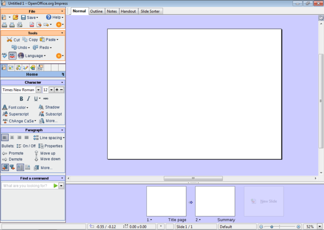
1024x768 with full sidebar
- The size of the picture is 1024x729 pixels. I have taken 39 pixels away in height: it is the size of the taskbar in Windows 7, which will probably be the standard when Renaissance becomes reality. The two standard panels in GNOME would take even more vertical space: 50 pixels height.
- This layout leaves more space for the document than in OOo 3.1.
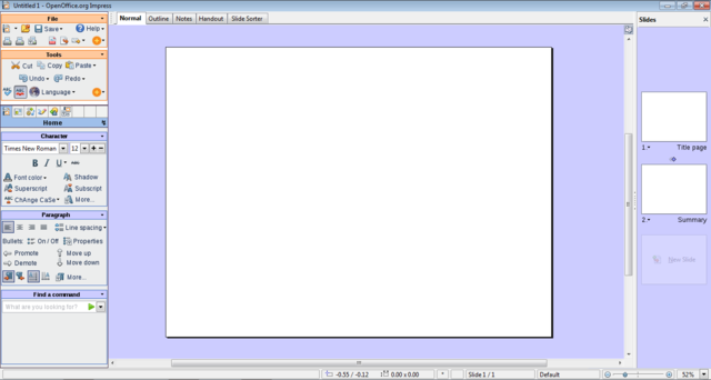
1366x768 with full sidebar
- The size of the picture is 1366x729 pixels. As in the precedent mockup, have taken 39 pixels away in height for the OS taskbar(s).
- Why 1366x768? It appears to be the tendency for laptop panels, replacing 1280x800, and it is an example of a 16:9 ratio screen resolution. More explanation in the detailed description.
- I should have made the "Slide Pane" larger. There is plenty of horizontal space for it. (It would take a lot of time to correct, so please imagine it!)
- It looks really ugly, but I tried to "toolbarize" the view tabs. (Normal, Outline, Notes, Slide Sorter) As a toolbar it can be moved around - vertical, for example, it would eat less space. But my main point is that now, toolbars can also be added on the same "line", therefore not loosing space:
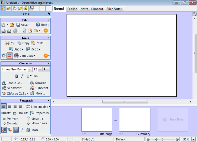
800x600 with full sidebar
- If the vertical size of the Impress window goes under 700 pixels, the "Find a Command" group disappears.
- The size of the picture is 800x576 pixels. I have taken 24 pixels away in height for a taskbar.
- I should have reduced the height of the slide pane at the botton, it is the same size as in 1024x768. Please imagine it a litte bit smaller!
- This mockup has 600 pixels in height, and hence shows how the design adapts to notebooks screen resolutions.
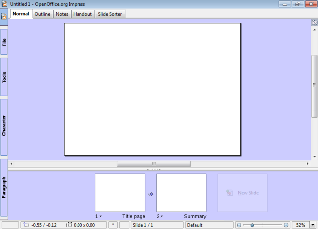
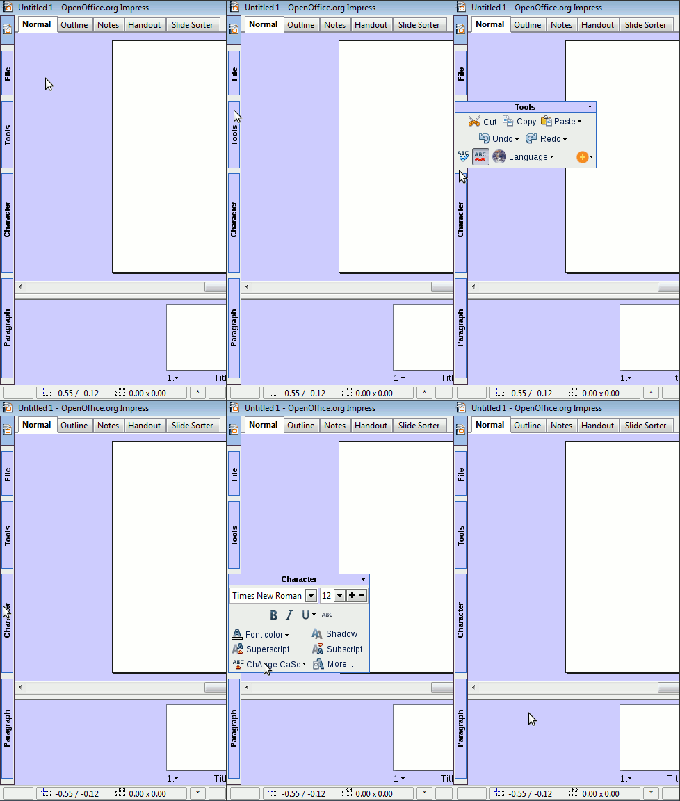
800x600 with collapsed sidebar
- In any resolution, the sidebar is able to collapse.
- Here is a proposal about how the collapsed sidebar could work:
(Sorry about the poor quality, it's the first animated picture in my life...)
- The collapsed sidebar would allow to go under 600 pixels height.
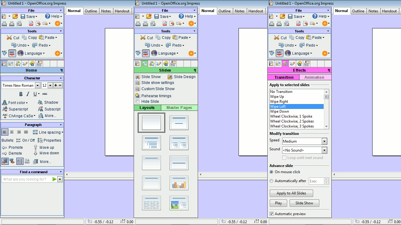
How the Sidebar Selector works...
- This is a variation on the sidebar theme, where the "File" and "Tools" groups stay on top of the sidebar. It was also influenced by comments from Brian Fleeger and Corsbu.
(Animated gif, 3 frames)
More Mockups... Writer!
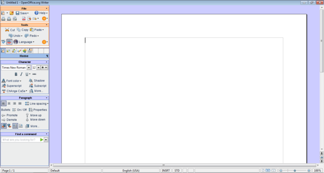
The focus of the call proposal is Impress. Nevertheless, Writer is interesting too, because it suffers more than Impress of the wide-screen trend. The page is mostly vertical (portrait), and there is no Slide Pane element. Two major differences!
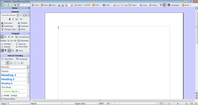
The current Writer aspect eats up a lot of vertical space, and leaves huge chunks of unused space on the sides. Here is how Writer 3.1 looks like on a 10:9 wide-screen monitor (1366x768):
A vertical UI would allow to display more of the most important element: the page!
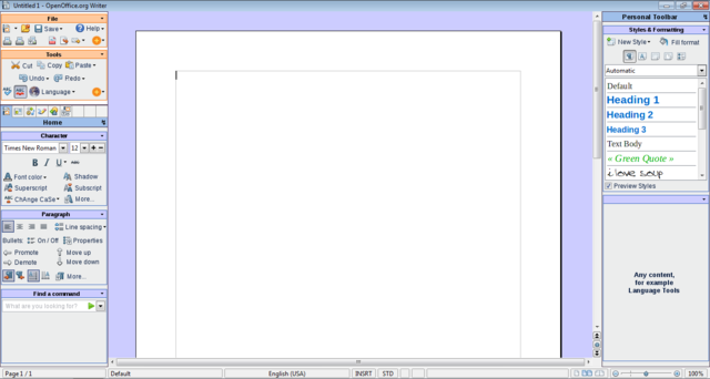
If we have 2 sidebars, we end up with the same zoom as in the first Writer mockup (100%), but with a 23% displayed page height increase:
Here comes the last general mockup. Unless other mockups, this one has almost everything:
- Toolbars, wich expand with text labels, as wide as possible,
- Ruler button, to show/hide the rulers easily,
- Zoom control, possible to type in zoom, or use left-click,
- Styles with preview,
- Sidebar, of course :-)
Detailed Description
- This proposal takes its roots in some basic ideas. I will detail some of them here.
- You may notice than some points are more detailed than others, regardless of their importance. One reason for it is that on some subjects, I am using material I had already written - for example the "line spacing" part. Let's start!
A. Modern wide-screen resolutions
1. Laptops
- There is a clear tendency in screen resolutions in favour of wide resolutions. Laptops have almost all wide resolutions by now, the newest adopting even wider resolutions like 1366x768 (Dell Studio 15, Studio 16, Inspiron 15), which seems to be the new standard, instead of 1280x800, 1600x900 (Sony Vaio FW Series) instead of 1440x900, or 1920x1080 (Dell Studio 16, Sony Vaio AW-Serie) instead of 1980x1200.
- I just goggled around, just to find an article showing that the 4:3 to 16:10 to 16:9 is not my own fantasy:
- Laptop have topped Desktop computer sales since Q4 2008. So they can't be ignored.

