Difference between revisions of "Sidebar Proposal by IBM"
Maliinchina (Talk | contribs) (Created page with '{{User Experience Community}} {| style="border: thin dashed #CC2222; padding:5px; background:#FFDAB9" |- | Please do not edit this page unless you are the original author. Your …') |
m (→Properties Panel: Fixed typos) |
||
| (11 intermediate revisions by one other user not shown) | |||
| Line 9: | Line 9: | ||
__TOC__ | __TOC__ | ||
| − | == Summary | + | == Summary== |
{| style="border: thin dashed #ff9900; padding:5px; background:#ffff99" | {| style="border: thin dashed #ff9900; padding:5px; background:#ffff99" | ||
|- | |- | ||
| − | |We propose a | + | |We propose a way which we call "Sidebar" to organize the commands/UI entries on OpenOffice.org UI. |
* All panels in OpenOffice.org can be docked to this sidebar. | * All panels in OpenOffice.org can be docked to this sidebar. | ||
* Users can switch the panels via tabs beside the docked panels. | * Users can switch the panels via tabs beside the docked panels. | ||
| Line 21: | Line 21: | ||
* Current OpenOffice.org UI can be migrated to this UI easily and quickly. | * Current OpenOffice.org UI can be migrated to this UI easily and quickly. | ||
* Users don't need to suffer the big changes and knowledge break, like what MS Ribbon did. | * Users don't need to suffer the big changes and knowledge break, like what MS Ribbon did. | ||
| − | * Provide a reasonable layout. More and more screens are wide nowadays. Put such UI on side will save the vertical spacing on screen and provide more | + | * Provide a reasonable layout. More and more screens are wide nowadays. Put such UI on side will save the vertical spacing on screen and provide more space for editing. |
|} | |} | ||
| − | |||
| − | |||
| − | == | + | == Sidebar == |
| − | + | '''Manage the panels with Sidebar''' | |
| − | + | * All panels of OOo 3.1 can be docked to the side of editing area. | |
{| class="prettytable" | {| class="prettytable" | ||
| − | | [[Image: | + | | [[Image:IBM_Sidebar_Properties.jpg]] |
| − | + | ||
|} | |} | ||
| − | + | Users can click on the icons on a skinny bar beside the panel, to switch between panels. | |
| − | + | <BR> | |
| − | + | <BR> | |
| − | + | Here is an example: switch to Style List panel. | |
| − | + | ||
| − | + | ||
| − | + | ||
{| class="prettytable" | {| class="prettytable" | ||
| − | | [[Image: | + | | [[Image:IBM_Sidebar_Style_list.jpg]] |
| − | + | ||
|} | |} | ||
| + | <BR> | ||
| + | <BR> | ||
| + | <BR> | ||
| + | '''Customization''' | ||
| + | * Users can select which panels will be shown on Sidebar. Just right-click on the skinny bar and set on a menu. | ||
| + | <BR> | ||
| + | <BR> | ||
| + | '''Be Compatible with current behaviors of panels in OOo 3.1''' | ||
| + | * Users are free to dock the panels. They can dock the panels to the Sidebar, as what we are shown here. | ||
| + | * Users can also dock the panels to bottom/top/left, just like what users can do in current OOo 3.1. | ||
| − | |||
| − | + | == Properties Panel == | |
| − | + | ||
| − | + | ||
| − | + | ||
| − | + | ||
| + | '''The properties panel on sidebar''' | ||
| + | * There are some sub-panels on properties panel. E.g. Text, Paragraph, Table, Area, Line, Graphic, Cell Appearance, Number Format, Master Page, Page Layout, Template, etc... | ||
| + | * The properties panel will show different sub-panels for different context. E.g. When users are editing texts, the sub-panels like Text and Paragraph will be shown. When users focus on a slide, the sub-panels of Slide Layout, Template, and Master Page will be shown there. | ||
| + | * So in most contexts, users don't need to switch between panels manually. They can get them on Properties Sidebar directly. | ||
| + | <BR> | ||
| + | <BR> | ||
| + | '''Example: Editing texts''' | ||
| + | <BR> | ||
| + | Here is an example for the context when users editing texts. Text and Paragraph sub-panels will be shown on Properties panel. | ||
{| class="prettytable" | {| class="prettytable" | ||
| − | | [[Image: | + | | [[Image:IBM_Sidebar_Properties.jpg]] |
| − | + | ||
|} | |} | ||
| − | + | <BR> | |
| − | + | '''Example: The context when users select a page of presentation''' | |
| − | + | <BR> | |
| − | + | When users select a page(click the thumbnail on Slide View or just click the blank on a page), the Layout, Master Page and Template will be shown as sub-panels on Properties sidebar. | |
| − | + | <BR> | |
| − | + | Only recent 6 layouts and templates are shown on the panel. | |
| − | + | ||
{| class="prettytable" | {| class="prettytable" | ||
| − | | [[Image: | + | | [[Image:IBM_Sidebar_SDPage.jpg]] |
| − | + | ||
|} | |} | ||
| − | + | <BR> | |
| − | + | Users can get all layouts/templates via a pop up panel. | |
| − | + | ||
| − | + | ||
| − | + | ||
| − | + | ||
| − | + | ||
| − | + | ||
| − | + | ||
| − | + | ||
| − | + | ||
| − | + | ||
{| class="prettytable" | {| class="prettytable" | ||
| − | | [[Image: | + | | [[Image:SDPage_Popup.jpg]] |
| − | + | ||
|} | |} | ||
| − | |||
| − | |||
| − | |||
| − | |||
| − | |||
| − | |||
| − | |||
| − | |||
| − | |||
| − | |||
| − | |||
| − | |||
| − | |||
| − | |||
| − | |||
| − | |||
| − | |||
| − | |||
| − | |||
| − | |||
| − | |||
| − | |||
| − | |||
| − | |||
| − | |||
| − | |||
| − | |||
| − | |||
| − | |||
| − | |||
| − | |||
| + | {| style="border: thin dashed #ff9900; padding:5px; background:#ffff99" | ||
| + | |- | ||
| + | |Author: Ma Li | ||
| + | |- | ||
| + | |User Experience Designer | IBM Lotus Symphony | ||
| + | |- | ||
| + | |Locate in Beijing, China | ||
| + | |- | ||
| + | |Mail: malicdl@cn.ibm.com | ||
|} | |} | ||
| − | |||
| − | |||
| − | |||
| − | |||
| − | |||
| − | |||
| − | |||
| − | |||
| − | |||
| − | |||
| − | |||
| − | |||
| − | |||
| − | |||
| − | |||
| − | |||
| − | |||
| − | |||
| − | |||
| − | |||
| − | |||
| − | |||
| − | |||
| − | |||
| − | |||
| − | |||
| − | |||
| − | |||
| − | |||
| − | |||
| − | |||
| − | |||
| − | |||
| − | |||
| − | |||
| − | |||
| − | |||
| − | |||
| − | |||
| − | |||
| − | |||
| − | |||
| − | |||
| − | |||
| − | |||
| − | |||
| − | |||
| − | |||
| − | |||
| − | |||
Latest revision as of 21:57, 10 September 2021
|
|
|---|
|
Quick Navigation
Team |
| Please do not edit this page unless you are the original author. Your feedback and comments are welcome in the Comments section below or on the ui@ux.openoffice.org mailing list. |
Design Proposal -- Sidebar -- By IBM
The following design proposal is part of the collection of design proposals for “Accessing Functionality”, which is part of Project Renaissance.
Summary
We propose a way which we call "Sidebar" to organize the commands/UI entries on OpenOffice.org UI.
|
Benefit:
|
Sidebar
Manage the panels with Sidebar
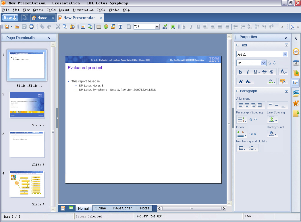
- All panels of OOo 3.1 can be docked to the side of editing area.
|
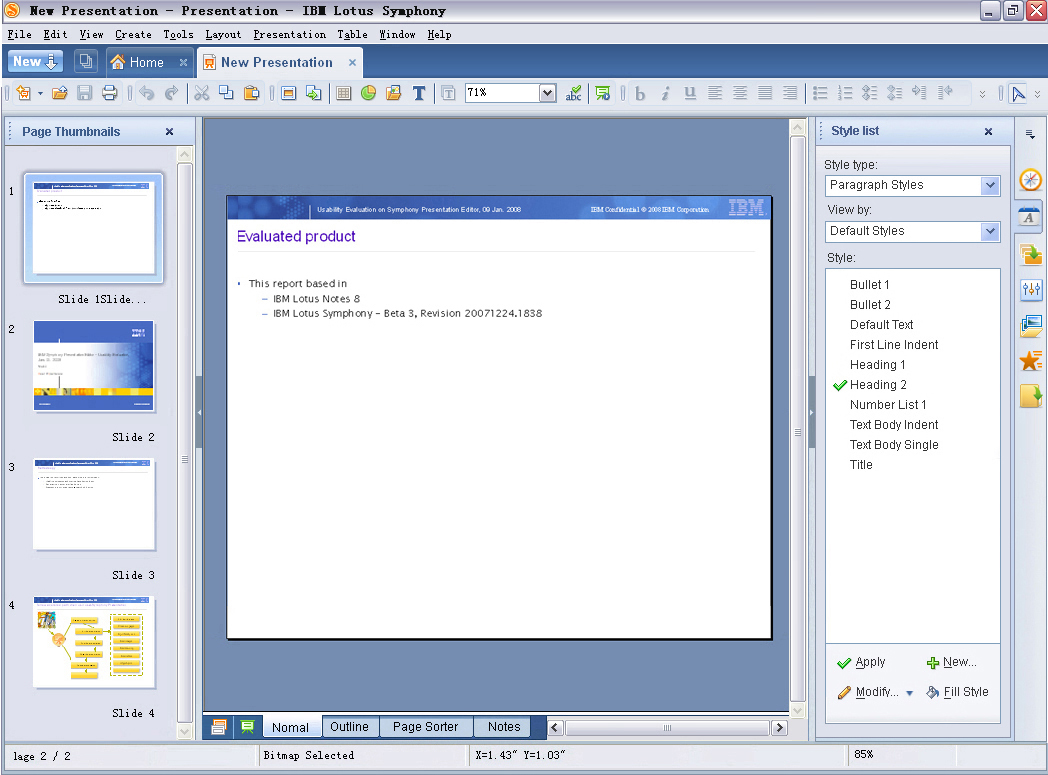
Users can click on the icons on a skinny bar beside the panel, to switch between panels.
Here is an example: switch to Style List panel.
|
Customization
- Users can select which panels will be shown on Sidebar. Just right-click on the skinny bar and set on a menu.
Be Compatible with current behaviors of panels in OOo 3.1
- Users are free to dock the panels. They can dock the panels to the Sidebar, as what we are shown here.
- Users can also dock the panels to bottom/top/left, just like what users can do in current OOo 3.1.
Properties Panel
The properties panel on sidebar
- There are some sub-panels on properties panel. E.g. Text, Paragraph, Table, Area, Line, Graphic, Cell Appearance, Number Format, Master Page, Page Layout, Template, etc...
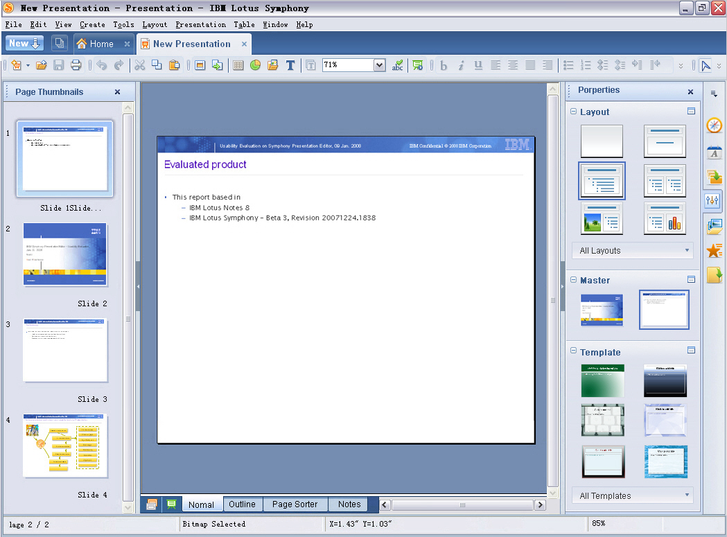
- The properties panel will show different sub-panels for different context. E.g. When users are editing texts, the sub-panels like Text and Paragraph will be shown. When users focus on a slide, the sub-panels of Slide Layout, Template, and Master Page will be shown there.
- So in most contexts, users don't need to switch between panels manually. They can get them on Properties Sidebar directly.
Example: Editing texts
Here is an example for the context when users editing texts. Text and Paragraph sub-panels will be shown on Properties panel.

|
Example: The context when users select a page of presentation
When users select a page(click the thumbnail on Slide View or just click the blank on a page), the Layout, Master Page and Template will be shown as sub-panels on Properties sidebar.
Only recent 6 layouts and templates are shown on the panel.
|
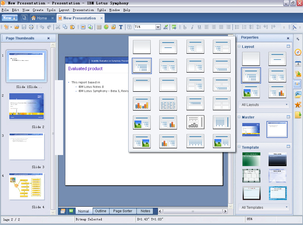
Users can get all layouts/templates via a pop up panel.
|
| Author: Ma Li |
| IBM Lotus Symphony |
| Locate in Beijing, China |
| Mail: malicdl@cn.ibm.com |
