|
|
| (66 intermediate revisions by 6 users not shown) |
| Line 1: |
Line 1: |
| − | The sidebar (working title) is a new feature likely to be in the 4.0 release. It combines ideas and code from both the [[Symphony]] sidebar and the OpenOffice [[Impress]] task pane. | + | The sidebar is a UI feature that was introduced for all OpenOffice applications in version 4.0. It is based on the [[Symphony]] Properties Panel which in turn is based on the old [[Impress]] task pane. The sidebar looks like this: |
| | | | |
| − | The UX part of the work is described on another [[AOO_UX_Design_Exploration_-_Task_Pane_Content_-_Information_Design|page]]. This page focuses on the API design and implementation.
| + | [[File:Sidebar-Writer.png|600px|center]] |
| | | | |
| − | Help in whatever form (writing code, designing the UI, testing) is welcome.
| |
| | | | |
| − | ==Status==
| + | Information about the implementation of the sidebar and how to extend it with new panels can be found in the [[Sidebar for Developers]] page. |
| | | | |
| − | *Designed API (new services and interfaces) and configuration for declaration of sidebar decks and panels and notification of context changes.
| + | A [[#Glossary|glossary]] is available below. |
| − | *Initial implementation as test of the design. Most of the changes can be found in [http://svn.apache.org/viewvc/openoffice/branches/sidebar/main/sfx2/source/sidebar/ sfx2/source/sidebar] and [http://svn.apache.org/viewvc/openoffice/branches/sidebar/main/svx/source/sidebar/ svx/source/sidebar].
| + | |
| − | * Developer builds are available, see [[Sidebar#Developer_Builds|below]]
| + | |
| − | * Migration of first Symphony panel is progressing well. Simple theming is already in place.
| + | |
| − | * Theme is represented as XPropertySet. See screenshot below for a Java extension that a) displays the current context in a sidebar panel and that b) provides a dialog for visualizing the different property values and allows simple switching between theme presets.
| + | |
| | | | |
| − | Current screenshots:
| |
| | | | |
| − | Controls in sidebar pane are themable. Click one of the preset buttons in the Java theme dialog to see one of the proposed themes applied to a working panel:
| + | ==Overview== |
| | | | |
| − | [[File:sidebar-2013-01-15.png|400px]] | + | The sidebar window is located on the right side of the edit views of Writer, Calc, Impress, Draw, Base. It contains one or more [[#Panels|panels]], based on the current document context. Panels are organized into [[#Decks|decks]]. A [[#Tab_Bar|tab bar]] on the right side of the sidebar allows to switch between different decks. |
| | | | |
| − | Migration of Symphony text properties panel (work in progress). With original Symphony icons (far left) and OpenOffice icons (all other) and with different colors for panel titles and panel backgrounds:
| + | The [[#Properties|Properties]] deck is context sensitive. When text is being edited then it contains panels for changing the font or text attributes, when a graphical object is selected then other panels give access to fill and line style as well as the object's position and size. |
| | | | |
| − | [[File:sidebar-2013-01-18-a.png|200px]], [[File:sidebar-2013-01-18-b.png|200px]], [[File:sidebar-2013-01-18-c.png|200px]], [[File:sidebar-2013-01-18-d.png|200px]] | + | <br>[[Image:Sidebar-Screenshot-Writer-Context-Text.png|300px]] [[Image:Sidebar-Screenshot-Writer-Context-Shape.png|300px]] [[Image:Sidebar-Screenshot-Writer-Context-Graphic.png|300px]]<br>''Different panels in Properties deck for different contexts (from left to right): text editing, logo pasted as outline, logo pasted as bitmap'' |
| | | | |
| − | Simple panels, provided by a Java extension. Menu for switching between decks and for hiding or showing decks:
| |
| | | | |
| − | [[File:sidebar-a-2013-01-16.png|150px]], [[File:sidebar-b-2013-01-16.png|200px]], [[File:sidebar-c-2013-01-16.png|100px]]
| + | A panel is basically a mix of a toolbar and a non-modal dialog. That means that sidebar panels do not lock the document. The user can freely mix working in the edit view to eg enter text and use the [[#Text|Text]] panel to change text attributes. |
| | | | |
| − | Past activities:
| + | At the moment, toolbars and sidebar panels share many functions. For example, the buttons for making text bold or italic exist in both the text toolbar and the [[#Text|Text]] panel. This duplicity is the result of a design decision to allow users to gradually learn to use the sidebar. It is our plan to reduce functions provided in toolbars and provide them only in the sidebar. The speed and scope of this change depends on feedback from our users. |
| − | * Created a new sidebar that at this moment can display panels that are provided
| + | |
| − | ** by a new extension (see above),
| + | |
| − | ** by already existing extensions using the XUIElementProvider interface family,
| + | |
| − | ** by Impress (but there are still severe painting problems).
| + | |
| − | * The sidebar menu already works. It is almost identical to its Symphony counterpart with one additional entry for docking or undocking the sidebar.
| + | |
| − | * Individual panels can be collapsed or expanded.
| + | |
| − | * The older and unfinished sidebar support that was done when OpenOffice was developed by Oracle is still active as a reference.
| + | |
| | | | |
| − | ==Resources==
| + | The width of the sidebar is variable. The controls in its panels are adjusted accordingly. When the sidebar becomes too small to be usable it collapses to the tab bar. This transitional state is indicated by an arrow that is displayed in place of the deck. A click on one of the buttons on the tab bar restores the deck to its former width. |
| | | | |
| − | * UX
| + | [[File:Sidebar-Different-Widths.png|640px]] |
| − | **[[AOO_UX_Design_Exploration_-_Task_Pane_Content_-_Information_Design|UX design exploration]]
| + | |
| − | **[[AOO_UX_Design_Exploration_-_Docked_Task_Pane_Container_-_Pane_Header_User_Interface_Design|Pane Header UI Design]]
| + | |
| − | **[[AOO_UX_Design_Exploration_-_Task_Pane_Content_Panel_-_User_Interface_Design_Proposals|UX Design propoals]]
| + | |
| − | * Symphony
| + | |
| − | ** Assessment of the [[AOO_Symphony_UX_Migration/Merge_Analysis_-_Task_Pane|migrating the Symphony sidebar]].
| + | |
| − | ** Older proposal to use the [[Sidebar_Proposal_by_IBM|Symphony sidebar]].
| + | |
| − | * AOO
| + | |
| − | ** Overview of an existing but unfinished attempt of implementing [[Framework/Article/Tool_Panels_Internals|tool panels]].
| + | |
| − | ** Introduction to [[Framework/Article/Tool Panels|writing tool panels]].
| + | |
| − | ** Description of the [[Drawing framework|drawing framework]], that is used by the Impress tool panel.
| + | |
| | | | |
| − | ==Developer Builds== | + | ==Panels== |
| − | Developer builds for the sidebar use an internal and unofficial version number in order to cope with incompatible interfaces changes. The current version number is 0.6 (as of January 28, 2013).
| + | Eleven property panels have been migrated from IBM Lotus Symphony: Alignment, Area, Cell Appearance, Graphic, Line, Number Format, Page, Paragraph, Position and Size, Text and Wrap. |
| − | Builds exist for [http://people.apache.org/~af/sidebar/0.6/Apache_OpenOffice_3.5.0_Win_x86_install-arc_en-US.zip Windows], [http://people.apache.org/~af/sidebar/0.6/Apache_OpenOffice_3.5.0_Linux_x86-64_install-arc_en-US.tar.gz Linux] (requires glibc >= 2.15: Ubuntu 12.4 or later, Fedora 17 or later...), and [http://people.apache.org/~af/sidebar/0.6/Apache_OpenOffice_3.5.0_MacOS_x86_install-arc_en-US.tar.gz MacOSX].
| + | Seven panels come from the old Impress tool panel: Available for Use, Custom Animation, Layouts, Recently Used, Slide Transition, Table Design, Used in This Presentation. |
| | + | Four are non-modal (ie non locking) dialogs: Functions, Gallery, Navigator, Styles and Formatting. |
| | + | One is new: Insert Shapes. |
| | | | |
| − | The activation of the sidebar is still a little inconvenient:
| + | [[File:Sidebar-Panels.png|500px]] |
| − | * Start the sidebar developer build of OpenOffice.
| + | |
| − | * Create an Impress document.
| + | |
| − | * Activate menu entry View->Sidebar. A mostly empty window opens.
| + | |
| − | * Close OpenOffice and start it again.
| + | |
| | | | |
| − | Now you can create/open Writer, Calc, Impress or Draw documents and work with the sidebar. In Impress you have to enter text edit mode for all buttons to become enabled (the text property panel would/will normally not be shown when not editing text).
| + | Some of these are displayed in the context sensitive 'Properties' deck, others are displayed in a deck on their own. In that case the panel title bar is usually not displayed and the deck title is the same as the panel title. When the panel title bar is shown then a mouse click on it collapses the panel to just its title bar. Another click and the panel is expanded to its former size. |
| − | Buttons with drop down boxes do not yet work.
| + | |
| | | | |
| − | ===SidebarWorkbench===
| + | [[File:Sidebar-Expand-Collapse.png|350px]] |
| | | | |
| − | There is a Java extension for development and debugging of the sidebar. It can be downloaded [http://people.apache.org/~af/sidebar/0.6/SidebarWorkbench.oxt here]. Note that it writes a log file to <code>/tmp/sidebar.log</code>. On Windows without cygwin this may not work. Do not use the developer builds for important documents: there may be dragons (aka severe bugs).
| + | Some panels have a 'More Options' button in their title bar. A click on it opens a dialog with many more options than would fit into the panel. These dialogs, however, are modal, ie. the edit view is locked while the dialogs are open. |
| | | | |
| − | On Windows and Linux you can use it to
| + | [[File:Sidebar-more-options.png|500px]] |
| − | # add some dummy decks and panels to the sidebar.
| + | |
| − | # monitor the current context. It is displayed in a panel in the Properties deck.
| + | |
| − | # modify the look of the sidebar with an external Java dialog called "Theme Dialog".
| + | |
| | | | |
| − | The "Theme Dialog" has three sections:
| + | ===Alignment (Calc only)=== |
| − | ;Presets: Ten buttons let you choose between the nine themes proposed on [[AOO_UX_Design_Exploration_-_Task_Pane_Content_Panel_-_User_Interface_Design_Proposals|this UX page]]. A tenth button activates a theme that is similar to the original Symphony sidebar.
| + | Alignment of cell text (horizontal, vertical, rotation) |
| − | ;Options: More fine grained options for changing the panel title bar background (normal, dark), the panel background (normal, white), use of Symphony icons, use of system colors (not yet fully implemented), use of the high contrast mode color scheme. The later does not activate the high contrast mode. It is just a quick way to activate the color scheme.
| + | |
| − | ;Properties: A list of all the properties in the sidebar theme XPropertySet that are evaluated for the look of the sidebar. Editing is not (yet) possible.
| + | |
| | | | |
| − | ==Glossary==
| + | [[File:Sidebar-Panel-Alignment.png|100px]] |
| − | Work in progress. Comments are welcome.
| + | |
| | | | |
| − | [[File:SidebarNames.png|thumb|200px|Schematic overview of sidebar components. Location of elements do not reflect UX design.]]
| + | ===Area=== |
| − | ;sidebar: Name of the feature and name of the control including all its components (icon bar, content panels).
| + | Fill style of shapes like color, gradient, bitmap, hatch, transparency. |
| − | :Also known as task pane(l) or tool pane(l)
| + | |
| − | ;tab bar: Similar to a vertical tool bar. Clicking on buttons switches between sidebar decks.
| + | |
| − | ;deck: Contains one or more content panels. Only one deck is visible at any one time.
| + | |
| − | ;content panel: Displays information about the document and/or provides the means for document modification.
| + | |
| − | :Each content panel focuses on one topic like font, table or shape properties.
| + | |
| − | :There may be more than one content panel in a deck.
| + | |
| − | :Examples are the task panels of the Impress task pane or the property views of the Symphony sidebar.
| + | |
| − | ;title bar: Displays the title for the current sidebar deck.
| + | |
| − | :Can contain a closer button.
| + | |
| − | ;content panel title: Displays the title for one content panel. Optional when there is only one content panel.
| + | |
| − | ;configuration menu button: Opens a popup menu that allows switching between decks and also allows the activation and deactivation (tab is not shown) of decks.
| + | |
| | | | |
| − | ==Implemenation design==
| + | [[File:Sidebar-Panel-Area.png|100px]] |
| | | | |
| − | The sidebar consists of two major components:
| + | ===Available for Use (Impress only)=== |
| − | *The buttons in the vertical tab bar on the right switch manually between sidebar decks.
| + | List of all available templates. |
| − | *The content area contains a two-tier hierarchy of deck and content panels. There is exactly one deck visible at any one time. It contains one or more content panels. A content panel can be displayed expanded or collapsed.
| + | |
| | | | |
| − | The set of visible deck and content panels changes when a context change is broadcast. Context changes occur for example when in Writer the cursor is moved from text into a table or when in Impress text editing of a shape is activated.
| + | [[File:Sidebar-Panel-AvailableForUse.png|100px]] |
| | | | |
| − | Decks and context panels are specified via configuration and UNO interfaces and thus can be implemented not only in the AOO core code but also by extensions.
| + | ===Cell Appearance (Calc only)=== |
| | + | Cell background color and border. |
| | | | |
| | + | [[File:Sidebar-Panel-CellAppearance.png|100px]] |
| | | | |
| − | ===Context change notification=== | + | ===Custom Animation (Impress only)=== |
| | + | Add or modify animations of shapes. |
| | | | |
| − | Context changes are broadcast via the new
| + | [[File:Sidebar-Panel-CustomAnimation.png|100px]] |
| − | ui::ContextSwitchEventMultiplexer singleton (which is based on the equally
| + | |
| − | new ui::EventMultiplexer service).
| + | |
| | | | |
| − | Context change broadcasts have to be manually inserted into
| + | ===Functions (Calc only)=== |
| − | application code.
| + | Insert functions (mathematical, string related, other) to a Calc cell. |
| | | | |
| − | Notifications about context changes are restricted to single views by using the XController as
| + | [[File:Sidebar-Panel-Functions.png|100px]] |
| − | selector: an XController object is passed to ui::EventMultiplexer::addEventListener() and
| + | |
| − | ui::EventMultiplexer::broadcastEvent() methods.
| + | |
| | | | |
| − | The sidebars (there is one per document window) listen for context change
| + | ===Gallery=== |
| − | notifications and rearrange the set of visible decks and panels
| + | Gallery dialog as sidebar panel. |
| − | according to the configuration entries for each deck and panel.
| + | |
| | | | |
| − | There will be a predefined standard set of contexts but extensions can
| + | [[File:Sidebar-Panel-Gallery.png|100px]] |
| − | provide decks and panels for new contexts and can also notify context changes for them.
| + | |
| | | | |
| − | ===Content panels=== | + | ===Graphic=== |
| | + | Adjust bitmap attributes like brightness, contrast, colors, gamma. |
| | | | |
| − | Decks and content panels are specified via the configuration. The
| + | [[File:Sidebar-Panel-Graphic.png|100px]] |
| − | new Sidebar.xcs defines schemas for decks and content panels that
| + | |
| − | contain:
| + | |
| − | * UI title
| + | |
| − | * Application and context names for which a deck or a content panel is to be visible.
| + | |
| − | * Icons for normal and high-contrast mode.
| + | |
| − | * Simple layout information. Two different schemas will be supported
| + | |
| − | *# Use all the available space (distributed equally when more than one panel reuests this)
| + | |
| − | *# Vertical stack. The default for content panels migrated from Symphony. Requres content panels to support a new interface ui::XVerticalStackLayoutElement with the method getHeightForWidth()
| + | |
| − |
| + | |
| − | For the actual creation of panel objects (decks do not need per-object implementation) the existing ui::UIElementFactoryManager and the configuration entries in the
| + | |
| − | <application>WindowState configuration files are used.
| + | |
| | | | |
| − | ===Sidebar=== | + | ===Insert Shapes (Draw only)=== |
| | + | Buttons and drop down menus for inserting shapes into Draw documents. |
| | | | |
| − | It is the responsibility of the sidebar to display the right set of
| + | [[File:Sidebar-Panel-InsertShapes.png|100px]] |
| − | content panels for the current combination of application (writer,
| + | |
| − | calc, impress, draw, base) and context (eg text-editing,
| + | |
| − | table-is-selected).
| + | |
| | | | |
| − | The visible set of deck and content panels changes on three occasions:
| + | ===Layouts (Impress only)=== |
| − | # A context change is notified via the ContextSwitchEventMultiplexer
| + | Assign a predefined layout to a slide. There are different sets of layouts for the different edit modes standard, handout and notes. |
| − | # User clicks on one of the buttons in the sidebar tab bar.
| + | |
| − | # Explicit requests to show a certain deck or panel (used by Impress to show the layout panel when the user opens the page context menu and clicks Slide->Slide Layout)
| + | |
| | | | |
| | + | [[File:Sidebar-Panel-Layout-Standard.png|100px|top]] [[File:Sidebar-Panel-Layout-Handout.png|100px|top]] [[File:Sidebar-Panel-Layout-Notes.png|100px|top]] |
| | | | |
| − | ==Implementation Work== | + | ===Line=== |
| | + | Adjust color, width and style of lines and outlines. |
| | | | |
| − | Using bugzilla issue [https://issues.apache.org/ooo/show_bug.cgi?id=121420 121420].
| + | [[File:Sidebar-Panel-Line.png|100px]] |
| | | | |
| − | The list of open and done parts of the sidebar implementation are (to be expanded and color coded): | + | ===Navigator=== |
| | + | The navigator dialog as sidebar panel. Small differences between the different applications. |
| | | | |
| − | === Content Change Notification ===
| + | [[File:Sidebar-Panel-Navigator-Writer.png|100px]] [[File:Sidebar-Panel-Navigator-Calc.png|100px]] [[File:Sidebar-Panel-Navigator-Impress.png|100px]] |
| − | * EventMultiplexer
| + | |
| − | ** New service/singleton [http://svn.apache.org/viewvc/openoffice/branches/sidebar/main/offapi/com/sun/star/ui/ContextChangeEventMultiplexer.idl?view=markup ui::ContextChangeEventMultiplexer]
| + | |
| − | ** New interface [http://svn.apache.org/viewvc/openoffice/branches/sidebar/main/offapi/com/sun/star/ui/XContextChangeEventMultiplexer.idl?view=markup ui::XContextChangeEventMultiplexer]
| + | |
| − | ** New interface [http://svn.apache.org/viewvc/openoffice/branches/sidebar/main/offapi/com/sun/star/ui/XContextChangeEventListener.idl?view=markup ui::XContextChangeEventListener]
| + | |
| − | ** New struct [http://svn.apache.org/viewvc/openoffice/branches/sidebar/main/offapi/com/sun/star/ui/ContextChangeEventObject.idl?view=markup ui::ContextChangeEventObject]
| + | |
| − | ** Implementation of [http://svn.apache.org/viewvc/openoffice/branches/sidebar/main/framework/source/services/ContextChangeEventMultiplexer.cxx?view=markup ContextChangeEventMultiplexer]
| + | |
| − | * Add context change notification for Writer, Calc, Impress, Draw, Base
| + | |
| | | | |
| − | === Decks and content panels === | + | ===Number Format (Calc only)=== |
| − | * Configuration (all done)
| + | Set the number format of selected cells. |
| − | ** New configuration Schema [http://svn.apache.org/viewvc/openoffice/branches/sidebar/main/officecfg/registry/schema/org/openoffice/Office/UI/Sidebar.xcs?view=markup org/openoffice/Office/UI/Sidebar.xcs]
| + | |
| − | *** New template for decks
| + | |
| − | *** New template for content panels
| + | |
| − | * Implement manager for decks and panels (done)
| + | |
| − | * Example code for testing and as tutorial (work in progress)
| + | |
| − | * Migration of Symphony decks and content panels for Writer(W), Calc(C), Impress(I) (see [[AOO_UX_Design_Exploration_-_Task_Pane_Content_-_Information_Design#Task_Pane_Content_-_Proposal_for_discussion|proposal]])
| + | |
| − | **alignment (C)
| + | |
| − | *: sc/source/ui/propertypanel/alignmentpropertypage.cxx
| + | |
| − | **area (W,C,I)
| + | |
| − | *:svx/source/propertypanel/areapropertypage.cxx
| + | |
| − | **cell appearance (C)
| + | |
| − | *:sc/source/ui/propertypanel/appearpropertypage.cxx
| + | |
| − | **graphic (W,C,I)
| + | |
| − | *:svx/source/propertypanel/graphicpropertypage.cxx
| + | |
| − | **line (W,C,I)
| + | |
| − | *:svx/source/propertypanel/linepropertypage.cxx
| + | |
| − | **number format (C)
| + | |
| − | *:sc/source/ui/propertypanel/numformatpropertypage.cxx
| + | |
| − | **page (W)
| + | |
| − | *:sw/source/ui/propertypanel/pagepropertypage.cxx
| + | |
| − | **paragraph (W,I)
| + | |
| − | *:svx/source/propertypanel/paragraphpropertypage.cxx
| + | |
| − | **position and size (I,C/chart and media,W/graphic,C/(text, line, shape and graphic),W/(text, line, shape))
| + | |
| − | *:svx/source/propertypanel/posizepropertypage.cxx
| + | |
| − | **slide layout (I)
| + | |
| − | *:sd/source/ui/propertypanel/pagelayoutpage.cxx
| + | |
| − | **table design (I)
| + | |
| − | *:sd/source/ui/propertypanel/tabledesignpage.cxx
| + | |
| − | **text (W,I,C/cell selected,C/(text (editing cell text)) (started)
| + | |
| − | *:svx/source/propertypanel/textpropertypage.cxx
| + | |
| − | **wrap (W)
| + | |
| − | *:sw/source/ui/propertypanel/wrappropertypage.cxx
| + | |
| − | * Migration of AOO decks and content panels (see [[AOO_UX_Design_Exploration_-_Task_Pane_Content_-_Information_Design#Task_Pane_Content_-_Proposal_for_discussion|proposal]])
| + | |
| − | **Style List
| + | |
| − | **Clipart
| + | |
| − | **Navigator
| + | |
| − | **Functions
| + | |
| − | **Data Pilot
| + | |
| − | * Migration of Impress panels (see [[AOO_UX_Design_Exploration_-_Task_Pane_Content_-_Information_Design#Task_Pane_Content_-_Proposal_for_discussion|proposal]])
| + | |
| − | **Slide Templates/Master Slides
| + | |
| − | **Custom Animation/Animation Effects
| + | |
| − | **Slide Transition
| + | |
| | | | |
| − | === Sidebar ===
| + | [[File:Sidebar-Panel-NumberFormat.png|100px]] |
| − | * Tab bar (done)
| + | |
| − | * Tabs (done)
| + | |
| − | ** Icons and high contrast icons, read from configuration (done)
| + | |
| − | ** Test with internal and external (extension) code (done)
| + | |
| − | * Title bars for decks and content panels (done)
| + | |
| − | * Outer layouting of content panels (done)
| + | |
| − | ** Distribution of vertical space between panels
| + | |
| − | ** Collaps and expand panels (done)
| + | |
| − | * Management of context changes (done)
| + | |
| − | ** Read specification of decks and content panels from configuration (done)
| + | |
| − | ** Connect to EventMultiplexer and listen for content changes
| + | |
| − | ** Update visible deck and panels on context change
| + | |
| − | * Dockable child window as container of sidebar
| + | |
| − | * Configuration menu (done)
| + | |
| | | | |
| − | ==How to help== | + | ===Page (Writer only)=== |
| | + | Set page properties like orientation, margin or size. |
| | | | |
| − | The migration of the Symphony panels to OpenOffice is a lot of work. Here is how you can help.
| + | [[File:Sidebar-Panel-Page.png|100px]] |
| | | | |
| − | ===Introduction=== | + | ===Paragraph=== |
| − | The content in the sidebar is organized into decks, panels and tabs. There is always exactly one deck visible. It can contain one or more panels. Tabs are allow manual switching between decks.
| + | Adjust paragraph properties. |
| − | In general the current deck and its panels is defined by the current context. A context consists of an identifier for the application and one identifier for the actual context like text editing, cursor in table, image editing and so on.
| + | |
| | | | |
| | + | There are small differences for different contexts.<br>From left to right: Impress/Table, Writer/Annotation, Writer/DrawText, Writer/Table, Writer/Text. |
| | | | |
| − | Both UNO API and configuration represent a context with two strings:
| + | [[File:Sidebar-Panel-Paragraph-Impress-Table.png|100px|top|Impress/Table]] |
| − | ; UNO : com/sun/star/ui/ContextChangeEventObject
| + | [[File:Sidebar-Panel-Paragraph-Writer-Annotation.png|100px|top|Writer/Annotation]] |
| − | ; registry : org/openoffice/Office/UI/Sidebar.xcs / Context
| + | [[File:Sidebar-Panel-Paragraph-Writer-DrawText.png|100px|top|Writer/DrawText]] |
| − | For the C++ implementation there is a enum wrapper that allows switch() statements:
| + | [[File:Sidebar-Panel-Paragraph-Writer-Table.png|100px|top|Writer/Table]] |
| − | sfx2/sidebar/EnumContext.hxx
| + | [[File:Sidebar-Panel-Paragraph-Writer-Text.png|100px|top|Writer/Text]] |
| − | like this
| + | |
| − | void DoSomething (const EnumContext& rContext)
| + | |
| − | {
| + | |
| − | switch (rContext.GetCombinedContext())
| + | |
| − | {
| + | |
| − | case CombinedEnumContext(Application_Calc, Context_Cell):
| + | |
| − | ...
| + | |
| | | | |
| − | ===Notification of context changes=== | + | ===Position and Size=== |
| | + | Change position, size and rotation of shapes. Not all of these attributes can be modified in any context. Free positioning is not supported in Writer. Bitmaps can not be rotated in Writer. |
| | | | |
| − | Notification of context changes is done via one single event multiplexer that is used by all documents and views:
| + | This results in three different versions of the panel: with position, size and rotation (left) with size and rotation (center) only size (right) |
| − | ;service: com/sun/star/ui/ContextChangeEventMultiplexer.idl
| + | |
| − | ;interface: com/sun/star/ui/XContextChangeEventMultiplexer.idl
| + | |
| − | There is a C++ convenience wrapper in svx:
| + | |
| − | svx/inc/sidebar/ContextChangeEventMultiplexer.hxx
| + | |
| − | that has a single static method:
| + | |
| − | static void NotifyContextChange (
| + | |
| − | const cssu::Reference<css::frame::XController>& rxController,
| + | |
| − | const ::sfx2::sidebar::EnumContext::Context eContext);
| + | |
| − | It hides the messy instantiation of the UNO singleton and conversion of the parameters.
| + | |
| − | The rxController is used for two things:
| + | |
| − | # Determine the application and fill in the right string/identifier in the resulting context change event.
| + | |
| − | # Allow listeners to be notified only for context changes of a single view
| + | |
| − | The eContext argument is defined in
| + | |
| − | sfx2/sidebar/EnumContext.hxx
| + | |
| | | | |
| − | ====Task====
| + | [[File:Sidebar-Panel-PositionAndSize-Impress.png|100px|top|Impress]] |
| − | * Add calls to ContextChangeEventMultiplexer::NotifyContextChange() whenever a relevant context change occurs so that the sidebar can display the appropriate deck and panels.
| + | [[File:Sidebar-Panel-PositionAndSize-Writer-Draw.png|100px|top|Writer/Draw]] |
| − | * Add missing contexts to EnumContext.hxx and Sidebar.xcs and provide a word or two of explanation.
| + | [[File:Sidebar-Panel-PositionAndSize-Writer-Bitmap.png|100px|top|Writer/Graphic]] |
| | | | |
| − | ====Tips==== | + | ===Recently Used (Impress only)=== |
| − | Look for Update calls for SID_SVX_PROPERTY_CONTEXT
| + | List the recently used templates/master pages. |
| − | in sfx2/source/control/dispatch.cxx, SfxDispatcher::Update_Impl()
| + | |
| − | and sfx2/source/control/bindings.cxx, IMPL_LINK(SfxBindings, NextJob_Impl...)
| + | |
| − | and for calls to
| + | |
| − | sfx2/source/view/viewfrm.cxx, SfxViewFrame::GetPropertyContextId()
| + | |
| | | | |
| − | ====Examples====
| + | [[File:Sidebar-Panel-RecentlyUsed.png|100px|top]] |
| | | | |
| − | Notification of start of text editing in Draw/Impress:
| + | ===Slide Transition (Impress only)=== |
| − | sd/source/ui/func/futext.cxx, FuText::DoExecute()
| + | Add or modify transition animations between slides. |
| | | | |
| − | Notification of Draw/Impress having been started:
| + | [[File:Sidebar-Panel-SlideTransition.png|100px|top]] |
| − | sd/source/ui/view/ViewShellBase.cxx, ViewShellBase::Activate()
| + | |
| | | | |
| − | ===Creation of a panel factory=== | + | ===Styles and Formatting=== |
| − | Panels are created by factories via the <code>ui::XUIElementFactory</code> interface and its
| + | The styles and formatting dialog, aka Stylist, as sidebar panel. |
| − | createUIElement(
| + | |
| − | const ::rtl::OUString& rsResourceURL,
| + | |
| − | const ::cssu::Sequence<css::beans::PropertyValue>& rArguments)
| + | |
| − | method.
| + | |
| − | ====Task====
| + | |
| − | Implement the ui::XUIElementFactory interface.
| + | |
| | | | |
| − | The sidebar calles the createUIElement() method with the these arguments:
| + | There are small differences between the applications: (from left to right) Writer, Calc, Impress |
| − | ;ParentWindow: a awt::XWindow object that is to be used as parent window for any new windows created by the panel. Both size and location of this parent window are modified by the panel layouter of the current deck. A panel that wants to layout its controls manually has to listen for size changes of the parent window.
| + | |
| − | ;Frame: the frame::XFrame object of the view for which the sidebar displays decks and panels.
| + | |
| − | ;SfxBindings: a pointer to an SfxBindings object (wrapped in a sal_uInt64) that can be used to create controls. This hack is intended as a temporary solution. It is desirable to replace it with a UNO based solution.
| + | |
| − | The panel factory is expected to create and return a ui::XUIElement object for a given URL. Create a new panel like this:
| + | |
| − | if (sURL.equals("my/panel"))
| + | |
| − | {
| + | |
| − | Control* pPanelControl = new PanelControl(pParentWindow, xFrame, pBindings);
| + | |
| − | return sfx2::sidebar::SidebarPanelBase::Create(
| + | |
| − | rsResourceURL,
| + | |
| − | xFrame,
| + | |
| − | pPanel);
| + | |
| − | }
| + | |
| | | | |
| − | ====Examples====
| + | [[File:Sidebar-Panel-StylesAndFormatting-Writer.png|100px|top]] |
| − | See <code>svx/source/sidebar/PanelFactory.cxx</code>
| + | [[File:Sidebar-Panel-StylesAndFormatting-Calc.png|100px|top]] |
| | + | [[File:Sidebar-Panel-StylesAndFormatting-Impress.png|100px|top]] |
| | | | |
| | + | ===Table Design (Impress only)=== |
| | + | Properties of tables in Impress. |
| | | | |
| − | ===Creation of a panel control===
| + | [[File:Sidebar-Panel-TableDesign.png|100px|top]] |
| − | The content of a panel is typically painted by an instantiation of the <code>vcl::Control</code> class. The <code>XUIElement</code> interface gives access to the <code>XWindow</code> component of the control via the <code>XUIElement::getWindow()</code> method.
| + | |
| | | | |
| − | ====Task==== | + | ===Text=== |
| | + | Adjust text properties like font, size, bold, colors. |
| | | | |
| − | Implement the <code>XUIElement</code> interface and add it to a panel factory.
| + | There are small differences in different applications and contexts. Not all controls/attributes are available everywhere. |
| | | | |
| − | Choose a panel factory in the module where the new panel class will be located. Add support for the panel class to the <code>XUIElementFactory::createUIElement()</code> method.
| + | [[File:Sidebar-Panel-Text-Calc.png|100px|top]] |
| | + | [[File:Sidebar-Panel-Text-Impress-Table.png|100px|top]] |
| | + | [[File:Sidebar-Panel-Text-Writer.png|100px|top]] |
| | + | [[File:Sidebar-Panel-Text-Writer-Annotation.png|100px|top]] |
| | | | |
| − | You can use the <code>sfx2::sidebar::SidebarPanelBase</code> class for taking care of the boiler plate code. Despite its name (which should be change) <code>SidebarPanelBase</code> is not a base class for the new panel class. Due to the design of the <code>XUIElement</code> interface (with its <code>XUIElement::getRealInterface()</code> and <code>XUIElement::getWindow()</code> methods) the <code>XUIElement</code> interface can be implemented independently from the actual panel control.
| + | ===Used in This Presentation (Impress only)=== |
| − | SidebarPanelBase implements the <code>XUIElement::getRealInterface()</code> to return itself. It implements the <code>XUIElement::getWindow()</code> to return the awt::XWindow interface of the panel control. <code>XUIElement::createAccessible()</code> is not yet implemented.
| + | List of the templates/master pages that are currently used by the document. |
| − | The <code>SidebarPanelBase</code> provides additional functionality:
| + | |
| − | * Forwarding of context change events: It registers at the <code>ContextChangeEventMultiplexer</code> and forwards all relevant events to the panel control if it implements the ContextChangeReceiverInterface interface (which is a local class of SidebarPanelBase). It uses a
| + | |
| − | <code>dynamic_cast<></code> to check if the interface is supported. If it is <code>SidebarPanelBase</code> converts the event data to an <code>EnumContext</code> object and calls <code>ContextChangeReceiverInterface::HandleContextChange()</code>.
| + | |
| − | * A simple implementation of the <code>ui::XVerticalStackLayoutElement</code> interface that returns the current height of the control (<code>mpControl->GetSizePixel().Height()</code>).
| + | |
| − | For the implementation or migration of the actual panel control see the following section.
| + | |
| − | ====Example====
| + | |
| | | | |
| − | See <code>svx/source/sidebar/PanelFactory.cxx</code> for the use of the <code>SidebarPanelBase</code> class.
| + | [[File:Sidebar-Panel-UsedInThisPresentation.png|100px|top]] |
| − | See <code>svx/source/sidebar/text/TextPropertyPanel.cxx</code> for the implementation of the <code>HandleContextChange</code> method.
| + | |
| | | | |
| − | ===Migration of property pages=== | + | ===Wrap (Writer only)=== |
| | + | Select how to wrap text around a graphical object. |
| | | | |
| − | The Symphony property pages represent much functionality that in AOO can be found in toolbars. That may explain the extensive use of ToolBox controls in the panels.
| + | [[File:Sidebar-Panel-Wrap.png|100px|top]] |
| | | | |
| − | ====Task==== | + | ==Decks== |
| − | * Migrate the panels listed in http://wiki.openoffice.org/wiki/AOO_Symphony_UX_Migration/Merge_Analysis_-_Task_Pane or come up with a better list.
| + | |
| − | * Locate the panel implementation in the Symphony code branch. Typical places are:
| + | |
| − | ** svx/source/propertypanel/
| + | |
| − | ** sw/source/ui/propertypanel/
| + | |
| − | ** sc/source/ui/propertypanel/
| + | |
| − | ** sd/source/ui/propertypanel/
| + | |
| − | * Use ::sfx2::sidebar::SidebarPanelBase and ::sfx2::sidebar::ControllerItem::ItemUpdateReceiverInterface
| + | |
| − | as base classes.
| + | |
| − | These take care registering at the ContextChangeEventMultiplexer and item controllers.
| + | |
| − | * Replace member declarations of controls with scoped_ptrs, so that the controls can be created by a factory and can have a different, derived class.
| + | |
| − | Replace
| + | |
| − | ToolBox maToolBoxIncDec;
| + | |
| − | with
| + | |
| − | ::boost::scoped_ptr<ToolBox> mpToolBoxIncDec;
| + | |
| − | Then, in the constructor replace
| + | |
| − | maToolBoxIncDec (this, SVX_RES(TB_INCREASE_DECREASE)),
| + | |
| − | with
| + | |
| − | mpToolBoxIncDec(sfx2::sidebar::ControlFactory::CreateToolBox(this, SVX_RES(TB_INCREASE_DECREASE))),
| + | |
| − | * Handle context changes:
| + | |
| − | Replace
| + | |
| − | virtual void Init(PropertyContextType nContextId);
| + | |
| − | with
| + | |
| − | virtual void HandleContextChange (
| + | |
| − | const ::sfx2::sidebar::EnumContext aContext);
| + | |
| − | In the implementation replace
| + | |
| − | void SvxTextPropertyPage::Init(PropertyContextType nContextId)
| + | |
| − | {
| + | |
| − | meContextType = nContextId;
| + | |
| − | if( nContextId == PROPERTY_CONTEXT_SC_CELL || nContextId == PROPERTY_CONTEXT_SC_PIVOT ) //modified::add s
| + | |
| − | with
| + | |
| − | void TextPropertyPanel::HandleContextChange (
| + | |
| − | const ::sfx2::sidebar::EnumContext aContext)
| + | |
| − | {
| + | |
| − | if (maContext == aContext)
| + | |
| − | {
| + | |
| − | // Nothing to do.
| + | |
| − | return;
| + | |
| − | }
| + | |
| − | maContext = aContext;
| + | |
| − | switch (maContext.GetCombinedContext())
| + | |
| − | {
| + | |
| − | case CombinedEnumContext(Application_Calc, Context_Cell):
| + | |
| − | case CombinedEnumContext(Application_Calc, Context_Pivot):
| + | |
| − | The first lines (above the switch() statement) could be moved into the base class.
| + | |
| − | * Make a similar replacement wherever meContextType is used in if() statements.
| + | |
| − | * Replace the use of SfxPropertyPageController with ::sfx2::sidebar::ControllerItem. Controller items connect items (basically the model of toolbar buttons) and state change listeners (the panel that you are migrating).
| + | |
| − | In the header replace
| + | |
| − | SfxPropertyPageController maFontNameControl;
| + | |
| − | with
| + | |
| − | ::sfx2::sidebar::ControllerItem maFontNameControl;
| + | |
| − | In the constructor replace
| + | |
| − | maFontNameControl (SID_ATTR_CHAR_FONT, this, GetBindings())
| + | |
| − | with
| + | |
| − | maFontNameControl (SID_ATTR_CHAR_FONT, *pBindings, *this)
| + | |
| | | | |
| − | Also transform
| + | A deck is a container for one or more panels. In some cases, where there is only one panel and the panel title and deck title are the same, the panel title bar is not painted. |
| − | void SvxTextPropertyPage::StateChangedImpl(USHORT nSID, SfxItemState eState, const SfxPoolItem* pState)
| + | |
| − | into
| + | |
| − | virtual void NotifyItemUpdate(
| + | |
| − | const sal_uInt16 nSId,
| + | |
| − | const SfxItemState eState,
| + | |
| − | const SfxPoolItem* pState);
| + | |
| − | to be informed of state changes.
| + | |
| | | | |
| − | * Replace icons
| + | The deck title bar is not an active element, ie mouse clicks are ignored, but it can receive the keyboard focus. That is an accessibility feature. |
| − | Where possible we should use the standard AOO icons (although in same places we should thing about replacing the AOO icons with Symphony icons).
| + | |
| − | Find the uno command name and do a replacement like:
| + | |
| − | maToolBoxIncDec.SetItemImage(TBI_INCREASE, Application::GetSettings().GetStyleSettings().GetHighContrastMode()? maImgIncreaseHigh : maImgIncrease);
| + | |
| − | maToolBoxIncDec.SetItemImage(TBI_DECREASE, Application::GetSettings().GetStyleSettings().GetHighContrastMode()? maImgDecreaseHigh : maImgDecrease);
| + | |
| − | with
| + | |
| − | mpToolBoxIncDec->SetItemImage(TBI_INCREASE, GetIcon(A2S(".uno:Grow")));
| + | |
| − | mpToolBoxIncDec->SetItemImage(TBI_DECREASE, GetIcon(A2S(".uno:Shrink")));
| + | |
| − | The GetIcon() method takes care (hopefully) of the high contrast mode.
| + | |
| − | * One source file may contain more than one class definition. It is good practice to separate these into their own files. And it makes it easier for others to work on other panels in the same source file.
| + | |
| − | * Use namespaces instead of the Svx class prefixes, ie use svx::sidebar namespace (or sw::sidebar, etc) and get rid of the Svx class prefixes.
| + | |
| | | | |
| − | ====Tips==== | + | ===Custom Animation (Impress only)=== |
| − | Do the Draw/Impress panels last, these are more complicated than the others due to their use of an Impress specific framework.
| + | Contains only the [[#Custom_Animation_.28Impress_only.29|Custom Animation]] panel. |
| | | | |
| − | ====Examples====
| + | Icon is [[file:Sidebar-Icon-CustomAnimation.png]]. |
| − | See svx/source/sidebar/text/TextPropertyPanel.cxx in the sidebar branch for the first migrated panel.
| + | |
| | | | |
| − | ==Existing implementation== | + | ===Functions (Calc only)=== |
| | + | Contains only the [[#Functions_.28Calc_only.29|Functions]] panel. |
| | | | |
| − | Not all the API design and implementation work has to be started from scratch. There several parts that can be used/reused/adapted.
| + | Icon is [[file:Sidebar-Icon-Functions.png]]. |
| | | | |
| − | ===In main/sd/=== | + | ===Gallery=== |
| − | The [[drawing framework]] is used for the Impress taskpane, all Impress views and the slide show. A tree of URLs (called a configuration) defines the different layers of containers (windows) and views (taskpane panels). SD views only modify a configuration, update and synchronization of the associated view shells is left to the ConfigurationController.
| + | Contains only the [[#Gallery|Gallery]] panel. |
| | | | |
| − | Contextual changes of tool bars are handled in SD in a single place by the ToolBarManager. It receives notifications about context changes by registering as listener at the EventMultiplexer.
| + | Icon is [[file:Sidebar-Icon-Gallery.png]]. |
| | | | |
| − | Example:
| + | ===Master Pages (Impress only)=== |
| − | When an Impress shape enters text edit mode then sd::View sends an
| + | Contains the [[#Used_in_This_Presentation_.28Impress_only.29|Used in This Presentation]], |
| − | event to the EventMultiplexer. That forwards the event to the
| + | [[#Recently_Used_.28Impress_only.29|Recently Used]], |
| − | ToolBarManager.
| + | [[#Available_for_Use_.28Impress_only.29|Available for Use]] panels. |
| − | The ToolBarManager checks its set of rules, finds the one that
| + | |
| − | activates the text edit tool bar and replaces the current context bar
| + | |
| − | with the text edit bar.
| + | |
| | | | |
| | + | Icon is [[file:Sidebar-Icon-MasterPages.png]]. |
| | | | |
| | + | ===Navigator=== |
| | + | Contains only the [[#Navigator|Navigator]] panel. |
| | | | |
| | + | Icon is [[file:Sidebar-Icon-Navigator.png]]. |
| | | | |
| − | Screenshots from the developer snapshots.
| + | ===Properties=== |
| − | In all three screenshots mouse is over the third button from the top in the sidebar, button above is selected.
| + | Contains a selection of the panels [[#Alignment_.28Calc_only.29|Alignment]], [[#Area|Area]], [[#Cell_Appearance_.28Calc_only.29|Cell Appearance]], [[#Graphic|Graphic]], [[#Insert_Shapes_.28Draw_only.29|Insert Shapes]], [[#Line|Line]], [[#Number_Format_.28Calc_only.29|Number Format]], [[#Page_.28Writer_only.29|Page]], [[#Paragraph|Paragraph]], [[#Position_and_Size|Position and Size]], [[#Text|Text]] and [[#Wrap_.28Writer_only.29|Wrap]]. |
| − | Click to enlarge.
| + | |
| | | | |
| − | Linux: [http://people.apache.org/~af/sidebar/screenshots/screenshot-linux-sidebar.png http://people.apache.org/~af/sidebar/screenshots/screenshot-linux-sidebar-small.png] Mac: [http://people.apache.org/~af/sidebar/screenshots/screenshot-mac-sidebar.png http://people.apache.org/~af/sidebar/screenshots/screenshot-mac-sidebar-small.png] Windows: [http://people.apache.org/~af/sidebar/screenshots/screenshot-windows-sidebar.png http://people.apache.org/~af/sidebar/screenshots/screenshot-windows-sidebar-small.png]
| + | Icon is [[file:Sidebar-Icon-Properties.png]]. |
| | | | |
| − | Detail views of regular toolbar buttons. Right "abc" button is selected, mouse is over left "abc" button.
| + | This is the only deck that is context sensitive by default. A list of which panels are belong to which contexts can be found [[Sidebar_for_Developers#Contexts|here]]. |
| | | | |
| − | Linux: http://people.apache.org/~af/sidebar/screenshots/screenshot-linux-toolbar.png Mac: http://people.apache.org/~af/sidebar/screenshots/screenshot-mac-toolbar.png Windows: http://people.apache.org/~af/sidebar/screenshots/screenshot-windows-toolbar-detail.png
| + | ===Slide Transition (Impress only)=== |
| | + | Contains only the [[#Slide_Transition_.28Impress_only.29|Slide Transition]] panel. |
| | | | |
| − | Examples of toolbars in other applications:
| + | Icon is [[file:Sidebar-Icon-SlideTransition.png]]. |
| | | | |
| − | Linux (file explorer): [http://people.apache.org/~af/sidebar/screenshots/screenshot-linux-explorer.png http://people.apache.org/~af/sidebar/screenshots/screenshot-linux-explorer-small.png]
| + | ===Styles and Formatting=== |
| − | Mac (Garageband): [http://people.apache.org/~af/sidebar/screenshots/screenshot-mac-GarageBand.png http://people.apache.org/~af/sidebar/screenshots/screenshot-mac-GarageBand-small.png] Windows (File Explorer): [http://people.apache.org/~af/sidebar/screenshots/screenshot-windows-Explorer.png http://people.apache.org/~af/sidebar/screenshots/screenshot-windows-Explorer-small.png]
| + | Contains only the [[#Styles_and_Formatting|Styles and Formatting]] panel. |
| | | | |
| | + | Icon is [[file:Sidebar-Icon-StylesAndFormatting.png]]. |
| | | | |
| − | For comparison here is a screenshot from Symphony (on Windows):
| + | ==Tab Bar== |
| | + | The tab bar is a column of icons on the right side of the sidebar. Its buttons switch between decks. The top button opens a menu that offers another way to switch decks. A sub menu allows individual decks to be hidden. |
| | | | |
| − | http://people.apache.org/~af/sidebar/screenshots/screenshot-sidebar-symphony.png
| + | ==Glossary== |
| − | | + | [[File:SidebarNames.png|thumb|200px|Schematic overview of sidebar components. Location of elements do not reflect UX design.]] |
| − | | + | ;sidebar: Name of the feature and name of the control including all its components (icon bar, content panels). |
| − | ===In main/svtools/ and main/sfx2/=== | + | :Also known as task pane(l) or tool pane(l) |
| − | | + | ;tab bar: Similar to a vertical tool bar. Clicking on buttons switches between sidebar decks. |
| − | The unfinished implementation of an office wide toolpane with Symphony like functionality can be found in svtools/source/toolpanel/ and sfx2/source/dialog/taskpane/. See [[Framework/Article/Tool Panels Internals]] for details.
| + | ;deck: Contains one or more content panels. Only one deck is visible at any one time. |
| − | | + | ;content panel: Displays information about the document and/or provides the means for document modification. |
| − | ===Existing API (main/offapi/)===
| + | :Each content panel focuses on one topic like font, table or shape properties. |
| − | | + | :There may be more than one content panel in a deck. |
| − | XUIElement and XToolPanel from com::sun::star::ui provide an API abstraction of the toolpanel.
| + | :Examples are the task panels of the Impress task pane or the property views of the Symphony sidebar. |
| − | | + | ;title bar: Displays the title for the current sidebar deck. |
| − | It is already possible to provide [[Framework/Article/Tool_Panels|new tool panels]] from an extension.
| + | :Can contain a closer button. |
| − | | + | ;content panel title: Displays the title for one content panel. Optional when there is only one content panel. |
| − | | + | ;configuration menu button: Opens a popup menu that allows switching between decks and also allows the activation and deactivation (tab is not shown) of decks. |
| − | ===In the symphony branch===
| + | |
| | | | |
| − | The sidebar is implemented in sfx2/source/propertypanel.
| |
| − | Base functionality for sidebar and content panes can be found in svx/source/propertypanel.
| |
| | | | |
| − | Find application specific content panels in sw/source/ui/propertypanel, sc/source/ui/propertypanel, sd/source/ui/propertypanel.
| + | ==References== |
| − | In these directories the files propertydlg.cxx defines the set of panels that are to be displayed. These lists are hardcoded and can not be modified by extensions.
| + | The UX part of the work is described on another [[AOO_UX_Design_Exploration_-_Task_Pane_Content_-_Information_Design|page]]. This page focuses on the API design and implementation. |
| | | | |
| − | Painting of control backgrounds is also hardcoded. Look for instance at svx/source/propertypanel/paragraphpropertypage.cxx and search for calls to DrawGradient(). Colors for the background gradients are defined in every file that paints button backgrounds.
| + | [[Category:Development]] |
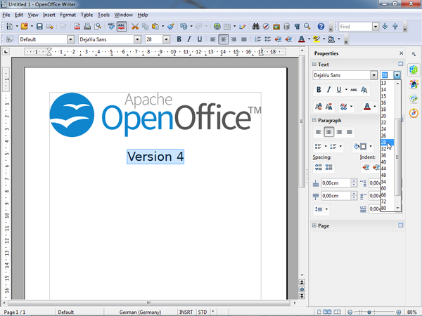
The sidebar is a UI feature that was introduced for all OpenOffice applications in version 4.0. It is based on the Symphony Properties Panel which in turn is based on the old Impress task pane. The sidebar looks like this:
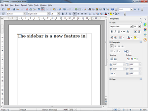
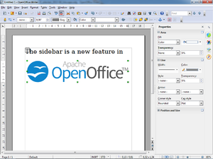
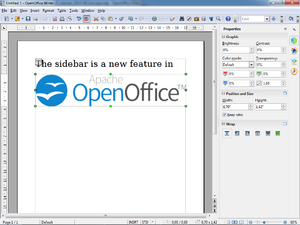
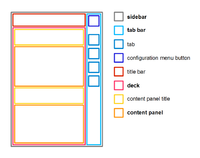
The sidebar window is located on the right side of the edit views of Writer, Calc, Impress, Draw, Base. It contains one or more panels, based on the current document context. Panels are organized into decks. A tab bar on the right side of the sidebar allows to switch between different decks.
At the moment, toolbars and sidebar panels share many functions. For example, the buttons for making text bold or italic exist in both the text toolbar and the Text panel. This duplicity is the result of a design decision to allow users to gradually learn to use the sidebar. It is our plan to reduce functions provided in toolbars and provide them only in the sidebar. The speed and scope of this change depends on feedback from our users.
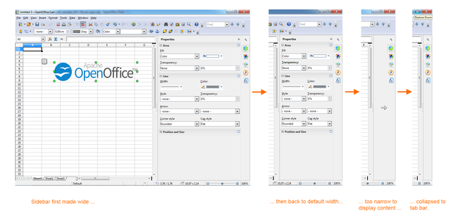
The width of the sidebar is variable. The controls in its panels are adjusted accordingly. When the sidebar becomes too small to be usable it collapses to the tab bar. This transitional state is indicated by an arrow that is displayed in place of the deck. A click on one of the buttons on the tab bar restores the deck to its former width.
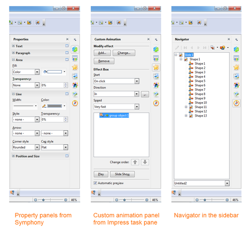
Eleven property panels have been migrated from IBM Lotus Symphony: Alignment, Area, Cell Appearance, Graphic, Line, Number Format, Page, Paragraph, Position and Size, Text and Wrap.
Seven panels come from the old Impress tool panel: Available for Use, Custom Animation, Layouts, Recently Used, Slide Transition, Table Design, Used in This Presentation.
Four are non-modal (ie non locking) dialogs: Functions, Gallery, Navigator, Styles and Formatting.
One is new: Insert Shapes.
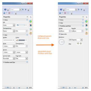
Some of these are displayed in the context sensitive 'Properties' deck, others are displayed in a deck on their own. In that case the panel title bar is usually not displayed and the deck title is the same as the panel title. When the panel title bar is shown then a mouse click on it collapses the panel to just its title bar. Another click and the panel is expanded to its former size.
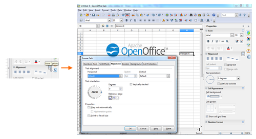
Some panels have a 'More Options' button in their title bar. A click on it opens a dialog with many more options than would fit into the panel. These dialogs, however, are modal, ie. the edit view is locked while the dialogs are open.
Fill style of shapes like color, gradient, bitmap, hatch, transparency.
List of all available templates.
Cell background color and border.
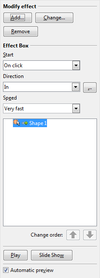
Add or modify animations of shapes.
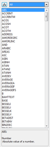
Insert functions (mathematical, string related, other) to a Calc cell.
Gallery dialog as sidebar panel.
Adjust bitmap attributes like brightness, contrast, colors, gamma.
Buttons and drop down menus for inserting shapes into Draw documents.
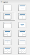
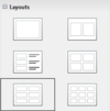
Assign a predefined layout to a slide. There are different sets of layouts for the different edit modes standard, handout and notes.
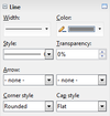
Adjust color, width and style of lines and outlines.
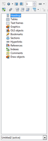
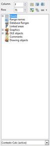
The navigator dialog as sidebar panel. Small differences between the different applications.
Set the number format of selected cells.
Set page properties like orientation, margin or size.
Adjust paragraph properties.
There are small differences for different contexts.
From left to right: Impress/Table, Writer/Annotation, Writer/DrawText, Writer/Table, Writer/Text.
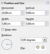
Change position, size and rotation of shapes. Not all of these attributes can be modified in any context. Free positioning is not supported in Writer. Bitmaps can not be rotated in Writer.
This results in three different versions of the panel: with position, size and rotation (left) with size and rotation (center) only size (right)
List the recently used templates/master pages.
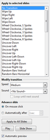
Add or modify transition animations between slides.
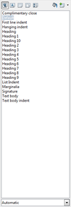
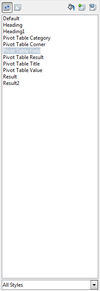
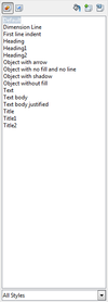
The styles and formatting dialog, aka Stylist, as sidebar panel.
There are small differences between the applications: (from left to right) Writer, Calc, Impress
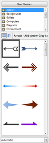
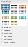
Properties of tables in Impress.
Adjust text properties like font, size, bold, colors.
There are small differences in different applications and contexts. Not all controls/attributes are available everywhere.
List of the templates/master pages that are currently used by the document.
Select how to wrap text around a graphical object.
A deck is a container for one or more panels. In some cases, where there is only one panel and the panel title and deck title are the same, the panel title bar is not painted.
The deck title bar is not an active element, ie mouse clicks are ignored, but it can receive the keyboard focus. That is an accessibility feature.
This is the only deck that is context sensitive by default. A list of which panels are belong to which contexts can be found here.
The tab bar is a column of icons on the right side of the sidebar. Its buttons switch between decks. The top button opens a menu that offers another way to switch decks. A sub menu allows individual decks to be hidden.
