Difference between revisions of "Sidebar"
(Added last set of panel screenshots.) |
(+cat) |
||
| (7 intermediate revisions by one other user not shown) | |||
| Line 1: | Line 1: | ||
| − | The sidebar is a UI feature that was introduced for all OpenOffice applications in version 4.0. It is based on the [[Symphony]] Properties Panel which in turn is based on the old [[Impress]] task pane. | + | The sidebar is a UI feature that was introduced for all OpenOffice applications in version 4.0. It is based on the [[Symphony]] Properties Panel which in turn is based on the old [[Impress]] task pane. The sidebar looks like this: |
| − | + | [[File:Sidebar-Writer.png|600px|center]] | |
| − | |||
| − | A panel is basically a mix of a toolbar and a non-modal dialog. That means that sidebar panels do not lock the document. The user can freely mix working in the edit view to eg enter text and use the | + | Information about the implementation of the sidebar and how to extend it with new panels can be found in the [[Sidebar for Developers]] page. |
| + | |||
| + | A [[#Glossary|glossary]] is available below. | ||
| + | |||
| + | |||
| + | ==Overview== | ||
| + | |||
| + | The sidebar window is located on the right side of the edit views of Writer, Calc, Impress, Draw, Base. It contains one or more [[#Panels|panels]], based on the current document context. Panels are organized into [[#Decks|decks]]. A [[#Tab_Bar|tab bar]] on the right side of the sidebar allows to switch between different decks. | ||
| + | |||
| + | The [[#Properties|Properties]] deck is context sensitive. When text is being edited then it contains panels for changing the font or text attributes, when a graphical object is selected then other panels give access to fill and line style as well as the object's position and size. | ||
| + | |||
| + | <br>[[Image:Sidebar-Screenshot-Writer-Context-Text.png|300px]] [[Image:Sidebar-Screenshot-Writer-Context-Shape.png|300px]] [[Image:Sidebar-Screenshot-Writer-Context-Graphic.png|300px]]<br>''Different panels in Properties deck for different contexts (from left to right): text editing, logo pasted as outline, logo pasted as bitmap'' | ||
| + | |||
| + | |||
| + | A panel is basically a mix of a toolbar and a non-modal dialog. That means that sidebar panels do not lock the document. The user can freely mix working in the edit view to eg enter text and use the [[#Text|Text]] panel to change text attributes. | ||
| + | |||
| + | At the moment tool bars and sidebar panels share many functions. For example the buttons for making text bold or italic exist in both the text toolbar and the [[#Text|Text]] panel. This duplicity is the result of a design decision to allow users to gradually learn to use the sidebar. It is our plan to reduce functions provided in tool bars and provide them only in the sidebar. The speed and scope of this change depends on feedback from our users. | ||
| + | |||
| + | The width of the sidebar is variable. The controls in its panels are adjusted accordingly. When the sidebar becomes too small to be usable it collapses to the tab bar. This transitional state is indicated by an arrow that is displayed in place of the deck. A click on of the buttons in the tab bar restores the deck to its former width. | ||
| + | |||
| + | [[File:Sidebar-Different-Widths.png|640px]] | ||
| − | |||
| − | |||
| − | |||
==Panels== | ==Panels== | ||
| Line 16: | Line 32: | ||
Seven panels come from the old Impress tool panel: Available for Use, Custom Animation, Layouts, Recently Used, Slide Transition, Table Design, Used in This Presentation. | Seven panels come from the old Impress tool panel: Available for Use, Custom Animation, Layouts, Recently Used, Slide Transition, Table Design, Used in This Presentation. | ||
Four are non-modal (ie non locking) dialogs: Functions, Gallery, Navigator, Styles and Formatting. | Four are non-modal (ie non locking) dialogs: Functions, Gallery, Navigator, Styles and Formatting. | ||
| − | One is new: Insert. | + | One is new: Insert Shapes. |
| + | |||
| + | [[File:Sidebar-Panels.png|500px]] | ||
Some of these are displayed in the context sensitive 'Properties' deck, others are displayed in a deck on their own. In that case the panel title bar is usually not displayed and the deck title is the same as the panel title. When the panel title bar is shown then a mouse click on it collapses the panel to just its title bar. Another click and the panel is expanded to its former size. | Some of these are displayed in the context sensitive 'Properties' deck, others are displayed in a deck on their own. In that case the panel title bar is usually not displayed and the deck title is the same as the panel title. When the panel title bar is shown then a mouse click on it collapses the panel to just its title bar. Another click and the panel is expanded to its former size. | ||
| + | |||
| + | [[File:Sidebar-Expand-Collapse.png|350px]] | ||
Some panels have a 'More Options' button in their title bar. A click on it opens a dialog with many more options than would fit into the panel. These dialogs, however, are modal, ie. the edit view is locked while the dialogs are open. | Some panels have a 'More Options' button in their title bar. A click on it opens a dialog with many more options than would fit into the panel. These dialogs, however, are modal, ie. the edit view is locked while the dialogs are open. | ||
| + | |||
| + | [[File:Sidebar-more-options.png|500px]] | ||
===Alignment (Calc only)=== | ===Alignment (Calc only)=== | ||
| Line 162: | Line 184: | ||
The deck title bar is not an active element, ie mouse clicks are ignored, but it can receive the keyboard focus. That is an accessibility feature. | The deck title bar is not an active element, ie mouse clicks are ignored, but it can receive the keyboard focus. That is an accessibility feature. | ||
| − | + | ===Custom Animation (Impress only)=== | |
| − | + | Contains only the [[#Custom_Animation_.28Impress_only.29|Custom Animation]] panel. | |
| − | + | ||
| − | + | ||
| − | + | ||
| − | + | ||
| − | + | ||
| − | + | ||
| − | + | Icon is [[file:Sidebar-Icon-CustomAnimation.png]]. | |
| − | + | ||
| + | ===Functions (Calc only)=== | ||
| + | Contains only the [[#Functions_.28Calc_only.29|Functions]] panel. | ||
| + | |||
| + | Icon is [[file:Sidebar-Icon-Functions.png]]. | ||
| + | |||
| + | ===Gallery=== | ||
| + | Contains only the [[#Gallery|Gallery]] panel. | ||
| + | |||
| + | Icon is [[file:Sidebar-Icon-Gallery.png]]. | ||
| + | |||
| + | ===Master Pages (Impress only)=== | ||
| + | Contains the [[#Used_in_This_Presentation_.28Impress_only.29|Used in This Presentation]], | ||
| + | [[#Recently_Used_.28Impress_only.29|Recently Used]], | ||
| + | [[#Available_for_Use_.28Impress_only.29|Available for Use]] panels. | ||
| + | |||
| + | Icon is [[file:Sidebar-Icon-MasterPages.png]]. | ||
| + | |||
| + | ===Navigator=== | ||
| + | Contains only the [[#Navigator|Navigator]] panel. | ||
| + | |||
| + | Icon is [[file:Sidebar-Icon-Navigator.png]]. | ||
| + | |||
| + | ===Properties=== | ||
| + | Contains a selection of the panels [[#Alignment_.28Calc_only.29|Alignment]], [[#Area|Area]], [[#Cell_Appearance_.28Calc_only.29|Cell Appearance]], [[#Graphic|Graphic]], [[#Insert_Shapes_.28Draw_only.29|Insert Shapes]], [[#Line|Line]], [[#Number_Format_.28Calc_only.29|Number Format]], [[#Page_.28Writer_only.29|Page]], [[#Paragraph|Paragraph]], [[#Position_and_Size|Position and Size]], [[#Text|Text]] and [[#Wrap_.28Writer_only.29|Wrap]]. | ||
| + | |||
| + | Icon is [[file:Sidebar-Icon-Properties.png]]. | ||
| + | |||
| + | This is the only deck that is context sensitive by default. A list of which panels are belong to which contexts can be found [[Sidebar_for_Developers#Contexts|here]]. | ||
| + | |||
| + | ===Slide Transition (Impress only)=== | ||
| + | Contains only the [[#Slide_Transition_.28Impress_only.29|Slide Transition]] panel. | ||
| + | |||
| + | Icon is [[file:Sidebar-Icon-SlideTransition.png]]. | ||
| + | |||
| + | ===Styles and Formatting=== | ||
| + | Contains only the [[#Styles_and_Formatting|Styles and Formatting]] panel. | ||
| + | |||
| + | Icon is [[file:Sidebar-Icon-StylesAndFormatting.png]]. | ||
| + | |||
| + | ==Tab Bar== | ||
| + | The tab bar is a column of icons on the right side of the sidebar. Its buttons switch between decks. The top button opens a menu that offers another way to switch decks. A sub menu allows individual decks to be hidden. | ||
| + | |||
| + | ==Glossary== | ||
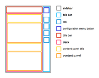
[[File:SidebarNames.png|thumb|200px|Schematic overview of sidebar components. Location of elements do not reflect UX design.]] | [[File:SidebarNames.png|thumb|200px|Schematic overview of sidebar components. Location of elements do not reflect UX design.]] | ||
;sidebar: Name of the feature and name of the control including all its components (icon bar, content panels). | ;sidebar: Name of the feature and name of the control including all its components (icon bar, content panels). | ||
| Line 191: | Line 249: | ||
==References== | ==References== | ||
The UX part of the work is described on another [[AOO_UX_Design_Exploration_-_Task_Pane_Content_-_Information_Design|page]]. This page focuses on the API design and implementation. | The UX part of the work is described on another [[AOO_UX_Design_Exploration_-_Task_Pane_Content_-_Information_Design|page]]. This page focuses on the API design and implementation. | ||
| + | |||
| + | [[Category:Development]] | ||
Revision as of 21:27, 25 September 2013
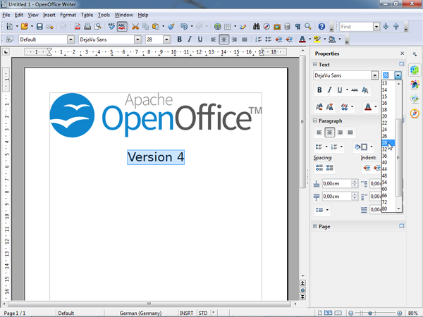
The sidebar is a UI feature that was introduced for all OpenOffice applications in version 4.0. It is based on the Symphony Properties Panel which in turn is based on the old Impress task pane. The sidebar looks like this:
Information about the implementation of the sidebar and how to extend it with new panels can be found in the Sidebar for Developers page.
A glossary is available below.
Contents
- 1 Overview
- 2 Panels
- 2.1 Alignment (Calc only)
- 2.2 Area
- 2.3 Available for Use (Impress only)
- 2.4 Cell Appearance (Calc only)
- 2.5 Custom Animation (Impress only)
- 2.6 Functions (Calc only)
- 2.7 Gallery
- 2.8 Graphic
- 2.9 Insert Shapes (Draw only)
- 2.10 Layouts (Impress only)
- 2.11 Line
- 2.12 Navigator
- 2.13 Number Format (Calc only)
- 2.14 Page (Writer only)
- 2.15 Paragraph
- 2.16 Position and Size
- 2.17 Recently Used (Impress only)
- 2.18 Slide Transition (Impress only)
- 2.19 Styles and Formatting
- 2.20 Table Design (Impress only)
- 2.21 Text
- 2.22 Used in This Presentation (Impress only)
- 2.23 Wrap (Writer only)
- 3 Decks
- 4 Tab Bar
- 5 Glossary
- 6 References
Overview
The sidebar window is located on the right side of the edit views of Writer, Calc, Impress, Draw, Base. It contains one or more panels, based on the current document context. Panels are organized into decks. A tab bar on the right side of the sidebar allows to switch between different decks.
The Properties deck is context sensitive. When text is being edited then it contains panels for changing the font or text attributes, when a graphical object is selected then other panels give access to fill and line style as well as the object's position and size.
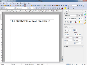
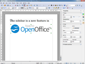
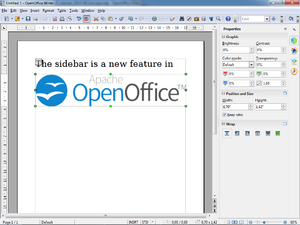
Different panels in Properties deck for different contexts (from left to right): text editing, logo pasted as outline, logo pasted as bitmap
A panel is basically a mix of a toolbar and a non-modal dialog. That means that sidebar panels do not lock the document. The user can freely mix working in the edit view to eg enter text and use the Text panel to change text attributes.
At the moment tool bars and sidebar panels share many functions. For example the buttons for making text bold or italic exist in both the text toolbar and the Text panel. This duplicity is the result of a design decision to allow users to gradually learn to use the sidebar. It is our plan to reduce functions provided in tool bars and provide them only in the sidebar. The speed and scope of this change depends on feedback from our users.
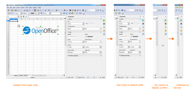
The width of the sidebar is variable. The controls in its panels are adjusted accordingly. When the sidebar becomes too small to be usable it collapses to the tab bar. This transitional state is indicated by an arrow that is displayed in place of the deck. A click on of the buttons in the tab bar restores the deck to its former width.
Panels
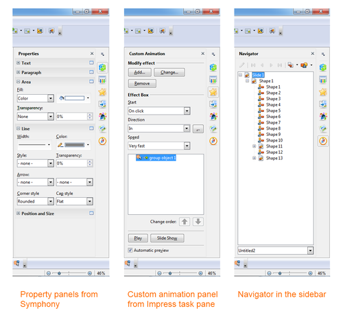
Eleven property panels have been migrated from IBM Lotus Symphony: Alignment, Area, Cell Appearance, Graphic, Line, Number Format, Page, Paragraph, Position and Size, Text and Wrap. Seven panels come from the old Impress tool panel: Available for Use, Custom Animation, Layouts, Recently Used, Slide Transition, Table Design, Used in This Presentation. Four are non-modal (ie non locking) dialogs: Functions, Gallery, Navigator, Styles and Formatting. One is new: Insert Shapes.
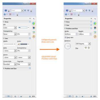
Some of these are displayed in the context sensitive 'Properties' deck, others are displayed in a deck on their own. In that case the panel title bar is usually not displayed and the deck title is the same as the panel title. When the panel title bar is shown then a mouse click on it collapses the panel to just its title bar. Another click and the panel is expanded to its former size.
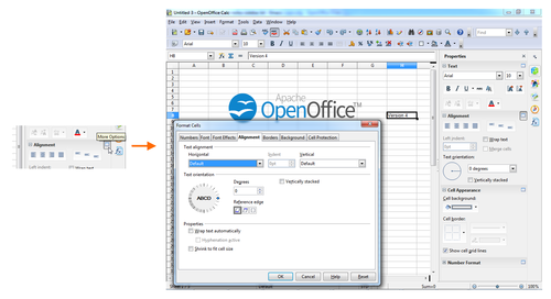
Some panels have a 'More Options' button in their title bar. A click on it opens a dialog with many more options than would fit into the panel. These dialogs, however, are modal, ie. the edit view is locked while the dialogs are open.
Alignment (Calc only)
Alignment of cell text (horizontal, vertical, rotation)
Area
Fill style of shapes like color, gradient, bitmap, hatch, transparency.
Available for Use (Impress only)
List of all available templates.
Cell Appearance (Calc only)
Cell background color and border.
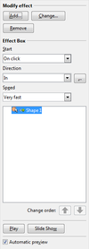
Custom Animation (Impress only)
Add or modify animations of shapes.
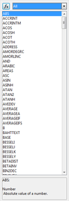
Functions (Calc only)
Insert functions (mathematical, string related, other) to a Calc cell.
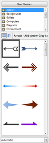
Gallery
Gallery dialog as sidebar panel.
Graphic
Adjust bitmap attributes like brightness, contrast, colors, gamma.
Insert Shapes (Draw only)
Buttons and drop down menus for inserting shapes into Draw documents.
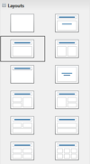
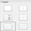
Layouts (Impress only)
Assign a predefined layout to a slide. There are different sets of layouts for the different edit modes standard, handout and notes.
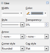
Line
Adjust color, width and style of lines and outlines.
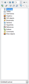
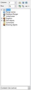
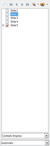
The navigator dialog as sidebar panel. Small differences between the different applications.
Number Format (Calc only)
Set the number format of selected cells.
Page (Writer only)
Set page properties like orientation, margin or size.
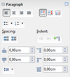
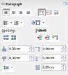
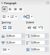
Paragraph
Adjust paragraph properties.
There are small differences for different contexts.
From left to right: Impress/Table, Writer/Annotation, Writer/DrawText, Writer/Table, Writer/Text.
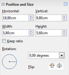
Position and Size
Change position, size and rotation of shapes. Not all of these attributes can be modified in any context. Free positioning is not supported in Writer. Bitmaps can not be rotated in Writer.
This results in three different versions of the panel: with position, size and rotation (left) with size and rotation (center) only size (right)
Recently Used (Impress only)
List the recently used templates/master pages.
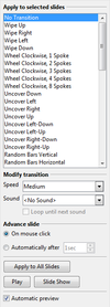
Slide Transition (Impress only)
Add or modify transition animations between slides.
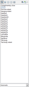
Styles and Formatting
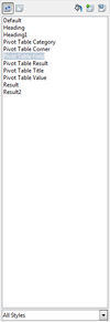
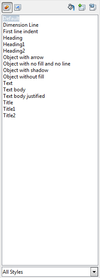
The styles and formatting dialog, aka Stylist, as sidebar panel.
There are small differences between the applications: (from left to right) Writer, Calc, Impress
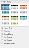
Table Design (Impress only)
Properties of tables in Impress.
Text
Adjust text properties like font, size, bold, colors.
There are small differences in different applications and contexts. Not all controls/attributes are available everywhere.
Used in This Presentation (Impress only)
List of the templates/master pages that are currently used by the document.
Wrap (Writer only)
Select how to wrap text around a graphical object.
Decks
A deck is a container for one or more panels. In some cases, where there is only one panel and the panel title and deck title are the same, the panel title bar is not painted.
The deck title bar is not an active element, ie mouse clicks are ignored, but it can receive the keyboard focus. That is an accessibility feature.
Custom Animation (Impress only)
Contains only the Custom Animation panel.
Functions (Calc only)
Contains only the Functions panel.
Gallery
Contains only the Gallery panel.
Master Pages (Impress only)
Contains the Used in This Presentation, Recently Used, Available for Use panels.
Contains only the Navigator panel.
Properties
Contains a selection of the panels Alignment, Area, Cell Appearance, Graphic, Insert Shapes, Line, Number Format, Page, Paragraph, Position and Size, Text and Wrap.
This is the only deck that is context sensitive by default. A list of which panels are belong to which contexts can be found here.
Slide Transition (Impress only)
Contains only the Slide Transition panel.
Styles and Formatting
Contains only the Styles and Formatting panel.
Tab Bar
The tab bar is a column of icons on the right side of the sidebar. Its buttons switch between decks. The top button opens a menu that offers another way to switch decks. A sub menu allows individual decks to be hidden.
Glossary
- sidebar
- Name of the feature and name of the control including all its components (icon bar, content panels).
- Also known as task pane(l) or tool pane(l)
- tab bar
- Similar to a vertical tool bar. Clicking on buttons switches between sidebar decks.
- deck
- Contains one or more content panels. Only one deck is visible at any one time.
- content panel
- Displays information about the document and/or provides the means for document modification.
- Each content panel focuses on one topic like font, table or shape properties.
- There may be more than one content panel in a deck.
- Examples are the task panels of the Impress task pane or the property views of the Symphony sidebar.
- title bar
- Displays the title for the current sidebar deck.
- Can contain a closer button.
- content panel title
- Displays the title for one content panel. Optional when there is only one content panel.
- configuration menu button
- Opens a popup menu that allows switching between decks and also allows the activation and deactivation (tab is not shown) of decks.
References
The UX part of the work is described on another page. This page focuses on the API design and implementation.
