Proposal by Jaron Baron
|
|
|---|
|
Quick Navigation
Team |
| Please do not edit this page unless you are the original author. Your feedback and comments are welcome in the Comments section below or on the ui@ux.openoffice.org mailing list. |
Design Proposal "DaVinci"
The following design proposal is part of the collection of design proposals for “Accessing Functionality”, which is part of Project Renaissance.
Contents
Summary and Status
The DaVinci proposal introduces some non-traditional UI elements which are described below. Keep in mind that OOo's expansive functionalities must all lie within a simple design; this is not an easy task. Therefore my goal is to focus on accessibility of commands, and an intuitive UI layout. The focus of the design is:
- the elimination of most modal formatting and properties windows
- (subsequently) a focus on dynamic formatting
- efficient accessibility of the majority of commands
- a more explicit incorporation of styles and master slides within normal formatting tasks
- efficient use of screen real-estate compared to competitors
Each UI element is intended to serve a clear and definitive purpose. Because the UI panes are an essential UI element, I felt I needed to include two wireframe mockups showing the panes minimized and expanded.
TO UNDERSTAND HOW DIFFERENT UI ELEMENTS BEHAVE PLEASE READ THE FINAL SECTION
Status: Request for Comments
Proposal nearly complete - all of the proposal's pertinent information is present. Some additional independent UI element design concepts may be added as an appendix at the end of the proposal.
Wireframe Mockup
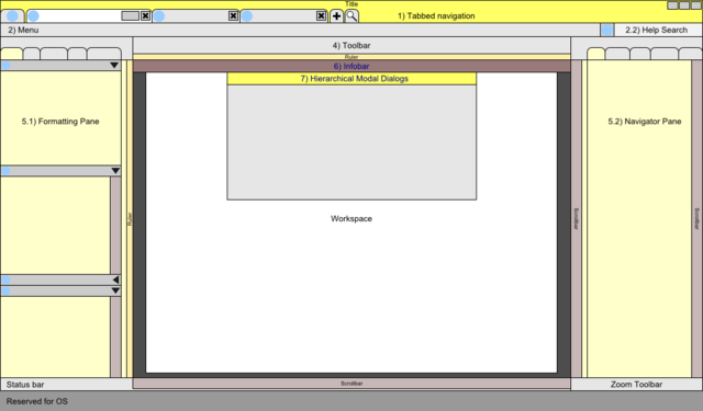
| Figure 1 - Wireframe |
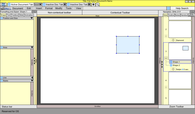
| Figure 3 - Detailed mockup with expanded panes |
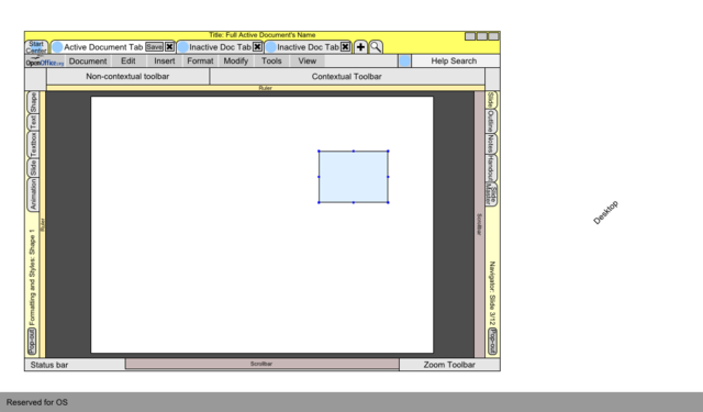
| Figure 4 - Detailed mockup with minimized panes |
Detailed Description
For a description of each UI element and its behavior see the next section.
Describe dynamic behavior: The main proposed dynamic behaviors include:
- Graphical focus behavior:
I envision the toolbar iconography becoming desaturated (gray-scale) when the cursor is in the workspace. This will visually reduce clutter and allow the user to keep focus on the workspace. Furthermore, the currently active scroll bar will be saturated so that the user always knows the result of operating the mouse scroll wheel.
- Cursor-crossing expansion of the navigator and format panes:
The navigator and format panes expand using a cursor-crossing behavior. There are two scenarios to consider to understand why I chose this behavior. First, consider the OOo window maximized. If the user wants to activate a pane, he or she may simply slam the mouse to the side of the screen. This is essentially an infinitely sized target for the sake of calculating accessibility times. For the second case consider OOo in a windowed mode. The benefits of the edge of the screen no longer apply. However, by using a cursor-crossing behavior, the user may still activate the pane even if the cursor overshoots the pane. This effectively enlarges the target cursor area for the sake of accessibility times.
- "Slot machine" scrolling in the navigator pane:
Instead of having a traditional scroll bar for the navigator pane I propose a "slot machine" like scrolling behavior. As the user scrolls using the mouse wheel, the slide visible in the workspace will always be centered in the navigator pane. The scroll bar will behave like an accelerator instead of as an absolute position; the farther the scroll bar is moved down, the faster the user will be able to scroll through the slides. I expect that the behavior will be very intuitive and will provide for faster access in long presentations or documents.
- Modal navigation:
The navigator has tabs which change "views" or "modes." Currently in impress, the user may switch between for example, slide view and outline view; the navigator duplicates this functionality. However, the navigator will also includes navigation by the different navigable UI objects. (For example, in Writer, you can currently navigate by frames, tables, pages and other objects.) When the user is inserting and formatting most objects he or she is simply navigating by "slides". Lets pretend a user is editing a picture, the user is then “Navigating by Pictures." This change in navigation invokes contextual changes to the UI providing access to the relevant formatting tools for pictures (like crop or resize) in the toolbar and format pane. Effectively the modes or views allow the user to temporarily change focus to a specific object in the workspace with a UI environment that best provides for the user's needs. An infobar warning lets the user know that a modality change has occurred and provides quick access to the “normal” default view they are used too. These navigation modes or views will have the same tools across the user suite, such that formatting a spreadsheet in Impress feels and looks the same as formatting a spreadsheet in Calc.
Additionally, this reduces the development and revision workload on developers by simplifying user interactions to contextual object modes that behave similarly across the suite; if a change is made to the behavior of spreadsheets in Calc then it would take effect in all program suites.
Explain the rationale and assumptions: I chose to eliminate floating modal windows to allow for dynamic object formatting and due to the restrictions that come with modal windows. Additionally, I sought to create an interface with few exceptions to the rules implied by the UI layout. For that reason, the toolbars are roughly organized by the menu options (edit, insert, format, modify, etc..). A user will always access a certain kind of command from the same toolbar. Additionally, you may note that I have left, center and right justified the toolbars; this clearly visually separates the different designated toolbar spaces.
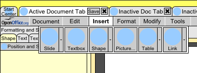
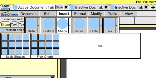
Since the insert bar must contain a lot of object insertion options, it will use a "ribbon" element to provide access to a variety of features (as shown in figure 5 below). The OpenOffice.org menu will clearly differentiate program specific options from document specific options. It has been intentionally made large. Currently, handicap accessibility options for OOo are hidden within the tools>option dialog. For users with handicaps, accessing these features may be prohibitively difficult.
The rationale behind the format toolbar and format pane comes from my perception that many users will access only a small number of popular commands. However, the remaining users will also want quicker and convenient access to all the format options. Therefore, a real-estate friendly format toolbar provides access to common formatting commands while the format pane provides access to the full extensive formatting options.
Highlight particular design ideas and alternatives:
List issues and open questions:
- Modal Navigation concept:
I am most concerned that this modal navigation concept will come across as complex. It is actually quite simple. Editing an object creates contextual UI changes that optimize the UI for the specific object. Please let me know how/if I can better explain the navigator behavior.
- Format Pane layout, object selection consistency, and categorizing formatting options
I have been through 4-5 revisions of the format pane and simply posted the simplest one. After reviewing the other design proposals with similar format pane concepts, I had to laugh a little; my other proposed format pane designs are extremely similar to the ones other people proposed, like a tree organization, accordion, and others. I would like to discuss the problem if people are interested. I perceive the user's formatting to be defined within 5 hierarchical levels:
1) Object category - Either a global object (like a style), hard-formatting, or other. Examples: text style or a selected text, slide master/layout or selected slide, animation is an example of other (essentially, animations sort of belong to an object, and slide transitions belong to a slide, but they are defined by other interactions and therefore don't really belong under the formatting options of a selected object.)
2) Selected object - Examples: Slide, shape, or text; "Body Text" style, or "Default" Slide master, animation for "Shape 1"
3) Object property category - Example for a text box: Paragraph, Character, Line, Area, Text, Bullets and Numbering, Position and Size
4) Object property sub-category - Example for Paragraph: Indents & Spacing, Alignment, Asian Typography, Tabs
5) Object property - Examples: Indent before text, Indent after text, line spacing etc...
My goal was to create a hierarchical formatting structure (thus the accordion and tab layout) that recognizes the complexity of the formatting options available for a given object, and also allows the user to clearly select which object they wanted to format. Remember that selecting certain objects, like a slide or a style, is currently an ambiguous procedure. For user experience consistency, formatting a paragraph style, for example, should not be much different than formatting a paragraph. My challenge is how to easily convey the over-abundance of formatting options available to the user. I was hoping to use the navigator to help organize how the user selects an object. Future functionality, for example, could include a styles view which lets the user format styles as though they are hard-formatting paragraphs in a document. However, that is outside of the scope of Renaissance. Any ideas people have would be nice; I have thought about how to do this for a while and none of the solutions seem simple enough for the average user.
Additional Material and Mockups
Main UI Elements
1) Document Tabs:
Figure 1 - 4
- The document tabs replace the “window” menu for global navigation
- Though perhaps they are not the most important UI element now, they provide utility for future functionality
- The StartCenter could be a tab at start-up
- A new, and open tab could provide quick access to those commands.
2) Menus:
Figure 1 - 4, & 5
- Menus must be maintained at a minimum for cross-platform consistency since OS X still requires menus.
- Provides comfort for older users who haven't yet established where all the new commands are located.
- Not all commands will be accessible via the new UI. Many obscure and rarely used commands (especially certain tools) may remain within the menu system. Advanced users will likely spend more time using menu items versus basic users who will find all of their needs met by the other UI elements.
- Menu's use a sort of ribbon UI element instead of the traditional drop-down menu, for better organization and faster access
- In Figure 5, the Insert ribbon is shown, demonstrating that the user can easily access all the insert commands within very little screen real-estate.
- The large ribbon drop-down buttons provide sufficient space for all the different menu options and in the case of Figure 6 shows how insert can contain all 122 OOo shapes.
2.1) The “OpenOffice.org” menu:
Figure 1 - 4
- OOo suite needs a menu item that clearly differentiates document options from program options
- Mac OS X requires a “program” menu
- Contains customization options, handicap options, program update information and provides a space for future functionality
2.2) Help search:
Figure 1 - 4
- Allows the user to search the help dialog without a floating window
- While searching help directly from the UI may not be a key UI element now, it reserves a space and sets a precedent for future functionality, such as a command-line prompt.
- Is a required UI object in Mac OSX's help menu.
4) Toolbars: The toolbars are divided into universal non-contextual commands (Undo, Copy, Paste) and contextual formatting commands.
Figure 1 - 4
- Designed for easy access to the most popular commands
5) Panes: There are two panes, the navigator and the format pane
Minimized: Figure 2 & 4; Expanded: Figure 1 & 3
- Panes can be either minimized and docked (as shown in figure 3), open and docked (as shown in figure 4) or maybe even windowed (not shown).
- Expanded panes versus minimized panes: balance screen real estate and clutter with accessibility
- Cursor-crossing is used to pop-out the minimized panes: If a window is maximized the user may slam the cursor into the side of the screen (essentially creating an infinite cursor target). To duplicate that benefit when the program is windowed, the cursor needs to cross over the minimized pane to activate (NOT a mouse-over effect, a cursor-crossing effect). It is deactivated when the cursor crosses back into the workspace (or sufficient time passes) thus allowing for a near infinite cursor target to activate the pane (though the return time for the cursor must be considered when looking at the efficiency of this system).
5.1) Formatting Pane:
Figure 1 - 4
- The format pane has tabs of different format options for the selected object(s) and there is also "slide/page" and "animation" tabs.
- Additionally, for each tab, a tree system separates the main formatting categories.
- The tabs replace the different format windows available for an object. For example, a draw object would replace the menus: Position and size, area, line, text, paragraph, character; with the tabs: "Shape" (Position and size, area, line), "Text" (paragraph, character), and "Textbox" (text).
- Users can create a customizable format pane tab with their most used commands, although that is more the function of the toolbar.
5.2) Navigator Pane:
Figure 1 - 4
- The navigator tabs change the current UI mode/view. In Impress, this includes switching between the Slide, Outline, and Notes views.
- The navigator tabs ALSO include the different navigable UI objects. [For example, in Writer, you can navigate by frames, tables, pages, or other objects].
- Essentially, the modes or views allow the user to temporarily change focus to a specific object in the workspace with a UI environment that best provides for the user's needs.
- Contextual UI changes occur primarily when the user changes navigation to a different Mode/View. If a user is editing a picture, then the user is “Navigating by Pictures” and has access to the relevant formatting tools for pictures (like crop or resize) in the toolbar. The format pane would also change to reflect the currently navigated object.
- NOTE: An Infobar warning lets the user know that a modality change has occurred and provides quick access to the “normal” default view they are used too.
- These modes or views have the same tools across the user suite, such that formatting a spreadsheet in Impress feels and looks the same as formatting a spreadsheet in Calc.
6) Infobar: There are two different types of infobars persistent and temporary
Figure 1 & 7
- Doesn't float, and therefore won't block the user's workspace.
6.1) Temporary: help/tip information
- Pops-up for a short time providing help/tip information
- Replaces “paperclip” and allows for some basic textual communication when using the "paperclip" feature
6.2) Persistent: conveys changes in navigation information, or tool information
- Indicates a change in navigation (as discussed above under the navigation tab section)
- Provides quick access for the user to return to the previous or default navigation mode
- Visually reinforces UI contextual changes
- Provides a UI tool for multiple OOo tools to be active and not interfere, (such as a search bar, and a word count bar both being active at the same time).
- I propose a "Tabbing" bar that provides a better interface for users to format a paragraph's tabbing. Currently, the window tabbing dialog is cumbersome and using the ruler alone seems to confuse most users or simply hides the tabbing functionality.
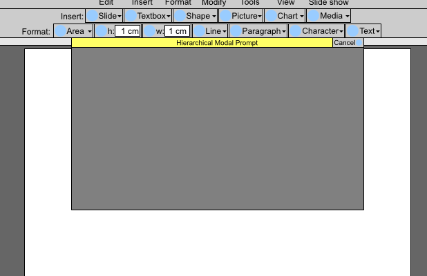
7) Hierarchical Modal dialogs:
Figure 1, 8 & 9
- Eliminate the modal floating windows
- Ensures user focus is on modal prompts and strictly assigns the prompt to a specific document (and thus eliminates potential confusion when the user can't interface with a document due to the presence of a hidden modal prompt)
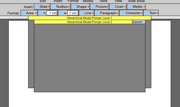
- Uses a stackable, or hierarchical modal prompt that shows the user which level of modal prompt they are currently in, as well as the titles of the previous modal prompts. (For example, consider the selection of the modal Print dialog and the modal Properties dialog within it. Two modal windows are open, Print and Printer Properties. The user can clearly see that he/she started with the print dialog and is now in the printer properties dialog).
8) Status bar:
- Shows all pertinent status information, like language, cursor position, slide number, etc...
Misc) Direct manipulation UI elements: I propose adopting a large number of direct manipulation elements.
Not shown
- The direct-manipulation snippets discussed in the wiki are a great example of how users need more ways to interface with objects.
- To build on the object modal navigation concepts discussed earlier, each object that has a navigation category could have a direct-manipulation element that allows the user to switch navigation and therefore edit that object. (For example, a picture could be positioned and sized during Slide navigation. When the user wants to edit the picture, instead of switching to navigation by picture via the navigation tabs, the user could simply click on an "edit" button displayed on the picture itself which would change to navigation by picture.)
- [In writer, each paragraph, when active (aka the cursor is in the paragraph), should have a direct-manipulation Style (DMS) drop-down, that shows the paragraph's current style and allows the user to quickly change it. Additionally, the DMS would contain indent buttons if the style included numbering and bullets. By always showing the paragraph style, I hope that users will begin to adopt the use of style functionality in their documents].
| Figure 5 - Insert Menu Ribbon |
| Figure 6 - Insert Menu Ribbon with Expanded "Insert Shape" Command |
| Figure 7 - Infobar |
| Figure 8 - Modal Dialog |
| Figure 9 - Hierarchical Modal Dialog |
Author or Team Working on This Proposal
| Author / Team Member | Contact (OpenOffice.org login name, used for email) |
| Jaron Kuppers | JaronBaron |
Comments
| Sorry to have to say this let this design die or go back to drawing board. Never put tabs of documents on a part line across the screen user many want to open up 30 to 50 documents at once how are you to know.
Centralizing things people who do GUI studies sometimes says it a advantage problem here users are use to non centralized. Also forgot the advantage of ribbon bar that when the section is selected it stays displayed so reducing mouse action. Yes you have saved space but you basically over cooked it. Too compact Too alien to what users are use to --Oiaohm 23:25, 13 May 2009 (UTC) |
| Hi Oiaohm, Thanks for your comments! I realize I over-cooked my proposal. Due to limitations in time I have not had time to revise and simplify some of my ideas. Also, I focused too heavily on including all of OOo's commands and not enough time on the commands users will need most often. Additionally, I too heavily focused on preserving screen real-estate (thus the complex expanding side-bars, which is a feature only advanced users will understand).) |
| Hi Jaron! Thanks for your proposal! Here are my comments. I see one serious problem in your proposal. You mix a lot of navigation/grouping elemtens e.g. menu, tabs, toolbars, and side panes etc. which are scattered all over the place. In that sense, I see a strong vialation of our design directive "minimize clutter and maximize consistency (similar elements are grouped and positioned in similar ways)". This makes the overall aesthetic appearance of the UI as complex and really hard to learn. Remember, Hick's law? "The time it takes to make a decision increases as the number of alternatives increases." Hence, a UI that forces a user to look for functionality at many different locations which in addition behave differently, will not solve our current problems. Andreas |
| Hi Andreas, Thanks for your in-depth comments! I definitely realized that my UI was too cluttered. I have revised it accordingly, but still fear it is a bit cluttered. Hopefully some of my ideas have at least some merit standing apart from my overall UI design. Cheers, Jaron --JaronBaron 23:57, 26 May 2009 (UTC) |

