Proposal by Cinly Ooi
Design Proposal "Control Panel and More"
|
|
|---|
|
Quick Navigation
Team |
| Please do not edit this page unless you are the original author. Your feedback and comments are welcome in the Comments section below or on the ui@ux.openoffice.org mailing list. |
The following design proposal is part of the collection of design proposals for “Accessing Functionality”, which is part of Project Renaissance.
Summary and Status
Completed uploading of all information. I am in the process of reorganizing it.
This proposal contains the following:
- A pallette system to organized tools. This system replaces the majority of the toolbars and dialog windows dotted around OOo. The tools in them are collected into pallettes. Palletes are organized to provide all the tools needed according to specific tasks. At any time, the proposal envisage that only at most two pallettes are open thus reducing clutter. Crucially, pallettes provide more freedom in displaying tools. It is proposed that the pallettes are placed at locations where there is naturally space that are not used by the slides on the screen.
- A New "Combined" view where all three components of the presentation, i.e., slides, notes and handout can be viewed on one screen
- Modification to
- the Slide Sorter View
- outline view that
- New
- Presentation Control Panel that supply tools/information to the presenter
- a Master View that helps users modify the presentation master.
This proposal does not proposed any groundbreaking changes, it aggregates good ideas seen in other applications, especially Lotus Symphony and Apple Keynote. However, there is enough innovation in it to argue that the proposal is not merely an aggregation plus incremental innovation.
I admit that there are tools listed here that are not currently in Impress. I ask that readers treat them as an indication of the potential of this proposal and where appropriate, the potential of OOo Impress.
I believe the system proposed here is also applicable to other OOo applications such as Write and Draw.
Status: Request for Comments
After you consider the comments and questions in the comments section, revise your proposal for completeness and understandability. When you feel your proposal is ready for evaluation, please change the status above to “Proposal Complete”.
Mockup
Please add your main “wireframe” mockup. For example: A mockup which shows the functionality for adding a slide in Impress.
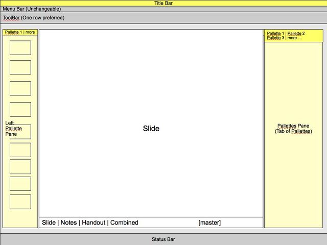
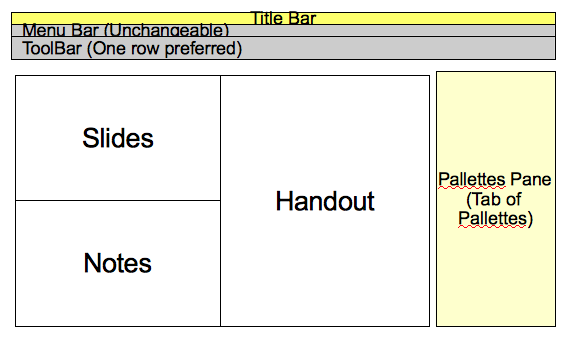
The main aim is to provide as much space for the Slide as possible. This is achieved by exploiting the fact that most projectors are still using 4:3 ratio while monitors are increasingly using 16:9 ratio. The result? Space on the top and bottom of the slides are at a a premium but there are more space at both the left and right.
Users expect some items, such as menu bar and tool bar and status bar to span across the screen horizontally. It is necessary to make sure we maintain this expectation. However, the area devoted to them should be kept as small as possible. Luckily, the fact that projectors are generally at lower resolution than monitor, and that user like to display the full slide (rather than zoom-in view) means we do have some space to squeeze those items in.
Menu bar
Like the current system, but with emphasis on things that affect the whole presentation (open/save/comments/page properties)
Tool bar
Preference is for old-fashion icon and tooltip, instead of the modern, larger icon+text version. The reasoning is users already know how open/save/print/zoom/cut/paste looks like, so there is no need for text. The space saved is given to the slide edit window.
It is also recommended that only one row of toolbar is provided.
Pallette Pane
Pallette panes are designed to hold pallettes. Each pallette pane can hold an unlimited number of pallette. Any pallette can be attached to any pallette pane.
It is envisage that the pallette pane are normally attached to either the sides, i.e. the left and right edges of Impress Window, just below the toolbar and just above the status bar. The pallette pane can be detached and used as a floating window.
It is envisaged that most of the time, there will only be two pallette pane shown, i.e., at the left and right edges of the window. Both pane should be open at all time. However, for smaller screen, the pallette can be reduced to just a thin line, and expanded to its full size when the mouse pointer hover on the thin line.
Slide Edit Area
It is the aim of this proposal to give it as much space as possible.
Each view is a tab. There are four tabs for four different views: Slide, Note, Handout and Combined view. In Combined view, all three Slide/Note/Handout will be display side-by-side.
A toggle button named "master" located at the right of the tabs give access to the master page view. When it is clicked, The master for the selected view will be presented for editing.
Detailed Description
Pallette
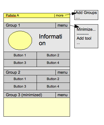
The Pallete is a collection of tools/information objects.
Pallete offers the following advantages over toolbars:
- The useable area for presenting tools is larger in pallete
- Pallette can contain information object, toolbars generally do not
- It offers more flexibility in presenting the tools. For example, there is little to no expectation of the size of the tools.
Organization
Pallette is organized by task, i.e., tools that the user requires or likely to use are organized into a pallette.
Inside each pallette, tools are organized into their logical groups
Group can be minimized to make more screen area available for other groups. They can also be resized. But unless they are put into "Pallette design" mode, you cannot change the order of the group, or move individual tools around inside the group.
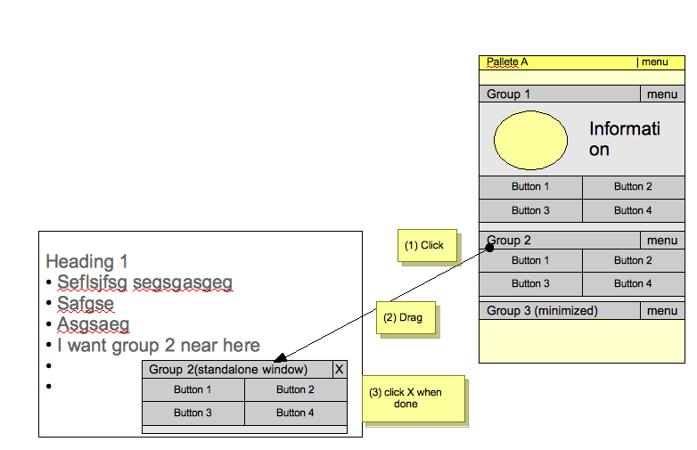
What happens if you have buttons that you are going to click on very frequently?
Normally, when editing a slide, there are short period of activity where a few tools will be selected and used very frequently. Moving the mouse to and from pallette is too time consuming and troublesome.
For these situation, the user will drag a group from the pallette and placed it near where it is needed.
Note that dragging a group do not actually detached the group from the pallette, but simply clone the group and put it in a "floating" window. When done, user simply throw away the pallette.
This system is meant to temporary put the tools you need near where you need it. It is not meant to be a replacement/alternative to the pallette system.
Creating new pallette | Editing the pallette
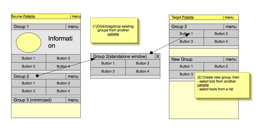
Advanced user can choose to create pallettes.
After creating a new empty pallette, to populate the pallette, one can populate the pallette the traditional way, i.e., selecting tools from a dialog box. However, it is also possible to populate the palltte by
- Click and drag groups from another pallette
- create a new group, but drag tools from another pallette
Example Pallettes
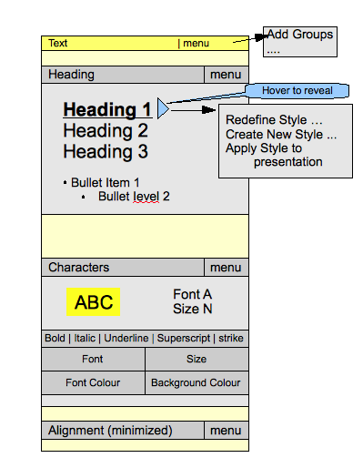
Text Pallette
This pallete is about manipulating text.
The top group show the available Text format, complete with how they look.
- To create new TextBox, user drag and drop the appropriate text-style they want into the slide
- The context menu is borrowed from Apple's keynote, because it is useful to have those features. OOo can of course rolls its own context menu.
The middle group allows the user to format the look and feel of the selected text in the slide. Note that the top part of the middle group is an information object, it only display information
The bottom group (minimized) controls the alignment of the text in the text box, and perhaps the alignment of any objects in the slide
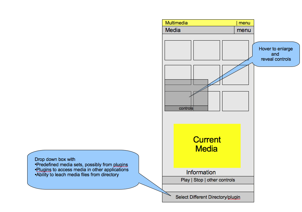
Media Pallette
This pallete is about inserting media (picture/movies/sound) into the slides.
The top part shows thumbnails of available media. Hovering the cursor above any thumbnail will bring up a bigger thumbnail, completed with controls you might want to use (play/stop). To insert the media, drag and drop into the slide
The middle portion is about customizing the media. For movies/sounds, the user might be permitted to select to play only part of the clip in the presentation and to specify the an image in the movie to use as place holder in the slide. For picture, manipulation of the the colour (transparently, cropping etc) might be provided.
The bottom part is a dropdown box that allows the user to choose a different set of medias. OOo plugins can add items to this drop down box. The standard directory browsing is of courseprovided to show all media in a directory on the top part of the pallete. The main idea of the drop down box is to organize media and make them easier to find.
Future possibilities
- OOo's plugin can contribute new pallette
- Users save pallettes along with their documents or as a separate file, to share with friends
Slide Edit Window
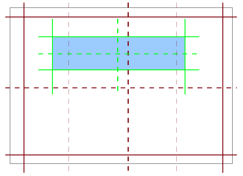
Guide lines to align objects
The best way to help align objects with respect to another object/slide is to help guiding lines appear where appropriate. The reference model is the way Apple iWork's, with the following addition:
- Extra guiding lines, possibly on different colour, for the edge of the "printable area" defined by the template. This is useful to ensure all slides looks exactly the same, especially after user moves objects around.
Text wrapping
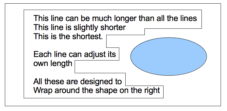
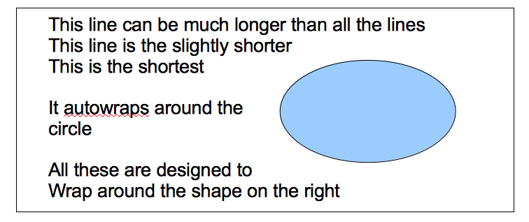
If is very useful to be able to wrap text around another object. There are two possible way.
The first way is to allow adjusting the left/right margin for individual line:
The second way (preferred method) is to allow user to make TextBox aware of the overlap between it's bounding box, and another object's bounding box. It will use this information to wrap around the object.
Apology for the mistake in the pictures. The object is on the right, not left
The observation I wish to exploit is the fact that Impress is normally used for presentation.
- Most projectors still uses 4:3 format. A computer display normally uses 16:9 format. This means we have more space at the left/right of the screen to play. But the demand for space on the top/bottom are more pressing.
- Most projectors are at lower resolution from a computer display. We can use this to allow users to display the full slide (the preferred mode) and use spaces around the display to host tools.
- However, not everyone has a large screen. The popularity of so-called netbook means the small screen problem is going to stay. Therefore, it is necessary to allow hiding tools and other items to maximize the area for slide editing.
This space is reserved for the detailed description of your design. Add anything you might find important for us to know. If you don't have any clue what this might be, then you will find some topics below.
- Describe dynamic behavior: The mockup above is something static. To better illustrate what will happen on the screen, describe what actions would be taken by the user and what would appear on screen.
- Explain the rationale and assumptions: If you decided to go for a certain concept, then please explain why you chose this.
- Highlight particular design ideas and alternatives: A concept usually incorporates many individual ideas. If you think certain ideas are really unique, then please highlight them. And if you think that there were other really good ideas which could not be implemented at the same time, tell us about them.
- List issues and open questions: Please list any issues you are aware of and open questions. Do not worry if your proposal or concept isn't perfect. If you have discovered any stumbling blocks or worries, then please provide this information right from the start. Maybe the team can help find answers/solutions.
Slide Sorter View
The Slide Sorter view will keep all its existing functionalities, plus :
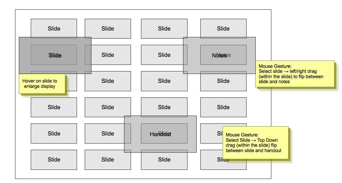
Combined View
The presentation is made up of three components: Slide, Notes and Handouts. Why cann't we see ALL three at the same time? The Combined View make this happens.
Limited editing ability is available for all three components.
For smaller screen, as the mouse hover on the component, it will be enlarged for viewing and editing.
Presentation Mode
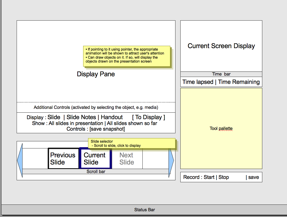
In presentation mode, it is not unusual to find that there are two screens available. The aim here is to use one of the screen as the Presentation Control Panel.
It also contains things like:
- Tool Pallettes (bottom right)
- It will contain the tools users might want on the tool pallette, such as "laser pointer".
- Slide selector (bottom left)
- The slide selection allows presenter to select the next slide to display: Prsenter can skip/add slides in a way that is transparent to the audience
- Display Pane (top left0
- The console remembers the slide being shown to audience, and can project a summary to the presentation screen. This is useful because it is not uncommon to find audience asking to flip back to a particular slide, but cannot remember which. This will allow him to tell the presenter which one to open.
- Presenter can look at the slide, notes or handout. Can send them to the presentation screen if need be.
- If the presenter actually drawn object on the screen, he can choose to save it as a "snapshot"
- If there are objects that have additional controls, e.g. Movie, the controls will be shown to the presenter if he select the object from the display pane. He can then then use the control to play the movie. All these without showing the controls to the audience.
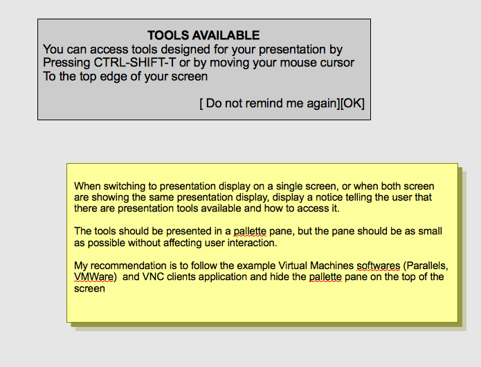
However, not everyone is fortunate enough to have two screen. If you have one screen, this is what should happen
Master/Template creation
The aim is to make creating master slides/presentation template so easy that the user actually wants to design the master slides from scratch rather than using existing templates.
In the Standard Design Mode
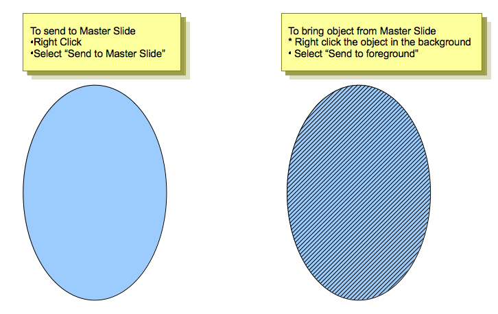
Can we switch object to and from the master (background)? Rational: A lot of time users are not exclusively working on Master/Slide, but a combination of both. To have to switch between them is troublesome.
- Add to slide master : For every object on the slide, its context menu will have a entry called "add to slide master". Clicking this will put the object into the slide master and this change will be propagated to all existing slides and new slides.
- Removing objects : If you right-click on an object which is on the master, you will get the following option
- Remove from slide master : Remove the object from the slide master. The changes affect the master, i.e., it will be propagated to all existing slides and new slides.
- Remove from slide : Remove the object from this slide only.
Note that objects in the master are still NOT selectable, simply right-click-able.
In the Master Design Mode
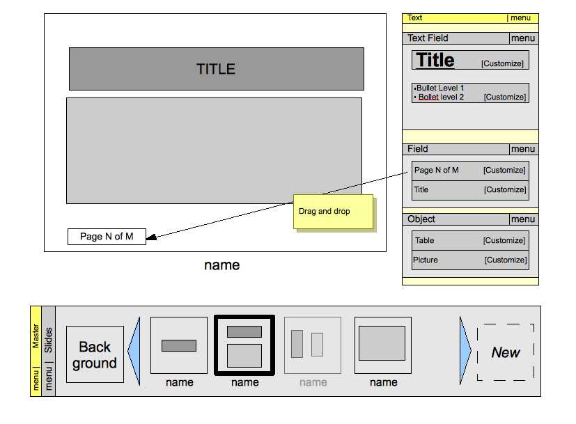
In this mode, no slide content is shown, only elements for the master.
The partial mockup is shown below
- Pallete
- User click and drag the field they want on to the Slide Master
- Master Slide available (bottom)
- Clicking on "Background" slide will allow user to edit the background, including positioning a frame to mark the "printable area" which the designer advise the user to keep their stuff in. Everything on this slide will be display on ALL slides.
- Clicking on new create a new slide master
- For other slide master, grey out slides means hidden slides master, i.e., designer do not want user to use it. If user create a new master template from scratch, the same grey out facilities can be used to suggests to user which type of slides master he might wants to create.
Of course masters are available for Slide, Notes and Handouts.
In the future
May be the "Background" slide can have layers. Layers can then be enable/disabled in individual slide.
Outline View
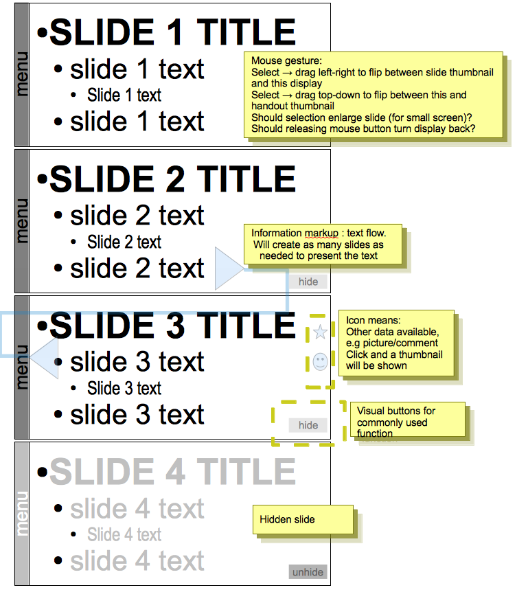
The outline view should look something like below:
Additional Material and Mockups
Please share everything you might think is important to better understand your proposal. Perhaps you also have other ideas which are not directly related to “Accessing Functionality”? You might add further documents, Internet links, or additional mockups - e.g. showing a workflow or different states of the software.
The Outline view shows only text. However, it should still keep it very clear visually which slide the text belong to.
It is designed to show how the presentation is organized, so it should contains visual markup, e.g. text flow in "Slide continuation".
All slides, including hidden slides, will be shown. User can hide/unhide slides.
Author or Team Working on This Proposal
| Author / Team Member | Contact (OpenOffice.org login name, used for email) |
| Cinly Ooi | ooi |
Comments
| Community members, this is where your comments and questions concerning completeness and clarity should be written. Please add your OpenOffice.org login name to let us contact you via email. |
Your space :-)

