Difference between revisions of "Platform UI Differences"
(→Differences) |
B michaelsen (Talk | contribs) (→Contributors) |
||
| (19 intermediate revisions by 5 users not shown) | |||
| Line 1: | Line 1: | ||
==Contributors== | ==Contributors== | ||
| − | + | see [http://wiki.services.openoffice.org/w/index.php?title=Platform_UI_Differences&action=history history] | |
| − | ==Introduction | + | ==Introduction== |
| − | This page is | + | While the [[UI Layout]]-page shows the conceptual differences between the platforms, it is not possible to create good UI by just high-level changes. This page aims to document the differences in details in the UI (and report the status in Ooo). |
| + | |||
| + | Since the current OOo is more-or-less carbon copy of Windows XP GUI on '''all''' platforms, this page will not document that GUI at all. Focus is put to the platforms that differ from Windows XP GUI. | ||
==Complementary and Related projects== | ==Complementary and Related projects== | ||
The possible future UI Layout work is complementary and not overlapping with: | The possible future UI Layout work is complementary and not overlapping with: | ||
| − | * [ | + | * [http://indiehig.com/wiki/Main_Page Indie HIG] The Missing manuals on the Mac OS X User Interface |
* Graphics Rendering re-work: [[Mac_OS_X_Porting_-_Canvas|OOo Canvas]] | * Graphics Rendering re-work: [[Mac_OS_X_Porting_-_Canvas|OOo Canvas]] | ||
* [[Uno/Effort/Uno_Runtime_Environment|UNO Runtime environment]] | * [[Uno/Effort/Uno_Runtime_Environment|UNO Runtime environment]] | ||
* [http://odftoolkit.openoffice.org/ ODF Toolkit] and | * [http://odftoolkit.openoffice.org/ ODF Toolkit] and | ||
* OOo Runner [[Mac_OS_X_Porting_-_Separate_apps_%28OOoRunner_-framework%29|Separate Apps on Mac OS X]] | * OOo Runner [[Mac_OS_X_Porting_-_Separate_apps_%28OOoRunner_-framework%29|Separate Apps on Mac OS X]] | ||
| + | * [http://library.gnome.org/devel/hig-book/stable/ Gnome Human Interface Guidelines] for Solaris and Linux Gnome Desktops (the XFCE Desktop follows these guidelines too most of the time) | ||
==Goals== | ==Goals== | ||
| Line 18: | Line 21: | ||
Document the differences in Platform specific UIs (e.g. Aqua/Mac OS X, Aero/Vista, Gnome/Linux, KDE/Linux Win32/Windows XP). | Document the differences in Platform specific UIs (e.g. Aqua/Mac OS X, Aero/Vista, Gnome/Linux, KDE/Linux Win32/Windows XP). | ||
| − | The focus is in stuff expressed in GUI guidelines (e.g. Aqua HIG, Aero xxx, Gnome UI SG,...) and stuff that is ''standard'' or ''preferred'' way of doing things, as exemplified by high quality applications on each platform (e.g. Apple Pages (iWork) on Mac OS X, MS Word (Vista Office), Abiword on Gnome) | + | Follow the implementation progress with status-tables. |
| + | |||
| + | The focus is in stuff expressed in GUI guidelines (e.g. Aqua HIG, Aero xxx, Gnome UI SG,...) and stuff that is ''standard'' or ''preferred'' way of doing things, as exemplified by high quality applications on each platform (e.g. Apple Pages (iWork) on Mac OS X, MS Word (Vista Office), and Abiword on Gnome) | ||
==Differences== | ==Differences== | ||
| − | The following lists the typical applications used on various platforms | + | The following lists and documents the differences in the typical applications used on various platforms, compared to OpenOffice.org. The aim is to show that while there are similarities in these platform-specific applications, and much of the actual functionality is quite similar, the actual UI (i.e. '''how''' you accomplish those functions) has differences both on surface and in deeper levels. |
Stuff to add (Mac OS X): | Stuff to add (Mac OS X): | ||
| − | * | + | * OK/cancel buttons: ok on the right side (this is also true for Gnome/XFCE on Linux/Solaris, KDE supports both but defaults to the Win32 way) |
| − | * | + | * The "jellybean" button that hides the toolbar |
| + | * Blend the toolbar background with the menu bar | ||
{| border="1" cellpadding="5" cellspacing="0" align="center" | {| border="1" cellpadding="5" cellspacing="0" align="center" | ||
|+'''Platform specific UI differences''' | |+'''Platform specific UI differences''' | ||
|- | |- | ||
| − | ! style="width:100px;" | !! style="background:#59e;width: | + | ! style="width:100px;" | !! style="background:#59e;width:210px;" | Mac OS X (Aqua) !! style="background:#59e;width:210px;" | Windows Vista (Aero) !! style="background:#59e;width:210px;" | Ubuntu Linux/Sun Java Desktop for Solaris (Gnome) |
|- | |- | ||
! style="background:#abcdef;" colspan="4" | Application Menu | ! style="background:#abcdef;" colspan="4" | Application Menu | ||
|- | |- | ||
| − | | '''Location'''<br> ''Where the menu is located'' || | + | | '''Location'''<br> ''Where the menu is located'' |
| + | || [[Image:Aqua-menu.png]] <br><br>System wide menu in the top of the screen. Contents of the menu depend on which is the active window | ||
| + | || [[Image:Vistaoffice-menu.png]] <br><br>'''Vista Office''' (Ribbon UI): Merging of menus and toolbars, resulting in tabbed toolbars.<br>'''Vista''' (Aero): In the top of the application window. | ||
| + | || In the top of the application window | ||
|- | |- | ||
| − | | '''Icons''' || | + | | '''Icons''' |
| + | || [[Image:Aqua-menu-no-icons.png]] <br><br>No icons in the menu || '''Ribbon:''' No (regular) menus.<br> '''Aero:''' No icons in the menu || typically icons in the menu (system option) | ||
| + | |- | ||
| + | | '''Main structure'''<br>''what are the top-level menu items'' || Apple-button (systemwide), Pages (i.e. the application menu), File, Edit, Insert, Format, Arrange, View, Window, Help. In total: 10 || '''Ribbon/Word:''' Office-button (similar to "File" -menu), Home, Insert, Page Layout, References, Mailings, Review, View. In total: 8. ''Note: Clearly task-oriented structure'' || File, Edit, View, Insert, Format, Bookmarks, Go, Windows, Help see [http://library.gnome.org/devel/hig-book/stable/menus-standard.html.en HIG about standard menus] | ||
|- | |- | ||
| − | | '''Preferences'''<br> ''Where the settings are located and what they are called'' || | + | | '''Preferences'''<br> ''Where the settings are located and what they are called'' || [[Image:OOo_prefs_on_macosx2.jpg]] <br><br>'''Preferences...''' in the "'''Application menu'''" e.g. Pages -menu, accessible with CMD-, || '''Options...''' under the Office orb|| '''Preferences''' as last entry in the Editmenu |
|- | |- | ||
! style="background:#abcdef;" colspan="4" | Toolbars | ! style="background:#abcdef;" colspan="4" | Toolbars | ||
|- | |- | ||
| − | | '''Icons'''<br> ''The default setting'' || [http://mox.fidisk.fi/opensource/UI/differences/aqua-toolbar.png http://mox.fidisk.fi/opensource/UI/differences/ | + | | '''Icons'''<br> ''The default setting'' || [[Image:Aqua-toolbar-tn.png]] [http://mox.fidisk.fi/opensource/UI/differences/aqua-toolbar.png full size] <br><br>10-15 icons (large: 30x30px) with text underneath || [[Image:Vistaoffice-toolbar-tn.png]] [http://mox.fidisk.fi/opensource/UI/differences/vistaoffice-toolbar.png full size] <br><br>'''Ribbon:''' three sizes. Amounts per tab - <br>''Main actions:'' 3-11 icons, (large: 35x35px) with text underneath. <br>''Important actions:'' 3-19 icons, (small: 20x20px) with text on the right side. <br>''Other actions:'' 0-29 icons, (small: 20x20px) without text. || 10-15 icons (size: 24x24px, 48x48 option for accessability) with text underneath as default. Text only or icon only are available as options |
|- | |- | ||
| − | | '''Customization'''<br> ''How the toolbars are customized'' || [ | + | | '''Customization'''<br> ''How the toolbars are customized'' || [[Image:Aqua-toolbar-customize-tn.png]] [http://mox.fidisk.fi/opensource/UI/differences/aqua-toolbar-customize.png full size] <br><br>Main toolbars are customizable through right clicking, selecting '''Customize...''' and then drag-and-dropping. ''Much of the toolbar functionality in'' '''Inspector''' ''-tool instead.'' || [[Image:Vistaoffice-toolbar-customize-tn.png]] [http://mox.fidisk.fi/opensource/UI/differences/vistaoffice-toolbar-customize.png full size] <br><br>'''Ribbon:''' Main toolbars are NOT customizable. The Quicklaunch toolbar is customisable from its toolbar and from "Customize" in ??? > Options -menu. Shows a dialog. <br><br>|| Not editable / occasionally the same style as Mac OS X. ''NOTE: Also in Mozilla applications'' |
|- | |- | ||
| '''Style'''<br> ''What the toolbar icons/buttons look like'' || '''No surrounding 3D "button" around the icon''', colors used sparingly, as few metaphors as possible. Icons have subtle shadow. || ??? || No button borders, richer colors, icons in 3D perspective | | '''Style'''<br> ''What the toolbar icons/buttons look like'' || '''No surrounding 3D "button" around the icon''', colors used sparingly, as few metaphors as possible. Icons have subtle shadow. || ??? || No button borders, richer colors, icons in 3D perspective | ||
| Line 51: | Line 63: | ||
| '''Highlight'''<br> ''What the toolbar icons/buttons look like, when clicked'' || '''No highlight''' ''No visual change in the button'' || '''Light-bulb highlight''' ''buttons look like they are shining'' || Highlights with dark color to show the full button area | | '''Highlight'''<br> ''What the toolbar icons/buttons look like, when clicked'' || '''No highlight''' ''No visual change in the button'' || '''Light-bulb highlight''' ''buttons look like they are shining'' || Highlights with dark color to show the full button area | ||
|- | |- | ||
| − | |||
! style="background:#abcdef;" colspan="4" | Dialogs (and Sheets) | ! style="background:#abcdef;" colspan="4" | Dialogs (and Sheets) | ||
|- | |- | ||
| Line 62: | Line 73: | ||
! style="background:#abcdef;" colspan="4" | Design goals | ! style="background:#abcdef;" colspan="4" | Design goals | ||
|- | |- | ||
| − | | '''Target users'''<br> ''What kind of people are the applications designing for?'' || Normal people who want to | + | | '''Target users'''<br> ''What kind of people are the applications designing for?'' || Normal people who want to make well designed documents with good layout. '''Not just word processing''' |
| + | || Word processing for the average Joe, lots of functionality | ||
| + | || Usability important, clean UI | ||
|- | |- | ||
| '''Templates'''<br> ''What is the purpose of the templates?'' || To learn/get ideas for good style/design, '''professional quality''' || To have all the templates for all the possible occasions || Get the templates you want from the internet repositories | | '''Templates'''<br> ''What is the purpose of the templates?'' || To learn/get ideas for good style/design, '''professional quality''' || To have all the templates for all the possible occasions || Get the templates you want from the internet repositories | ||
| − | |||
|- | |- | ||
| − | |||
|} | |} | ||
| − | |||
[[Category:Porting]] | [[Category:Porting]] | ||
| − | |||
| − | |||
[[Category:Architecture]] | [[Category:Architecture]] | ||
[[Category:Features]] | [[Category:Features]] | ||
[[Category:User Experience]] | [[Category:User Experience]] | ||
| + | [[Category:To-Do]] | ||
Latest revision as of 11:57, 17 November 2010
Contributors
see history
Introduction
While the UI Layout-page shows the conceptual differences between the platforms, it is not possible to create good UI by just high-level changes. This page aims to document the differences in details in the UI (and report the status in Ooo).
Since the current OOo is more-or-less carbon copy of Windows XP GUI on all platforms, this page will not document that GUI at all. Focus is put to the platforms that differ from Windows XP GUI.
Complementary and Related projects
The possible future UI Layout work is complementary and not overlapping with:
- Indie HIG The Missing manuals on the Mac OS X User Interface
- Graphics Rendering re-work: OOo Canvas
- UNO Runtime environment
- ODF Toolkit and
- OOo Runner Separate Apps on Mac OS X
- Gnome Human Interface Guidelines for Solaris and Linux Gnome Desktops (the XFCE Desktop follows these guidelines too most of the time)
Goals
Document the differences in Platform specific UIs (e.g. Aqua/Mac OS X, Aero/Vista, Gnome/Linux, KDE/Linux Win32/Windows XP).
Follow the implementation progress with status-tables.
The focus is in stuff expressed in GUI guidelines (e.g. Aqua HIG, Aero xxx, Gnome UI SG,...) and stuff that is standard or preferred way of doing things, as exemplified by high quality applications on each platform (e.g. Apple Pages (iWork) on Mac OS X, MS Word (Vista Office), and Abiword on Gnome)
Differences
The following lists and documents the differences in the typical applications used on various platforms, compared to OpenOffice.org. The aim is to show that while there are similarities in these platform-specific applications, and much of the actual functionality is quite similar, the actual UI (i.e. how you accomplish those functions) has differences both on surface and in deeper levels.
Stuff to add (Mac OS X):
- OK/cancel buttons: ok on the right side (this is also true for Gnome/XFCE on Linux/Solaris, KDE supports both but defaults to the Win32 way)
- The "jellybean" button that hides the toolbar
- Blend the toolbar background with the menu bar
| Mac OS X (Aqua) | Windows Vista (Aero) | Ubuntu Linux/Sun Java Desktop for Solaris (Gnome) | |
|---|---|---|---|
| Application Menu | |||
| Location Where the menu is located |
 System wide menu in the top of the screen. Contents of the menu depend on which is the active window |
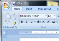
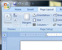
 Vista Office (Ribbon UI): Merging of menus and toolbars, resulting in tabbed toolbars. Vista (Aero): In the top of the application window. |
In the top of the application window |
| Icons | No icons in the menu |
Ribbon: No (regular) menus. Aero: No icons in the menu |
typically icons in the menu (system option) |
| Main structure what are the top-level menu items |
Apple-button (systemwide), Pages (i.e. the application menu), File, Edit, Insert, Format, Arrange, View, Window, Help. In total: 10 | Ribbon/Word: Office-button (similar to "File" -menu), Home, Insert, Page Layout, References, Mailings, Review, View. In total: 8. Note: Clearly task-oriented structure | File, Edit, View, Insert, Format, Bookmarks, Go, Windows, Help see HIG about standard menus |
| Preferences Where the settings are located and what they are called |
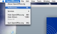
 Preferences... in the "Application menu" e.g. Pages -menu, accessible with CMD-, |
Options... under the Office orb | Preferences as last entry in the Editmenu |
| Toolbars | |||
| Icons The default setting |
 full size full size 10-15 icons (large: 30x30px) with text underneath |
 full size full size Ribbon: three sizes. Amounts per tab - Main actions: 3-11 icons, (large: 35x35px) with text underneath. Important actions: 3-19 icons, (small: 20x20px) with text on the right side. Other actions: 0-29 icons, (small: 20x20px) without text. |
10-15 icons (size: 24x24px, 48x48 option for accessability) with text underneath as default. Text only or icon only are available as options |
| Customization How the toolbars are customized |
 full size full size Main toolbars are customizable through right clicking, selecting Customize... and then drag-and-dropping. Much of the toolbar functionality in Inspector -tool instead. |
 full size full size Ribbon: Main toolbars are NOT customizable. The Quicklaunch toolbar is customisable from its toolbar and from "Customize" in ??? > Options -menu. Shows a dialog. |
Not editable / occasionally the same style as Mac OS X. NOTE: Also in Mozilla applications |
| Style What the toolbar icons/buttons look like |
No surrounding 3D "button" around the icon, colors used sparingly, as few metaphors as possible. Icons have subtle shadow. | ??? | No button borders, richer colors, icons in 3D perspective |
| Highlight What the toolbar icons/buttons look like, when clicked |
No highlight No visual change in the button | Light-bulb highlight buttons look like they are shining | Highlights with dark color to show the full button area |
| Dialogs (and Sheets) | |||
| Customize Toolbar What kind of UI is used? |
Opens a Sheet | Opens a Dialog | N/A or Opens a Sheet |
| Workflow (Task vs. other) | |||
| Interaction styles | |||
| Design goals | |||
| Target users What kind of people are the applications designing for? |
Normal people who want to make well designed documents with good layout. Not just word processing | Word processing for the average Joe, lots of functionality | Usability important, clean UI |
| Templates What is the purpose of the templates? |
To learn/get ideas for good style/design, professional quality | To have all the templates for all the possible occasions | Get the templates you want from the internet repositories |