Difference between revisions of "OpenOffice.org Dashboard Concept"
From Apache OpenOffice Wiki
| Line 3: | Line 3: | ||
I have developed the mockup shown below with the following design goals in mind: | I have developed the mockup shown below with the following design goals in mind: | ||
| − | # Feels more like a web browser, which everyone is comfortable with. | + | # Feels more like a web browser, which everyone is comfortable with, making adoption of OOo seem easier for new users. |
# Local and web search: get from Google. Get paid for it, like Firefox does. | # Local and web search: get from Google. Get paid for it, like Firefox does. | ||
| − | # Tabs are not 100% required for this Dashboard, but without them it would be | + | # Tabs are not 100% required for this Dashboard, but without them it would be more difficult to return to a persistent Dashboard (we could put a button in a toolbar, of course). But, we need tabs anyway. |
| − | # The central area of the page lets users add their own Google Gadgets, as Spicebird ([http://www.spicebird.com/content/google-applets-spicebird http://www.spicebird.com/content/google-applets-spicebird]) has pioneered. We should preload several good ones, such as Google Chat, a calendar and a news feed or two. | + | # The central area of the page lets users add their own Google Gadgets, as Spicebird ([http://www.spicebird.com/content/google-applets-spicebird http://www.spicebird.com/content/google-applets-spicebird]) has pioneered. We should preload several good ones, such as Google Chat, a calendar and a news feed or two (including one pointing to our major news announcements). |
| − | # Inspired by Google Chrome and Spicebird and KDE social desktop ideas. | + | ## It should be possible to write OOo extensions that place new widgets in the central area, too. |
| + | # Inspired by [http://www.google.com/chrome Google Chrome] and [http://www.spicebird.com/ Spicebird] and [http://kde.org/ KDE] social desktop ideas. | ||
[[Image:OOoDash1.png]] | [[Image:OOoDash1.png]] | ||
Revision as of 19:17, 22 December 2008
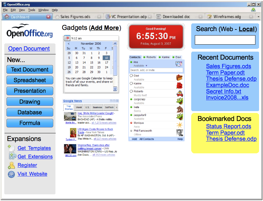
The Welcome Screen introduced in OOo 3.0 can be extended to provide lots of important user functionality. At the same time, it can be designed and architected in a modular way that will make OOo feel much more "web2.0" and modern to our users. I propose renaming it the "OpenOffice.org Dashboard" to indicate how much it has been expanded.
I have developed the mockup shown below with the following design goals in mind:
- Feels more like a web browser, which everyone is comfortable with, making adoption of OOo seem easier for new users.
- Local and web search: get from Google. Get paid for it, like Firefox does.
- Tabs are not 100% required for this Dashboard, but without them it would be more difficult to return to a persistent Dashboard (we could put a button in a toolbar, of course). But, we need tabs anyway.
- The central area of the page lets users add their own Google Gadgets, as Spicebird (http://www.spicebird.com/content/google-applets-spicebird) has pioneered. We should preload several good ones, such as Google Chat, a calendar and a news feed or two (including one pointing to our major news announcements).
- It should be possible to write OOo extensions that place new widgets in the central area, too.
- Inspired by Google Chrome and Spicebird and KDE social desktop ideas.
