Notes2 Design Visualization of Focus
< Back to the Notes2 main page
Summary
tbd
Rationale
It should be possible for the user to clearly identify or to distinguish:
- Notes Windows that belong to a certain Notes Anchor which is selected
- a currently edited Notes Window
- the currently edited Document Text
Assumptions
tbd
Proposed Designs
Proposal "Adjust Intensity of the Text Color"
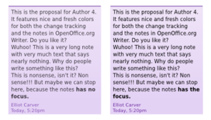
The picture shows the visualization of the focus (e.g. when selected, edited) in simplified Notes Windows: The color intensity of the text in the left Notes Window is decreased to reduce the distraction of the user from working with the main document text in Writer.
The colors that identify different authors should not be altered, therefore no transparency is used for Notes Windows' background. The use of transparency for the Notes Windows background color could have a negative impact on the ability of the user to differentiate the - sometimes similar - colors.
Proposal “Highlighting When Hovering The Anchor”
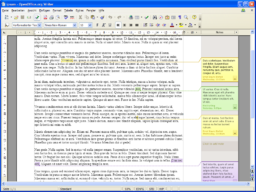
The following proposal show a moderate animation of the Notes Windows when the mouse pointer hovers the Notes Anchor. The goal of this kind of highlighting is to guide the view of the user towards the Note Window. So the user is not "forced" to follow the thin connector lines. This kind of highlighting is shown only one time.
Advantages:
- The view of the user is guided towards the Note Window.
- After showing the animation, the Note Window is shown in the common look.
Disadvantages:
- Maybe some users will get a bit annoyed.
Proposal "Increased Shadow"
The following proposals describes the use of Note Window shadows to distinguish the different states (e.g. Note Window edited, Note Window highlighted). The style of the Note Window shadows are derivated from the shadow of the document's pages.
Advantages:
- It remains the color concept of the Note Window all the time (important for identifying the author)
- It is a very subtle effect and fits into the concept of shadow for editing the notes
Disadvantages:
- It is a very subtle effect and may be overlooked
- The effect is only visible at the bottom of the Note Window. For long notes, the bottom may be hidden by the current viewport area. (This is true if we ignore changed connector line).
Examples
The following mockups show examples of the functionality.
Specification
- The following descriptions of the shadows consider the Note Window to be displayed in the document at 100% zoom level. Similar to the Notes Window itself, the shadow is dependent on the zoom level inside the document.
- Color dark gradient: base color 535353 RGB, from alpha 255 to 0
- Color bright gradient: base color bdb4ab RGB, from alpha 255 to 0
- State "Normal" of the Note Window:
- If the Note Window is neither "Viewed" nor "Edited" (please see below), then the state of the Note Window is "Normal."
- Element N1: width same as Note Window, height 2px, color linear bright gradient
- State "View" of the Note Window:
- If the Anchor of a Note is hovered by a) the text cursor in the Writer document window or b) hovered by the mouse pointer, then the state of the Note Window is "Viewed".
- Element V1: width same as Note Window, height 4px, color linear bright gradient
- State "Edit" of the Note Window
- If the text cursor is placed inside the Note Window, then the state of the Note Window is "Edit".
- Element E1: width same as Note Window, color dark gradient linear
- Element E2: width 4px, height 4px, color radial dark gradient
- Element E3: width 4px, height dependent on Note Window height, color linear dark gradient
- Element E4: width 4px, height 4px, color radial dark gradient
- Element E5 (placeholder for area without shadow): height 2px
- Please note that this kind of visualization ignores the "real" behavior of shadow. Normally, the shadow for the whole Note Window has an offset in both horizontal and vertical position. Here, the Note shadow starts directly at the lower left side of the Note Window. (Otherwise we will not have a smooth transition between the states "View" and "Edit". Changes of the visualization of "Normal" and "View" do not look good, therefore their appearance is kept.)
Assumptions / Open Points
- The current proposal assumes that the document pages do have a more pleasant shadow in comparison with the current 3px solid one.
- If possible, the user's experience could be strongly enhanced by smooth transitions of the shadows between the single Note Window states (e.g. natural transition like the sine function, duration 200 ms).
Proposal "Increased Shadow (adapted to technical limitations)"
This proposal extends the proposal "Increased Shadow".
Due to technical limitations, it is only possible to detect if the user starts hovering the mouse pointer on the anchor. It is not possible to detect when the mouse pointer does not hover the anchor any longer. Therefore the previous proposal "Increased Shadow" has to be adapted until the full functionality can be provided by the OpenOffice.org framework.
The following changes are made to the specification in the state "View": After the user moved the mouse pointer to hover the anchor of the note, the Note Window enters the state "View", the state "View" is kept for 1 second, after that time the state of the Note Window is set back to "Normal". The state "Normal" is kept until the user hovers the anchor again.
Proposal "Simple Color Change of the Note Window Background"
Because of the low implementation effort, Max proposed another kind of focus visualization. If mouse pointer hovers the Notes Anchor or the Notes Windows, or the user edits the Note User Data inside the Note Window, then background of the Note Window is changed.
The following background colors could be used:
- bright background color (e.g. change the yellow gradient of Author 1 to a bright yellow)
- dark background color (e.g. change the yellow gradient of Author 1 to a darker yellow)
- slightly darker background gradient
Advantages:
- Is known by a large competitor (please refer to the comment below)
Disadvantages:
- If the color is changed, the Note Window will not clearly represent the corresponding Author (Reason: Different background colors/styles in different Note Windows will refer to the same author.)
- If a darker background is used, then it is more difficult to read the Note User Data (Reason: lower contrast between background color and foreground text color; please refer to the comment below)
Please note: The application Microsoft Word shows a rather bad behavior in this case, because it darkens the color of the notes background. That leads to less contrast in the case the note is viewed or edited by. This should be avoided under all circumstances.
Selected Design
The selected design for the Visualization of Focus is "Increased Shadow (adapted to technical limitations)".
Implementation
tbd
Code Changes
tbd
Outstanding Issues
tbd


