Logo Usage Guidelines Proposals
Proposals for Logo Usage Guidelines
The following are ideas and proposals of how to define the use of the OpenOffice.org logo. None of these are official, but are being discussed by the Branding initiative.
You will find more detailed information about the Branding Guidelineshere
Proposal for Conference and seasonal Logos
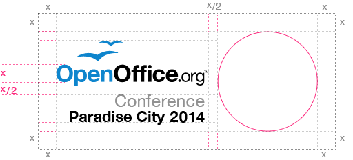
This is a proposal among others (collected at BeDipp's user page) of how to integrate the OpenOffice.org Logo with different graphical elements or conference logos. The white space is reduced compared to the normal logo and the font in this proposal isn't the final.
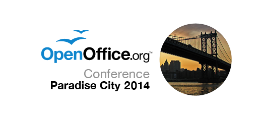
Here are two examples of how to fill the orb (in this case with a graph [1] and a foto [2]), but the idea is to leave the space within the orb to the creativity of the assigned design team.
#1
#2
(The foto is under a Creative Commons license. By jphilipg)
Fonts
The logo can be accompanied with additional text for conference, seasonal or project specific use. This font will be the default font to use together with the logo. It is important that the chosen font supports a wide range of languages and scripts (i.e. unicode font). This will benefit consistency among different projects and languages.
Proposals:
- DejaVu Sans - font home
- Droid Sans - font home
- Liberation Sans - font home
- M+ 1p - font home
- Molengo - font home
- Nobile - font home
- Vegur ( problems with Version 601 on Mac CS4 Illustrator ) - font home
- M+ fonts: M+ 1p M+ 1c M+ 2p M+ 2c
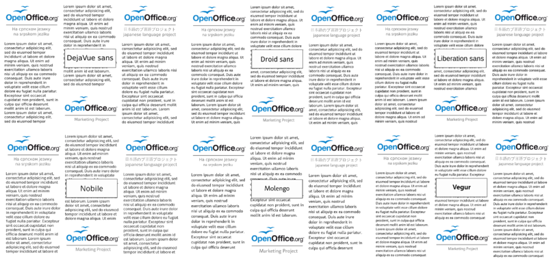
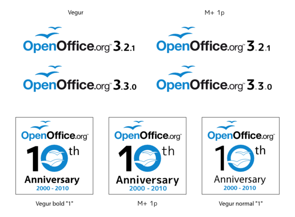
Source for the font comparison graphics
PDF with dummy text: http://wiki.services.openoffice.org/w/images/0/09/New_font_2010.pdf
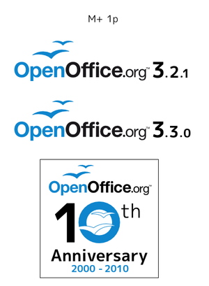
Comparison with special interest on numbers: version designation and OOo10 anniversary (Design based on Miguel Boto's work):
Black and White Logo Versions
We provide two more versions of our logo for special use-cases: Black only for monochrome printing without any other colors and Grey/Black for greylevel printers. Please be aware that only the Blue/Black logo is the original OpenOffice.org logo that should be used wherever possible.
| Black only | Grey (55%) | Black | |
| HEX | # 000000 | # 717171 | # 000000 |
| RGB | 0, 0, 0 | 113, 113, 113 | 0, 0, 0 |
| CMYK | not yet defined | not yet defined | not yet defined |
| Pantone | not yet defined | not yet defined | not yet defined |
| Percentage Black | 100% | 55% | 100% |
No other modifications to the logo
As already defined in the Trademark Policy the logo is not allowed to be modified. This includes changes in color or shades, outlines and sub- or superposed images as well as aspect ratio and (re)moving parts of the logo:
Never change the color of the logo or use different shades.
Never outline the logo.
Do not place any imagery inside the logo.
Never stretch the logo from it's original form but respect its aspect ratio.
Do not place the gulls on a different place.
Do not remove the ™ (trademark symbol)
Minimal Logo Size
Our logo should be able to be recognized at first sight, so we ask you not to reduce it's size to less than 100x30 pixel in digital media and 35x11 mm when printed.
100 x 30 pixel (35 x 11 mm)
Some material is normally looked at from larger distances (like posters). Here larger sizes might be appropriate, but defining these sizes not easy.
As a rough estimation try to hide the logo behind a pencil held with straight arm. If the logo can't be covered by the pencil, it is large enough.
General white space around the logo
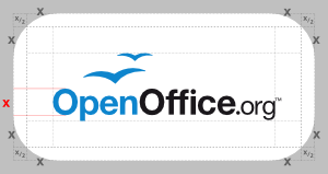
Every graphical element needs some space around it to be recognized as independent element. For the OpenOffice.org logo the minimum space around the text and the gulls is as large as the height of the large "O".
If you use the logo on a closed area around it, it is recommended to add a rounded rectangle around the minimal whitespace (half the height of the "0" to any side, reaching the rectangular whitespace at the corners).
For visual balance the "TM" sign is not part of the area that should be surrounded by the whitespace. The right border is one "O" height right of the utmost part of the "g".
Even if leaving an empty area behind the logo is described as "whitespace", a few other colors (like light blue) can be used as background, as you can read above.
reduced whitespace for project internal usage
This part has been discussed controversely on our mailing list, but especially in the Native-Language Confederation there has been positive feedback for the following proposal:
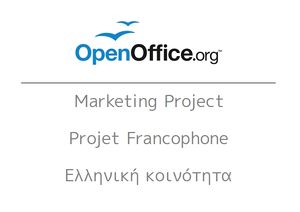
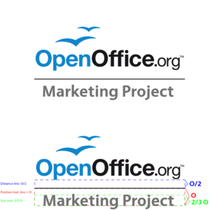
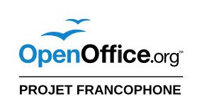
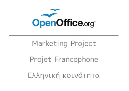
For Accepted Projects of OpenOffice.org as well as Native-Language Projects of OpenOffice.org a reduced whitespace of half the height of the "O" should allow to add their project name or other text like slogans under a horizontal line below the logo.
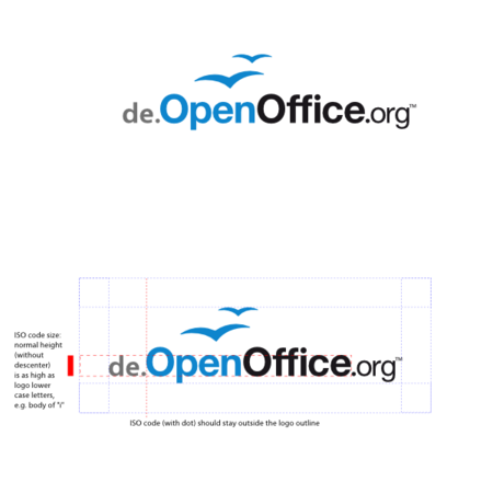
The NLC projects are eagerly awaiting a decision by the trademark holder's legal compartment about adding their iso codes to the logo in the same position as on their URL:
Until now there has not been any decision, so this part might be removed later on.
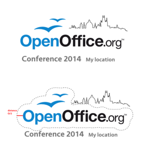
One singular exception is the OOoCon logo, the logo for the annual OpenOffice.org Conference. Here the logo is extended by a graphical element, not only by text. Half the height of the "O" defines for this logo a whitespace area around every single part of the logo instead of creating a rectangle with lot of whitespace at the right upper corner. This allows the creation of balanced OOoCon logos where the graphic is just an addition to the logo :
accompanying font
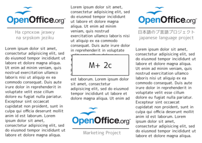
As the logo font itself is a proprietary one, an open font has been searched to allow combinations of the logo with accompagnying text. The font nearest to our ideals is M plus 1p with broad support of non-Latin areas in Unicode.
If a designer is able to do so, we recommend to round the rectangular dots in the font when creating a graphical work containing this font.
