Difference between revisions of "Logo Usage Guidelines"
| (4 intermediate revisions by 2 users not shown) | |||
| Line 13: | Line 13: | ||
=== Are you allowed to use the logo? === | === Are you allowed to use the logo? === | ||
| − | Because of the necessity to protect the brand OpenOffice.org our logo is not licensed under an open source license. As it is trademarked you are allowed to use it if you follow the [ | + | Because of the necessity to protect the brand OpenOffice.org our logo is not licensed under an open source license. As it is trademarked you are allowed to use it if you follow the [http://about.openoffice.org/index.html#logo|OpenOffice.org Trademark Policy], which allows you to use our brand to refer to our product and our community only. |
| + | Follow the simple steps to request permission. | ||
| − | <br> | + | <br> |
=== How should you use the logo? === | === How should you use the logo? === | ||
Latest revision as of 12:18, 29 December 2018
Logo Usage Guidelines version 1.0
What do we mean by talking about the OpenOffice.org logo?
This is the present OpenOffice.org logo:
Copyright © 2010, Oracle and/or its affiliates. All rights reserved.
Are you allowed to use the logo?
Because of the necessity to protect the brand OpenOffice.org our logo is not licensed under an open source license. As it is trademarked you are allowed to use it if you follow the Trademark Policy, which allows you to use our brand to refer to our product and our community only. Follow the simple steps to request permission.
How should you use the logo?
Our logo should be presented in a way that refers to our product and/or our community in a respectful and not misleading way. At the same time we want to strengthen the OpenOffice.org brand by providing a consistent visual impression of our logo.
We want to achieve these goals by the rules and recommendations brought together in these guidelines:
Contents
Logo Usage Guidelines
These logo usage guidelines are also available in the Branding Usage Guidelines
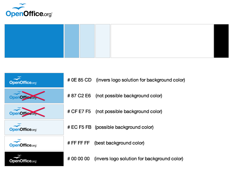
Brand Colors
| Please do not use the color picker to extract the colors. The colors shown on your screen may have been already altered by your computer's color management system. |
Logo
Table
| |
Blue | Black |
| HEX | 0E85CD | 000000 |
| RGB | 14 133 205 | 0 0 0 |
| CMYK | tbd | tbd |
| Pantone | tbd | tbd |
Logo: DO's
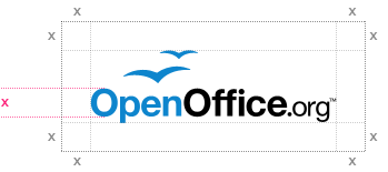
White Space Logo
This is the white space that should be left unchanged around the logo:
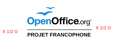
NLC logo
Whitespace
Example with the Liberation Sans font type.
Logo Inverse
1. Blue:
2. Black:
Logo Black and White
Logo Grayscale
This is a conversion from a 24-bit image to an 8-bit image to obtain the correct color.
Color code of gray:
Blacktone: 55%
RGB: R 113 - G 113 - B 113
HEX: # 71 71 71
Gulls
- Guidelines on using the gulls by themselves (e.g. the gull orb)
Minimum Sizes
100 x 30 pixel (35 x 11 mm)
Logo DONT's
Colors
Never change the color of the logo or use different shades.
Never outline the logo.
Do not place any imagery inside the logo.
Aspect Ratio
Never stretch the logo from it's original form but respect its aspect ratio.
Background Colour
Don't use background colors that negatively affects readability of the logo.
Place and Elements
Do not place the gulls on a different place.
Trademark Symbol
Do not remove the ™ (trademark symbol)
Font
The best font to use in combination with the OpenOffice.org logo is the open font M plus 1p with broad support of non-Latin areas in Unicode.
If a designer is able to do so, we recommend to round the rectangular dots in the font when creating a graphical work containing this font.
Logo Usage Guidelines Proposals
Members of the Branding initiative have proposed additional logo usage guidelines. Until it is decided if they are accepted, these guidelines will be on the Logo Usage Guideline Proposals wiki page. Bold text


