Difference between revisions of "GoodDefaults GridHandling"
From Apache OpenOffice Wiki
| Line 57: | Line 57: | ||
| Resolution vs. Points | | Resolution vs. Points | ||
| At the moment the handling is a bit awkward (Resolution vs. Points vs. User Expectations) --> Without changing the dialogs itself, how about (SI units): 1 cm with 9 points => 1 mm Grid. | | At the moment the handling is a bit awkward (Resolution vs. Points vs. User Expectations) --> Without changing the dialogs itself, how about (SI units): 1 cm with 9 points => 1 mm Grid. | ||
| + | | | ||
| + | |- | ||
| + | | grid toolbar icon in standard toolbar | ||
| + | | at the moment we have the 'display grid' icon in the 'standard toolbar' and this option is a rather poor for grid handling (switch display grid on/off) => it would be nice if we could change this button with a more powerful one, which opens the toolbar for grid handling (option toolbar) which is rather difficult to find at the moment (menue: view/toolbars/option). | ||
| | | | ||
|} | |} | ||
Revision as of 14:43, 7 April 2010
(3.2 default settings)
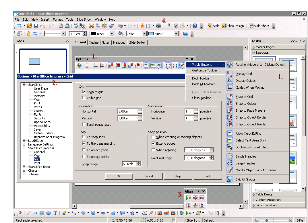
current points of handling grids:
- 1. option toolbar (available over menue: view/toolbars/option) disabled by default
- 2. grid options (menue: tools/options/impress/grid)
- 3. align toolbar (icon in drawing toolbar) movable/dockable
- 4. icon 'display grid' in presentation toolbar
- (5.) menue: view/grid/ .. 'display grid', 'snap to grid', 'grid to front' (not on the pic.)
Ideas
| Name |
Description |
Comments |
|---|---|---|
| Guides when Moving |
'Guides When Moving' is a feature option which is switched off by default .. it is worth to be on instead. |
|
| Rotation Mode |
'Rotation Mode after Clicking Object' is a feature option which is switched off by default .. it is worth to be on instead. |
|
| Reset grid to defaults |
'reset grid defaults' (button) .. do we need such a feature? after a time and some settings the user can get confused and/or some settings can have unpredictable effects for the user -> for example: people check 'when creating or moving objects', forgotten it and then only squares can be draw, not more rectangle (because of the square snapping) => looks like a bug. |
|
| Grid snapping vs. zoom |
if you zoom, you maybe want to handle smaller shapes .. do you also want a smaller resolution for grid snapping? |
|
| Combine display and snap to grid? |
Does it make sense to combine 'display grid' & 'snap to grid' in one icon/button (if you switch the grid, you also want to snap)? (current default: 'display grid': off, 'snap to grid': on) |
|
| Change Handle Size | The current handle size was defined years ago - with displays offering less density than today. I propose to change the default handle size to "large". This option can be found in the toolbar "Options". | |
| Resolution vs. Points | At the moment the handling is a bit awkward (Resolution vs. Points vs. User Expectations) --> Without changing the dialogs itself, how about (SI units): 1 cm with 9 points => 1 mm Grid. | |
| grid toolbar icon in standard toolbar | at the moment we have the 'display grid' icon in the 'standard toolbar' and this option is a rather poor for grid handling (switch display grid on/off) => it would be nice if we could change this button with a more powerful one, which opens the toolbar for grid handling (option toolbar) which is rather difficult to find at the moment (menue: view/toolbars/option). |
=> which further features should be 'switched' on/off per default? Which default sucks?
Autor: Christoph Lukasiak (Clu) 24 March 2010
