Difference between revisions of "Documentation/OOo3 User Guides/Writer Guide/Creating a simple form"
Clairedwood (Talk | contribs) (→Insert form controls) |
Clairedwood (Talk | contribs) (→Configure controls) |
||
| Line 42: | Line 42: | ||
== Configure controls == | == Configure controls == | ||
| − | + | After inserting the controls, you need to configure them to look and behave as you want. Right-click on a form control within your document and select '''Control''' from the pop-up (context) menu to open the Properties dialog box for the selected control. Double-clicking on a form control also opens this dialog box. | |
| − | The | + | The Properties dialog box has three pages: General, Data, and Events. For simple forms, only the General page is of any interest. On this page you can set the look and feel of the control. See [[Documentation/OOo3_User_Guides/Writer_Guide/Example:_a_simple_form#Configure form controls|Configure form controls]] and [[Documentation/OOo3_User_Guides/Writer_Guide/Advanced_form_customization#Form control formatting options|Form control formatting options]] for more information, and the descriptions in the Help for details. Configuration for use with a database is discussed in [[Documentation/OOo3_User_Guides/Writer_Guide/Accessing_data_sources#Creating a form for data entry|Creating a form for data entry]]. |
| − | + | ||
| − | [[ | + | |
| − | + | ||
| − | + | ||
| + | The fields on this dialog box vary with the type of control. For example: | ||
* Some controls have visible labels, such as Push Button and Option Button. The label text can be set. | * Some controls have visible labels, such as Push Button and Option Button. The label text can be set. | ||
* The List Box contains a list of options to choose from. Set these in the List entries box. | * The List Box contains a list of options to choose from. Set these in the List entries box. | ||
| + | |||
| + | Notice the scroll bar in this dialog box. You can use the scroll bar or enlarge the dialog box to see additional fields. | ||
| + | |||
| + | [[Image:WG15-2.png|thumb|none|500px|''Control Properties dialog box.'']] | ||
{{Documentation/Tip| Double-clicking on a control also brings up the Control Properties dialog box.}} | {{Documentation/Tip| Double-clicking on a control also brings up the Control Properties dialog box.}} | ||
Revision as of 15:25, 6 June 2010
This section explains how to create a simple form without any links to a data source or database and without advanced customization.
Create a document
There is nothing special to be done when creating a document to use as a form. Create a new Writer document with File > New > Text document.
Open the form toolbars
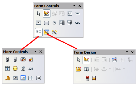
Two toolbars control form creation: Form Controls and Form Design. Select View > Toolbars > Form Controls and View > Toolbars > Form Design to show them both.
Two toolbars control form creation: Form Controls and Form Design. Select View > Toolbars > Form Controls and View > Toolbars > Form Design to show them both. The Form Controls toolbar has a button for each of the most commonly used types of control.
You can also open the Form Design toolbar from the Form Controls toolbar. Some of the less commonly used controls are on a third toolbar —More Controls—also opened from the Form Controls toolbar.
You can dock these toolbars in different places on the Writer window, or leave them floating. The image below shows the three toolbars floating.
See Form controls reference for descriptions of the tools on these toolbars.
Activate design mode
Click the Design Mode On/Off button ![]() on the Form Controls toolbar to turn design mode on. (Click it again when you want to turn it off.) This activates the buttons for inserting form controls and selects controls for editing.
on the Form Controls toolbar to turn design mode on. (Click it again when you want to turn it off.) This activates the buttons for inserting form controls and selects controls for editing.
When design mode is off, the form behaves as it would for the end user. Buttons can be pressed, check boxes selected, list items selected, and so on.
Insert form controls
- To insert a form control into the document, click the control’s icon to select it. The mouse pointer changes to look like this:

- Click in the document where you want the control to appear. (You can move it later.)
- Holding the left mouse button down, drag the control to size it. Some controls have a fixed size symbol followed by the name of
the control (for example, Check Box or Option Button).
- The control button remains active, so you can insert several controls of the same type without needing to go back to the toolbar.
- To change to another tool, click its icon on the toolbar.
- To stop inserting controls, click on the Select button
 on the Form Controls toolbar, or click on any of the controls you have just inserted. The mouse pointer changes back to its normal appearance.
Configure controls
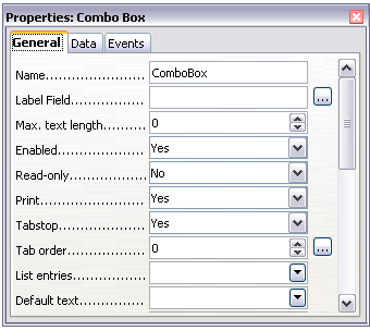
After inserting the controls, you need to configure them to look and behave as you want. Right-click on a form control within your document and select Control from the pop-up (context) menu to open the Properties dialog box for the selected control. Double-clicking on a form control also opens this dialog box.
The Properties dialog box has three pages: General, Data, and Events. For simple forms, only the General page is of any interest. On this page you can set the look and feel of the control. See Configure form controls and Form control formatting options for more information, and the descriptions in the Help for details. Configuration for use with a database is discussed in Creating a form for data entry.
The fields on this dialog box vary with the type of control. For example:
- Some controls have visible labels, such as Push Button and Option Button. The label text can be set.
- The List Box contains a list of options to choose from. Set these in the List entries box.
Notice the scroll bar in this dialog box. You can use the scroll bar or enlarge the dialog box to see additional fields.
Using the form
To use the form, leave design mode by clicking the Design Mode On/Off button ![]() .
.
A typical way to use a form is:
- You design the form, then save it when you are happy with it.
- You send the form to others (for example, by email).
- They fill in the form, save it and send it back to you.
- You open the form and see what their answers are.
| Content on this page is licensed under the Creative Common Attribution 3.0 license (CC-BY). |

