Difference between revisions of "Documentation/OOo3 User Guides/Draw Guide/Changing Object Attributes"
(→Text Formatting toolbar) |
|||
| (38 intermediate revisions by 2 users not shown) | |||
| Line 5: | Line 5: | ||
|NextPage=Documentation/OOo3_User_Guides/Draw_Guide/Combining_Multiple_Objects | |NextPage=Documentation/OOo3_User_Guides/Draw_Guide/Combining_Multiple_Objects | ||
}} | }} | ||
| + | |||
| + | This is Chapter 4 of the OpenOffice.org 3 Draw Guide, produced by the OOoAuthors group. A PDF of this chapter is available from [[Documentation/OOo3_User_Guides/Chapters|this wiki page]]. | ||
= Toolbars and menus = | = Toolbars and menus = | ||
| Line 14: | Line 16: | ||
{| style="border-spacing:0;" | {| style="border-spacing:0;" | ||
| − | | colspan="3" style="border:none;padding:0in;"| [[Image:DG3Ch4F1.png]] | + | | colspan="3" style="border:none;padding:0in;"| [[Image:DG3Ch4F1.png|none|thumb|500px]] |
|- | |- | ||
| style="border:none;padding:0in;"| '''1''' Styles and Formatting | | style="border:none;padding:0in;"| '''1''' Styles and Formatting | ||
| Line 50: | Line 52: | ||
== The context menu == | == The context menu == | ||
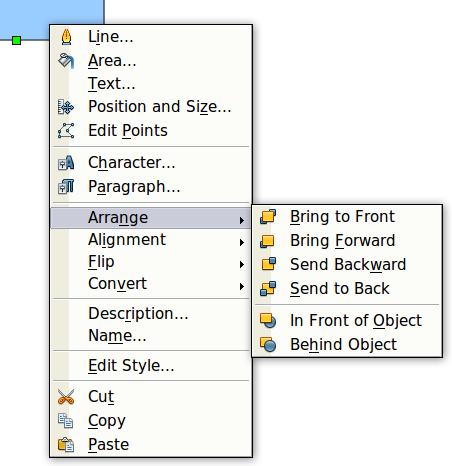
| − | When an object is selected, you can right-click on the object to bring up a context menu | + | When an object is selected, you can right-click on the object to bring up a context menu. The context menu provides additional access to the options shown above and another way to change an object's attributes. The entries with a small arrow on the right-hand side contain a submenu. |
| − | + | [[Image:DG3Ch4F3.png|none|thumb|500px|''Right-click on an object to see the context menu'']] | |
= Editing lines and borders = | = Editing lines and borders = | ||
| − | Lines, arrows, and the borders of an object are managed through the same dialog | + | Lines, arrows, and the borders of an object are managed through the same dialog. |
| − | + | [[Image:DG3Ch4F4.png|none||thumb|500px|''Lines and borders'']] | |
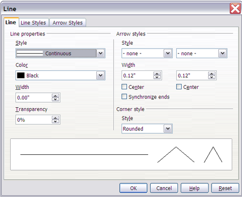
You can change some properties from the '''Line and Filling''' toolbar. To see more options, select the object and right-click on the object and choose '''Line''' from the context menu. This opens the Line dialog. | You can change some properties from the '''Line and Filling''' toolbar. To see more options, select the object and right-click on the object and choose '''Line''' from the context menu. This opens the Line dialog. | ||
| − | + | [[Image:DG4-3.png|none|thumb|500px|''Line dialog (right-click on an object and choose Line).'']] | |
== Common line properties == | == Common line properties == | ||
| − | In most cases the property you want to change is the | + | In most cases the property you want to change is the line's style (solid, dashed, invisible, and so on), its color, or its width. These options are all available from the Line and Filling toolbar. |
| − | + | [[Image:DG3Ch4F6.png|none|thumb|500px|''Common line options (style, width, color)'']] | |
| − | You can also edit these properties from the Line dialog. They are on the first tab, left column | + | You can also edit these properties from the Line dialog shown in the previous paragraph. They are on the first tab, left column. From the Line dialog you can also change the line's transparency. The figure below illustrates different degrees of transparency. |
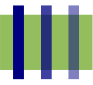
| − | + | [[Image:DG3Ch4F7.png|none|thumb|500px|''The vertical lines have different levels of transparency (0%, 25%, and 50%).'']] | |
== Drawing arrows == | == Drawing arrows == | ||
| − | Arrowheads (and other line | + | Arrowheads (and other line endings — usually referred to in this guide collectively as arrows) are a line property. Select a line and click on the '''Arrow Style''' [[Image:ArrowStyleIcon.png]] icon. This opens the Arrowheads menu. |
| − | + | [[Image:DG4-6.png|none|thumb|500px]] | |
There are several types of arrowheads available. Each end of the line can have a different arrowhead (or no arrowhead). | There are several types of arrowheads available. Each end of the line can have a different arrowhead (or no arrowhead). | ||
| − | { | + | {{Note| Arrowheads are only applicable to lines. They have no effect on an object's border.}} |
| − | + | ||
| − | + | ||
| − | + | In the Line dialog, ''Arrow styles'' on the right-hand side contains a number of options to fine tune the arrow properties. If '''Synchronize ends''' is selected, both line endings will have the same appearance. The '''Center '''option brings the middle of the arrow over the end point of the line. If this option is not selected, the line ends on the outermost edge of the arrow. It is much easier to understand if you look at the following sketch. | |
| − | In the Line dialog | + | |
| − | + | [[Image:DG3Ch4F9.png|none|thumb|500px|''Default arrowheads (left) vs centered arrowheads (right)'']] | |
== Customizing line and arrow styles == | == Customizing line and arrow styles == | ||
| Line 93: | Line 92: | ||
=== Customizing line styles === | === Customizing line styles === | ||
| − | In the Line dialog, click on the '''Line Styles''' tab | + | In the Line dialog, click on the '''Line Styles''' tab. From here you can customize the line styles or create your own (click on the '''Add''' button to create your own). You can change the length of the dashes, the space between them, and other attributes. |
| − | + | [[Image:DG3Ch4F10.png|none|thumb|500px|''Editing line styles'']] | |
| − | Use the '''Load Line Style''' [[Image:]]and '''Save Line Style''' [[Image:]] icons to save a new definition or read one from disk (file extension .sod). | + | Use the '''Load Line Style''' [[Image:LoadLineStyleIcon.png]]and '''Save Line Style''' [[Image:SaveLineStyleIcon.png]] icons to save a new definition or read one from disk (file extension .sod). |
=== Customizing arrow styles === | === Customizing arrow styles === | ||
| − | You can also create your own arrowheads to create some interesting effects, such as: | + | {| |
| + | |You can also create your own arrowheads to create some interesting effects, such as: | ||
| + | |[[Image:DG3Ch4F0a.png|none|thumb|500px]] | ||
| + | |- | ||
| + | |The first step is to draw a curve with the shape you want for the arrowhead. | ||
| + | |[[Image:DG3Ch4F11.png|none|thumb|500px]] | ||
| + | |} | ||
| + | {{Note| The arrowhead must be a curve. A curve is something you could draw without lifting a pencil. For example, [[Image:star.png]] is a curve but [[Image:smiley.png]] is not a curve. You can however draw forms which are not curves and then at the end convert them to a curve.}} | ||
| − | The | + | {{Tip| The part of the shape which should point in the direction of the line must be drawn facing upwards. The top of the shape will point towards the "outside" of the line.}} |
| − | + | Select the curve, open the Line dialog, and go to the '''Arrow Styles''' page. Click on '''Add''', enter a name for the arrow style and click '''OK'''. | |
| + | [[Image:DG3Ch4F12.png|none|thumb|500px|''Adding an arrow style'']] | ||
| − | + | Now you can access the new style from the ''Arrow style'' list below or the Arrowheads menu. | |
| − | + | ||
| − | + | ||
| − | + | ||
| − | + | ||
| − | + | ||
| − | + | ||
| − | + | ||
| − | + | ||
| − | + | ||
| − | + | ||
| − | + | ||
| − | + | ||
| − | + | ||
| − | + | ||
| − | Now you can access the new style from the ''Arrow style'' list | + | |
| − | + | [[Image:DG3Ch4F13.png|none|thumb|500px|''Arrow style list'']] | |
= Editing the inside (fill) of an object = | = Editing the inside (fill) of an object = | ||
The OpenOffice.org term for the inside of an object is '''Area fill'''. The area fill of an object can be a uniform color, a gradient, a hatching pattern, or an image. It can be made partly or wholly transparent and can throw a shadow. | The OpenOffice.org term for the inside of an object is '''Area fill'''. The area fill of an object can be a uniform color, a gradient, a hatching pattern, or an image. It can be made partly or wholly transparent and can throw a shadow. | ||
| − | + | [[Image:DG3Ch4F14.png|none|thumb|500px|''Different types of area fill'']] | |
== Common fill properties == | == Common fill properties == | ||
| Line 137: | Line 129: | ||
If you want no fill at all, select the object you wish to edit and on the '''Line and Filling''' toolbar select the option '''Invisible''' on the pull down list at the right of the paint can. | If you want no fill at all, select the object you wish to edit and on the '''Line and Filling''' toolbar select the option '''Invisible''' on the pull down list at the right of the paint can. | ||
| − | + | [[Image:DG3Ch4F15.png|none|thumb|500px|''Common fill options'']] | |
=== Fill with a uniform color === | === Fill with a uniform color === | ||
Select the object you wish to edit. On the '''Line and Filling''' toolbar, select '''Color''' on the pull down list at the right of the paint can, and then choose a color from the right-hand menu. | Select the object you wish to edit. On the '''Line and Filling''' toolbar, select '''Color''' on the pull down list at the right of the paint can, and then choose a color from the right-hand menu. | ||
| − | + | [[Image:DG3Ch4F16.png|none|thumb|500px|''Filling with a color'']]</center> | |
=== Fill with a gradient === | === Fill with a gradient === | ||
Select the object you wish to edit. On the '''Line and Filling''' toolbar, select '''Gradient''' and then choose a gradient from the right-hand menu. | Select the object you wish to edit. On the '''Line and Filling''' toolbar, select '''Gradient''' and then choose a gradient from the right-hand menu. | ||
| − | + | [[Image:DG3Ch4F17.png|none|thumb|500px|''Filling with a gradient'']] | |
=== Fill with a line pattern === | === Fill with a line pattern === | ||
The OOo term for line patterns is Hatching. Select the object you wish to edit. On the Line and Filling toolbar, select '''Hatching''' and then choose an option from the menu. | The OOo term for line patterns is Hatching. Select the object you wish to edit. On the Line and Filling toolbar, select '''Hatching''' and then choose an option from the menu. | ||
| − | + | [[Image:DG3Ch4F18.png|none|thumb|500px|''Filling with a line pattern'']] | |
=== Fill with an image === | === Fill with an image === | ||
You can fill an object with a bitmap image (as opposed to a vector graphic image). Select the object you wish to edit. On the '''Line and Filling''' toolbar, select '''Bitmap''' and then choose an option from the menu. | You can fill an object with a bitmap image (as opposed to a vector graphic image). Select the object you wish to edit. On the '''Line and Filling''' toolbar, select '''Bitmap''' and then choose an option from the menu. | ||
| − | + | [[Image:DG3Ch4F19.png|none|thumb|500px|''Filling with an image'']] | |
== Adding a shadow == | == Adding a shadow == | ||
| − | In Draw, shadows are considered an area property. Click on the Filling [[Image:]] icon on the '''Line and Filling''' | + | In Draw, shadows are considered an area property. Click on the Filling [[Image:FillingIcon.png]] icon on the '''Line and Filling''' toolbar — next to the area fill functions. |
| − | + | [[Image:DG3Ch4F20.png|none|thumb|500px|''Adding a shadow'']] | |
== Advanced area fill options == | == Advanced area fill options == | ||
| − | Click on the '''Area''' icon [[Image:]] to bring up the Area dialog. From this dialog, you can fine tune the area fill of an object in greater detail. | + | Click on the '''Area''' icon [[Image:AreaIcon.png]] to bring up the Area dialog. From this dialog, you can fine tune the area fill of an object in greater detail. |
=== Creating your own fill color === | === Creating your own fill color === | ||
| − | Click on the '''Colors''' tab of the Area dialog | + | Click on the '''Colors''' tab of the Area dialog. From here you can modify existing colors or create your own. |
| − | + | [[Image:DG3Ch4F21.png|none|thumb|500px|''Customizing the color palette'']] | |
| − | Depending on the color model (RGB or CMYK can be selected from the pull down menu) in use you can change the individual values of the constituent | + | Depending on the color model (RGB or CMYK can be selected from the pull down menu) in use you can change the individual values of the constituent colors — Red, Green, and Blue or Cyan, Magenta, Yellow, and Black. Click on '''Add''' to add this color to the color table. Clicking on the '''Modify''' button will change the values of the current color (here it is Blue 8, shown in the upper rectangle) to those on the screen in the lower rectangle. The '''Edit''' button allows you to fine tune the color using a palette with visual feedback. |
| − | Further explanation about color palettes can be found in | + | Further explanation about color palettes can be found in [[Documentation/OOo3_User_Guides/Draw_Guide/Tips_and_Tricks|Tips and Tricks]]. |
=== Creating your own gradient === | === Creating your own gradient === | ||
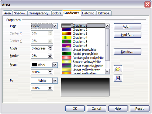
On the Area dialog, click on the '''Gradients''' tab. From here you can modify existing gradients or create your own. | On the Area dialog, click on the '''Gradients''' tab. From here you can modify existing gradients or create your own. | ||
| − | + | [[Image:DG3Ch4F22.png|none|thumb|500px|''Customizing gradients'']] | |
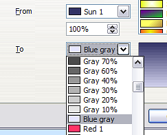
A gradient works by creating a smooth transition from one color to another. First, you need to choose two colors. | A gradient works by creating a smooth transition from one color to another. First, you need to choose two colors. | ||
| − | + | [[Image:DG4-21.png|none|thumb|500px|''Choosing colors for a gradient'']] | |
| − | Then choose a type of gradient. There are several available (Linear, Axial, Radial, and so on) and each has up to four different options to specify it in detail. For example, a radial gradient has a center you can specify | + | Then choose a type of gradient. There are several available (Linear, Axial, Radial, and so on) and each has up to four different options to specify it in detail. For example, a radial gradient has a center you can specify. |
| − | + | [[Image:DG3Ch4F24.png|none|thumb|''Center option in a radial gradient'']] | |
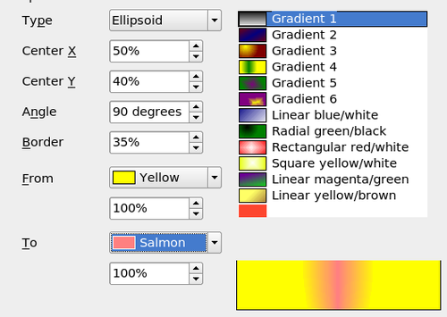
| − | + | The figure below shows how an ellipsoid gradient is rotated, moved vertically and horizontally, and the color of the border area varied. | |
| − | [[Image:|thumb|'' | + | [[Image:DG3Ch4F25.png|none|thumb|500px|''Center, Angle, and Border options for a gradient'']] |
=== Creating your own hatching (line pattern) === | === Creating your own hatching (line pattern) === | ||
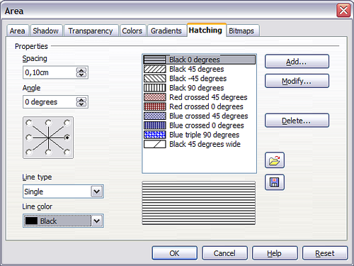
| − | On the Area dialog, click on the '''Hatching''' tab | + | On the Area dialog, click on the '''Hatching''' tab. From here you can modify existing hatchings (line patterns) or create your own. |
You can customize options like the spacing between lines, the angle and the color of the lines. There is no way to edit the line thickness. | You can customize options like the spacing between lines, the angle and the color of the lines. There is no way to edit the line thickness. | ||
| − | + | [[Image:DG3Ch4F26.png|none|thumb|500px|''Modifying hatchings'']] | |
=== Creating your own bitmap fill === | === Creating your own bitmap fill === | ||
| Line 205: | Line 197: | ||
To export a PNG image file: Create the image, select it, then choose '''File > Export''', choose '''PNG''' from the pulldown list of file formats, give the file a name, and save it. | To export a PNG image file: Create the image, select it, then choose '''File > Export''', choose '''PNG''' from the pulldown list of file formats, give the file a name, and save it. | ||
| − | To use an image as a bitmap fill, open the Area dialog and click on the '''Bitmaps''' tab | + | To use an image as a bitmap fill, open the Area dialog and click on the '''Bitmaps''' tab. |
| − | + | [[Image:DG3Ch4F27.png|none|thumb|500px|''Adding your own bitmap images'']] | |
From there you can add new bitmap images to serve as area fills. Click on '''Import''' and choose a file you previously saved. Give it a name that will make it easy to remember. The last imported image will appear at the bottom of the pulldown list of bitmap fills. Now you can use that image as an area fill. | From there you can add new bitmap images to serve as area fills. Click on '''Import''' and choose a file you previously saved. Give it a name that will make it easy to remember. The last imported image will appear at the bottom of the pulldown list of bitmap fills. Now you can use that image as an area fill. | ||
| − | + | [[Image:DG3Ch4F28.png|none|thumb|500px|''Adding your own bitmap images'']] | |
| − | { | + | {{Tip| If the imported image seems to be very small in the preview, probably you forgot to select the image before you exported it. The exported image was then the whole page with a (small) drawing on it.}} |
| − | + | ||
| − | + | ||
| − | |||
== Customizing shadows == | == Customizing shadows == | ||
| − | First, select the object you want to apply a custom shadow to. Open the Area dialog and go to the '''Shadow''' tab | + | First, select the object you want to apply a custom shadow to. Open the Area dialog and go to the '''Shadow''' tab. There you can customize the shadow's position, distance and color. |
| − | + | [[Image:DG3Ch4F29.png|none|thumb|500px|''Customizing shadows'']] | |
Shadows can also have transparency, so the shadow does not hide objects behind it. | Shadows can also have transparency, so the shadow does not hide objects behind it. | ||
| − | + | [[Image:DG3Ch4F30.png|none|thumb|500px|''Shadow with 50% transparency'']] | |
== Adding transparency == | == Adding transparency == | ||
| − | You can make objects partly or fully transparent, or even a with a varying degree of transparency (as a gradient). On the '''Transparency''' page | + | You can make objects partly or fully transparent, or even a with a varying degree of transparency (as a gradient). On the '''Transparency''' page, choose '''Transparency''' (for a uniform transparency) or '''Gradient''' for a gradient transparency. |
| − | + | [[Image:DG4-c.png|none|thumb|500px|''Transparency page of Area dialog'']] | |
| − | An example of gradient transparency is shown | + | An example of gradient transparency is shown below. See also [[#Dynamic gradients|Dynamic gradients]]. |
| − | + | [[Image:DG3Ch4F32.png|none|thumb|500px|''Example of gradient transparency'']] | |
= Using styles = | = Using styles = | ||
| − | Suppose that you want to apply the same area fill, line thickness, and border to a set of objects. This repetitive process can be greatly simplified by the use of styles. Styles allow you to define a formatting template (a style) and then to apply that style to multiple objects. For more about styles, see | + | Suppose that you want to apply the same area fill, line thickness, and border to a set of objects. This repetitive process can be greatly simplified by the use of styles. Styles allow you to define a formatting template (a style) and then to apply that style to multiple objects. For more about styles, see [[Documentation/OOo3_User_Guides/Writer_Guide/Introduction_to_Styles|Introduction to Styles]] in the ''Writer Guide''. |
| − | Click on the '''Styles and Formatting''' [[Image:]] icon on the '''Line and Filling''' toolbar or press the ''F11'' key to open the Styles and Formatting window | + | Click on the '''Styles and Formatting''' [[Image:StylesFormattingIcon.png]] icon on the '''Line and Filling''' toolbar or press the ''F11'' key to open the Styles and Formatting window. This window can be docked to the left or right side of the main Draw window, if you wish. |
| − | + | [[Image:DG3Ch4F33.png|none|thumb|500px|''Styles and Formatting window'']] | |
== Creating a new style == | == Creating a new style == | ||
| − | Select an object and customize the area fill and border. When you are satisfied, click on the '''New Style from Selection''' [[Image:]] icon on the Styles and Formatting window. This defines a new style based on the selected object. Type a name for the new style and click '''OK'''. | + | Select an object and customize the area fill and border. When you are satisfied, click on the '''New Style from Selection''' [[Image:NewStyleSelectionIcon.png]] icon on the Styles and Formatting window. This defines a new style based on the selected object. Type a name for the new style and click '''OK'''. |
== Applying a style == | == Applying a style == | ||
| Line 251: | Line 240: | ||
| − | { | + | {{Tip| '''Question:''' What happens if I modify a style after it has been applied?<br> |
| − | + | '''Answer:''' Then every object with that style is updated automatically!}} | |
| − | + | ||
| − | |||
| − | |||
| − | |||
== Modifying a style == | == Modifying a style == | ||
| − | Modifying a style is similar to creating a new style. Select an object '''with that style''' and change the area and line properties. When satisfied, click on the '''Update Style''' icon [[Image:]]. | + | Modifying a style is similar to creating a new style. Select an object '''with that style''' and change the area and line properties. When satisfied, click on the '''Update Style''' icon [[Image:UpdateStyleIcon.png]]. |
= Special effects = | = Special effects = | ||
| − | First make sure that the Drawing toolbar is selected ('''View > Toolbars > Drawing'''). On the Drawing toolbar, locate the '''Effects''' icon [[Image:]]. Click on the '''arrow''' next to that icon. This opens a submenu with all the special effect tools | + | First make sure that the Drawing toolbar is selected ('''View > Toolbars > Drawing'''). On the Drawing toolbar, locate the '''Effects''' icon [[Image:EffectsIcon.png]]. Click on the '''arrow''' next to that icon. This opens a submenu with all the special effect tools. |
{| style="border-spacing:0;" | {| style="border-spacing:0;" | ||
| style="border:none;padding:0.0382in;"| | | style="border:none;padding:0.0382in;"| | ||
| − | | style="border:none;padding:0.0382in;"| [[Image:]] | + | | style="border:none;padding:0.0382in;"| [[Image:DG3Ch4F34.png|none|thumb|500px|''Mode tear-off submenu'']] |
| style="border:none;padding:0.0382in;"| | | style="border:none;padding:0.0382in;"| | ||
| Line 285: | Line 270: | ||
'''8''' Gradient | '''8''' Gradient | ||
| − | |||
| − | |||
|} | |} | ||
| − | The tools are described in the following sections with the exception of the 3D rotation tool, which is described in | + | The tools are described in the following sections with the exception of the 3D rotation tool, which is described in [[Documentation/OOo3_User_Guides/Draw_Guide/Working_with_3D_Objects|Working with 3D Objects]]. |
== Rotating an object == | == Rotating an object == | ||
| − | Click on the '''Effects''' [[Image:]] icon to select the '''Rotate''' tool. Then select an object. The selected object will have red handles instead of the usual green handles. | + | Click on the '''Effects''' [[Image:EffectsIcon.png]] icon to select the '''Rotate''' tool. Then select an object. The selected object will have red handles instead of the usual green handles. |
{| style="border-spacing:0;" | {| style="border-spacing:0;" | ||
| − | | | + | | [[Image:RotateEx1.png]] |
| style="border:none;padding:0in;"| Grab one of the handles and move it to rotate the object. The black circle in the middle of the object is the pivot (center of rotation). You can move the location of the pivot with the mouse. | | style="border:none;padding:0in;"| Grab one of the handles and move it to rotate the object. The black circle in the middle of the object is the pivot (center of rotation). You can move the location of the pivot with the mouse. | ||
| − | | | + | | [[Image:RotateEx2.png]] |
|} | |} | ||
| + | |||
== Flip an object == | == Flip an object == | ||
| − | [[Image:]]Select an object and click on the '''Flip''' icon [[Image:]]. You will see a dashed line through the middle of the object. | + | {| |
| + | |[[Image:DG3Ch4F0d.png|thumb|100px]] | ||
| + | |Select an object and click on the '''Flip''' icon [[Image:FlipIcon.png]]. You will see a dashed line through the middle of the object. | ||
| + | |- | ||
| + | |[[Image:DG3Ch4F0e.png|thumb|100px]] | ||
| + | |This dashed line is the '''axis of symmetry'''. The object will be reflected about this line. Move one or both ends of the line with your mouse to set the orientation of the axis. | ||
| + | |- | ||
| + | |[[Image:DG3Ch4F0f.png|thumb|100px]] | ||
| + | |Then, grab any one of the eight green handles and move it across to the other side of the dashed line. The new position of the figure is shown faintly until the mouse is released. | ||
| + | |} | ||
| + | {{Note| If you press the ''Shift'' key while moving the line, the line will rotate in 45-degree increments.}} | ||
| − | |||
| − | |||
| − | |||
| − | |||
| − | |||
| − | |||
| − | |||
| − | |||
| − | |||
| − | |||
| − | |||
| − | |||
| − | |||
== Mirror copies == | == Mirror copies == | ||
Officially, this useful command does not (yet) exist in Draw. It can, however, be easily emulated. | Officially, this useful command does not (yet) exist in Draw. It can, however, be easily emulated. | ||
| Line 323: | Line 304: | ||
Move the axis of symmetry to the desired location of the mirror axis. Copy the object to the clipboard. Flip the object, then click on an empty area of the Draw screen in order to deselect the object. Paste from the clipboard to put a copy of the object in its original location and now you have a mirror copy. | Move the axis of symmetry to the desired location of the mirror axis. Copy the object to the clipboard. Flip the object, then click on an empty area of the Draw screen in order to deselect the object. Paste from the clipboard to put a copy of the object in its original location and now you have a mirror copy. | ||
| − | + | {| | |
| + | |[[Image:Mirror1.png|thumb]] | ||
| + | |[[Image:Mirror2.png]] | ||
| + | |- | ||
| + | |Colspan="2"|''Making a mirror copy of an object'' | ||
| + | |} | ||
== Distorting an image == | == Distorting an image == | ||
| Line 333: | Line 319: | ||
=== Distort an object === | === Distort an object === | ||
| − | Select an object and click on the '''Distort''' icon [[Image:]]. Draw will ask if you want to transform the object to a curve. This is a necessary step before distortion, so click '''Yes'''. Then you can move the object handles to stretch it. | + | Select an object and click on the '''Distort''' icon [[Image:DistortIcon.png]]. Draw will ask if you want to transform the object to a curve. This is a necessary step before distortion, so click '''Yes'''. Then you can move the object handles to stretch it. |
| − | The corner handles distort, as shown | + | The corner handles distort, as shown below. The midpoint handles distort the figure either horizontally (handle on vertical side of figure) or vertically (handle on horizontal side of figure). |
| − | + | [[Image:DG3Ch4F36.png|none|thumb|500px|''Distorting an image'']] | |
=== Set in circle (perspective) === | === Set in circle (perspective) === | ||
| − | Select an object and click on the '''Set in Circle (perspective)''' [[Image:]] icon. Draw will ask if you want to transform the object to a curve. This is a necessary step before distortion, so click '''Yes'''. Then you can move the object handles to give a pseudo three-dimensional perspective). | + | Select an object and click on the '''Set in Circle (perspective)''' [[Image:SetCirclePerspective.png]] icon. Draw will ask if you want to transform the object to a curve. This is a necessary step before distortion, so click '''Yes'''. Then you can move the object handles to give a pseudo three-dimensional perspective). |
| − | + | [[Image:DG3Ch4F37.png|none|thumb|500px|''Set an image in a circle with perspective'']] | |
=== Set to circle (slant) === | === Set to circle (slant) === | ||
| − | Select an object and click on the '''Set to Circle (slant)''' [[Image:]] icon. Draw will ask if you want to transform the object to a curve. This is a necessary step before distortion, so click '''Yes'''. Then you can move the object handles to give a pseudo three-dimensional slant perspective. | + | Select an object and click on the '''Set to Circle (slant)''' [[Image:SetCircleSlant.png]] icon. Draw will ask if you want to transform the object to a curve. This is a necessary step before distortion, so click '''Yes'''. Then you can move the object handles to give a pseudo three-dimensional slant perspective. |
| − | + | [[Image:DG3Ch4F38.png|none|thumb|500px|''Setting an image to a circle with slant perspective'']] | |
| − | { | + | {{Note| Transforming an object into a curve is a safe operation, but it cannot be reversed other than by clicking the '''Undo''' button.}} |
| − | + | ||
| − | + | ||
| − | |||
== Dynamic gradients == | == Dynamic gradients == | ||
| − | You can control transparency gradients in the same manner as color gradients. Both types of gradient can be used together. With a transparency gradient, the direction and degree of an | + | You can control transparency gradients in the same manner as color gradients. Both types of gradient can be used together. With a transparency gradient, the direction and degree of an object's fill color changes from opaque to transparent (in a regular gradient, the fill changes from one color to another, but the degree of transparency remains the same). |
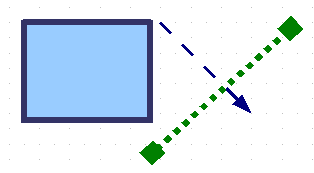
| − | If you have assigned transparency to an object with a color fill, you can control the transparency by clicking on the '''Transparency''' icon [[Image:]]. To define a transparent gradient, select an object, choose a transparency fill from the '''Line and Filling''' toolbar, The transparency icon is now active. When you click on this icon, a dashed line connecting two squares appears on the object. Move the two squares to modify the gradient. You can define the direction of the gradient (vertical, horizontal, or at any angle) and the spot at which the transparency begins. | + | If you have assigned transparency to an object with a color fill, you can control the transparency by clicking on the '''Transparency''' icon [[Image:TransparencyIcon.png]]. To define a transparent gradient, select an object, choose a transparency fill from the '''Line and Filling''' toolbar, The transparency icon is now active. When you click on this icon, a dashed line connecting two squares appears on the object. Move the two squares to modify the gradient. You can define the direction of the gradient (vertical, horizontal, or at any angle) and the spot at which the transparency begins. |
| − | In the same manner, to define a regular gradient, select an object, choose a gradient fill from the '''Line and Filling''' toolbar. The '''Gradient''' icon [[Image:]] is now active. When you click on the gradient icon, a dashed line connecting two squares appears on the object, just as it does for a transparency gradient. | + | In the same manner, to define a regular gradient, select an object, choose a gradient fill from the '''Line and Filling''' toolbar. The '''Gradient''' icon [[Image:GradientIcon.png]] is now active. When you click on the gradient icon, a dashed line connecting two squares appears on the object, just as it does for a transparency gradient. |
In both cases a dashed line connecting two small squares appears on top of the object. Click outside the object to set the gradient. | In both cases a dashed line connecting two small squares appears on top of the object. Click outside the object to set the gradient. | ||
| − | { | + | {{Note| If the transparency and gradient icons are not visible, you can display them using '''View > Toolbars > Mode'''. |
| − | + | Moving the squares will have different effects, depending on the type of gradient. For example, for a linear gradient, the start and end squares of the gradient will always be situated to either side of the center point of the object.}} | |
| − | + | ||
| − | + | The three examples below demonstrate how the type and degree of transparency can be controlled. | |
| + | {| | ||
| + | |[[Image:DG3Ch4F39a.png|thumb|200px]] | ||
| + | |A single color object and a transparency gradient, covering part of the underlying object. The gradient can be dynamically adjusted, made more transparent by moving the white square or more opaque by moving the black square. | ||
| + | |- | ||
| + | |[[Image:DG3Ch4F39b.png|thumb|200px]] | ||
| + | |An object with a color gradient, completely covering another object. The gradient is adjusted dynamically by moving the squares — the color of the square relating to the increase or decrease in that color. | ||
| + | |- | ||
| + | ||[[Image:DG3Ch4F39c.png|thumb|200px]] | ||
| + | | An object with both color and transparency gradients, partly covering the underlying object. | ||
| + | |colspan="2"|Dynamic gradients | ||
|} | |} | ||
| − | |||
| − | |||
| − | |||
| − | |||
| − | |||
| − | |||
| − | |||
| − | |||
| − | |||
{{CCBY}} | {{CCBY}} | ||
[[Category: Draw Guide (Documentation)]] | [[Category: Draw Guide (Documentation)]] | ||
[[Category: Documentation/Usage]] | [[Category: Documentation/Usage]] | ||
Latest revision as of 09:46, 16 July 2018
This is Chapter 4 of the OpenOffice.org 3 Draw Guide, produced by the OOoAuthors group. A PDF of this chapter is available from this wiki page.
Contents
To change an object’s attributes (such as color, border width, among others) you can use the Line and Filling toolbar or the context menu.
Line and Filling toolbar
If the Line and Filling toolbar is not visible, you can display it using View > Toolbars > Line and Filling. From here you can edit the most common object attributes. You can also open the Line dialog by clicking on the Line ![]() icon and the Area dialog by clicking on the Area
icon and the Area dialog by clicking on the Area ![]() icon to see more options.
icon to see more options.
| 1 Styles and Formatting
2 Line 3 Arrow Style |
4 Line Style
5 Line Width 6 Line Color |
7 Area
8-9 Area Style / Filling 10 Shadow |
| Line and Filling toolbar | ||
Text Formatting toolbar
When you select text, the Line and Filling toolbar changes to show text formatting options. You can also display the Text Formatting toolbar by choosing View > Toolbars > Text Formatting.
| Text Formatting toolbar (when text is selected) |
When an object is selected, you can right-click on the object to bring up a context menu. The context menu provides additional access to the options shown above and another way to change an object's attributes. The entries with a small arrow on the right-hand side contain a submenu.
Editing lines and borders
Lines, arrows, and the borders of an object are managed through the same dialog.
You can change some properties from the Line and Filling toolbar. To see more options, select the object and right-click on the object and choose Line from the context menu. This opens the Line dialog.
Common line properties
In most cases the property you want to change is the line's style (solid, dashed, invisible, and so on), its color, or its width. These options are all available from the Line and Filling toolbar.
You can also edit these properties from the Line dialog shown in the previous paragraph. They are on the first tab, left column. From the Line dialog you can also change the line's transparency. The figure below illustrates different degrees of transparency.
Drawing arrows
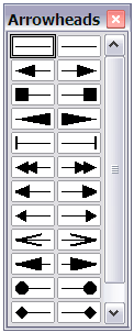
Arrowheads (and other line endings — usually referred to in this guide collectively as arrows) are a line property. Select a line and click on the Arrow Style ![]() icon. This opens the Arrowheads menu.
icon. This opens the Arrowheads menu.
There are several types of arrowheads available. Each end of the line can have a different arrowhead (or no arrowhead).
In the Line dialog, Arrow styles on the right-hand side contains a number of options to fine tune the arrow properties. If Synchronize ends is selected, both line endings will have the same appearance. The Center option brings the middle of the arrow over the end point of the line. If this option is not selected, the line ends on the outermost edge of the arrow. It is much easier to understand if you look at the following sketch.
Customizing line and arrow styles
You are not constrained to using only the line and arrow styles provided by default in Draw. You can modify the styles and create your own.
Customizing line styles
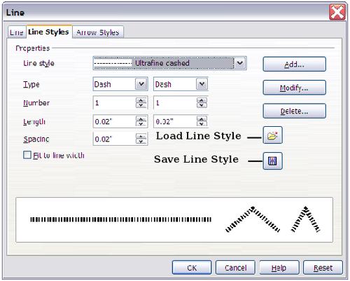
In the Line dialog, click on the Line Styles tab. From here you can customize the line styles or create your own (click on the Add button to create your own). You can change the length of the dashes, the space between them, and other attributes.
Use the Load Line Style ![]() and Save Line Style
and Save Line Style ![]() icons to save a new definition or read one from disk (file extension .sod).
icons to save a new definition or read one from disk (file extension .sod).
Customizing arrow styles
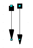
| You can also create your own arrowheads to create some interesting effects, such as: | |
| The first step is to draw a curve with the shape you want for the arrowhead. |
| The part of the shape which should point in the direction of the line must be drawn facing upwards. The top of the shape will point towards the "outside" of the line. |
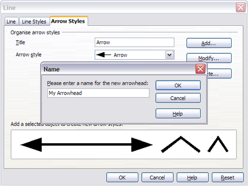
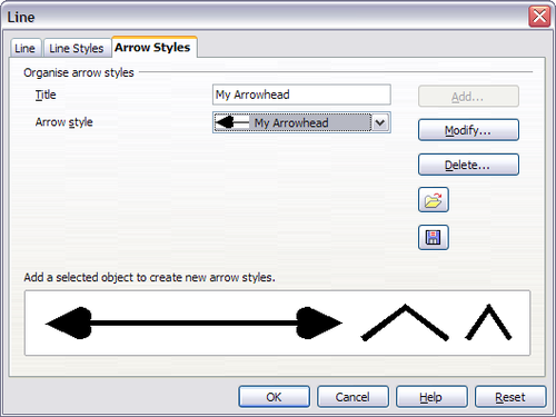
Select the curve, open the Line dialog, and go to the Arrow Styles page. Click on Add, enter a name for the arrow style and click OK.
Now you can access the new style from the Arrow style list below or the Arrowheads menu.
Editing the inside (fill) of an object
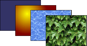
The OpenOffice.org term for the inside of an object is Area fill. The area fill of an object can be a uniform color, a gradient, a hatching pattern, or an image. It can be made partly or wholly transparent and can throw a shadow.
Common fill properties
In most cases, you will choose one of the standard fill options, whether it is a color, a gradient or an image. These options are all available from the Line and Filling toolbar.
If you want no fill at all, select the object you wish to edit and on the Line and Filling toolbar select the option Invisible on the pull down list at the right of the paint can.
Fill with a uniform color
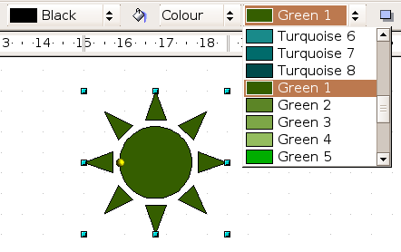
Select the object you wish to edit. On the Line and Filling toolbar, select Color on the pull down list at the right of the paint can, and then choose a color from the right-hand menu.
</center>Fill with a gradient
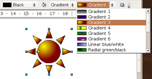
Select the object you wish to edit. On the Line and Filling toolbar, select Gradient and then choose a gradient from the right-hand menu.
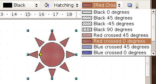
Fill with a line pattern
The OOo term for line patterns is Hatching. Select the object you wish to edit. On the Line and Filling toolbar, select Hatching and then choose an option from the menu.
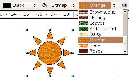
Fill with an image
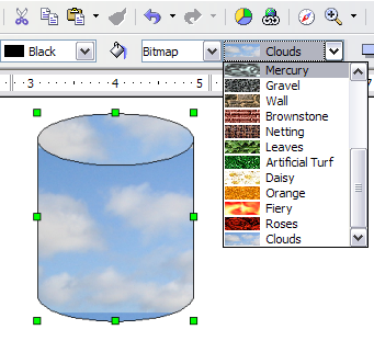
You can fill an object with a bitmap image (as opposed to a vector graphic image). Select the object you wish to edit. On the Line and Filling toolbar, select Bitmap and then choose an option from the menu.
Adding a shadow
In Draw, shadows are considered an area property. Click on the Filling ![]() icon on the Line and Filling toolbar — next to the area fill functions.
icon on the Line and Filling toolbar — next to the area fill functions.
Advanced area fill options
Click on the Area icon ![]() to bring up the Area dialog. From this dialog, you can fine tune the area fill of an object in greater detail.
to bring up the Area dialog. From this dialog, you can fine tune the area fill of an object in greater detail.
Creating your own fill color
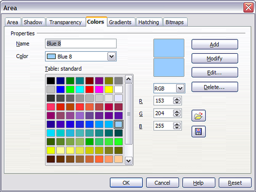
Click on the Colors tab of the Area dialog. From here you can modify existing colors or create your own.
Depending on the color model (RGB or CMYK can be selected from the pull down menu) in use you can change the individual values of the constituent colors — Red, Green, and Blue or Cyan, Magenta, Yellow, and Black. Click on Add to add this color to the color table. Clicking on the Modify button will change the values of the current color (here it is Blue 8, shown in the upper rectangle) to those on the screen in the lower rectangle. The Edit button allows you to fine tune the color using a palette with visual feedback.
Further explanation about color palettes can be found in Tips and Tricks.
Creating your own gradient
On the Area dialog, click on the Gradients tab. From here you can modify existing gradients or create your own.
A gradient works by creating a smooth transition from one color to another. First, you need to choose two colors.
Then choose a type of gradient. There are several available (Linear, Axial, Radial, and so on) and each has up to four different options to specify it in detail. For example, a radial gradient has a center you can specify.
The figure below shows how an ellipsoid gradient is rotated, moved vertically and horizontally, and the color of the border area varied.
Creating your own hatching (line pattern)
On the Area dialog, click on the Hatching tab. From here you can modify existing hatchings (line patterns) or create your own.
You can customize options like the spacing between lines, the angle and the color of the lines. There is no way to edit the line thickness.
Creating your own bitmap fill
You can add your own bitmap images to fill an area. First, you need to create the bitmap image. This could be a photo or another sketch you have created in another program. For example, you can draw something with Draw and export it as a PNG format image file.
To export a PNG image file: Create the image, select it, then choose File > Export, choose PNG from the pulldown list of file formats, give the file a name, and save it.
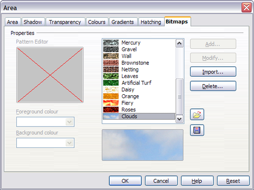
To use an image as a bitmap fill, open the Area dialog and click on the Bitmaps tab.
From there you can add new bitmap images to serve as area fills. Click on Import and choose a file you previously saved. Give it a name that will make it easy to remember. The last imported image will appear at the bottom of the pulldown list of bitmap fills. Now you can use that image as an area fill.
| If the imported image seems to be very small in the preview, probably you forgot to select the image before you exported it. The exported image was then the whole page with a (small) drawing on it. |
Customizing shadows
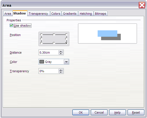
First, select the object you want to apply a custom shadow to. Open the Area dialog and go to the Shadow tab. There you can customize the shadow's position, distance and color.
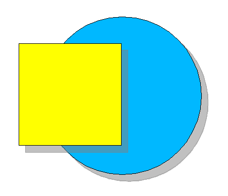
Shadows can also have transparency, so the shadow does not hide objects behind it.
Adding transparency
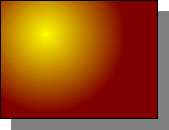
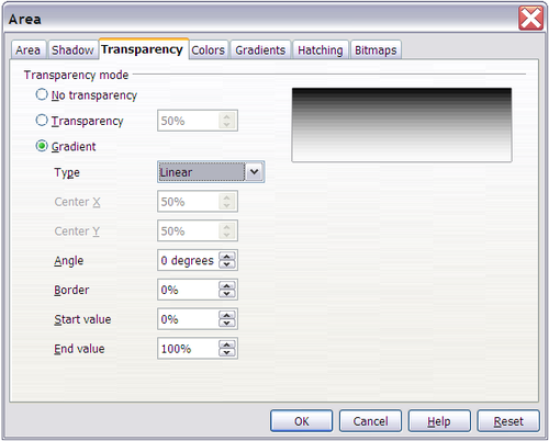
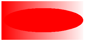
You can make objects partly or fully transparent, or even a with a varying degree of transparency (as a gradient). On the Transparency page, choose Transparency (for a uniform transparency) or Gradient for a gradient transparency.
An example of gradient transparency is shown below. See also Dynamic gradients.
Using styles
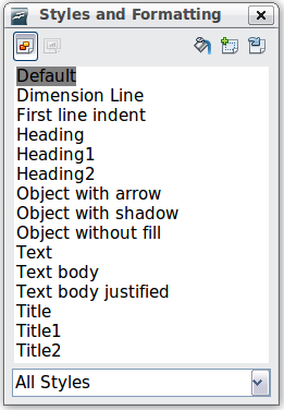
Suppose that you want to apply the same area fill, line thickness, and border to a set of objects. This repetitive process can be greatly simplified by the use of styles. Styles allow you to define a formatting template (a style) and then to apply that style to multiple objects. For more about styles, see Introduction to Styles in the Writer Guide.
Click on the Styles and Formatting ![]() icon on the Line and Filling toolbar or press the F11 key to open the Styles and Formatting window. This window can be docked to the left or right side of the main Draw window, if you wish.
icon on the Line and Filling toolbar or press the F11 key to open the Styles and Formatting window. This window can be docked to the left or right side of the main Draw window, if you wish.
Creating a new style
Select an object and customize the area fill and border. When you are satisfied, click on the New Style from Selection ![]() icon on the Styles and Formatting window. This defines a new style based on the selected object. Type a name for the new style and click OK.
icon on the Styles and Formatting window. This defines a new style based on the selected object. Type a name for the new style and click OK.
Applying a style
Once the new style is defined, you can apply it to other objects. Select another object and double-click on the style name you defined. The new object will acquire the area fill and line properties of that style.
| Question: What happens if I modify a style after it has been applied? Answer: Then every object with that style is updated automatically! |
Modifying a style
Modifying a style is similar to creating a new style. Select an object with that style and change the area and line properties. When satisfied, click on the Update Style icon ![]() .
.
Special effects
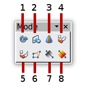
First make sure that the Drawing toolbar is selected (View > Toolbars > Drawing). On the Drawing toolbar, locate the Effects icon ![]() . Click on the arrow next to that icon. This opens a submenu with all the special effect tools.
. Click on the arrow next to that icon. This opens a submenu with all the special effect tools.
| 1 Rotate
2 Flip 3 In 3D Rotation Object |
4 Set in Circle (perspective)
5 Set to Circle (slant) 6 Distort |
7 Transparency
8 Gradient
|
The tools are described in the following sections with the exception of the 3D rotation tool, which is described in Working with 3D Objects.
Rotating an object
Click on the Effects ![]() icon to select the Rotate tool. Then select an object. The selected object will have red handles instead of the usual green handles.
icon to select the Rotate tool. Then select an object. The selected object will have red handles instead of the usual green handles.

|
Grab one of the handles and move it to rotate the object. The black circle in the middle of the object is the pivot (center of rotation). You can move the location of the pivot with the mouse. | 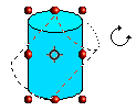
|
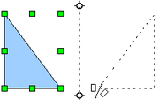
Flip an object
Mirror copies
Officially, this useful command does not (yet) exist in Draw. It can, however, be easily emulated.
Move the axis of symmetry to the desired location of the mirror axis. Copy the object to the clipboard. Flip the object, then click on an empty area of the Draw screen in order to deselect the object. Paste from the clipboard to put a copy of the object in its original location and now you have a mirror copy.
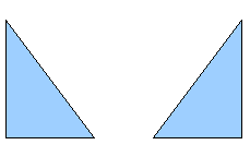
| |
| Making a mirror copy of an object | |
Distorting an image
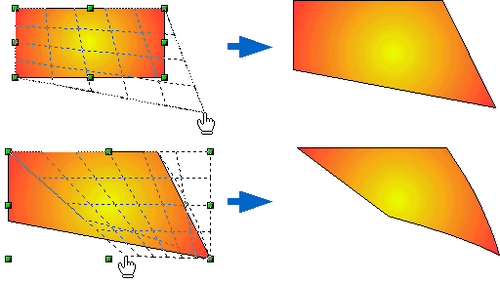
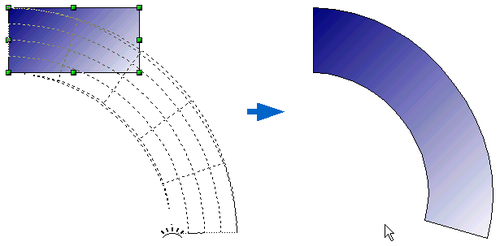
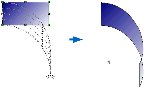
There are three tools on the Effects menu that let you drag the corners and edges of an object to distort the image.
The Distort tool distorts an object in perspective, the Set to Circle (slant) and Set in Circle (perspective) tools both create a pseudo three-dimensional effect.
The results of using these tools are shown in the following figures.
Distort an object
Select an object and click on the Distort icon ![]() . Draw will ask if you want to transform the object to a curve. This is a necessary step before distortion, so click Yes. Then you can move the object handles to stretch it.
. Draw will ask if you want to transform the object to a curve. This is a necessary step before distortion, so click Yes. Then you can move the object handles to stretch it.
The corner handles distort, as shown below. The midpoint handles distort the figure either horizontally (handle on vertical side of figure) or vertically (handle on horizontal side of figure).
Set in circle (perspective)
Select an object and click on the Set in Circle (perspective) ![]() icon. Draw will ask if you want to transform the object to a curve. This is a necessary step before distortion, so click Yes. Then you can move the object handles to give a pseudo three-dimensional perspective).
icon. Draw will ask if you want to transform the object to a curve. This is a necessary step before distortion, so click Yes. Then you can move the object handles to give a pseudo three-dimensional perspective).
Set to circle (slant)
Select an object and click on the Set to Circle (slant) ![]() icon. Draw will ask if you want to transform the object to a curve. This is a necessary step before distortion, so click Yes. Then you can move the object handles to give a pseudo three-dimensional slant perspective.
icon. Draw will ask if you want to transform the object to a curve. This is a necessary step before distortion, so click Yes. Then you can move the object handles to give a pseudo three-dimensional slant perspective.
| Transforming an object into a curve is a safe operation, but it cannot be reversed other than by clicking the Undo button. |
Dynamic gradients
You can control transparency gradients in the same manner as color gradients. Both types of gradient can be used together. With a transparency gradient, the direction and degree of an object's fill color changes from opaque to transparent (in a regular gradient, the fill changes from one color to another, but the degree of transparency remains the same).
If you have assigned transparency to an object with a color fill, you can control the transparency by clicking on the Transparency icon ![]() . To define a transparent gradient, select an object, choose a transparency fill from the Line and Filling toolbar, The transparency icon is now active. When you click on this icon, a dashed line connecting two squares appears on the object. Move the two squares to modify the gradient. You can define the direction of the gradient (vertical, horizontal, or at any angle) and the spot at which the transparency begins.
. To define a transparent gradient, select an object, choose a transparency fill from the Line and Filling toolbar, The transparency icon is now active. When you click on this icon, a dashed line connecting two squares appears on the object. Move the two squares to modify the gradient. You can define the direction of the gradient (vertical, horizontal, or at any angle) and the spot at which the transparency begins.
In the same manner, to define a regular gradient, select an object, choose a gradient fill from the Line and Filling toolbar. The Gradient icon ![]() is now active. When you click on the gradient icon, a dashed line connecting two squares appears on the object, just as it does for a transparency gradient.
is now active. When you click on the gradient icon, a dashed line connecting two squares appears on the object, just as it does for a transparency gradient.
In both cases a dashed line connecting two small squares appears on top of the object. Click outside the object to set the gradient.
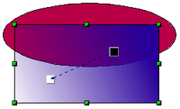
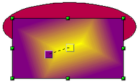
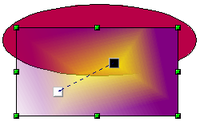
The three examples below demonstrate how the type and degree of transparency can be controlled.
| A single color object and a transparency gradient, covering part of the underlying object. The gradient can be dynamically adjusted, made more transparent by moving the white square or more opaque by moving the black square. | |||
| An object with a color gradient, completely covering another object. The gradient is adjusted dynamically by moving the squares — the color of the square relating to the increase or decrease in that color. | |||
| An object with both color and transparency gradients, partly covering the underlying object. | Dynamic gradients | ||
| Content on this page is licensed under the Creative Common Attribution 3.0 license (CC-BY). |

