Difference between revisions of "Documentation/OOo3 User Guides/Calc Guide/Object Properties dialog"
| (One intermediate revision by the same user not shown) | |||
| Line 1: | Line 1: | ||
| − | {{DISPLAYTITLE: | + | {{DISPLAYTITLE:Formatting the chart elements}} |
{{Documentation/CG3Ch4TOC | {{Documentation/CG3Ch4TOC | ||
|ShowPrevNext=block | |ShowPrevNext=block | ||
| Line 5: | Line 5: | ||
|NextPage=Documentation/OOo3_User_Guides/Calc Guide/Resizing and moving the chart | |NextPage=Documentation/OOo3_User_Guides/Calc Guide/Resizing and moving the chart | ||
}} | }} | ||
| − | + | Depending on the purpose of your document, for example a screen presentation or a printed document for a black and white publication, you might wish to use more detailed control over the different chart elements to give you is what you need. | |
| − | Depending on | + | |
| − | To | + | To format an element, left-click on the element that you wish to change, for example one of the axes. The element will be highlighted with green squares. Then, right-click and choose an item from the context menu. Each chart element has its own selection of items. In the next few sections we explore some of these options. |
| − | == | + | == Formatting axes and inserting grids == |
| − | Sometimes you need to have a special scale for one of the axes of your chart. After highlighting the axis you wish to change, right-click and choose | + | Sometimes you need to have a special scale for one of the axes of your chart, or you need smaller grid intervals, or you want to change the formating of the labels on the axis. After highlighting the axis you wish to change, right-click and choose one of the items from the pop-up menu. |
| − | You must first deselect the '''Automatic''' | + | Choosing '''Format Axis''' opens the dialog shown below. On the ''Scale'' tab, you can choose a logarithmic or linear scale (default), how many marks you need on the line, where the marks are to appear, and the increments (intervals) of the scale. You must first deselect the '''Automatic option''' in order to modify the value for any scale. |
| − | [[Image:CG3Ch4F20.png|thumb|none|500px|'' | + | [[Image:CG3Ch4F20.png|thumb|none|500px|''Formatting axis scales'']] |
| − | == Formatting data | + | On the Label tab, you can choose whether to show or hide the labels and how to handle them when they won’t all fit neatly into one row (for example, if the words are too long). |
| − | + | ||
| + | [[Image:CG3Ch4F21.png|thumb|none|500px|''Formatting axis labels'']] | ||
| + | |||
| + | Not shown here are the tab with options for choosing a font, formatting the lines, and positioning the elements of the line and interval marks. | ||
| + | |||
| + | == Formatting data labels == | ||
| + | You can choose properties for the labels of the data series. Carefully click on the chart element, then right-click and choose the property you want to change. This opens a dialog with several tabs where you can change the color of the label text, the size of the font, and other attributes. The Label tab is shown above. | ||
On the Data Labels tab, you can choose whether to: | On the Data Labels tab, you can choose whether to: | ||
| Line 28: | Line 33: | ||
These choices are the same as those shown for the [[Documentation/OOo3_User_Guides/Calc_Guide/Editing charts#Data labels|Data Labels dialog]]. | These choices are the same as those shown for the [[Documentation/OOo3_User_Guides/Calc_Guide/Editing charts#Data labels|Data Labels dialog]]. | ||
| − | The text for labels is taken from the column labels and it cannot be changed here. If the text needs to be abbreviated, or if it did not label your graph as you were expecting, | + | The text for labels is taken from the column labels and it cannot be changed here. If the text needs to be abbreviated, or if it did not label your graph as you were expecting, you need to change it in the original data table. |
| − | + | ||
| − | + | ||
| − | + | ||
| − | + | ||
== Choosing and formatting symbols == | == Choosing and formatting symbols == | ||
| − | In line and scatter charts the symbols representing the points can be changed to a different symbol shape or color through the object properties dialog. | + | In line and scatter charts the symbols representing the points can be changed to a different symbol shape or color through the object properties dialog. Select the data series you wish to change, right-click, and choose Format > Data Series from the context menu. |
| − | On the Line tab of the Data Series | + | On the Line tab of the Data Series dialog, in the Icon section, choose from the drop-down list '''Select > Symbols'''. Here you can choose no symbol, a symbol from an inbuilt selection, a more exciting range from the gallery, or if you have pictures you need to use instead, you can insert them using '''Select > From file'''. |
[[Image:CG3Ch4F22.png|thumb|none|500px|''Symbol selection'']] | [[Image:CG3Ch4F22.png|thumb|none|500px|''Symbol selection'']] | ||
Latest revision as of 01:37, 22 September 2010
Depending on the purpose of your document, for example a screen presentation or a printed document for a black and white publication, you might wish to use more detailed control over the different chart elements to give you is what you need.
To format an element, left-click on the element that you wish to change, for example one of the axes. The element will be highlighted with green squares. Then, right-click and choose an item from the context menu. Each chart element has its own selection of items. In the next few sections we explore some of these options.
Formatting axes and inserting grids
Sometimes you need to have a special scale for one of the axes of your chart, or you need smaller grid intervals, or you want to change the formating of the labels on the axis. After highlighting the axis you wish to change, right-click and choose one of the items from the pop-up menu.
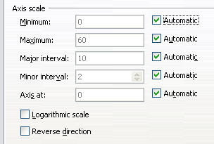
Choosing Format Axis opens the dialog shown below. On the Scale tab, you can choose a logarithmic or linear scale (default), how many marks you need on the line, where the marks are to appear, and the increments (intervals) of the scale. You must first deselect the Automatic option in order to modify the value for any scale.
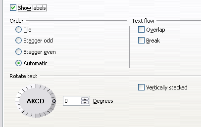
On the Label tab, you can choose whether to show or hide the labels and how to handle them when they won’t all fit neatly into one row (for example, if the words are too long).
Not shown here are the tab with options for choosing a font, formatting the lines, and positioning the elements of the line and interval marks.
Formatting data labels
You can choose properties for the labels of the data series. Carefully click on the chart element, then right-click and choose the property you want to change. This opens a dialog with several tabs where you can change the color of the label text, the size of the font, and other attributes. The Label tab is shown above.
On the Data Labels tab, you can choose whether to:
- Show the labels as text
- Show numeric values as a percentage or a number
- Include the legend box as part of the label
These choices are the same as those shown for the Data Labels dialog.
The text for labels is taken from the column labels and it cannot be changed here. If the text needs to be abbreviated, or if it did not label your graph as you were expecting, you need to change it in the original data table.
Choosing and formatting symbols
In line and scatter charts the symbols representing the points can be changed to a different symbol shape or color through the object properties dialog. Select the data series you wish to change, right-click, and choose Format > Data Series from the context menu.
On the Line tab of the Data Series dialog, in the Icon section, choose from the drop-down list Select > Symbols. Here you can choose no symbol, a symbol from an inbuilt selection, a more exciting range from the gallery, or if you have pictures you need to use instead, you can insert them using Select > From file.
| Content on this page is licensed under the Creative Common Attribution 3.0 license (CC-BY). |


