Gallery of chart types
It is important to remember that while your data can be presented with a number of different charts, the message you want to convey to your audience dictates the chart you ultimately use. The following sections present examples of the types of charts that Calc provides, with some of the tweaks that each sort can have and some notes as to what purpose you might have for that chart type. For details, see the Help.
Contents
柱形圖
Column charts are commonly used for data that shows trends over time. They are best for charts that have a relatively small number of data points. (For large time series a line chart would be better.) It is the default chart type, as it is one of the most useful charts and the easiest to understand.
Bar charts
Bar charts are excellent for giving an immediate visual impact for data comparison where time is not important, for example to compare the popularity of a few products in a marketplace.
- Graph one is achieved quite simply by using the chart wizard with Insert > Grids, un-check y-axis, and Insert > Mean Value Lines.
- Graph two is the 3D option in the chart wizard with a simple border and the 3D chart area twisted around.
- The third graph is an attempt to get rid of the legend and put labels showing the names of the companies on the axis instead. We also changed the colors to a hatch pattern.
Pie charts
Pie charts are excellent when you need to compare proportions. For example, comparisons of departmental spending: what the department spent on different items or what different departments spent. They work best with smaller numbers of values, about half a dozen; more than this and the visual impact begins to fade.
As the Chart Wizard guesses the series that you wish to include in your pie chart, you might need to adjust this initially on the Wizard’s Data Ranges page if you know you want a pie chart, or by using the Format > Data Ranges > Data Series dialog.
There are a couple of interesting things you can do with pie charts. This is one of the charts which can profitably be made into a 3D chart. It can then be tilted, given shadows, and generally turned into a work of art. Just don’t clutter it so much that your message is lost.
You can choose in the Chart Wizard to explode the pie chart, but this is an all or nothing option. If your aim is to accentuate one piece of the pie, you can separate out one piece by carefully highlighting it after you have finished with the Chart Wizard, and dragging it out of the pie plate. When you do this you might need to enlarge the chart area again to regain the original size of the pieces.
- 2D pie chart in Chart Wizard. Choose Insert > Legend and uncheck the Display legend box. Choose Insert > Data Labels and choose Show value as number. Then carefully select the piece of pie you wish to highlight. The best way is to move the cursor to the edge of the piece and click; the piece will have nine green highlight squares to mark it. Then drag it out from the rest of the pieces. You will find the actual pieces will decrease in size and you will need to highlight the chart wall and drag it at a corner to increase the size.
- 3D pie chart with realistic schema and illumination adjusted by going to Format > 3D view > Illumination where you can change the direction of the light, the color of the ambient light, and the depth of the shade. We also adjusted the 3D angle of the disc in the Perspective dialog on the same set of tabs.
Fortunately the chart updates as you make changes, so you can see the effects you are having.
If you want to separate out one of the pieces, click on it carefully; you should see a wire frame highlight. Drag it out with the mouse and like the 2D chart you need to increase the size of the chart wall. - 3D pie chart and Insert > Data labels, show data labels as percentage. Then carefully select each of the pieces so that it has a wire frame highlight and right-click to get the object properties dialog and choose the Area tab. For one we chose a bitmap, for another a gradient and for the third we used the Transparency tab and adjusted the transparency to 50%.
Donut charts
If you want to show the proportional nature of your data but want to include more than one data series, a donut chart is your best option. The extra layer attempts to give pies another dimension of time. However, two or three data series are all you can include before it becomes meaningless. The extra layer attempts to give pies another dimension of time.
As with pie chart, you can explode the pieces of the donut chart. You can also separate individual pieces as in pie charts.
As in pie charts, data labeling may be used a substitute for the legend, not an addition to it.
Area charts
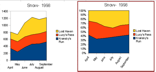
An area chart is a version of a line or column graph. It may be useful where you wish to emphasize volume of change. Area charts have a greater visual impact than a line chart, but the data you use will make a difference.
As shown above, an area chart is sometimes tricky to use. This may be one good reason to use transparency values in an area chart.
- Chart wizard > no y-grids. As the data overlaps, some of it is missing behind the first data series. This is not what you want. A better solution is Chart 2.
- Chart wizard > no y-grids > Object Properties > Area > 50% Transparency; Labels > Tile 55° . The transparency makes it easy to see the data hidden behind the first data series.
- Chart wizard > 3D > realistic > no y-grids > Object Properties > Area > 50% transparency. We also twisted the chart area around and gave the chart wall a picture of the sky. As you can see, the legend turns into labels on the z-axis. But overall, though it is visually more appealing, it is more difficult to see the point you are trying to make with the data.
Other ways of visualizing the same data series are represented by the stacked area chart or the percentage stacked area chart. The first does what it says, each number of each series is added to the others so that it shows an overall volume not a comparison of the data. The percentage stacked chart shows each value in the series as a part of the whole. For example in June all three values are added together and that number represents 100%. The individual values are a percentage of that. Many charts have varieties which have this option.
Line charts
A line chart is a time series with a progression. It is ideal for raw data, and useful for charts with plentiful data that shows trends or changes over time where you want to emphasize continuity. On line charts, the x-axis is ideal to represent time series data.
Things to do with lines: thicken them up, make them 3D, smooth the contours, just use points.
3D lines confuse the viewer, so just using a thicker line often works better.
Scatter or XY charts
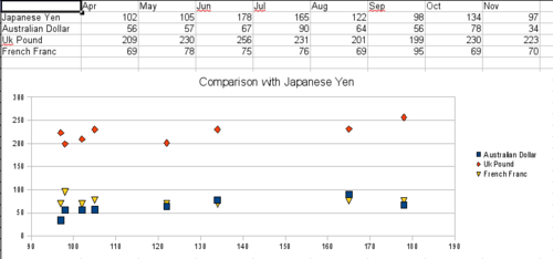
Scatter charts are great for visualizing data that you have not had time to analyze, and they may be the best for data when you have a constant value with which to compare the data; for example, weather data, reactions under different acidity levels, conditions at altitude, or any data which matches two series of numeric data. In contrast to line charts, the x-axis are the left to right labels which usually indicate a time series.
There is a catch with scatter charts that may surprise those unfamiliar with how they work. One data series represents the x-axis and the next represents the y-axis. The chart becomes a Cartesian map with each point showing the (x,y) point of each pair of data. Thus you may be hoping for a chart with two series of points, as you would get in a line chart, and only have one unexpectedly twisted line. Each additional series of data is matched against the original series. Figure 30 shows a comparison of three currencies with the Japanese Yen. Even though the table presents the monthly series, the chart does not. In fact the Japanese Yen does not appear; it is merely used as the constant series that all the other data series are compared to.
Net charts
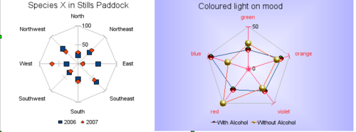
A net chart is similar to polar or radar graphs. They are useful for comparing data that are not time series, but show different circumstances, such as variables in a scientific experiment or direction. The poles of the net chart are the y-axes of other charts. Generally, between three and eight axes are best, any more and this type of chart becomes confusing. Before and after can be plotted on the same chart, or perhaps expected and real results, so that differences can be compared.
- Plain net chart without grids and with just points no lines.
- Net chart with lines and points and grid. axes colors changed as well as labels. chart area color = gradient quadrant and the points changed to fancy 3D ones.
There are also varieties of net chart that show the data series as stacked numbers or stacked percentages.
Stock charts
A stock chart is a specialized column graph specifically for stocks and shares. You can choose traditional lines, candlestick, and two-column type charts. The data required for these charts is quite specialized, with series for opening price, closing price, and high and low prices. Of course the x-axis represents a time series.
When you set up a stock chart in the Chart Wizard, the Data Series dialog is very important. You need to tell it which series is for the opening price, closing price, high and low price of the stock, or else the chart may be indecipherable. The sample table for this chapter needed to be changed to fit the data series.
A nice touch is that OpenOffice.org Chart color-codes the rising and falling shares: white for rising and black for falling in the candlestick chart, and red and blue in the traditional line chart.
Column and line charts
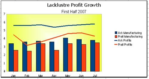
A column and line chart is a combination of two other chart types. It is useful for combining two distinct but related data series, for example sales over time (column) and the profit margin trends (line).
You can choose the number of columns and lines in the Chart Wizard. So for example you might have two columns with two lines to represent two product lines with the sales figures and profit margins of both.
The chart has data for two products, manufacturing costs and profits over a period of time, in this case, six months in 2007. We highlighted the table and started the Chart Wizard. We chose the Column and Line chart type with two lines and the data series in rows. Then we gave it a title to highlight the aspect we want to show. The lines are different colors at this stage and don’t reflect the product relationships. When we finished with the Chart Wizard, we highlighted the chart, clicked on the line, right-clicked, and chose Object properties > Line.
On this tab there are a few things to change, first the color to match the products, so both Ark Manufacturing and profit are blue and Prall is red. I think the lines need to be more noticeable so I made the lines thicker by increasing the width to .08.
The background is done by highlighting the chart wall and right-clicking, choosing Object Properties > Area, and changing the drop-down box to show Gradient. We chose one of the preset gradient patterns and made it lighter by going to the Transparency tab and making the gradient 50% transparent.
We also decided that the chart looked cleaner without the grid so we went to Insert > Grids and unchecked the X-axis option.
| Content on this page is licensed under the Creative Common Attribution 3.0 license (CC-BY). |


