Difference between revisions of "Documentation/OOo3 User Guides/Calc Guide/Gallery of chart types"
(→Line charts) |
(→線圖) |
||
| Line 65: | Line 65: | ||
== 線圖 == | == 線圖 == | ||
| − | + | 線圖是一個時間序列的圖。當你想要強調的連續性,它是理想的原始數據和有用的圖表,並擁有豐富的數據顯示的趨勢或隨著時間推移的變化。 | |
| + | 在折線圖,X軸代表是非常理想的時間序列數據 | ||
Things to do with lines: thicken them up, make them 3D, smooth the contours, just use points. | Things to do with lines: thicken them up, make them 3D, smooth the contours, just use points. | ||
Revision as of 05:47, 30 September 2009
It is important to remember that while your data can be presented with a number of different charts, the message you want to convey to your audience dictates the chart you ultimately use. The following sections present examples of the types of charts that Calc provides, with some of the tweaks that each sort can have and some notes as to what purpose you might have for that chart type. For details, see the Help.
Contents
柱形圖
Column charts are commonly used for data that shows trends over time. They are best for charts that have a relatively small number of data points. (For large time series a line chart would be better.) It is the default chart type, as it is one of the most useful charts and the easiest to understand.
長條圖
長條圖表對於視覺衝擊的數據進行比較優秀,時間並不重要,例如,比較流行的一些產品在市場上。
- 圖1為很容易表現出使用圖表的比較, 插入 “> 網格,取消勾選Y軸,並插入 ”> 均值線
- 圖二是一個簡單邊界和3D圖表的3D選項圖表
- 第三個圖公司名稱來代替軸的標籤。我們還改變了顏色的模式。
圓餅圖
當您需要比較的程度時,圓餅圖是顯示較為出色的。
當圖表數列包括在您的餅圖,如果你想有一個圓餅圖,您可能需要調整這個最初數據範圍頁面,或是使用格式 “> 數據範圍”數據系列對話框。
還有幾個有趣的事情可以做圓餅圖。 這是其中一個圖表,可以有效地製作成3D圖表。它可以傾斜或是有陰影,最後就變成了藝術作品。不過不要混亂得不得了,否則你的資訊會丟失。
您可以選擇在圖表匯出圓餅圖,但這是一個可有可無的選擇。如果你的目的是突出一件其中的餅圖,你可以分開後,在你完成了圖表,將他凸顯出來,並拖出來。當您這樣做時,您可能需要擴大圖表區並再次恢復原來的大小的塊。
- 2D圓餅圖表:選擇插入 “> 圖表 ,並取消顯示圖例框。 選擇插入 “> 數據標籤並選擇顯示數值 。然後,仔細選擇一塊你想突出餅圖。最好的方法是將角度移動到邊緣的一塊,然後按一下;將有9個綠色區域去強調它。然後將它從剩下的部分。你會發現實際的餅片圖,將減少大小,您需要強調圖表並在一個角度裡拖動它增加大小。
- 3D圓餅圖的架構和照明調整:格式 “> 3D視圖 ”> 照明 ,您可以改變光線的方向,光的顏色,以及陰影處。 我們還同一組的標籤,調整了3D角度光盤的對話框中,
幸運的是更新圖表進行變更時,你就可以看到您有效果。
.如果你想分開之一件,點選時仔細,你應該會看到一個線框亮點。拖出來用滑鼠像你需要增加的2D圖表的規模圖表一樣。
- 3D圓餅圖和插入 “> 數據標籤 ,會顯示數據標籤的百分比。然後,仔細選擇每件個線框突出和滑鼠右點獲得該對象的屬性對話框,選擇區選項。我們選擇其中一個圖,其他的,我們使用的透明標籤,並調整透明度調到50%。
環圈圖
If you want to show the proportional nature of your data but want to include more than one data series, a donut chart is your best option. The extra layer attempts to give pies another dimension of time. However, two or three data series are all you can include before it becomes meaningless. The extra layer attempts to give pies another dimension of time.
As with pie chart, you can explode the pieces of the donut chart. You can also separate individual pieces as in pie charts.
As in pie charts, data labeling may be used a substitute for the legend, not an addition to it.
平面圖
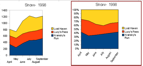
An area chart is a version of a line or column graph. It may be useful where you wish to emphasize volume of change. Area charts have a greater visual impact than a line chart, but the data you use will make a difference.
As shown above, an area chart is sometimes tricky to use. This may be one good reason to use transparency values in an area chart.
- Chart wizard > no y-grids. As the data overlaps, some of it is missing behind the first data series. This is not what you want. A better solution is Chart 2.
- Chart wizard > no y-grids > Object Properties > Area > 50% Transparency; Labels > Tile 55° . The transparency makes it easy to see the data hidden behind the first data series.
- Chart wizard > 3D > realistic > no y-grids > Object Properties > Area > 50% transparency. We also twisted the chart area around and gave the chart wall a picture of the sky. As you can see, the legend turns into labels on the z-axis. But overall, though it is visually more appealing, it is more difficult to see the point you are trying to make with the data.
Other ways of visualizing the same data series are represented by the stacked area chart or the percentage stacked area chart. The first does what it says, each number of each series is added to the others so that it shows an overall volume not a comparison of the data. The percentage stacked chart shows each value in the series as a part of the whole. For example in June all three values are added together and that number represents 100%. The individual values are a percentage of that. Many charts have varieties which have this option.
線圖
線圖是一個時間序列的圖。當你想要強調的連續性,它是理想的原始數據和有用的圖表,並擁有豐富的數據顯示的趨勢或隨著時間推移的變化。 在折線圖,X軸代表是非常理想的時間序列數據
Things to do with lines: thicken them up, make them 3D, smooth the contours, just use points.
3D lines confuse the viewer, so just using a thicker line often works better.
Scatter or XY charts
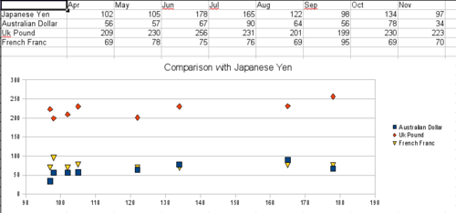
Scatter charts are great for visualizing data that you have not had time to analyze, and they may be the best for data when you have a constant value with which to compare the data; for example, weather data, reactions under different acidity levels, conditions at altitude, or any data which matches two series of numeric data. In contrast to line charts, the x-axis are the left to right labels which usually indicate a time series.
There is a catch with scatter charts that may surprise those unfamiliar with how they work. One data series represents the x-axis and the next represents the y-axis. The chart becomes a Cartesian map with each point showing the (x,y) point of each pair of data. Thus you may be hoping for a chart with two series of points, as you would get in a line chart, and only have one unexpectedly twisted line. Each additional series of data is matched against the original series. Figure 30 shows a comparison of three currencies with the Japanese Yen. Even though the table presents the monthly series, the chart does not. In fact the Japanese Yen does not appear; it is merely used as the constant series that all the other data series are compared to.
Net charts
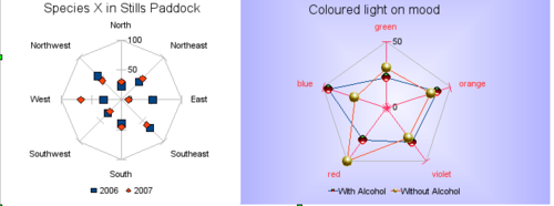
A net chart is similar to polar or radar graphs. They are useful for comparing data that are not time series, but show different circumstances, such as variables in a scientific experiment or direction. The poles of the net chart are the y-axes of other charts. Generally, between three and eight axes are best, any more and this type of chart becomes confusing. Before and after can be plotted on the same chart, or perhaps expected and real results, so that differences can be compared.
- Plain net chart without grids and with just points no lines.
- Net chart with lines and points and grid. axes colors changed as well as labels. chart area color = gradient quadrant and the points changed to fancy 3D ones.
There are also varieties of net chart that show the data series as stacked numbers or stacked percentages.
Stock charts
A stock chart is a specialized column graph specifically for stocks and shares. You can choose traditional lines, candlestick, and two-column type charts. The data required for these charts is quite specialized, with series for opening price, closing price, and high and low prices. Of course the x-axis represents a time series.
When you set up a stock chart in the Chart Wizard, the Data Series dialog is very important. You need to tell it which series is for the opening price, closing price, high and low price of the stock, or else the chart may be indecipherable. The sample table for this chapter needed to be changed to fit the data series.
A nice touch is that OpenOffice.org Chart color-codes the rising and falling shares: white for rising and black for falling in the candlestick chart, and red and blue in the traditional line chart.
Column and line charts
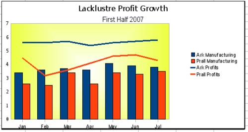
A column and line chart is a combination of two other chart types. It is useful for combining two distinct but related data series, for example sales over time (column) and the profit margin trends (line).
You can choose the number of columns and lines in the Chart Wizard. So for example you might have two columns with two lines to represent two product lines with the sales figures and profit margins of both.
The chart has data for two products, manufacturing costs and profits over a period of time, in this case, six months in 2007. We highlighted the table and started the Chart Wizard. We chose the Column and Line chart type with two lines and the data series in rows. Then we gave it a title to highlight the aspect we want to show. The lines are different colors at this stage and don’t reflect the product relationships. When we finished with the Chart Wizard, we highlighted the chart, clicked on the line, right-clicked, and chose Object properties > Line.
On this tab there are a few things to change, first the color to match the products, so both Ark Manufacturing and profit are blue and Prall is red. I think the lines need to be more noticeable so I made the lines thicker by increasing the width to .08.
The background is done by highlighting the chart wall and right-clicking, choosing Object Properties > Area, and changing the drop-down box to show Gradient. We chose one of the preset gradient patterns and made it lighter by going to the Transparency tab and making the gradient 50% transparent.
We also decided that the chart looked cleaner without the grid so we went to Insert > Grids and unchecked the X-axis option.
| Content on this page is licensed under the Creative Common Attribution 3.0 license (CC-BY). |


