Difference between revisions of "Chart2/TrendLines"
(→Trend line equation and coefficients) |
(→Trend line equation and coefficients: update for 2.4, replace picture, add link, emphasize that manual addition is no longer necessary) |
||
| Line 1: | Line 1: | ||
| − | |||
== Add polynomial regression type == | == Add polynomial regression type == | ||
[[Image:Chart2_TrendLines01.png]] | [[Image:Chart2_TrendLines01.png]] | ||
| Line 28: | Line 27: | ||
== Trend line equation and coefficients == | == Trend line equation and coefficients == | ||
| − | [[Image: | + | [[Image:calc240_regression_function.png|OpenOffice.org Calc 2.4.0 can add the equation for a regression curve ]] |
| − | + | * [http://www.openoffice.org/issues/show_bug.cgi?id=7998 Issue 7998] | |
| − | * | + | * [http://www.oooninja.com/2007/12/display-equations-for-regression-lines.html Instructions on how to add the equation and coeffecients to a regression curve] and related information for OpenOffice.org 2.4+ |
| − | + | ||
| − | + | === Manual addition of trendline === | |
| + | '''Before''' OpenOffice.org 2.4, it is necessary and possible to add the equation manually. The linear regression formula is Y=mX+b, where m=the slope, and b=the intercept. Let's say you're plotting a regression where the X-axis is in A2:A44, and the Y-axis is in B2:B44. Plot your scattergraph and place the regression line as you normally would. Select a cell near the graph, and enter | ||
="Y = " & ROUND(SLOPE(A2:A44;B2:B44);2) & "X + " & ROUND(INTERCEPT(A2:A44;B2:B44);2). | ="Y = " & ROUND(SLOPE(A2:A44;B2:B44);2) & "X + " & ROUND(INTERCEPT(A2:A44;B2:B44);2). | ||
That gives you the regression line's equation. In the cell just below the previous formula, enter | That gives you the regression line's equation. In the cell just below the previous formula, enter | ||
Revision as of 14:45, 8 March 2008
Contents
Add polynomial regression type
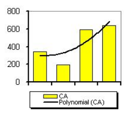
- Different types of regression lines are already offered: linear regression, exponential regression. But a polynomial regression curve is still missing. A macro on this site offers a workaround (french only):
- http://oooconv.free.fr/fitoo/fitoo_fr.html
- covered in http://www.openoffice.org/issues/show_bug.cgi?id=20819
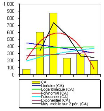
Allow more than one regression line for one series
Extrapolating of trend lines
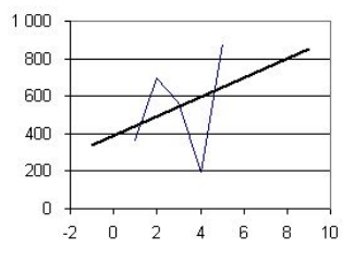
- Trend lines should also allow extrapolating. If data ranges from 1 to 5 but that x axes range from -2 to 10, then the trend line should display from -2 to +10.
- In Excel, the setting is called forward forecast and backward forecast.
- covered in http://www.openoffice.org/issues/show_bug.cgi?id=5085
Mean value for X and center of gravity
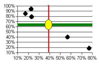
- Get the mean value not only for Y but also for X. A special symbol could mark the intersection point (the center of gravity).
- covered in http://www.openoffice.org/issues/show_bug.cgi?id=64816
Trend line equation and coefficients
OpenOffice.org Calc 2.4.0 can add the equation for a regression curve
- Issue 7998
- Instructions on how to add the equation and coeffecients to a regression curve and related information for OpenOffice.org 2.4+
Manual addition of trendline
Before OpenOffice.org 2.4, it is necessary and possible to add the equation manually. The linear regression formula is Y=mX+b, where m=the slope, and b=the intercept. Let's say you're plotting a regression where the X-axis is in A2:A44, and the Y-axis is in B2:B44. Plot your scattergraph and place the regression line as you normally would. Select a cell near the graph, and enter ="Y = " & ROUND(SLOPE(A2:A44;B2:B44);2) & "X + " & ROUND(INTERCEPT(A2:A44;B2:B44);2). That gives you the regression line's equation. In the cell just below the previous formula, enter ="R-square ="&ROUND(INDEX(LINEST(A2:A44;B2:B44;1;1);3;1);2). That will present the r-square value. Select both cells, and choose Edit->Copy.
Now, make sure the Drawing toolbar is visible (View->Toolbars->Drawing). Select the text box, and draw one. Choose Edit->Paste, and clean up the box so that it fits the text. Click outside the text box. Select the text box again, and move it onto the graph area where you want it to be displayed. (I usually put mine under the legend.) You can then dress up the chart, the text box, and the legend for presentation. When you're done editing, and have the box looking nice, then select the text box. Hold down the shift key and select the graph area. Right-click, and choose "Group."
You can now select the chart, and copy and paste it into Writer, Impress, or Draw documents as you wish.
Error bar for X
- Error bar for X added to the existent Y one
- covered in http://www.openoffice.org/issues/show_bug.cgi?id=42946
Data source for values or the error bar
- Obtain the value of the error bar from row or column in Calc
- covered in http://www.openoffice.org/issues/show_bug.cgi?id=366


