Difference between revisions of "Chart2/TrendLines"
From Apache OpenOffice Wiki
< Chart2
(→Trend line equation and coefficients: update for 2.4, replace picture, add link, emphasize that manual addition is no longer necessary) |
(removed already implemented features from the list of missing features) |
||
| Line 22: | Line 22: | ||
* Get the mean value not only for Y but also for X. A special symbol could mark the intersection point (the center of gravity). | * Get the mean value not only for Y but also for X. A special symbol could mark the intersection point (the center of gravity). | ||
* covered in http://www.openoffice.org/issues/show_bug.cgi?id=64816 | * covered in http://www.openoffice.org/issues/show_bug.cgi?id=64816 | ||
| − | |||
| − | |||
| − | |||
| − | |||
| − | |||
| − | |||
| − | |||
| − | |||
| − | |||
| − | |||
| − | |||
| − | |||
| − | |||
| − | |||
| − | |||
| − | |||
| − | |||
| − | |||
| − | |||
== Error bar for X == | == Error bar for X == | ||
* Error bar for X added to the existent Y one | * Error bar for X added to the existent Y one | ||
* covered in http://www.openoffice.org/issues/show_bug.cgi?id=42946 | * covered in http://www.openoffice.org/issues/show_bug.cgi?id=42946 | ||
| − | |||
| − | |||
| − | |||
| − | |||
Revision as of 08:40, 31 July 2008
Contents
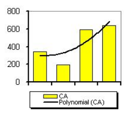
Add polynomial regression type
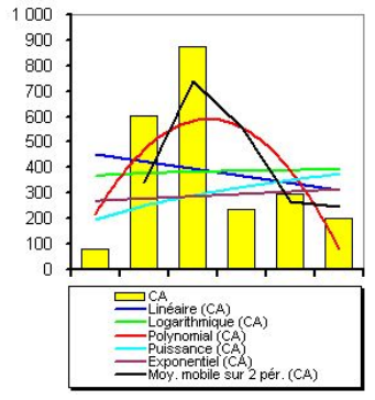
- Different types of regression lines are already offered: linear regression, exponential regression. But a polynomial regression curve is still missing. A macro on this site offers a workaround (french only):
- http://oooconv.free.fr/fitoo/fitoo_fr.html
- covered in http://www.openoffice.org/issues/show_bug.cgi?id=20819
Allow more than one regression line for one series
Extrapolating of trend lines
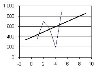
- Trend lines should also allow extrapolating. If data ranges from 1 to 5 but that x axes range from -2 to 10, then the trend line should display from -2 to +10.
- In Excel, the setting is called forward forecast and backward forecast.
- covered in http://www.openoffice.org/issues/show_bug.cgi?id=5085
Mean value for X and center of gravity
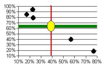
- Get the mean value not only for Y but also for X. A special symbol could mark the intersection point (the center of gravity).
- covered in http://www.openoffice.org/issues/show_bug.cgi?id=64816
Error bar for X
- Error bar for X added to the existent Y one
- covered in http://www.openoffice.org/issues/show_bug.cgi?id=42946


