Difference between revisions of "Chart2/Features2.4"
From Apache OpenOffice Wiki
< Chart2
(→Display bars on different axis next to each other) |
(→Number format for data labels: - added links) |
||
| Line 31: | Line 31: | ||
== Number format for data labels == | == Number format for data labels == | ||
| + | [http://www.openoffice.org/issues/show_bug.cgi?id=37792 37792] For data labels in charts it is now possible to choose a number format for the display of values and percentage values. Thus the precision of the displayed values can be changed for example. | ||
[[Image:Chart_OOo2.4_04.png]] | [[Image:Chart_OOo2.4_04.png]] | ||
| − | * | + | * Feature Announcement : http://graphics.openoffice.org/servlets/ReadMsg?list=features&msgNo=193 |
* Specification : http://specs.openoffice.org/chart/ChartDataLabels.odt | * Specification : http://specs.openoffice.org/chart/ChartDataLabels.odt | ||
| + | * Test case specification : http://www.openoffice.org/nonav/issues/showattachment.cgi/48936/Data_Labels.htm | ||
| + | * CWS : [http://eis.services.openoffice.org/EIS2/cws.ShowCWS?Path=SRC680%2Fchart14 chart14] integrated in SRC680m235 | ||
== Display both value and percentage as data point label == | == Display both value and percentage as data point label == | ||
Revision as of 17:06, 29 January 2008
Contents
- 1 Equations for regression curves
- 2 Reverse axes
- 3 Display bars on different axes next to each other
- 4 Number format for data labels
- 5 Display both value and percentage as data point label
- 6 Allow to display each part of a data label in a separate line
- 7 More flexible placement of labels on data points
- 8 Better automatic positions for lables on pie segments
- 9 Allow removing data point labels with delete key
- 10 Others Links
Equations for regression curves
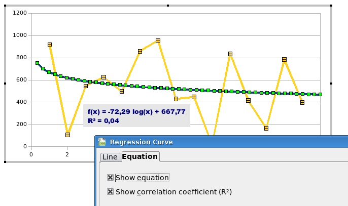
7998 The equation of trend lines and the R² value now can be displayed in the chart.
- Feature Announcement : http://graphics.openoffice.org/servlets/ReadMsg?list=features&msgNo=197
- Specification : http://specs.openoffice.org/chart/DisplayTrendLineEquations.odt
- Test case specification : http://www.openoffice.org/nonav/issues/showattachment.cgi/49695/TCS_Equations_for_regression_lines.htm
- CWS : chart17 integrated in SRC680m238
Reverse axes
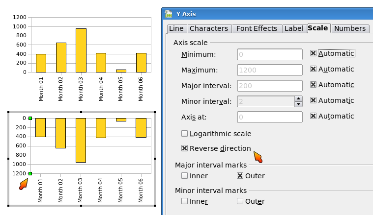
24614 It is possible now to change the direction of axes. Thus the user can choose where the lower values and where the higher values are displayed at an axis.
- Feature Announcement : http://graphics.openoffice.org/servlets/ReadMsg?list=features&msgNo=196
- Specification : http://specs.openoffice.org/chart/Chart_Scales_and_Intervals.odt
- Test case specification : http://www.openoffice.org/nonav/issues/showattachment.cgi/48782/reverse_direction.htm
- CWS : chart14 integrated in SRC680m235
Display bars on different axes next to each other
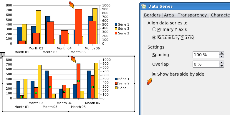
26795 In bar charts with two y axes it is now also possible to display all the bars next to each thus they don't hide each other anymore.
- Feature Announcement : http://graphics.openoffice.org/servlets/ReadMsg?list=features&msgNo=192
- Specification : http://specs.openoffice.org/chart/BarChartOptions.odt
- Test case specification : http://www.openoffice.org/nonav/issues/showattachment.cgi/48996/TCS_Display_Bars.htm
- CWS : chart14 integrated in SRC680m235
Number format for data labels
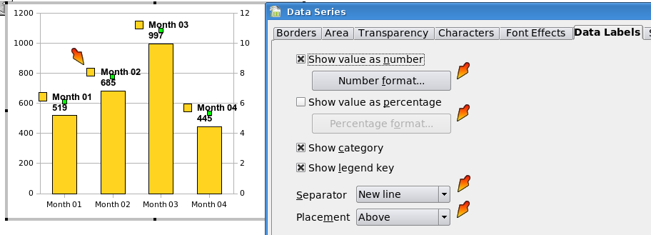
37792 For data labels in charts it is now possible to choose a number format for the display of values and percentage values. Thus the precision of the displayed values can be changed for example.
- Feature Announcement : http://graphics.openoffice.org/servlets/ReadMsg?list=features&msgNo=193
- Specification : http://specs.openoffice.org/chart/ChartDataLabels.odt
- Test case specification : http://www.openoffice.org/nonav/issues/showattachment.cgi/48936/Data_Labels.htm
- CWS : chart14 integrated in SRC680m235
Display both value and percentage as data point label
- Issue : 43489
- Specification : http://specs.openoffice.org/chart/ChartDataLabels.odt
Allow to display each part of a data label in a separate line
- Issue : 82051
- Specification : http://specs.openoffice.org/chart/ChartDataLabels.odt
More flexible placement of labels on data points
- Issue : 63857
- Specification : http://specs.openoffice.org/chart/ChartDataLabels.odt
Better automatic positions for lables on pie segments
- Issue : 4039
- Specification : http://specs.openoffice.org/chart/ChartDataLabels.odt
Allow removing data point labels with delete key
- Issue : 83344


